Minimal Logo Design: Why Simple Marks Are Hard to Get Right
Every line in a minimal logo has to earn its place. Here's how to tell if yours does.
Branding
September 28, 2026
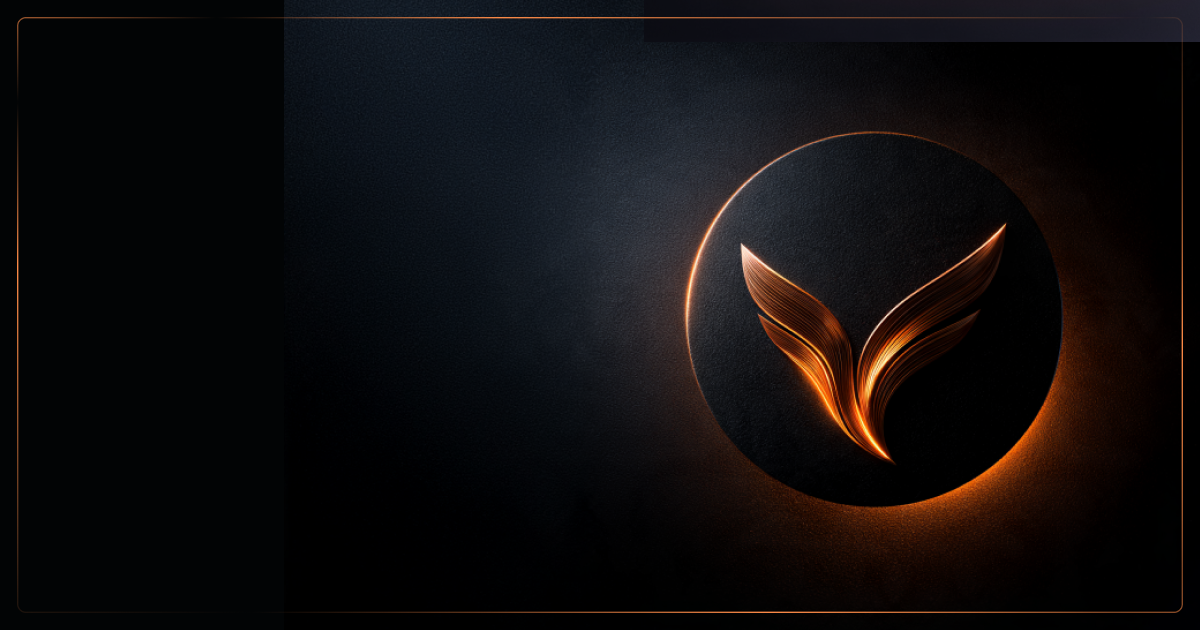
A credible logo has to do a lot of quiet work: signal trust in a first glance, hold up on a mobile screen, and still mean something once a prospect has seen it fifty times. For B2B marketing managers weighing a rebrand, the instinct toward a minimal logo is usually correct. A minimalist logo works because it reduces a brand to the smallest set of marks that still carry meaning, which makes it easier to recognize, scale, and apply consistently across a website, a pitch deck, and a trade-show banner. Getting there is the hard part.
Reduction sounds like the easy option. Strip the gradient, drop the tagline, pick one shape. In practice, every element that survives that process has to justify itself, and that scrutiny is what makes a simple mark so difficult to get right. If a rebrand is on the table, it's worth understanding what that scrutiny actually involves before a designer opens a file, and worth talking through with a team that treats visual identity as connected to positioning rather than decoration.
A simple logo is hard to design because it leaves no room for error, filler, or aesthetic cover. Minimalist logo design strips away texture, gradients, ornamental type, and secondary elements, which means every remaining line, curve, and proportion is doing all the communicating on its own.
That exposure is the whole challenge. In a detailed logo, a slightly awkward curve or uneven spacing can hide among other visual noise. In a minimal logo, there's no noise left to hide behind. In our experience, when a minimal mark feels slightly off, the cause is almost always a proportion, weight, or spacing decision nobody questioned.
This is also where brand identity and logo design diverge from pure aesthetics. Simplicity doesn't mean the emptiest possible mark. It means every visual element serves a specific purpose, with nothing included purely for decoration, a distinction explained well in this analysis of simplicity in logo design. The FedEx arrow hidden in negative space is simple, not because it lacks detail, but because every remaining piece earns its place.
For B2B and technology brands specifically, the stakes are higher. Complex products, long sales cycles, and technical buyers mean the mark has to carry credibility fast, often before a prospect reads a single word of positioning. A minimalist logo that feels arbitrary rather than intentional undercuts that credibility instead of building it.
Precision is what separates a confident minimal mark from a placeholder-looking one. Getting the proportions, weight, and spacing right at this level of restraint takes more design rigor, not less, a point covered directly in this breakdown of why minimal logo design demands more precision.
Reducing an idea without losing its meaning starts with defining the one concept the mark needs to carry before any shapes get drawn. Teams that jump straight to sketching design elements, circles, arrows, abstract marks, tend to produce something clean but generic, because there was never a specific idea to simplify in the first place.
The sequence that works in practice looks like this:
This is where a lot of minimalist logo ideas fall apart: the shape survives, but the meaning doesn't. A generic circle-and-line mark can look identical for a fintech company and a food brand, which defeats the purpose of the exercise. The goal when you make a minimalist logo isn't fewer elements for their own sake. It's the fewest elements that still point unmistakably at one idea.
Negative space deserves particular attention here. Used deliberately, it lets a mark carry a secondary layer of meaning without adding visual clutter, a technique explored in this guide to minimalist logo designs and styles for 2026. That second read, the one a viewer notices after a beat, is often what makes minimal logos memorable instead of forgettable.
The right logo form depends on what the brand needs to communicate at first glance, not on which style happens to be trending. Among the types of logos available, wordmark, geometric symbol, combination mark, or monogram, the choice should follow from the brand's name recognition, industry conventions, and how it will actually be used day to day.
A wordmark logo suits brands with a distinctive, ownable name and works well when the company is still building recognition and needs the name itself to do the branding. A geometric logo, built from precise, mathematically clean shapes, tends to signal structure and reliability, which is part of why it shows up so often in cloud, fintech, and cybersecurity branding.
Color choices carry real weight in a minimal system. With fewer visual elements overall, logo colors have to do more work signaling energy, trust, or approachability, and a flat, rationalized palette (often two to four brand colors) reads as more deliberate than a mark leaning on gradients, as noted in this look at flat logo design and brand simplification.
One opinion worth holding onto: modern, bold, and minimal are not the same thing. A modern minimalist logo favors clean geometry and restrained color over trend-driven effects, which is why the good ones hold up for years rather than months. A bold logo can still be simple, because boldness comes from weight and contrast, not extra elements. Chasing whichever label is trending is how tech brands end up looking like everyone else in their category.
In a B2B context, the best logo is the one that reads clearly as a label for the business at a glance, on a browser tab, a business card, or a conference badge, not one that photographs well in isolation. That distinction matters more for technology brands than most other categories, since the mark often has to represent something abstract (infrastructure, data, security) rather than a physical product. Getting the supporting typography right is part of that work too, which is worth pairing with a clear system for choosing a brand font.
Testing a minimal logo means checking it against real conditions, not just admiring it at presentation size. A mark that looks polished on a 27-inch monitor can fall apart as a 16-pixel favicon or a single-color engraving on a trade-show giveaway, and that gap only shows up once someone actually tests it there.
A practical refinement checklist:
Logo makers and templates can help with early exploration or quick mockups, but treat what they produce as sketches, not candidates. Anything a template gives you is, by definition, available to everyone else too.
Delivery is where a lot of self-service tools fall short for a growing B2B brand. A finished mark needs to exist as editable vector artwork (not just a locked logo template), an SVG for web use that scales without quality loss, and PNG files with a transparent background for use across decks, signatures, and campaign assets. Any agency or freelancer handling final files should hand over all three, plus color and monochrome variants, not a single flattened export.
Technology brands have leaned into minimalism for a practical reason: their products are often intangible, so the mark has to create clarity where the offering itself doesn't provide any visually. Slack's simplified hashtag-style icon, Spotify's single soundwave circle, and Uber's plain wordmark all work because each reduces the brand to one clean signal rather than trying to depict what the product does.
That pattern holds inside more specialized B2B categories too. Cloud, cybersecurity, and fintech brands tend to favor geometric marks (shields, nodes, abstract circuits) precisely because those categories deal in abstraction; a shield shape reads as "security" faster than any literal illustration could. A gallery of minimalist logo examples across tech companies shows how consistently that geometric, symbol-first approach recurs across the sector.
In practice, this is where a strategy-led approach to identity work pays off. On a project like CyFox XDR, a cybersecurity platform, the visual identity and logo needed to feel precise and trustworthy without leaning on cliché shield-and-lock imagery, which is the kind of brief that rewards a clear brand idea over a template-driven shortcut. The same logic applied to Tea-Fi's identity work, where a Web3 infrastructure product needed a mark distinctive enough to stand out in a crowded category while staying legible to both technical and business audiences.
The common thread across these examples isn't the absence of detail. It's that each mark was built around one idea specific enough that a competitor couldn't credibly use the same shape.
Choosing the right level of simplicity means matching the mark's restraint to how distinctive the underlying brand idea actually is. A generic circle or arrow, no matter how cleanly executed, won't build recognition on its own; recognition comes from repetition of something specific enough to be ownable. Before signing off on a concept, run it through the refinement checklist above, especially the competitor lineup test.
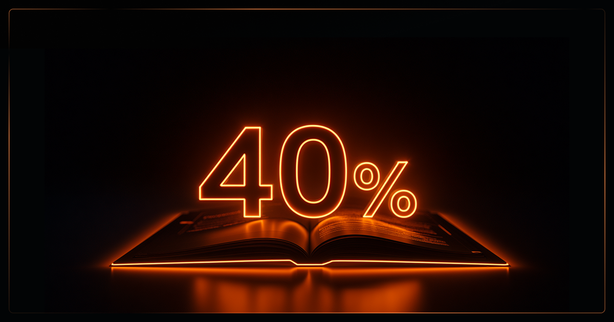
A rebrand built on this kind of scrutiny tends to pay off commercially, not just visually. When an MSP went through a strategic rebrand connected to positioning and go-to-market, close rates rose 40% following the launch, a reminder that a distinctive, well-tested mark is one piece of a broader commercial story, not the whole of it.
Marketing managers evaluating a rebrand should treat the logo as one output of a larger strategic branding and visual identity process, one that starts from positioning and ideal customer profile rather than from a mood board. A mark built that way tends to survive contact with competitors' logos, executive opinions, and five years of actual use.
AI logo tools are useful for speed and early exploration, but they carry real limits for a brand that needs to be legally distinct and strategically specific. AI generators can produce dozens of minimalist concepts from a text prompt in minutes, which makes them a reasonable way to test directions before committing budget to a full design process.
The limits show up past that exploration stage. AI-generated marks are trained on existing logos, so results skew toward familiar shapes, generic geometric symbols, safe color combinations, which is the opposite of the distinctiveness a growing brand needs. Two companies typing similar prompts can land on visually similar output, raising real questions about trademark uniqueness that a purely generative tool has no way to flag.
There's also a strategy gap. An AI tool has no access to a company's positioning, ideal customer profile, or competitive landscape unless a person feeds it that context and interprets the output against it. Generating concepts in seconds has changed how logo design starts, but not how it succeeds, since a mark still needs human judgment to become clear, memorable, and specific, a point made directly in this discussion of logo design after AI.
For a quick placeholder or a very early-stage side project, an AI logo maker can get a usable mark to market fast. For a company staking a rebrand on distinctiveness and legal clearance, a strategy-led design process (informed by competitor research, ICP work, and real-touchpoint testing) remains the more defensible route, particularly once the mark needs to anchor sales collateral, a website, and a campaign system rather than sit alone on a slide.
A minimal logo earns its simplicity rather than defaulting to it. The difficulty isn't in removing elements; it's in knowing which ones were never necessary and which ones were carrying the brand's actual meaning.
Getting a simple mark right takes a clear starting idea, deliberate use of shape, color, and negative space, and testing against real conditions: small sizes, one color, and the cluttered touchpoints where a logo actually has to perform. Templates and AI tools can help explore directions quickly, but distinctiveness and commercial relevance come from connecting the mark to positioning and audience, not from stripping detail until something looks clean.
For B2B and technology brands especially, a logo tested this way tends to age well, because it was built to be recognized, not just admired.
At Ideate, we build visual identities from positioning out, not from mood boards. We start with your ICP and competitive landscape, then design a mark that holds up next to your competitors and still works as a 16px favicon.
Explore our Brand Strategy & Visual Identity service →
The terms are often used interchangeably, but minimalism describes a design style rather than a fixed logo type. A minimal logo applies that style (restrained shapes, limited color, intentional negative space) while "simple" more broadly just means uncomplicated, which can apply to a wordmark, symbol, or combination mark alike.
A professional process typically spans two to four weeks, covering research, concept development, revisions, and final file delivery. Rushed timelines tend to produce generic shapes, since the reduction process that makes a mark distinctive takes iteration.
Yes, and it often works better than a detailed illustration would. Abstract categories like cloud infrastructure, cybersecurity, and fintech benefit from a clean symbol that signals one clear idea (security, speed, connection) rather than attempting to depict a technical process literally.
A complete delivery includes editable vector source files, an SVG for web use, and PNG exports with a transparent background, along with full-color and one-color variants. Locked template exports or single flattened images aren't sufficient for ongoing brand use across a website, decks, and campaign assets.
A logo maker or AI logo tool can help clarify direction and test rough concepts early, which is a reasonable way to gather reference points before a formal design process. For a brand that needs legal distinctiveness and long-term consistency, those early explorations work best as input into a strategy-led process rather than as the final deliverable.