10 Brands That Built Their Identity Around a Mascot: What Worked
Why the best mascots are systems, not drawings,
Branding
September 24, 2026
A mascot can carry a brand's personality into places a logo never reaches: a support ticket, a login screen, an error message, a Super Bowl ad. GitHub's Octocat shows up in developer swag and API documentation. Mailchimp's Freddie greets users mid-onboarding. Salesforce built an entire learning platform, Trailhead, around Astro and a cast of supporting characters. These aren't decoration bolted onto a wordmark; they're working parts of a visual identity, built to make abstract or technical offerings feel approachable without dumbing them down.
Ten brands, spanning SaaS platforms and grocery-aisle staples, show what a mascot can actually do for a business: simplify a complex product, give a campaign a repeatable hook, or carry a brand's tone across every channel it touches. Some of these characters anchor company-wide identities. Others belong to one product line or one seasonal campaign, which turns out to matter a great deal when a marketing team is deciding how far to lean on a character. For B2B and SaaS teams weighing whether a mascot belongs in their own strategic branding and visual identity, the pattern worth studying isn't the character design. It's the system of use around it.
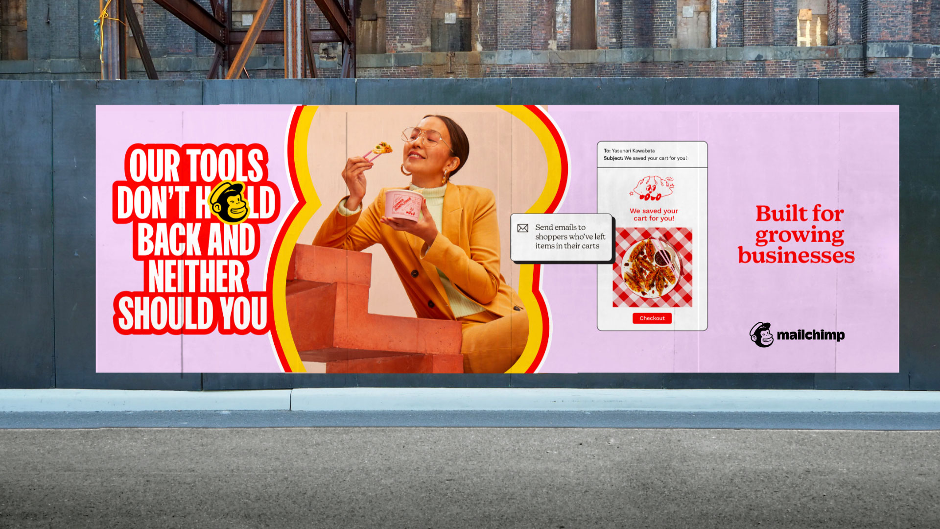
Freddie, the chimp head mark, is Mailchimp's most recognizable asset, but the real lesson is how tightly the character connects to the brand's tone of voice. Mailchimp built its whole visual language, quirky illustrations, hand-drawn type, offbeat copywriting, around the same sensibility Freddie represents: approachable, a little irreverent, never stiff.
For a marketing automation platform, that's a deliberate positioning choice. Email marketing and CRM tools can feel clinical. Freddie signals that Mailchimp wants to be the friendly option for small businesses, not the enterprise suite with a thousand settings.
The takeaway for B2B teams: a mascot works best when it's consistent with everything else in the identity system, not a cute logo mark sitting apart from a corporate deck. If the illustration style, copy voice, and character don't share a personality, the mascot reads as decoration.
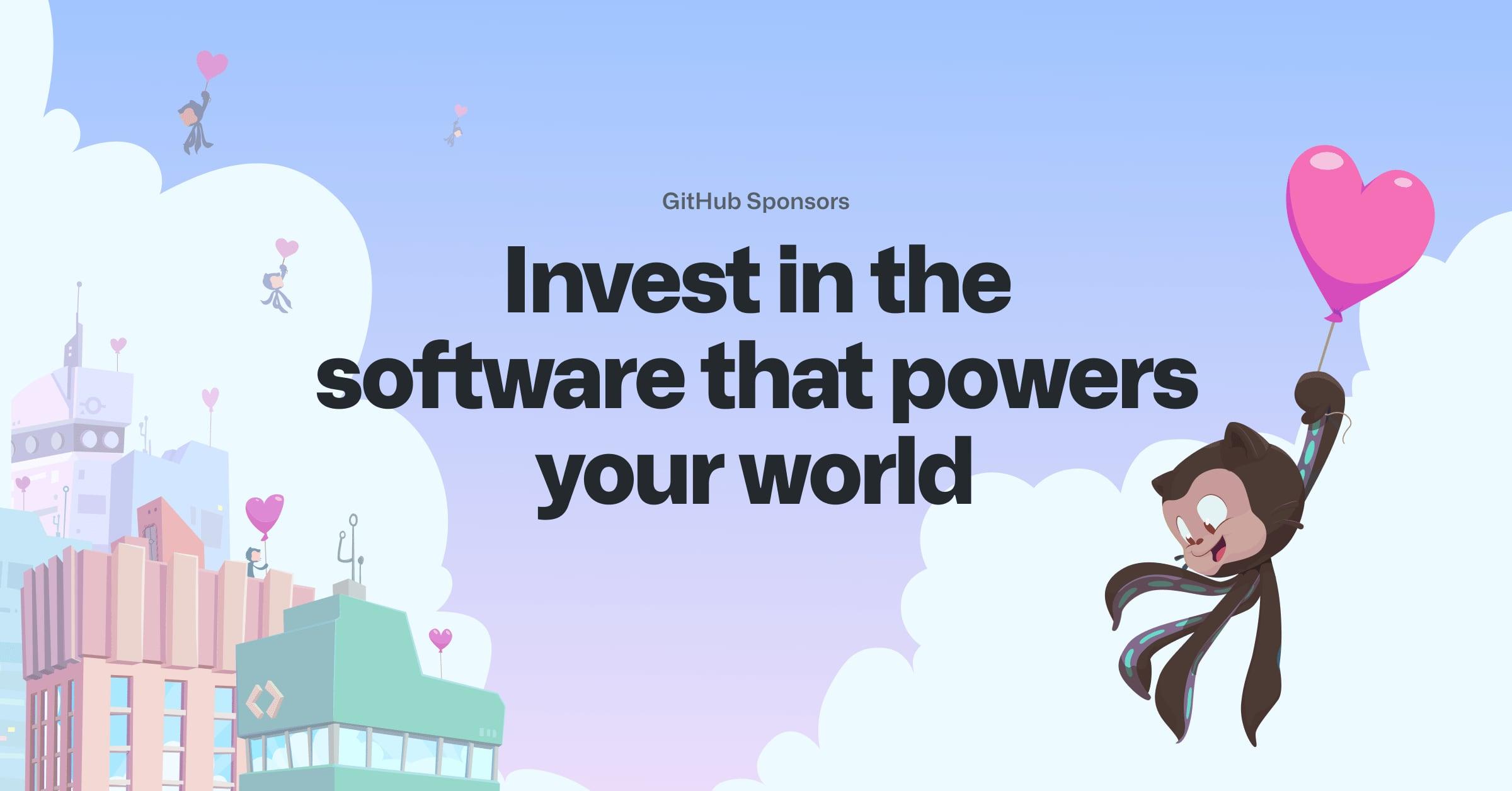
The Octocat is GitHub's clearest example of a mascot built for a technical audience rather than a mass consumer one. Developers are a skeptical crowd, generally allergic to marketing gloss, so GitHub's approach leans into remix culture instead of polish: the Octodex is a gallery of dozens of Octocat variations, many contributed by the community itself, each reflecting a different holiday, region, or in-joke.
That's the distinctive move. Rather than tightly controlling one approved character, GitHub let the mascot become a shared creative asset. It shows up on stickers, README badges, and conference swag, and its casual, DIY variations fit a platform built on open contribution.
For a SaaS company selling to developers or technical buyers, the lesson is about tone-matching, not aesthetics. A mascot aimed at engineers has to feel like it belongs in a code repository, not a stock-photo pitch deck.
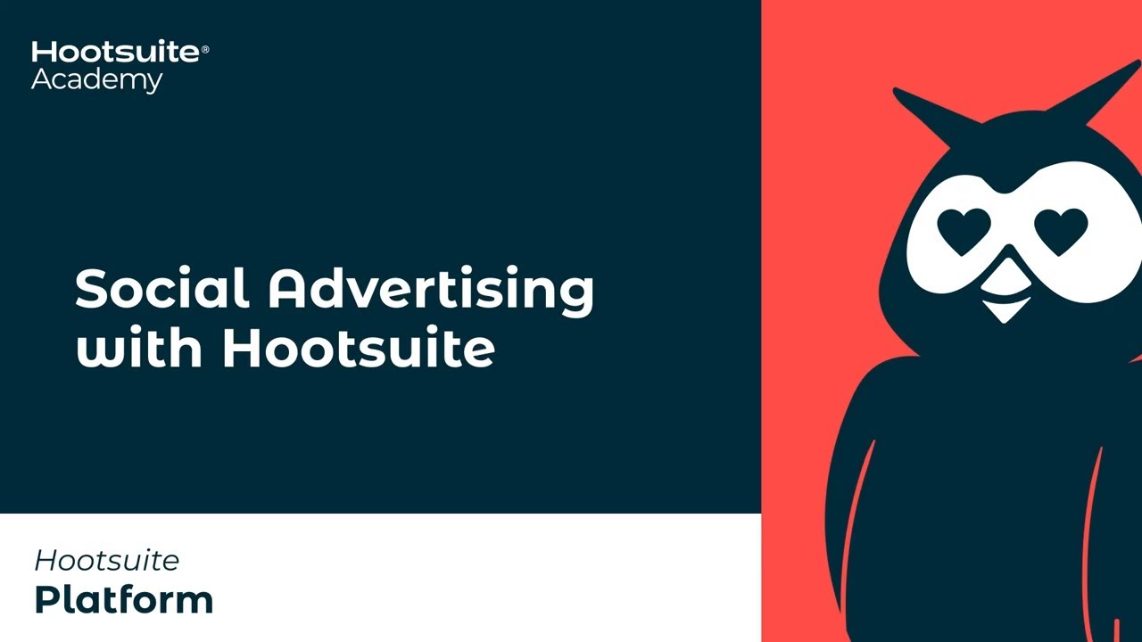
Owly, the one-eyed owl, gives Hootsuite a distinct visual mark, an owl positioned as a symbol of insight and awareness, watching over the social accounts a business manages. Hootsuite is a platform for managing social media accounts across channels, and Owly shows up consistently in its interface, its own social presence, and its swag, according to a rundown of famous brand mascots that covers his design and role.
What makes Owly useful for a B2B example is restraint. He's not shouting for attention or headlining ad campaigns; he's a quiet, recurring presence that gives a fairly utilitarian dashboard product some warmth. That's a realistic bar for most B2B software brands: consistent character presence rather than viral stunts.
Marketing teams managing multi-channel content calendars can take a practical cue here. A mascot doesn't need a origin story or a Super Bowl spot to earn its place; it just needs to show up the same way, every time, until it becomes shorthand for the brand.
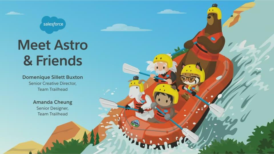
Astro belongs to Trailhead, Salesforce's learning and certification platform, not to the Salesforce corporate identity itself. That distinction matters more than it looks. Salesforce's core brand runs on cloud imagery and a fairly buttoned-up enterprise tone; Astro and the wider cast of Trailhead characters (Codey, Cloudy, Appy) exist specifically to make the learning experience feel less like corporate training and more like a game.
This is a useful model for any company running a certification program, academy, or community alongside a serious core product. The mascot doesn't have to represent the whole brand. It can live inside one sub-brand, doing a specific job: making a learning path feel achievable instead of intimidating.
Enterprise software buyers still expect polish from the main brand. Trailhead's mascots get to be playful precisely because they're scoped to onboarding and education, not the boardroom pitch.
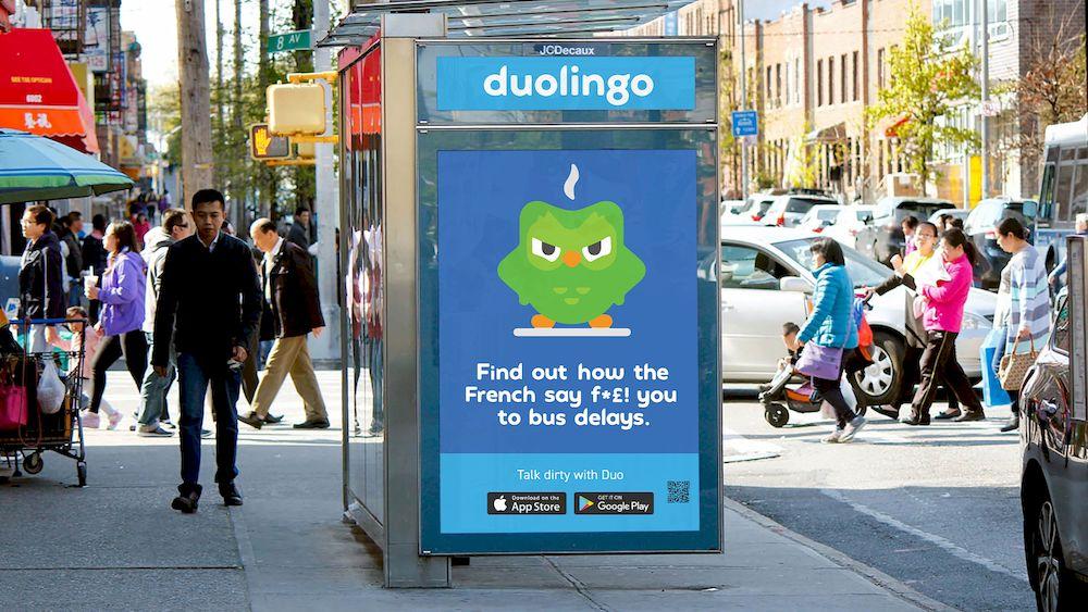
Duo, the green owl, is the clearest current example of a mascot whose main job happens on social media rather than in the product. Duolingo built an aggressive, chaotic social presence around Duo's "menacing" persona, leaning into memes, TikTok stunts, and a running joke about reminder notifications that feel like threats.
The strategic point for B2B marketers: Duo's social content strategy is really a content strategy wearing a mascot costume. The character gives the brand a consistent voice to riff from platform to platform, which is a lot easier to plan and produce than inventing a new campaign concept every week.
A B2B software company with a smaller, more literal-minded audience shouldn't try to copy Duo's chaos directly. The transferable idea is narrower and more useful: a character can be a recurring creative device for a content calendar, giving a social team a consistent lens for jokes, product tips, or commentary instead of starting from a blank page.
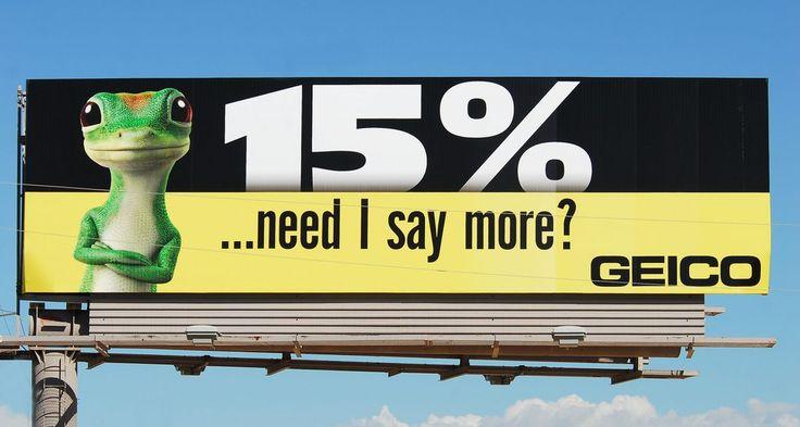
The GEICO Gecko turns a genuinely dry product, auto insurance, into something people can quote back. His job is entirely about simplifying a complicated pitch: instead of explaining rate comparisons and coverage tiers, the Gecko delivers a joke and a British accent, and the ad does its work through personality rather than data.
Mascots like the Gecko demonstrate a comparison that matters for any brand considering one: they're often a better long-term investment than celebrity spokespeople, since a character keeps a consistent image and message over time where a celebrity carries variable associations and risk. That's a real argument for B2B brands weighing a mascot against, say, a rotating cast of customer testimonials or influencer partnerships.
The insurance category leans on mascots specifically because most providers sell a near-identical product. A distinct character becomes a proxy for differentiation when the underlying offering is hard to tell apart from a competitor's.
The Michelin Man, known formally as Bibendum, has represented tire reliability since debuting at the 1898 Lyon Exhibition, making him one of the oldest mascots still in active use, according to a retrospective on iconic brand cartoon characters. Global recognition of the character sits at an astonishing 90%, a figure cited in coverage of the character's history and evolution.
What's instructive is how far Michelin stretched the mascot beyond tires. The company built the Michelin Guide, a restaurant and travel rating system, extending Bibendum's association with reliability into an entirely different category. That's a mascot doing brand-architecture work, lending trust across product lines rather than staying locked to one SKU.
For a B2B company with multiple product lines or service tiers, the Michelin case is a reminder that a mascot's real value is portability: does the character's core promise (reliability, insight, simplicity) travel to new offerings, or is it welded to one product forever?

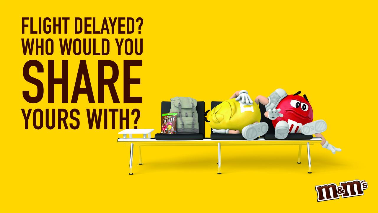
The Spokescandies work because each color gets a distinct personality, which gives M&M's a built-in cast for storytelling instead of a single static icon. Red is vain, Yellow is sweet and a little dim, Green carries her own running gags; the ensemble lets the brand build sketch-style ad campaigns without inventing a new character every cycle.
That structural choice, multiple mascots instead of one, is worth flagging for marketing teams building out a product suite. If a company sells several distinct tools or modules, a small cast of characters (each representing one product or persona) can do more narrative work than a single all-purpose mascot stretched thin across everything.
Campaigns featuring the Spokescandies also lean into cultural relevance and humor, keeping the characters current across packaging, advertising, and social content rather than freezing them in one era's design.
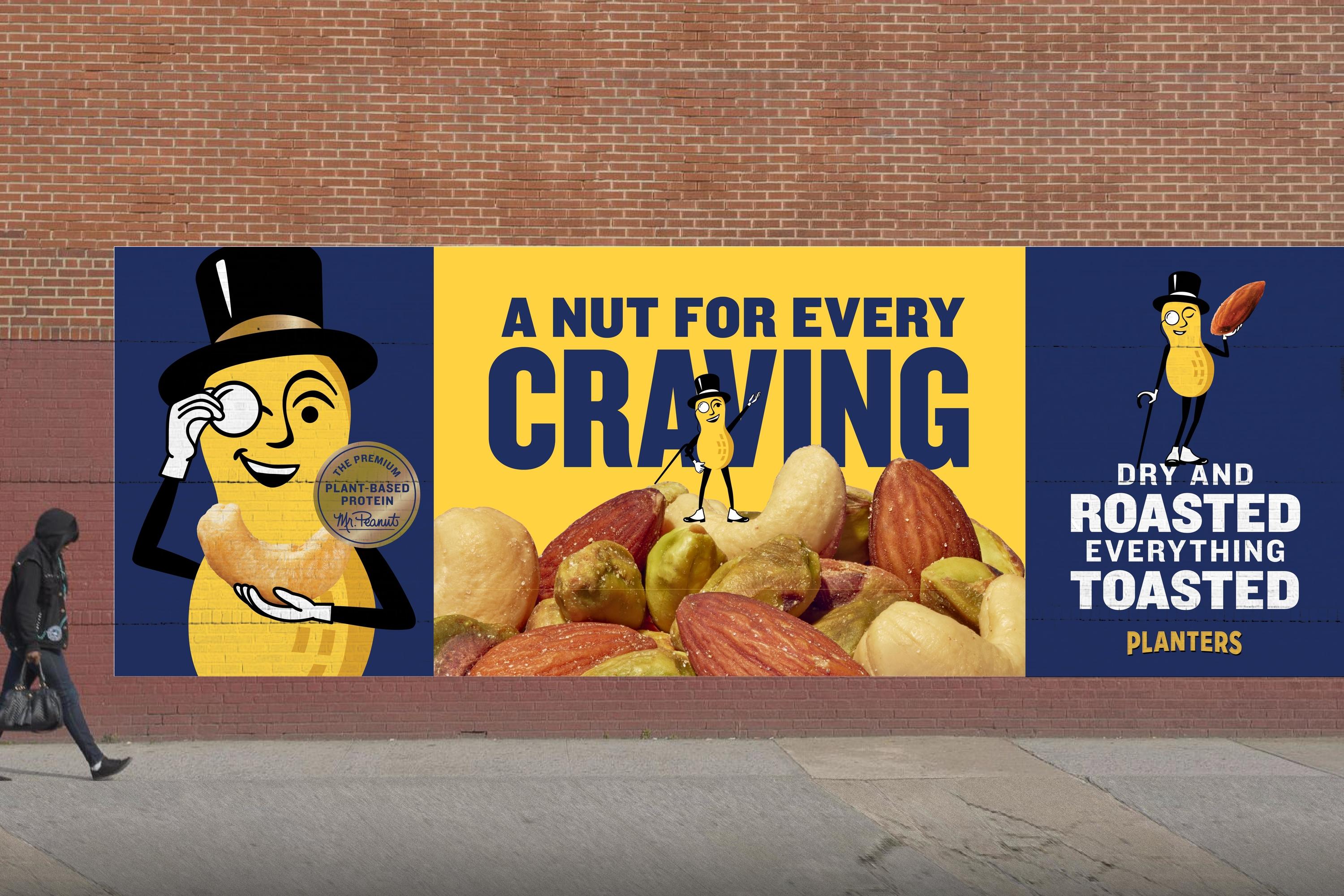
Mr. Peanut shows what happens when a century-old mascot takes a real creative risk. Planters "killed" the character in a 2020 Super Bowl campaign, then revived him as "Baby Nut," a stunt built for the news cycle and social media commentary as much as for the ad slot itself.
Mr. Peanut debuted in 1916, drawn by a 14-year-old boy in a company design contest, and has stayed remarkably stable since; a public survey asking whether to add a pocket watch or cufflinks to his look reportedly came back with a clear "don't change a thing," according to a history of famous brand mascot designs. That's a mascot with enough equity that Planters could afford to break the rules once, dramatically, and still land back on familiar ground.
The lesson isn't "kill your mascot for attention." It's that a long-running, well-established character has earned enough trust to support the occasional disruptive stunt. A newer or less consistent mascot doesn't have that cushion yet.
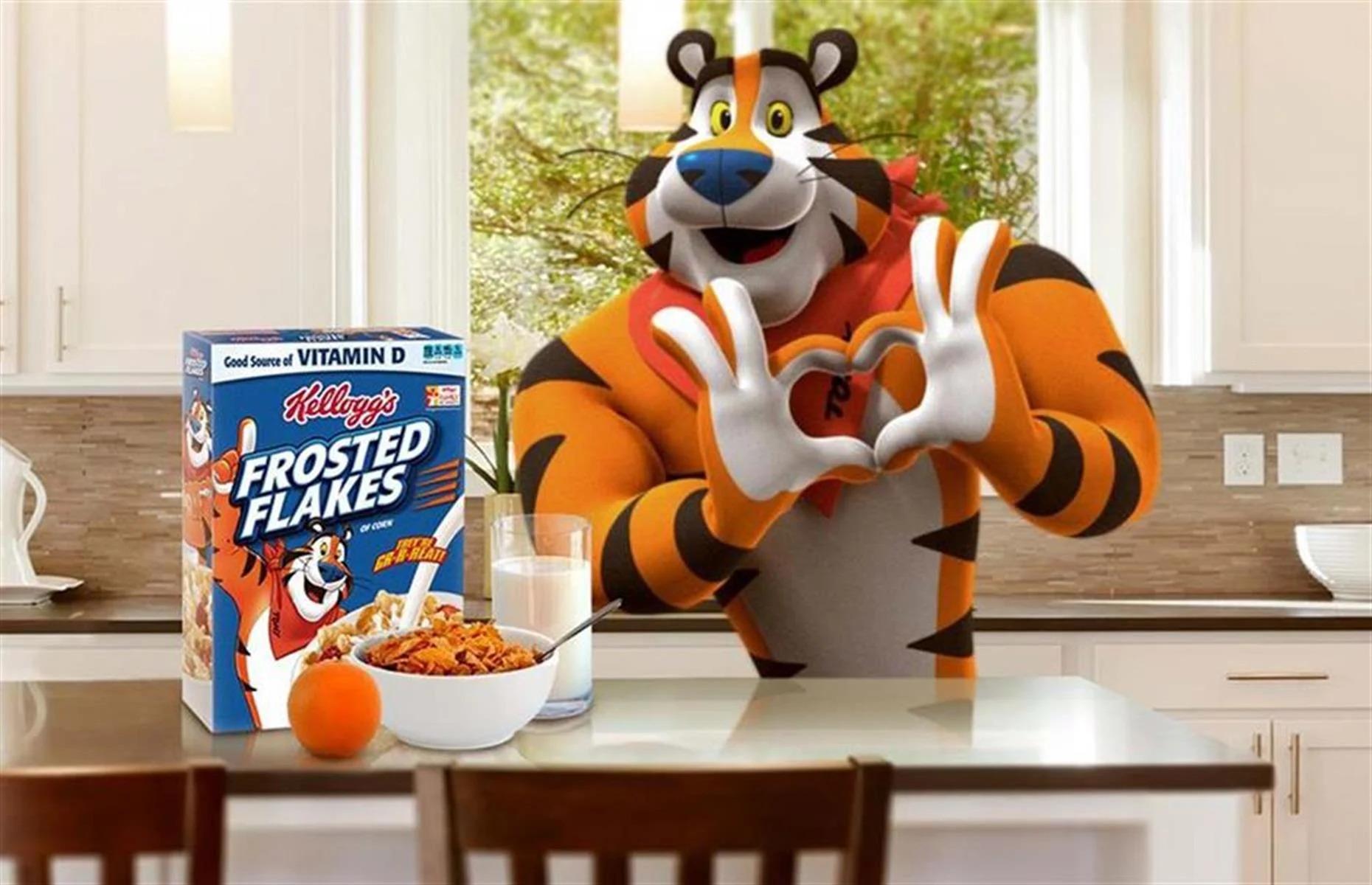
Tony the Tiger has anchored Frosted Flakes since 1951, and the character was chosen through consumer research rather than a single designer's instinct, competing against other mascot concepts before winning out. His catchphrase, delivered with a thumbs-up and a grin, became inseparable from the product itself.
The specific creative discipline here is repetition without stagnation. Tony's expression, pose, and catchphrase stay recognizable across decades of packaging and advertising, even as the art style updates. That consistency is what built the recognition; a mascot redesigned every few years never gets the chance to become shorthand for the product.
For any brand running a mascot long-term, Tony is the case study in picking a signature line or gesture and refusing to abandon it for the sake of novelty.
Across all ten examples, the mascots that hold up share a job description bigger than sitting next to a wordmark. They carry tone of voice, they give campaigns a repeatable creative hook, and several of them scope themselves to one product or sub-brand instead of the whole company.
A few patterns worth naming directly:
None of this happens by accident. Every one of these mascots sits inside a broader system of visual identity, messaging guidelines, and campaign planning; the character is the visible tip of a much larger creative structure.
A mascot earns its place when a product is genuinely hard to explain and a character can carry that explanation across channels more consistently than a logo alone. Cybersecurity, cloud infrastructure, and complex SaaS platforms are exactly the categories where a well-placed character can make dense material feel less intimidating, the same job Owly does for a social media dashboard or Astro does for Salesforce certification paths.
A mascot fits particularly well when a company has:
A mascot fits poorly when the brand's positioning depends on gravitas over approachability, such as enterprise security or financial infrastructure sold to risk-averse buyers who want confidence signals, not comic relief. It's also a poor fit when a marketing team can't commit to using the character consistently across product, sales collateral, and social content for years, since inconsistent or short-lived mascots (unlike Tony the Tiger's seven-decade run) never build enough recognition to pay off the investment.
Any brand considering the move should treat the mascot decision as a positioning question first, resolved before a single character sketch gets drawn. That's the kind of work that belongs in a brand strategy and visual identity process, alongside messaging, ICP definition, and the visual system the character will live inside, not as an isolated design exercise handed to whoever's free that week. Teams weighing this alongside other identity decisions, including something as foundational as choosing a brand font, will find the mascot question easier to answer once the rest of the visual system is defined. For companies weighing whether their own identity needs this kind of character or a sharper visual system without one, that's a conversation worth having before committing budget to either.
Mailchimp's Freddie, GitHub's Octocat, Hootsuite's Owly, and Salesforce's Astro (scoped to the Trailhead learning platform) are among the most recognizable mascots in SaaS. Duolingo's Duo, while a language-learning app rather than a B2B tool, is one of the most visible mascots in software marketing generally, largely through social media.
The mascots that endure pair a consistent visual design with disciplined, repeated use across every channel the brand touches, from packaging to social media to product interfaces. Tony the Tiger's decades-long consistency and Owly's steady presence inside Hootsuite's product both show that repetition, not novelty, builds recognition over time.
No. Several of the strongest examples here, including Astro and Owly, keep the mascot separate from the primary logo and use it as a supporting character across marketing and product touchpoints instead. A B2B brand can use a mascot inside one product or campaign without ever putting it in the company's core mark.
A well-designed mascot gives an abstract or technical concept a face and a personality, which people process faster and recall more easily than an abstract symbol or a wall of feature copy. GEICO's Gecko turns insurance comparisons into a joke, and Owly turns social media monitoring into a recognizable, approachable character; both let the audience grasp the value quickly.
A mascot is a poor fit when a brand's credibility depends on gravitas, such as enterprise security, legal, or financial services sold to buyers who want confidence signals over personality. It's also a weak choice for any team unwilling to commit to using the character consistently for years, since a mascot introduced and abandoned within a rebrand cycle never has time to build recognition.