KCC Manufacturing Case Study

Logo with stylized white text reading 'CYBONET' on a black background.
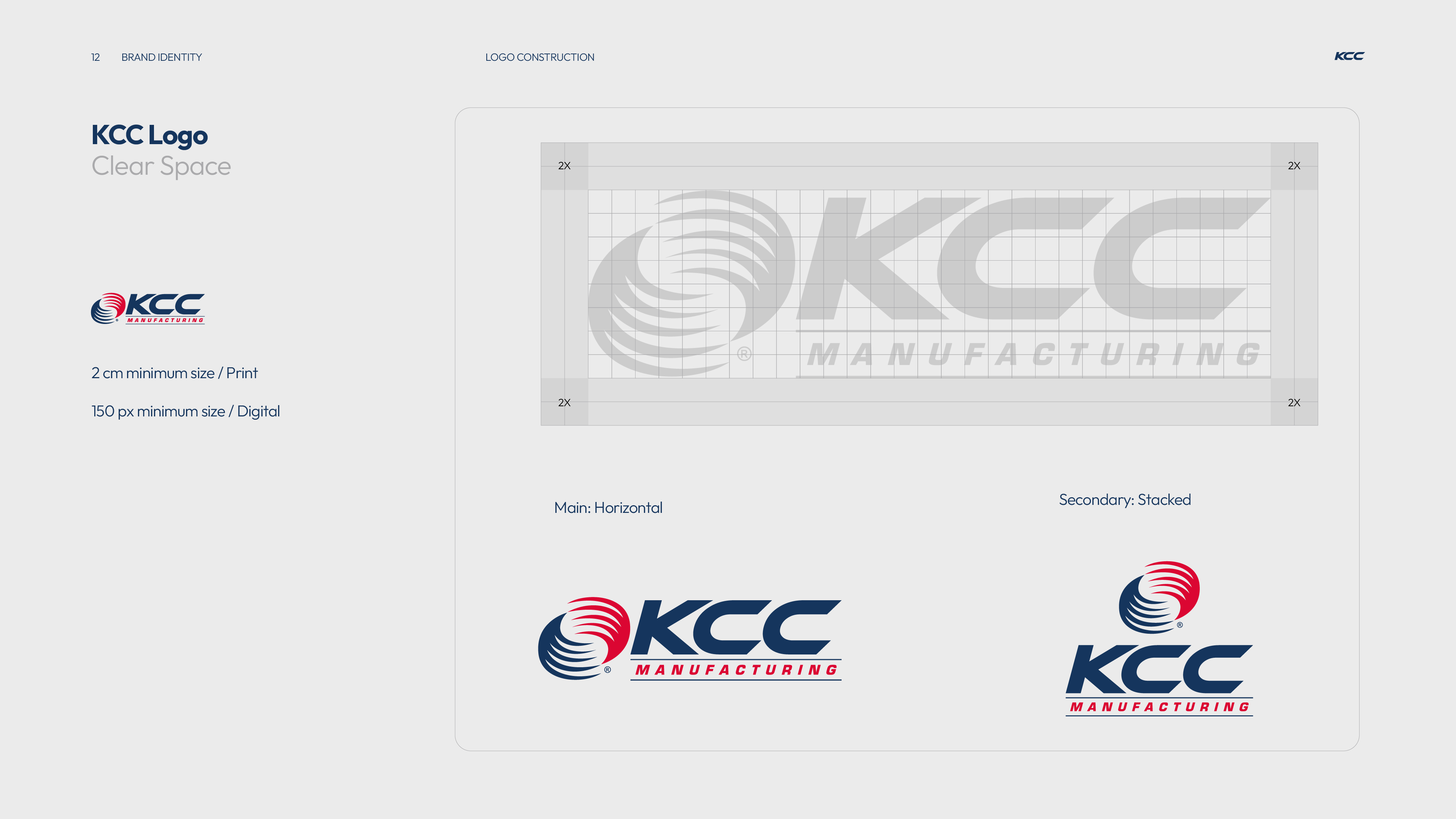
KCC Manufacturing logo

KCC Manufacturing is an employee-owned HVAC manufacturer where engineering expertise meets personal accountability. From air management to roofing infrastructure and contract manufacturing, KCC designs and builds with one principle in mind: better air performance starts with people who own the outcome.

  • Client : KCC Manufacturing

  • Scope : Strategic Branding & Visual Identity, Collateral Templates, Launch Campaign, Social Media Assets

  • Categories : Manufacturing, Engineering, HVAC, Cooling
01 / project overview
ProjectOverview

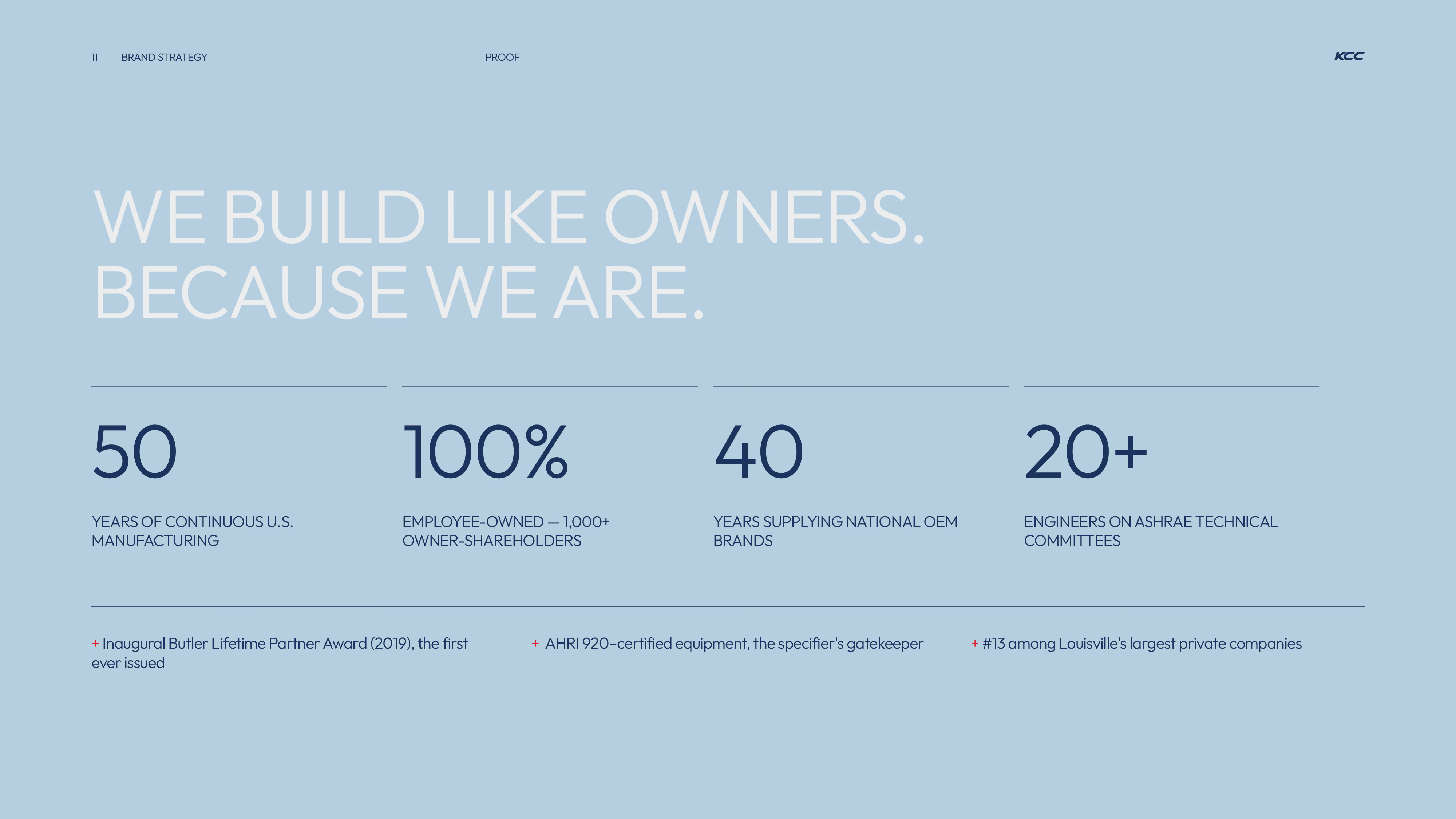
KCC Manufacturing is a 100% employee-owned U.S. commercial HVAC manufacturer with 50 years of continuous production, 1,000+ owner-shareholders and 20+ engineers sitting on ASHRAE technical committees. For most of those 50 years, it built equipment for national OEM brands. Now it was launching its own dedicated outdoor air system (DOAS) line, Viking, into a market dominated by established names.
The challenge was to bring those strengths forward without abandoning the heritage of an established industrial brand. The new identity therefore needed to feel engineered rather than decorated, modern rather than fashionable, and confident without losing the practical character of a manufacturing company.

02 / Strategic Branding
KCC ManufacturingStrategic Branding

Rather than completely abandoning KCC's existing visual equity, we developed a system that could make the company feel significantly more contemporary while remaining recognizably KCC.
‍
The identity is built around technical precision and controlled movement. Every element (typography, color, imagery and graphic forms) was designed to reinforce that idea.

TheChallenge

For most of its history, KCC's name sat behind other companies' products. Stepping out under its own brand meant carrying 50 years of industrial heritage into a crowded DOAS market, without looking like every other equipment maker. The identity had to feel engineered rather than decorated, modern rather than fashionable, and confident without losing the practical character of a manufacturing company.
‍
The identity is built around technical precision and controlled movement. Every element, typography, color, imagery and graphic forms, was designed to reinforce that idea.

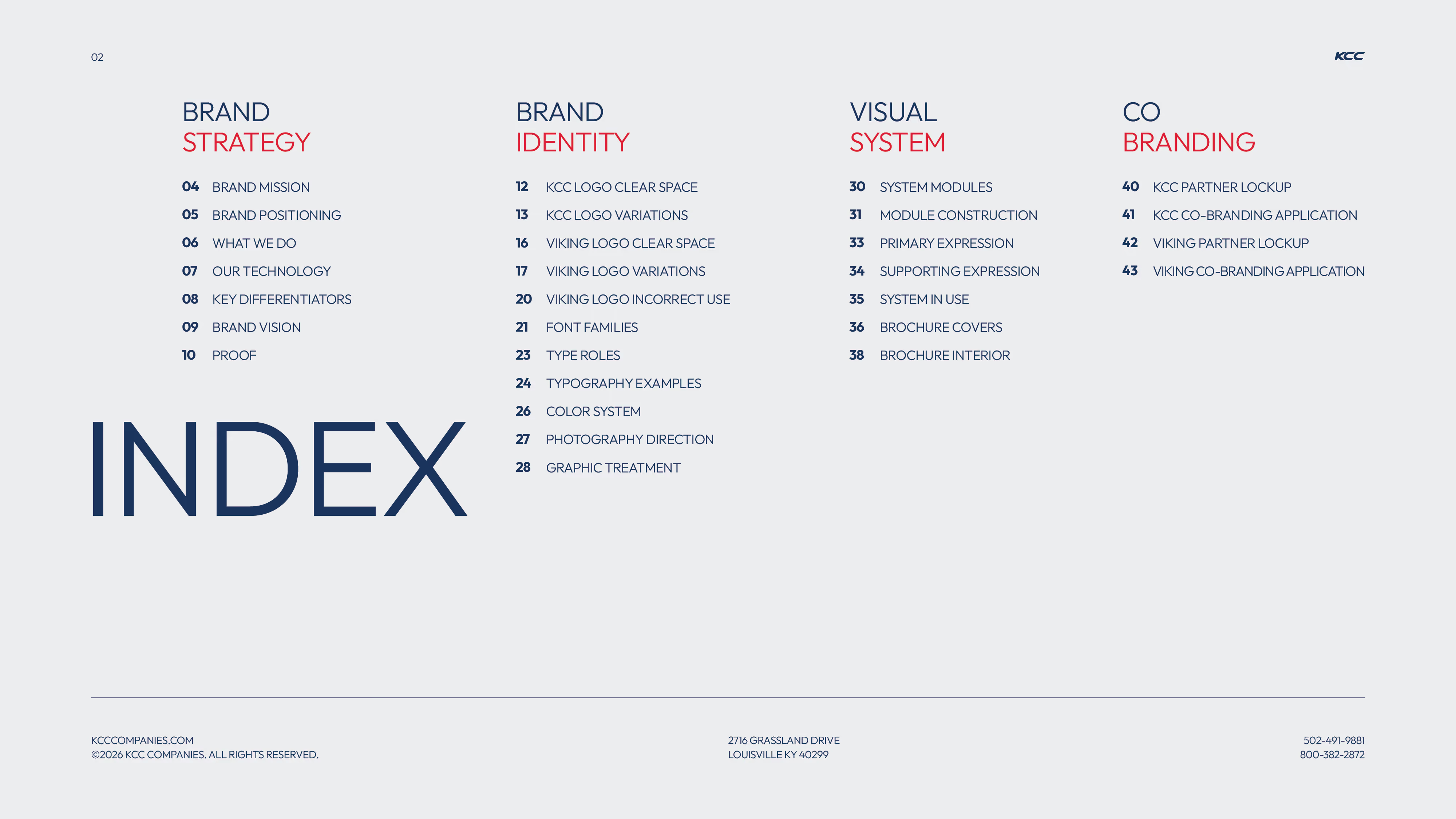
Table of contents titled INDEX, divided into four categories: Brand Strategy, Brand Identity, Visual System, and Co Branding, with numbered topics under each.
Red background with large faint number 01 in the center-right and text in navy and white that reads BRAND STRATEGY, along with small contact details and website information at the bottom.
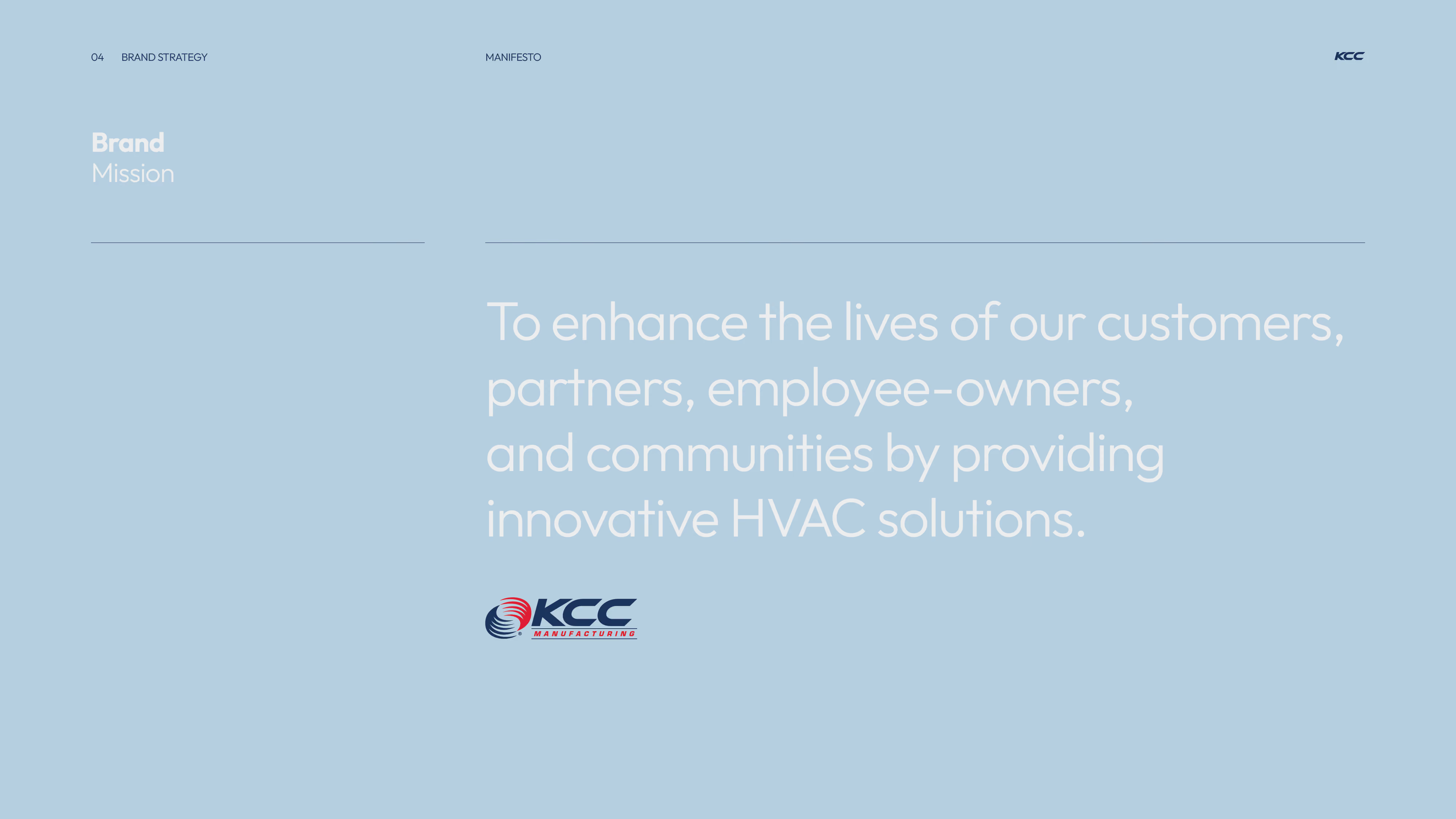
Text on a light blue background reading 'Brand Mission' and stating the mission is to enhance the lives of customers, partners, employee-owners, and communities by providing innovative HVAC solutions, with a KCC Manufacturing logo below.
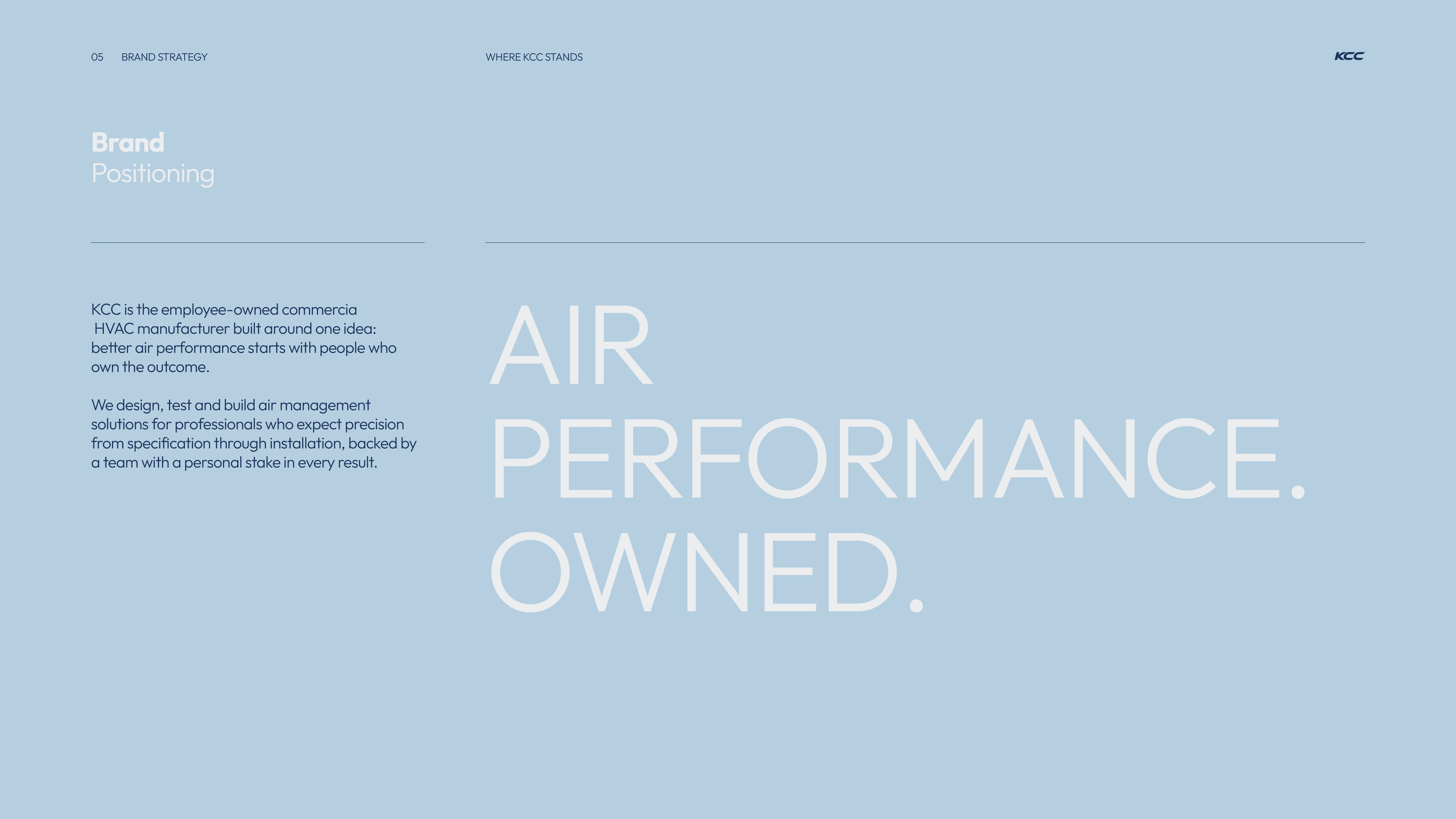
Brand positioning statement on a light blue background reading: KCC is an employee-owned commercial HVAC manufacturer focused on better air performance through people ownership. They design, test, and build air management solutions for professionals seeking precision from specification to installation, backed by a team personally invested in every result. Large text emphasizes 'AIR PERFORMANCE. OWNED.'
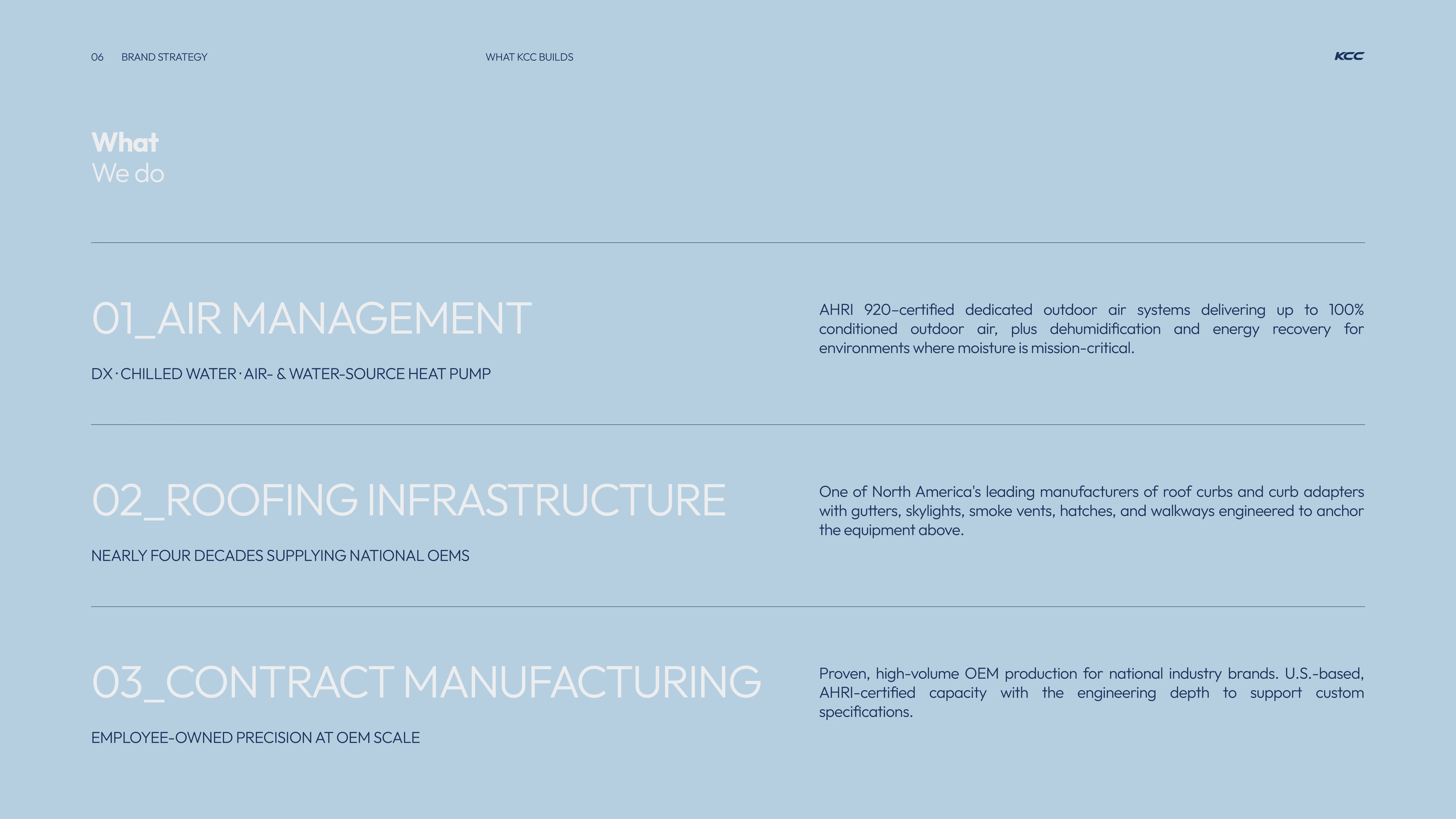
A blue slide presenting three main business areas of KCC: 01_Air Management with DX, chilled water, air- and water-source heat pump systems certified by AHRI 920 for 100% conditioned outdoor air and energy recovery; 02_Roofing Infrastructure supplying national OEMs with roof curbs, curb adapters, gutters, skylights, smoke vents, hatches, and walkways; 03_Contract Manufacturing offering high-volume OEM production with AHRI-certified capacity and engineering support for custom specs.
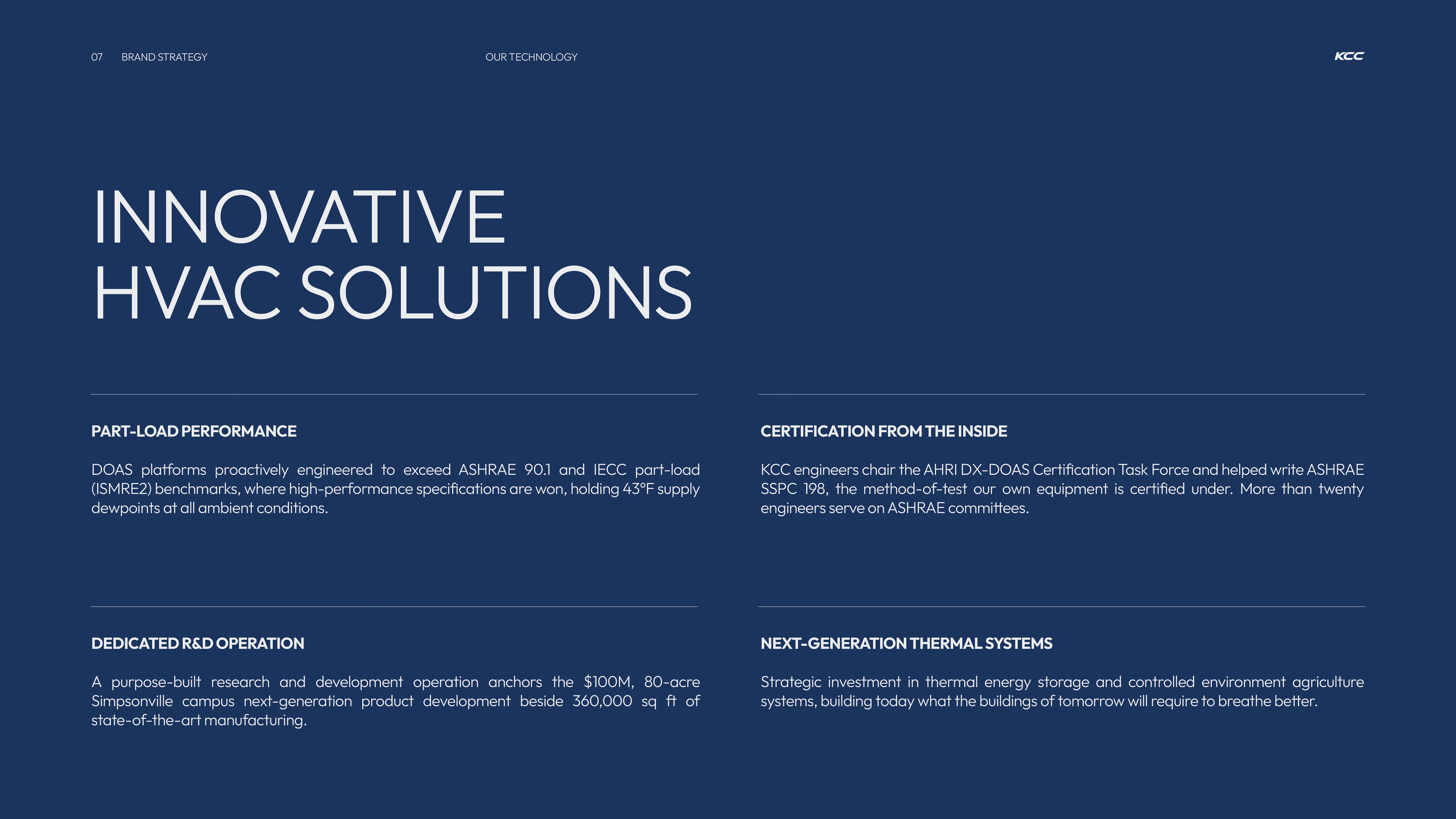
Dark blue slide titled Innovative HVAC Solutions with four sections: Part-Load Performance describing DOAS platforms exceeding ASHRAE 90.1 and IECC benchmarks maintaining 43°F supply dewpoints; Certification from the Inside noting KCC engineers chairing AHRI DX-DOAS Task Force and helping write ASHRAE SSPC 198 with over twenty engineers on ASHRAE committees; Dedicated R&D Operation detailing a $100M, 80-acre Simpsonville campus with 360,000 sq ft for next-generation product development and manufacturing; Next-Generation Thermal Systems discussing strategic investment in thermal energy storage and controlled environment agriculture systems for future buildings.
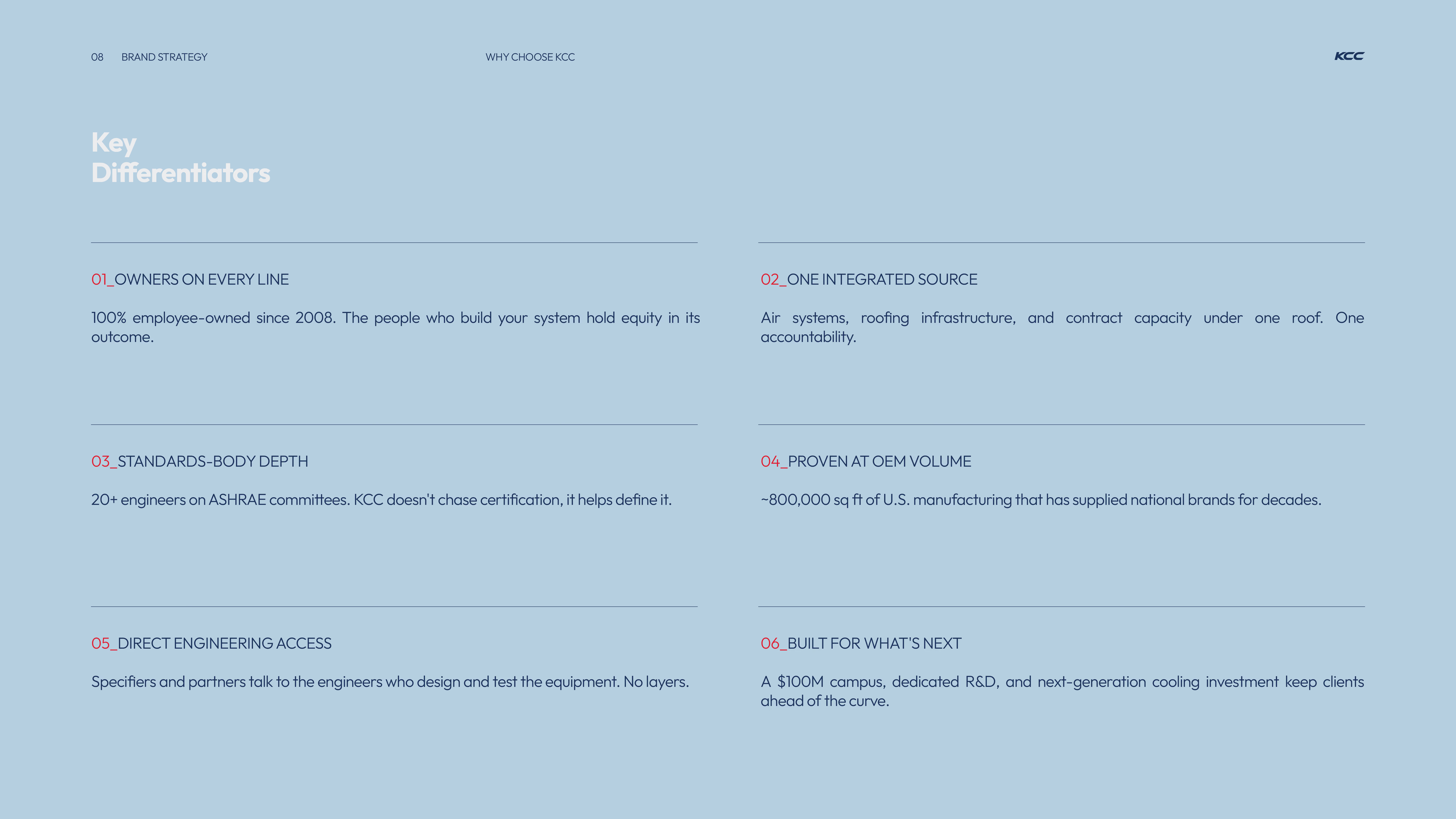
Text titled 'Key Differentiators' listing six points: 01 Owners on every line, 100% employee-owned since 2008; 02 One integrated source, combining air systems, roofing, and contract capacity; 03 Standards-body depth, with 20+ engineers on ASHRAE committees; 04 Proven at OEM volume, supplying ~800,000 sq ft of U.S. manufacturing; 05 Direct engineering access, allowing direct talk with engineers; 06 Built for what's next, including a $100M campus, R&D, and next-gen cooling investment.
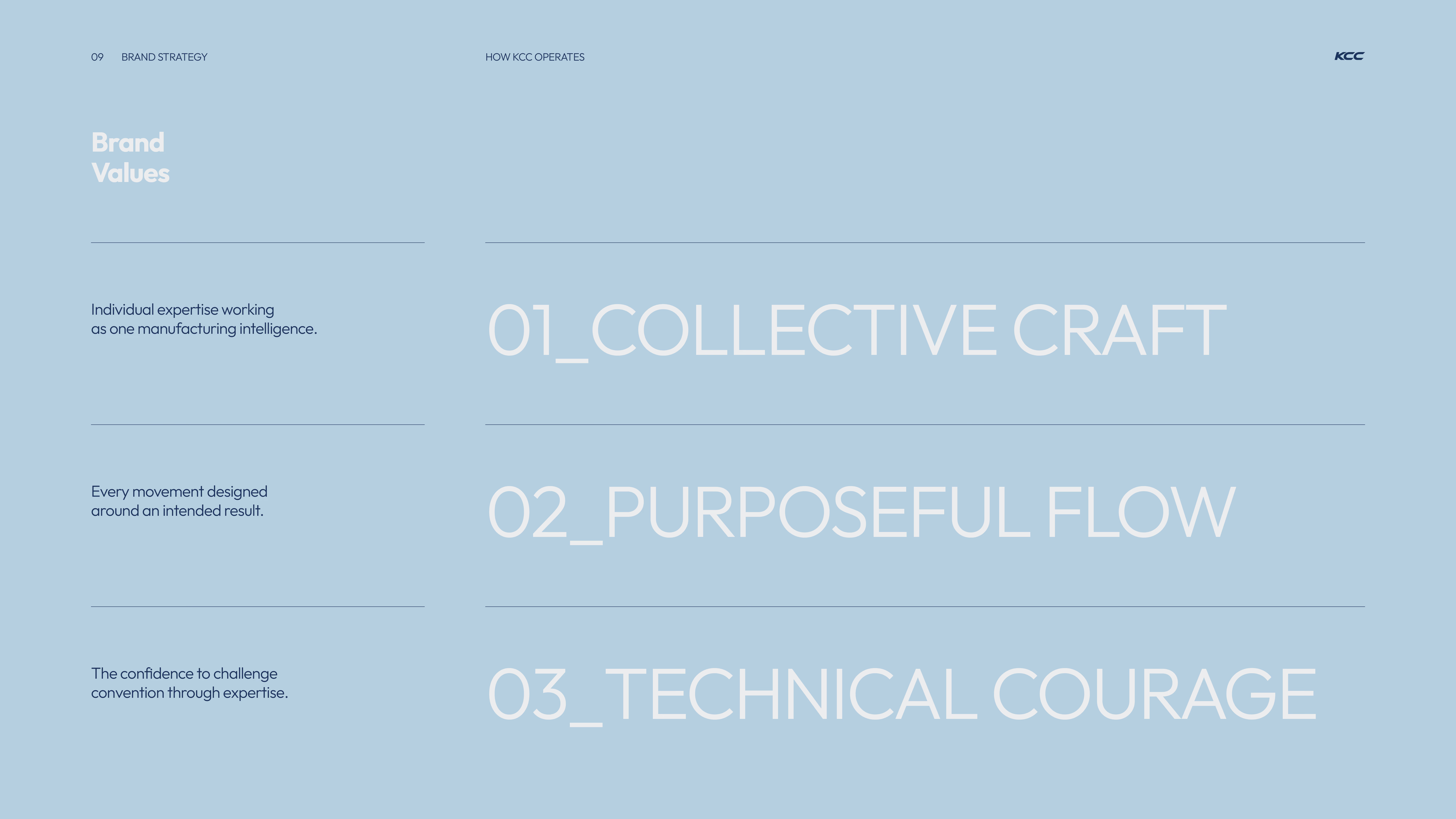
Slide titled 'Brand Values' showing three numbered values: 01_Collective Craft, 02_Purposeful Flow, and 03_Technical Courage, with descriptions emphasizing collective expertise, designed movement, and confidence to challenge convention.
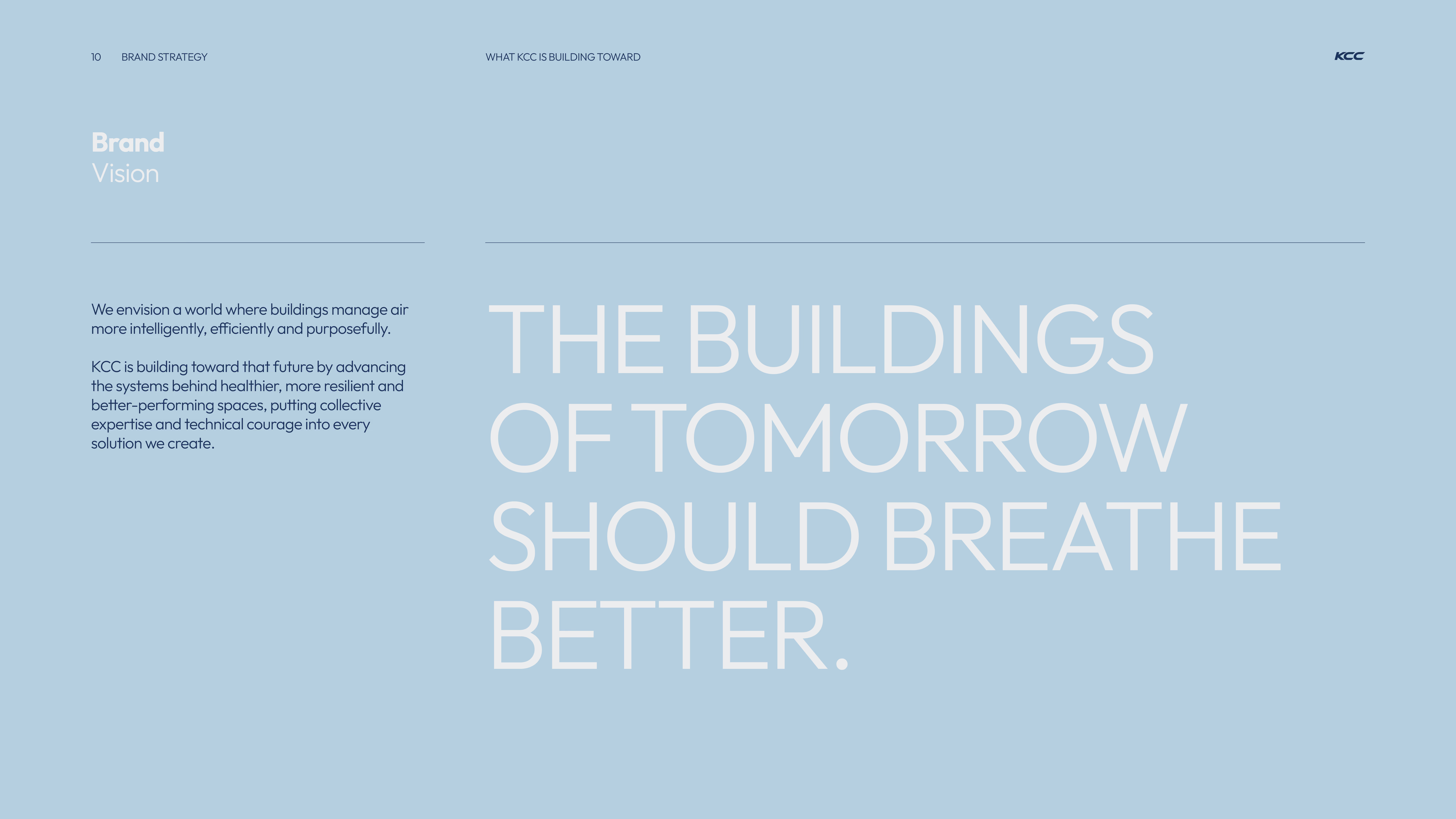
Brand vision statement on a light blue background stating that KCC envisions buildings managing air more intelligently, efficiently, and purposefully, aiming for healthier, resilient, and better-performing spaces, summarized by the phrase: The buildings of tomorrow should breathe better.
Slide with brand strategy proof stating 'We build like owners. Because we are.' Highlights: 50 years of continuous U.S. manufacturing, 100% employee-owned with 1,000+ owner-shareholders, 40 years supplying national OEM brands, and 20+ engineers on ASHRAE technical committees. Additional notes mention the Inaugural Butler Lifetime Partner Award (2019), AHRI 920-certified equipment as the specifier's gatekeeper, and ranking 13th among Louisville's largest private companies.
Red slide with large faint number '02' in the background and text reading 'BRAND IDENTITY' in bold letters, including contact details and KCC branding.
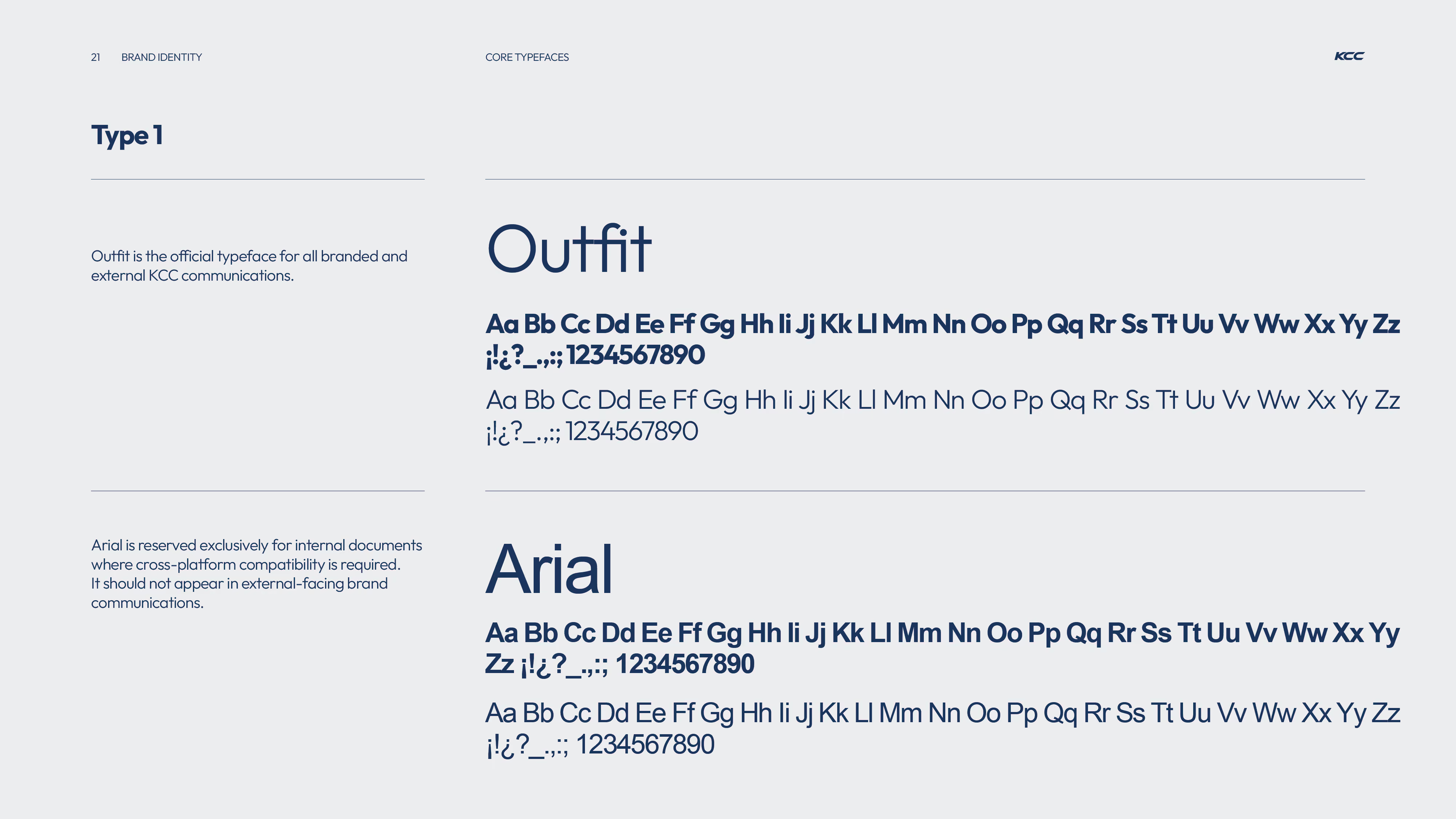
Typography guide showing two core typefaces for KCC brand identity: Outfit and Arial. Outfit is the official typeface for all branded and external communications, featuring uppercase, lowercase, numbers, and special characters in both bold and regular styles. Arial is reserved for internal documents requiring cross-platform compatibility and should not appear in external brand communications; it also displays uppercase, lowercase, numbers, and special characters in bold and regular styles.
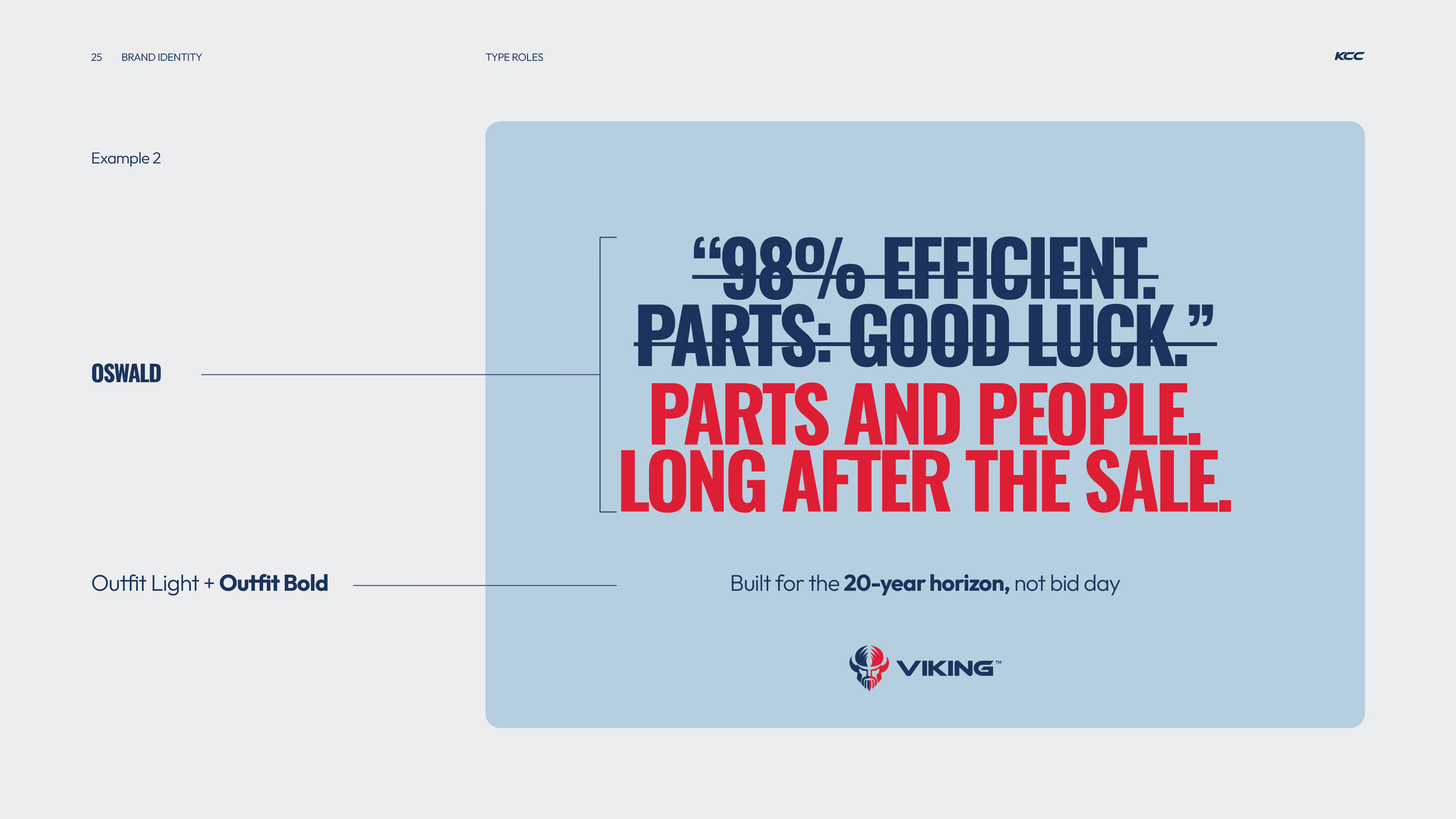
Brand identity example showing the Oswald typeface used for the quote with '98% efficient. Parts: good luck.' crossed out in dark blue, replaced by 'Parts and people. Long after the sale.' in red. The font combination is Outfit Light and Outfit Bold, with text noting 'Built for the 20-year horizon, not bid day,' above the Viking logo on a light blue background.
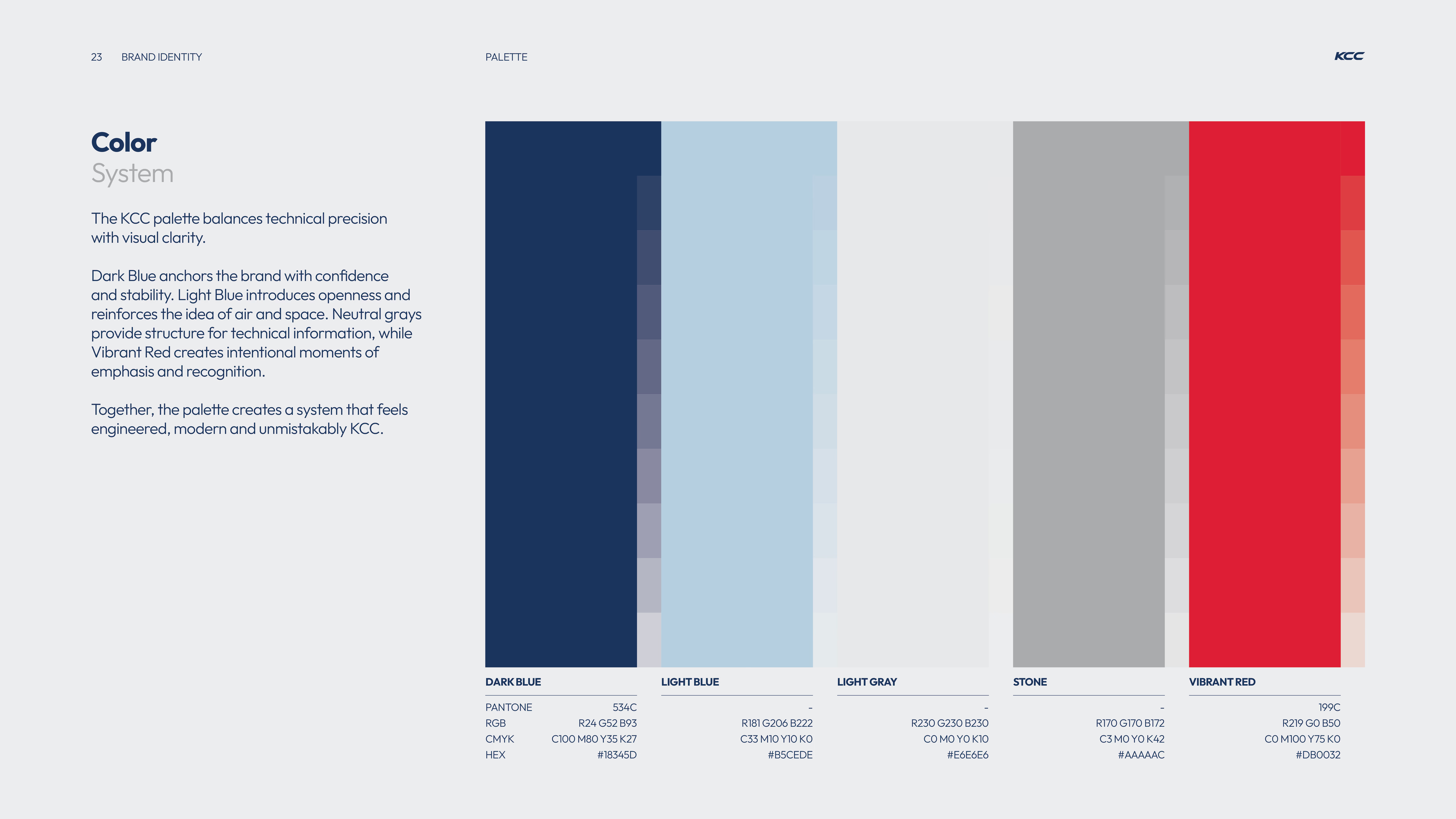
KCC brand color palette showing five color blocks: Dark Blue, Light Blue, Light Gray, Stone, and Vibrant Red with corresponding Pantone, RGB, CMYK, and HEX values for each color on a light gray background.
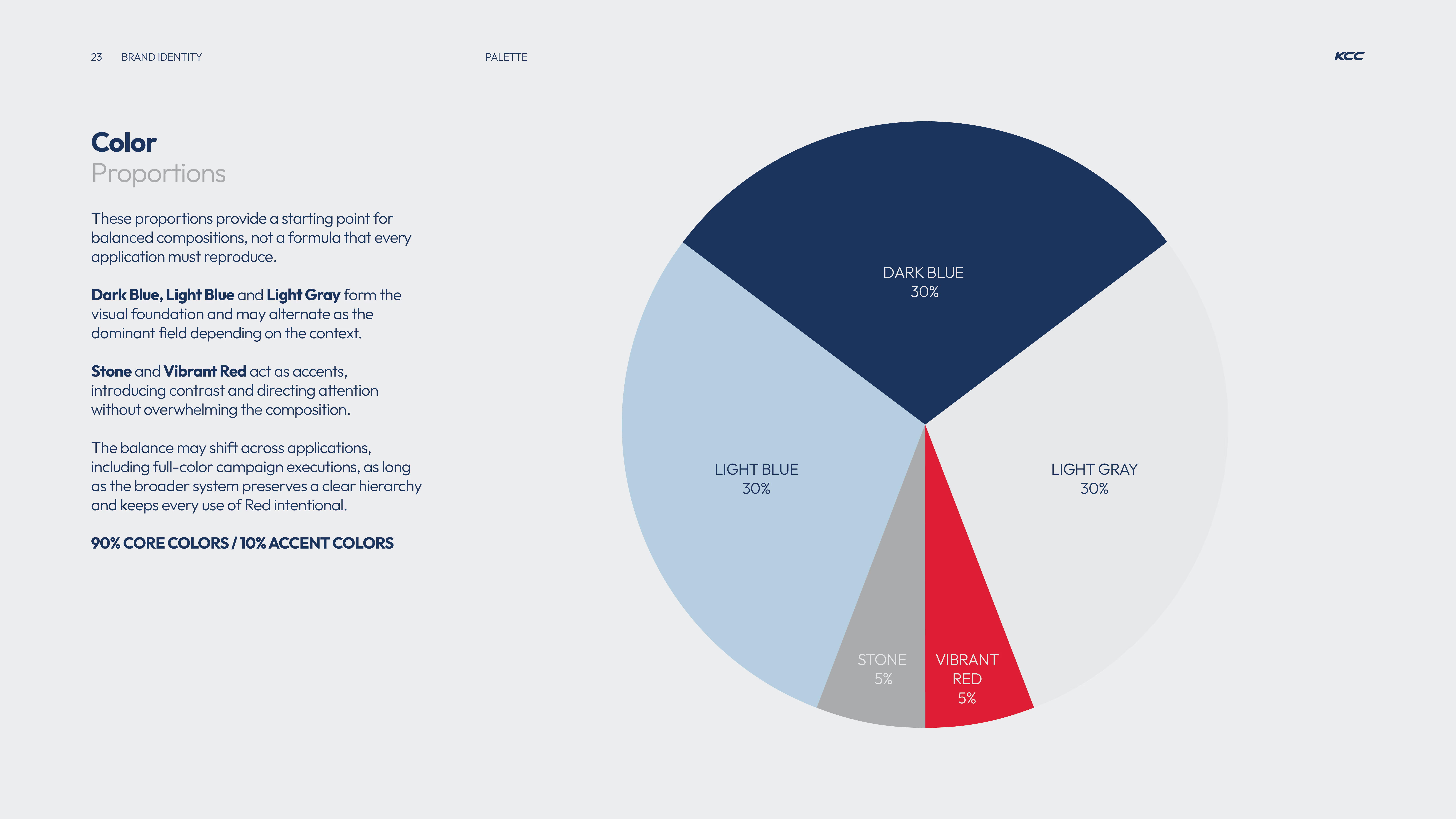
Pie chart showing color proportions for brand identity: Dark Blue 30%, Light Blue 30%, Light Gray 30%, Stone 5%, Vibrant Red 5%, with text explaining these proportions provide a starting point for balanced compositions and that 90% are core colors with 10% accent colors.
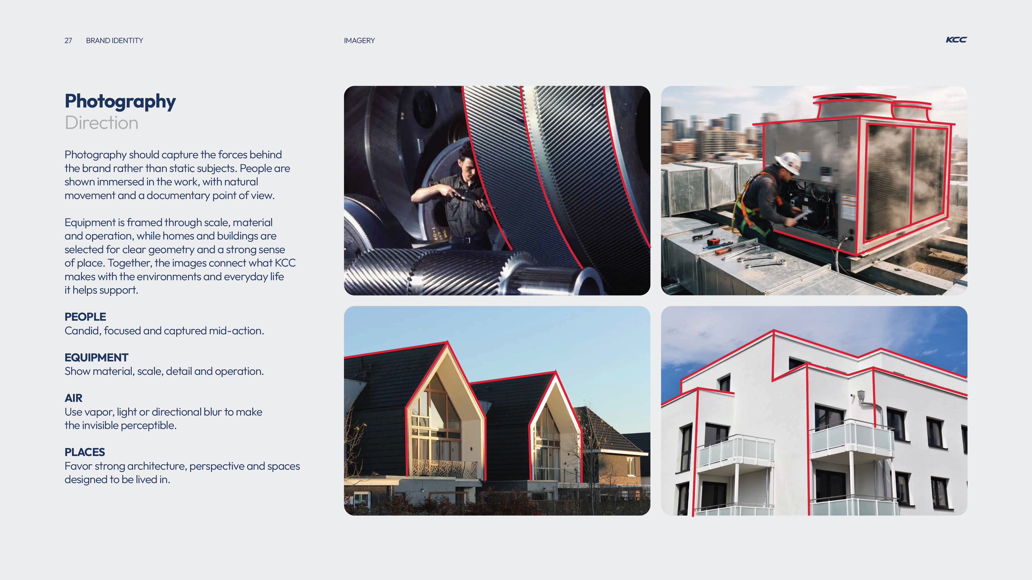
Four images illustrating photography direction for KCC brand: top-left shows a man working on large machinery gears, top-right a technician in safety gear working on rooftop HVAC equipment with visible vapor, bottom-left two modern houses with sharp rooflines and clear geometry, bottom-right a white modern building with terraces and angular architectural lines highlighted in red.
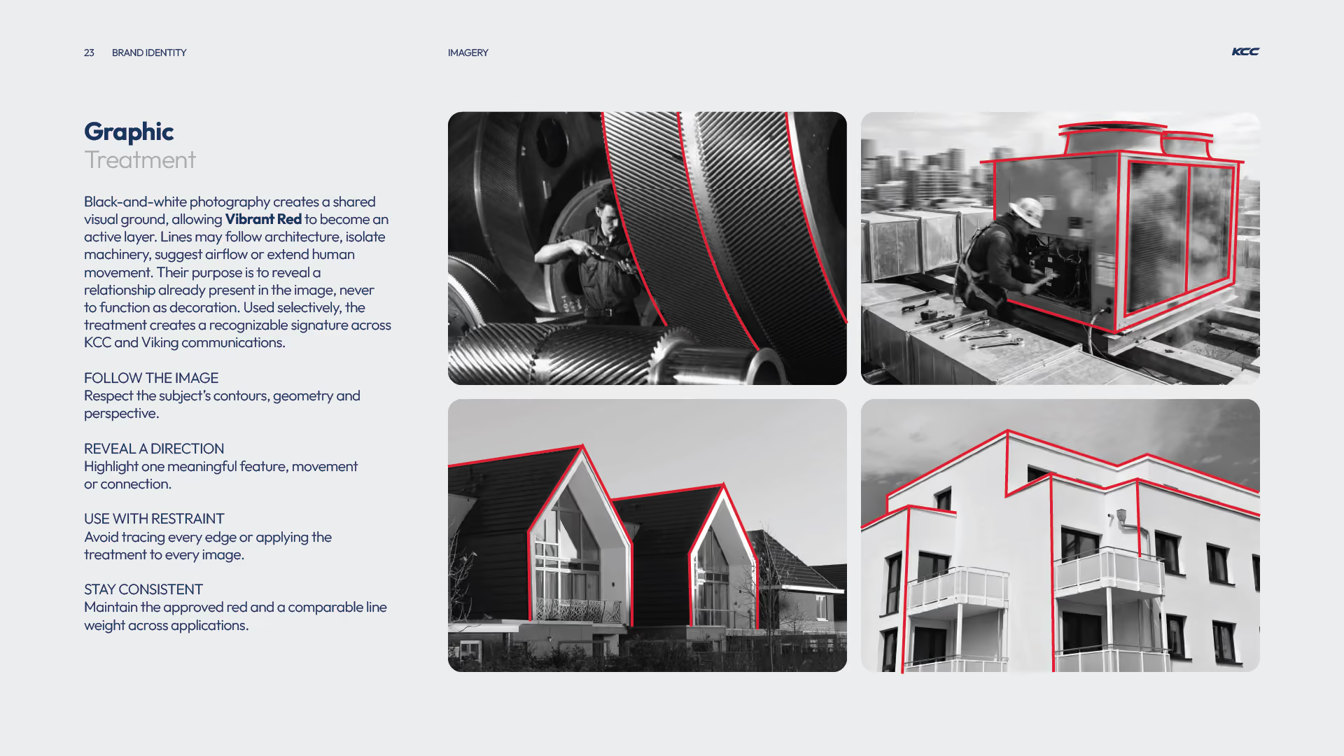
Four black-and-white images showing various industrial and architectural subjects with red lines tracing specific contours and edges to highlight shapes and movement, demonstrating a graphic treatment technique using vibrant red to enhance key features while respecting the subject's geometry and perspective.
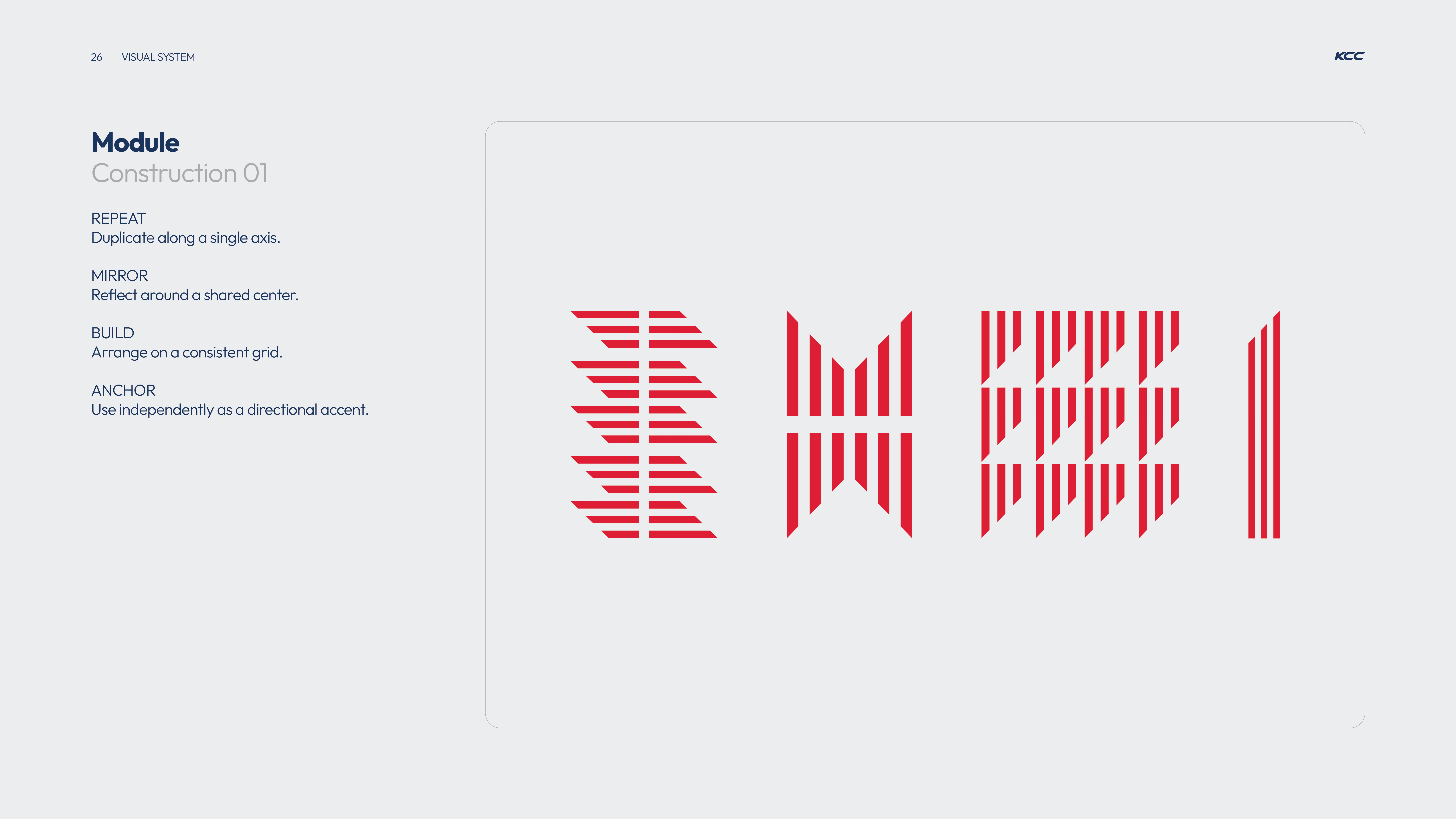
Visual system module titled 'Construction 01' with four design principles listed: Repeat to duplicate along a single axis, Mirror to reflect around a shared center, Build to arrange on a consistent grid, Anchor to use independently as a directional accent; alongside four corresponding red geometric pattern examples visualizing each principle on a light gray background.
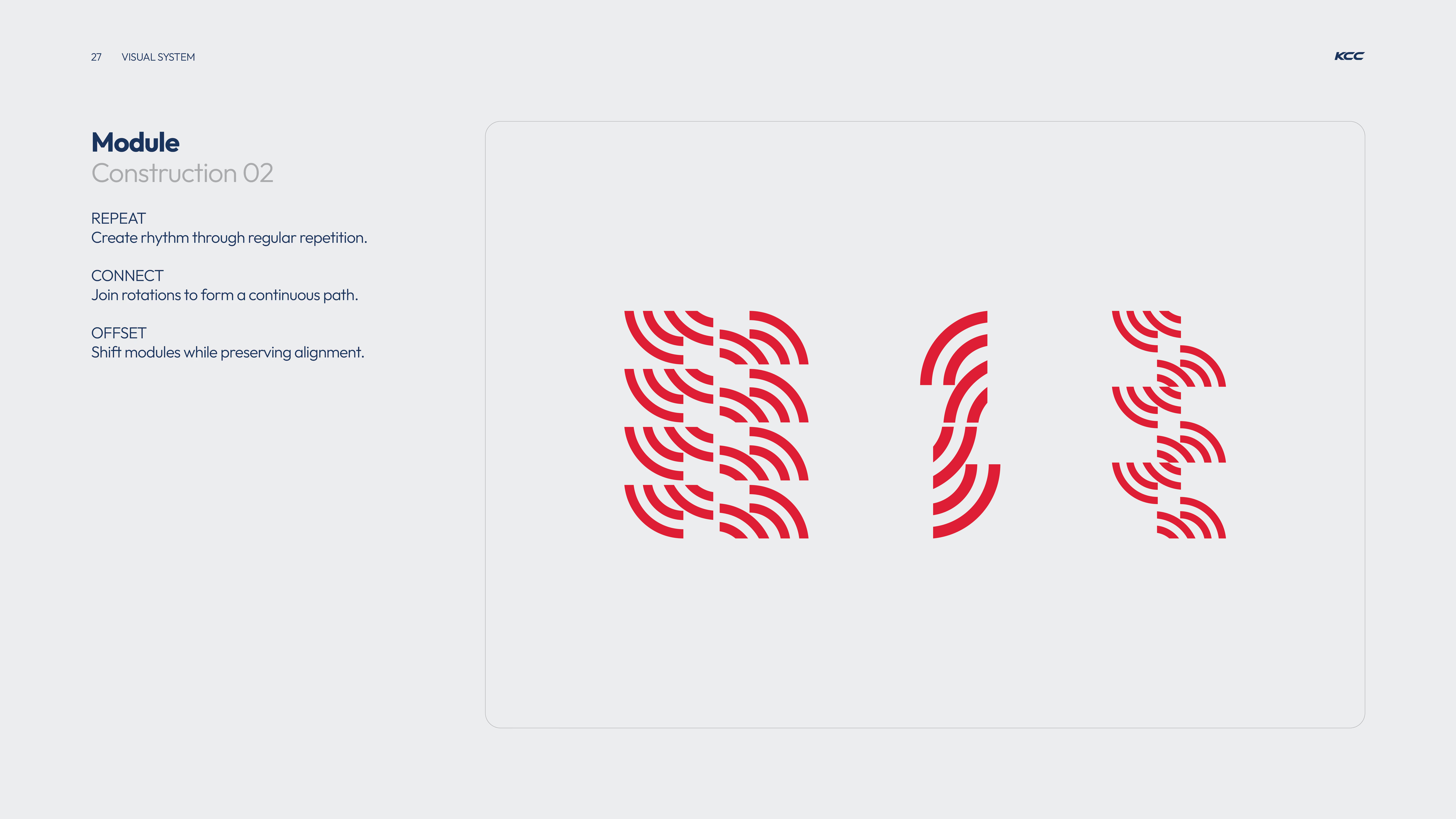
Diagram illustrating module construction with red curved line segments arranged in three groups demonstrating repeat for rhythm, connect for continuous path, and offset for shifted alignment.
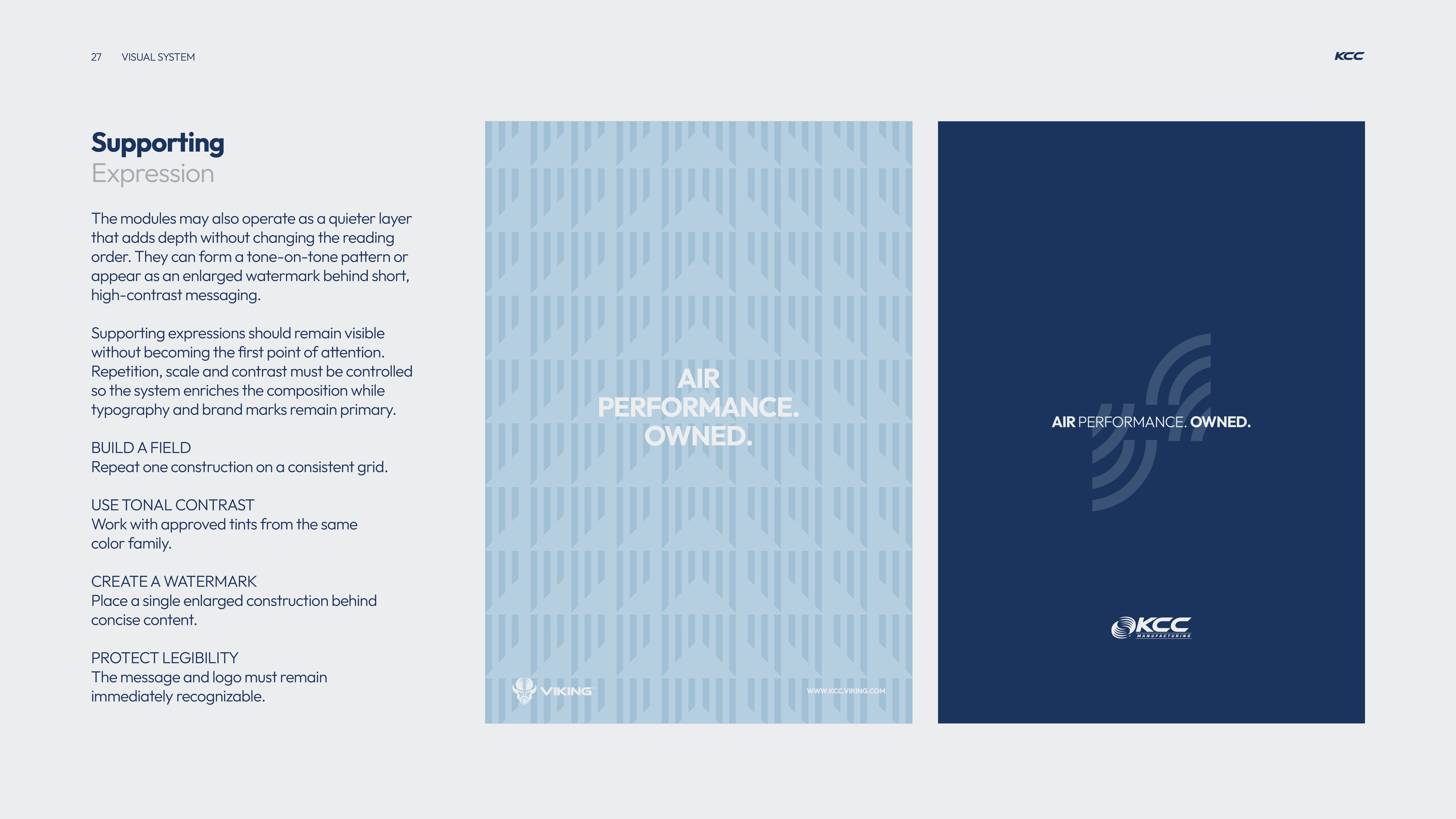
A visual design guide page titled 'Supporting Expression' with instructions about using quieter layers in design for depth without changing reading order, controlling repetition, scale, and contrast, and protecting legibility. It includes two example panels: the left panel has a light blue pattern background with white centered text 'AIR PERFORMANCE. OWNED.' and small logos at the bottom; the right panel has a dark blue background with the same centered text in white and light blue sound wave graphics beside it, along with a KCC Manufacturing logo at the bottom.
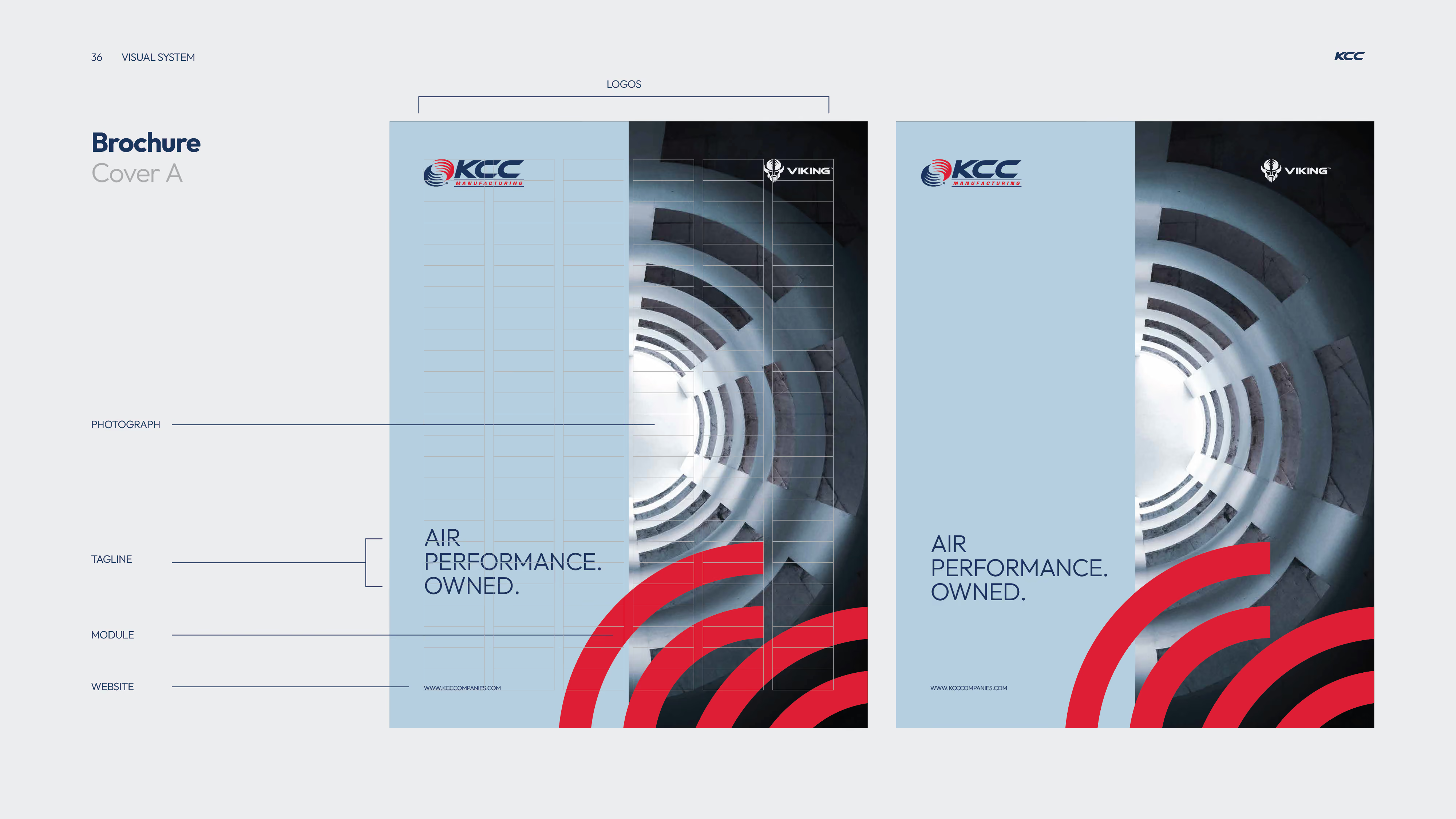
Two brochure cover designs side by side with blue backgrounds featuring the logos KCC Manufacturing and Viking at the top, a spiraling architectural photo on the right, red arc graphics at the bottom right, and the tagline 'AIR PERFORMANCE. OWNED.' above the website URL www.kcccompanies.com.
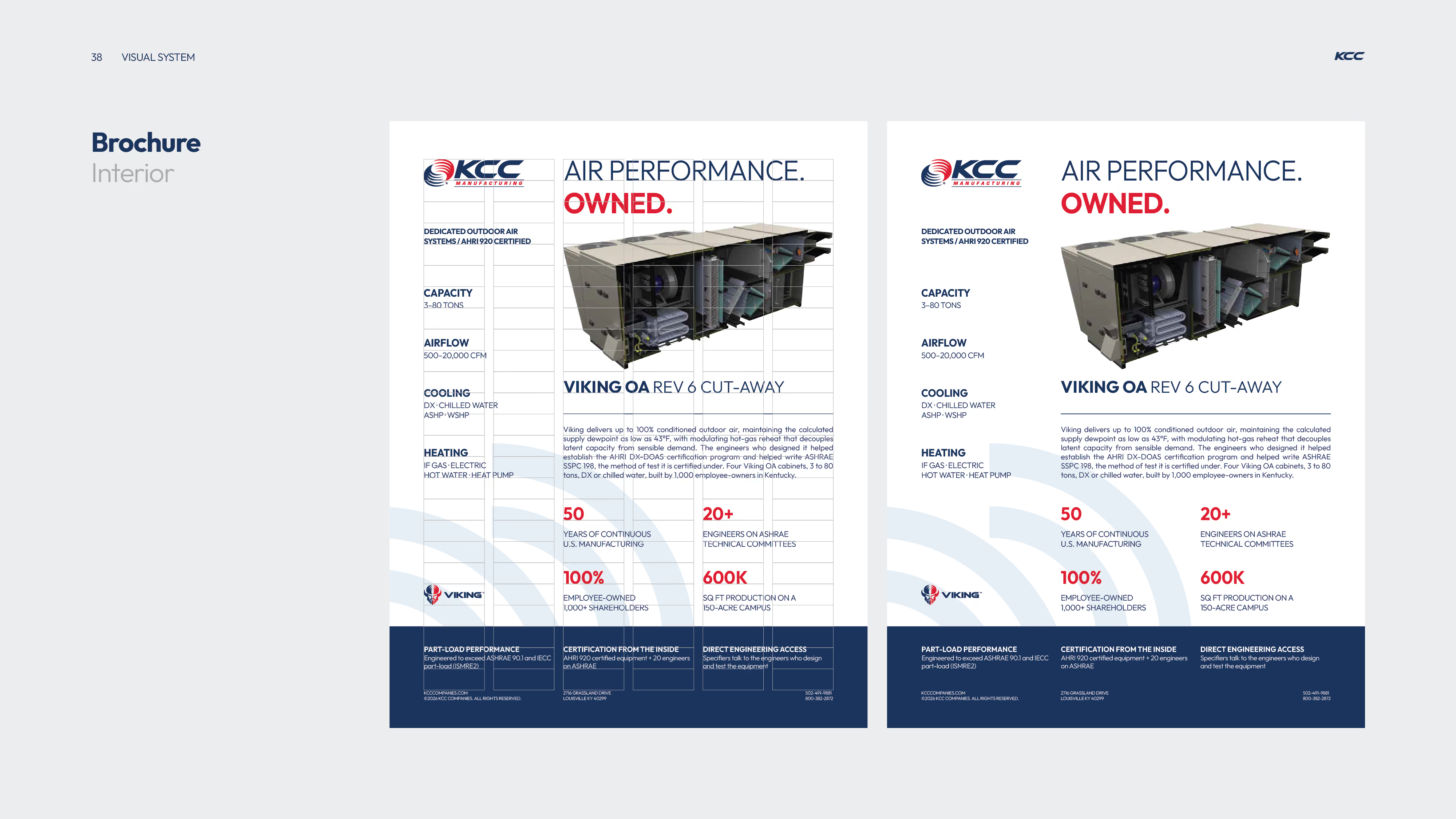
KCC brochure page showing details of VIKING OA Rev 6 cut-away dedicated outdoor air system with specifications including capacity (3-80 tons), airflow (500-20,000 CFM), cooling, and heating options; highlights include 50 years of continuous U.S. manufacturing, 100% employee-owned with 1,000+ shareholders, 20+ engineers on ASHRAE technical committees, and 600K sq ft production on a 150-acre campus; includes a cut-away image of the unit and sections on part-load performance, certification from inside, and direct engineering access.
Red background with large faint number '04' and the word 'CO-BRANDING' in large white letters center-left, with small text including a website, copyright, address, and phone numbers at the bottom corners.
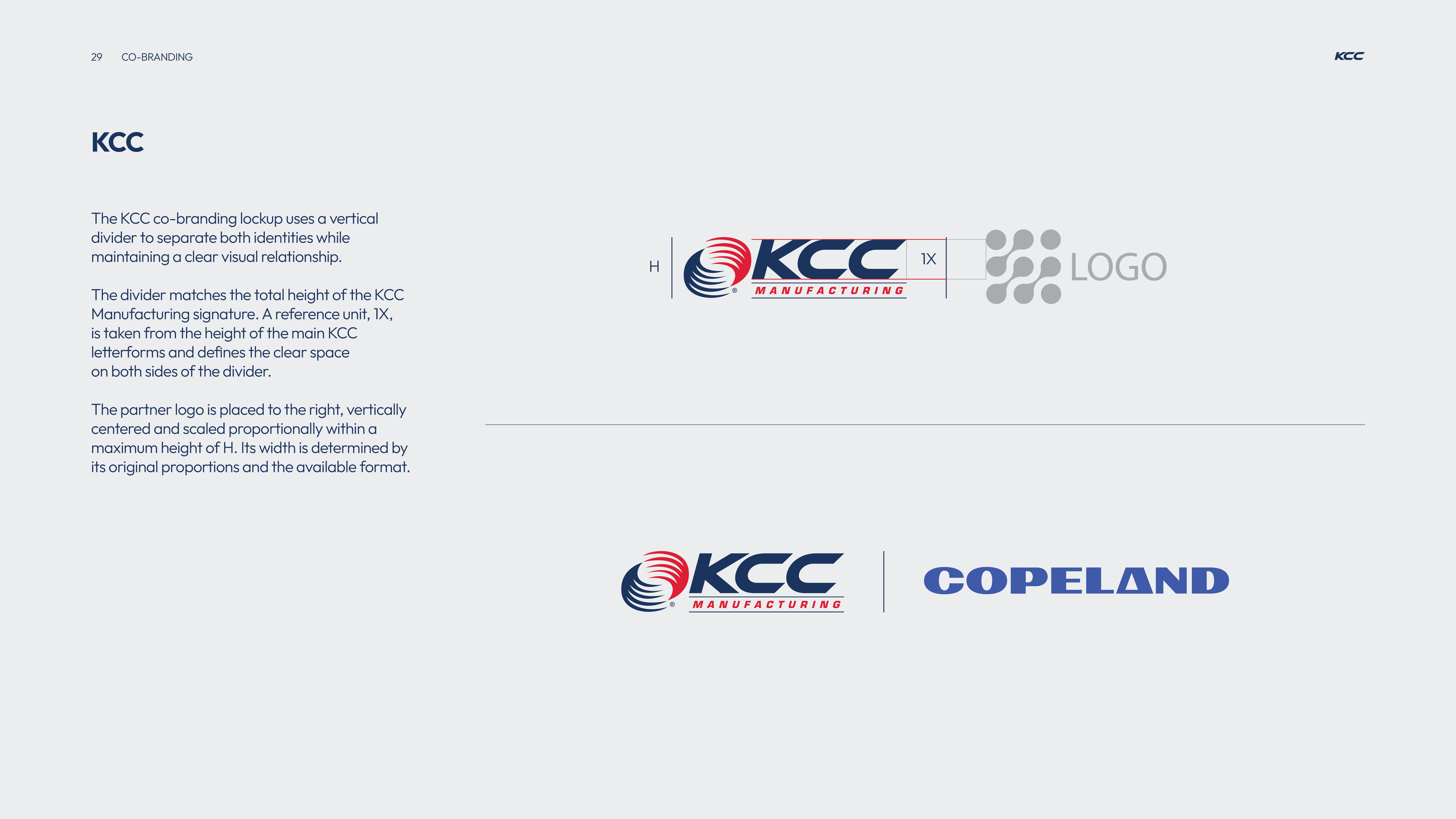
KCC co-branding guidelines showing a KCC Manufacturing logo with height labeled H and a vertical divider matching the height, separating it from a partner logo area. Text explains the divider uses a reference unit 1X from the KCC letterform height for clear space on both sides. The partner logo is positioned to the right, vertically centered, scaled within height H, with width based on original proportions. Below is an example combining the KCC Manufacturing logo with a vertical divider and the COPELAND logo to the right.
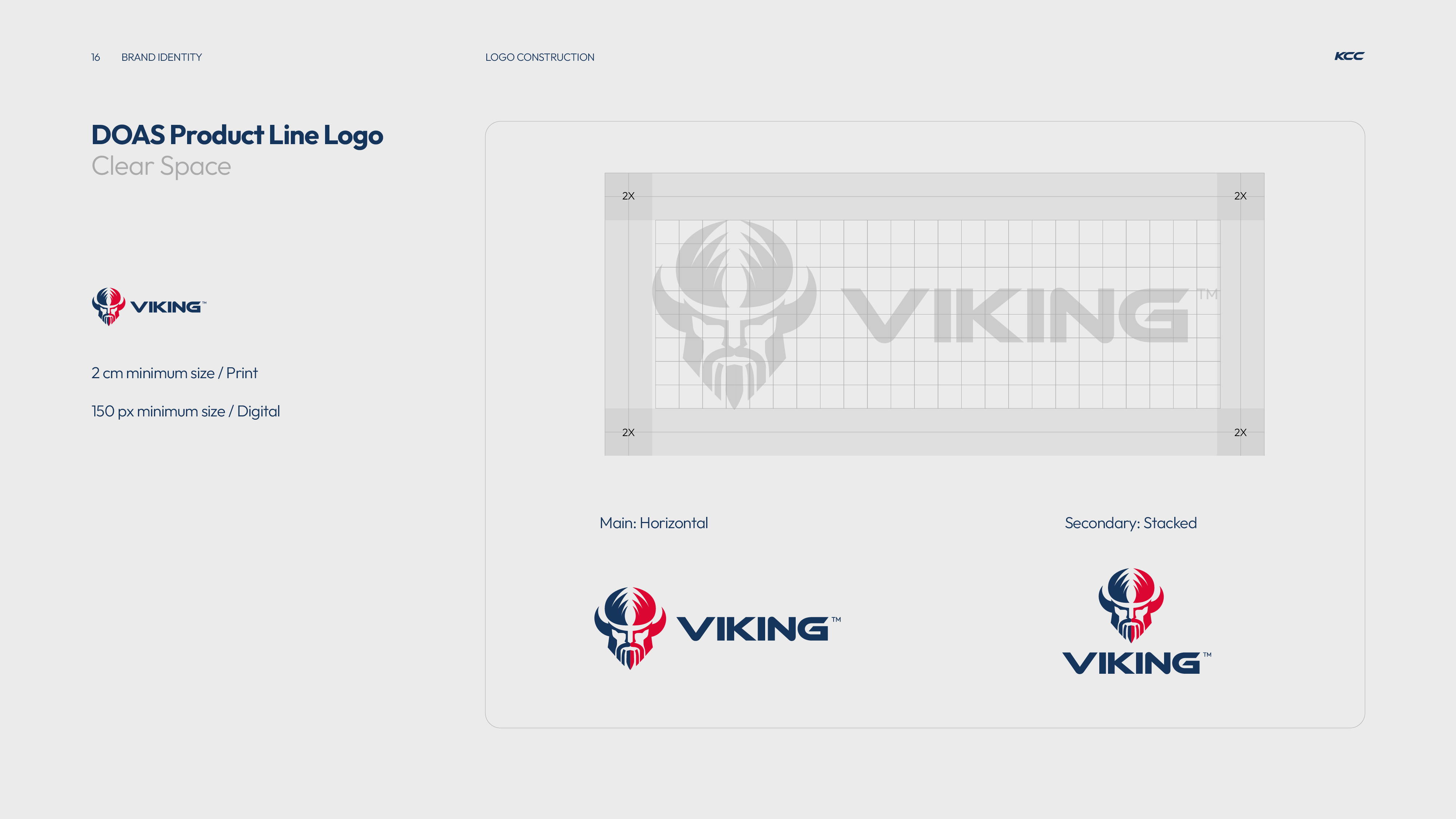
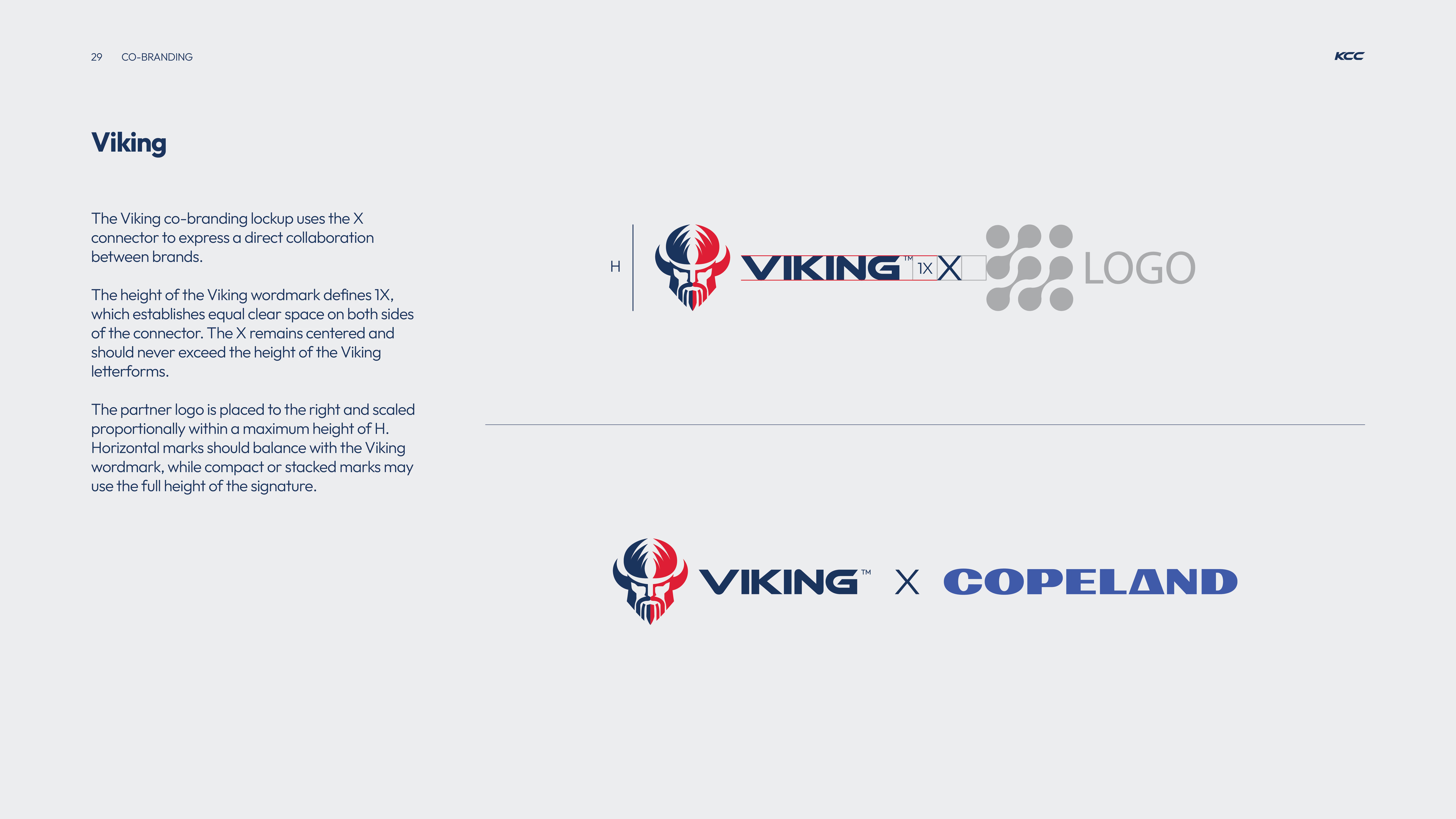
Branding guideline page showing the Viking co-branding lockup with a Viking helmet logo and wordmark connected by an X symbol to a placeholder for a partner logo, explaining spacing, height, and placement rules for collaboration logos.
Red slide with large faint number '02' in the background and text reading 'BRAND IDENTITY' in bold letters, including contact details and KCC branding.
Typography guide showing two core typefaces for KCC brand identity: Outfit and Arial. Outfit is the official typeface for all branded and external communications, featuring uppercase, lowercase, numbers, and special characters in both bold and regular styles. Arial is reserved for internal documents requiring cross-platform compatibility and should not appear in external brand communications; it also displays uppercase, lowercase, numbers, and special characters in bold and regular styles.
Brand identity example showing the Oswald typeface used for the quote with '98% efficient. Parts: good luck.' crossed out in dark blue, replaced by 'Parts and people. Long after the sale.' in red. The font combination is Outfit Light and Outfit Bold, with text noting 'Built for the 20-year horizon, not bid day,' above the Viking logo on a light blue background.
KCC brand color palette showing five color blocks: Dark Blue, Light Blue, Light Gray, Stone, and Vibrant Red with corresponding Pantone, RGB, CMYK, and HEX values for each color on a light gray background.
Pie chart showing color proportions for brand identity: Dark Blue 30%, Light Blue 30%, Light Gray 30%, Stone 5%, Vibrant Red 5%, with text explaining these proportions provide a starting point for balanced compositions and that 90% are core colors with 10% accent colors.
Four images illustrating photography direction for KCC brand: top-left shows a man working on large machinery gears, top-right a technician in safety gear working on rooftop HVAC equipment with visible vapor, bottom-left two modern houses with sharp rooflines and clear geometry, bottom-right a white modern building with terraces and angular architectural lines highlighted in red.
Four black-and-white images showing various industrial and architectural subjects with red lines tracing specific contours and edges to highlight shapes and movement, demonstrating a graphic treatment technique using vibrant red to enhance key features while respecting the subject's geometry and perspective.
Visual system module titled 'Construction 01' with four design principles listed: Repeat to duplicate along a single axis, Mirror to reflect around a shared center, Build to arrange on a consistent grid, Anchor to use independently as a directional accent; alongside four corresponding red geometric pattern examples visualizing each principle on a light gray background.
Diagram illustrating module construction with red curved line segments arranged in three groups demonstrating repeat for rhythm, connect for continuous path, and offset for shifted alignment.
A visual design guide page titled 'Supporting Expression' with instructions about using quieter layers in design for depth without changing reading order, controlling repetition, scale, and contrast, and protecting legibility. It includes two example panels: the left panel has a light blue pattern background with white centered text 'AIR PERFORMANCE. OWNED.' and small logos at the bottom; the right panel has a dark blue background with the same centered text in white and light blue sound wave graphics beside it, along with a KCC Manufacturing logo at the bottom.
Two brochure cover designs side by side with blue backgrounds featuring the logos KCC Manufacturing and Viking at the top, a spiraling architectural photo on the right, red arc graphics at the bottom right, and the tagline 'AIR PERFORMANCE. OWNED.' above the website URL www.kcccompanies.com.
KCC brochure page showing details of VIKING OA Rev 6 cut-away dedicated outdoor air system with specifications including capacity (3-80 tons), airflow (500-20,000 CFM), cooling, and heating options; highlights include 50 years of continuous U.S. manufacturing, 100% employee-owned with 1,000+ shareholders, 20+ engineers on ASHRAE technical committees, and 600K sq ft production on a 150-acre campus; includes a cut-away image of the unit and sections on part-load performance, certification from inside, and direct engineering access.
Red background with large faint number '04' and the word 'CO-BRANDING' in large white letters center-left, with small text including a website, copyright, address, and phone numbers at the bottom corners.
KCC co-branding guidelines showing a KCC Manufacturing logo with height labeled H and a vertical divider matching the height, separating it from a partner logo area. Text explains the divider uses a reference unit 1X from the KCC letterform height for clear space on both sides. The partner logo is positioned to the right, vertically centered, scaled within height H, with width based on original proportions. Below is an example combining the KCC Manufacturing logo with a vertical divider and the COPELAND logo to the right.
Branding guideline page showing the Viking co-branding lockup with a Viking helmet logo and wordmark connected by an X symbol to a placeholder for a partner logo, explaining spacing, height, and placement rules for collaboration logos.
Blue background with KCC Manufacturing logo at top left, large text saying THANK YOU in the center, and contact details including website, address in Louisville, KY, phone numbers, and ©2026 copyright at the bottom.
03 / Launch Campaign
The Viking EraLaunch Campaign

Turning technical HVAC proof points into a campaign people might actually stop to read.

The challenge was to introduce Viking without falling into the familiar language of industrial B2B advertising: efficiency claims, product photography and technical specifications that often look and sound interchangeable.

Working from KCC's newly developed brand platform, we created a launch campaign that combined technical credibility with a sharper, more confident personality, using humor and wit to turn real customer frustrations into memorable advertising. The campaign was built around a simple principle: make the joke, then show the proof.

Red background with large translucent number 04 in the center, white text 'ADS' on the left, and small blue text with contact details at the bottom corners.
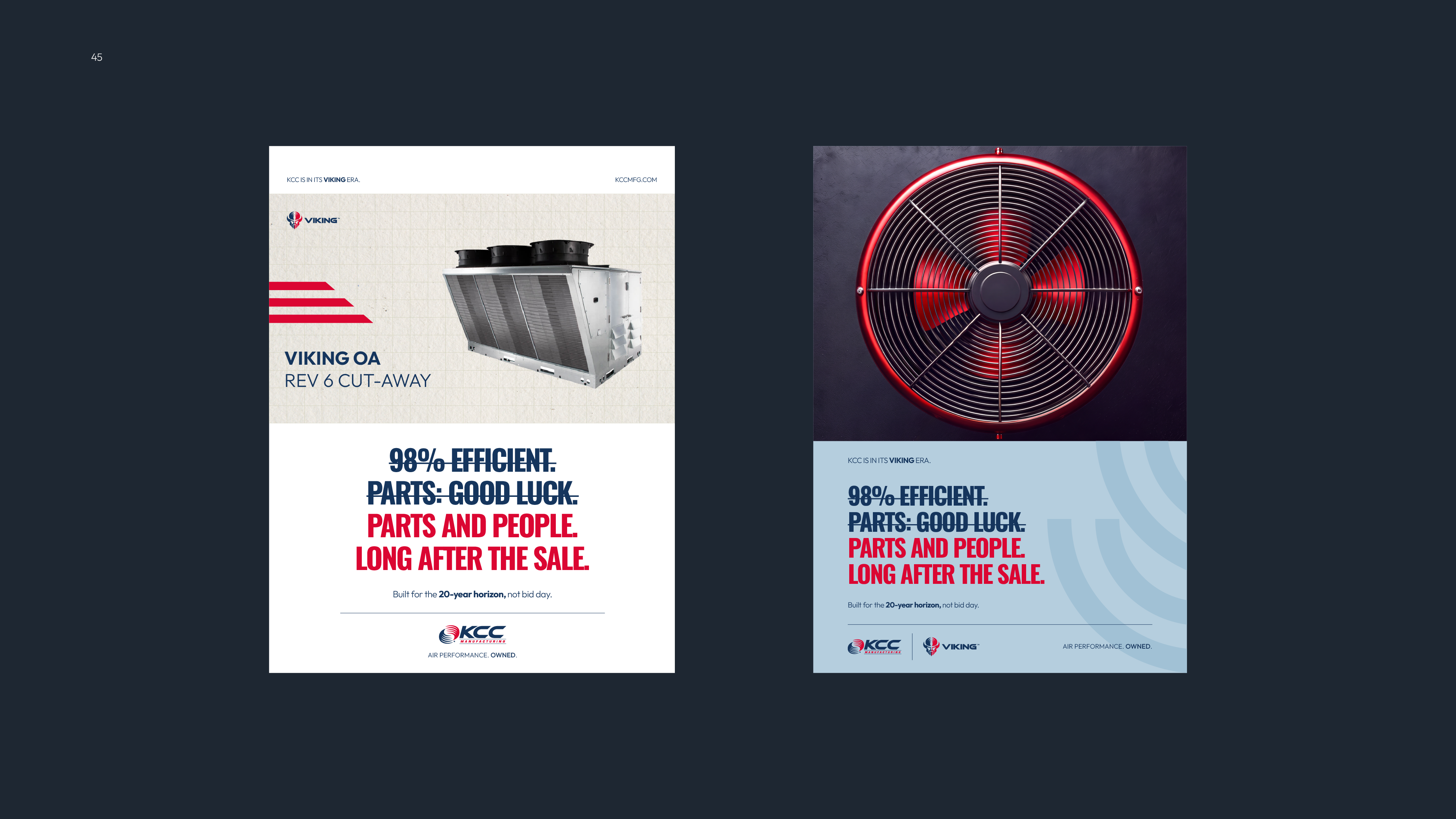
Two Viking brand promotional posters side by side. Left poster shows a metal HVAC unit with text 'Viking OA Rev 6 Cut-Away' and slogan emphasizing parts and people lasting long after the sale, with KCC Manufacturing branding. Right poster features a close-up of a red industrial fan with the same slogan about efficiency, parts, and people lasting long after the sale, also branded with KCC and Viking logos on a light blue background.
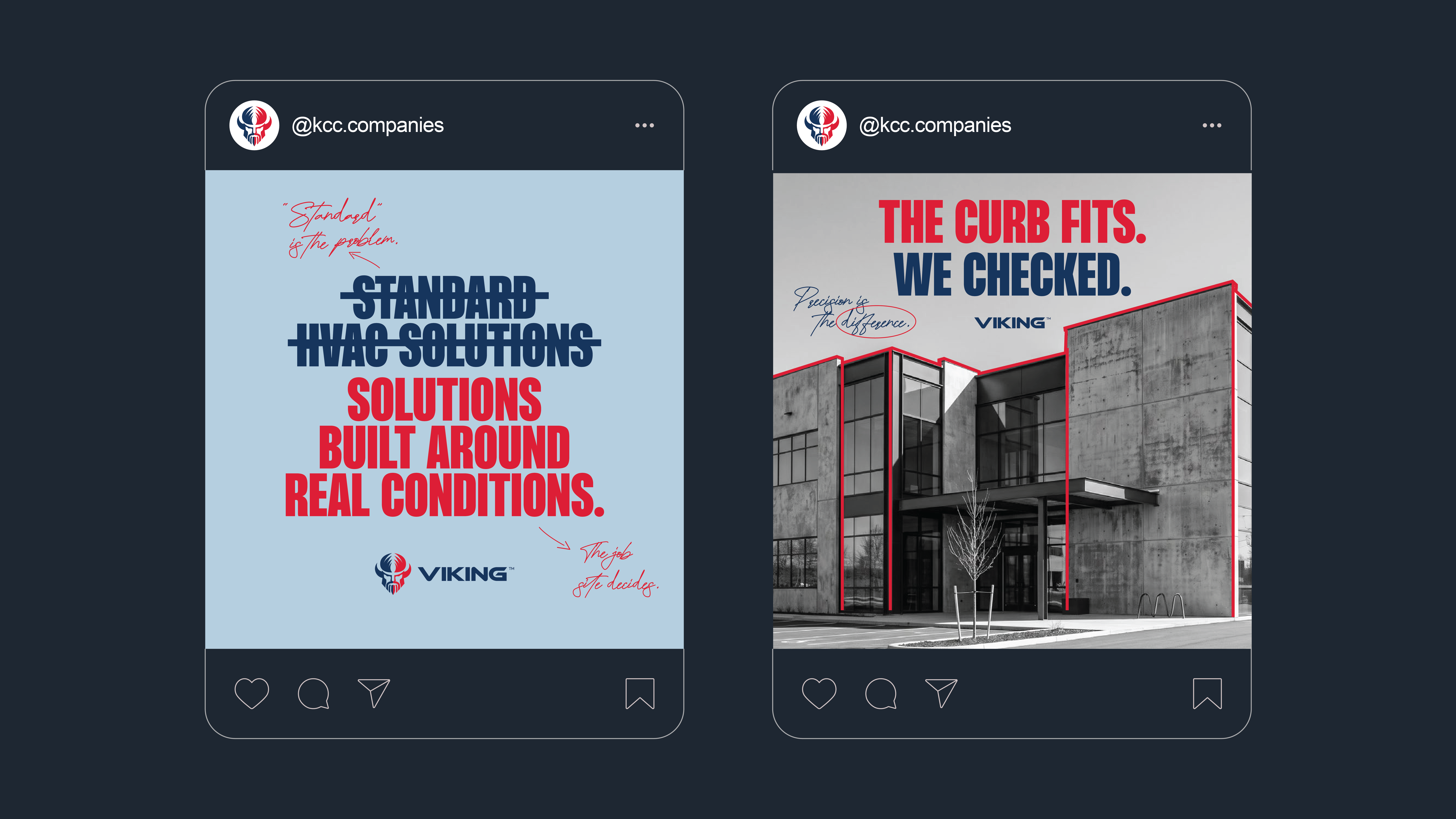
Two social media posts from @kcc.companies. The left post has a light blue background with the text 'Standard HVAC Solutions' crossed out and replaced by 'Solutions built around real conditions.' in bold red and navy fonts, with handwritten notes 'Standard is the problem.' and 'The job site decides.' The Viking logo is below the text. The right post shows a modern concrete building with outlines highlighted in red, with bold text 'The curb fits. We checked.' and handwritten 'Precision is the difference.', plus the Viking logo beneath.
Three print ad options for KCC and Viking brand collaboration on a light blue background. Each ad features the KCC logo, the phrase 'KCC IS IN ITS VIKING ERA' in bold with overlapping sound wave graphics, and the tagline '98% efficient. Parts: good luck. Parts and people. Long after the sale.' in red and navy. Below is 'Built for the long haul, not bid day,' with the Viking logo at the bottom. Option A has KCC alone at top; Option B shows KCC and Viking logos side by side; Option C repeats the tagline prominently with KCC top center. Each option is captioned below in white text.
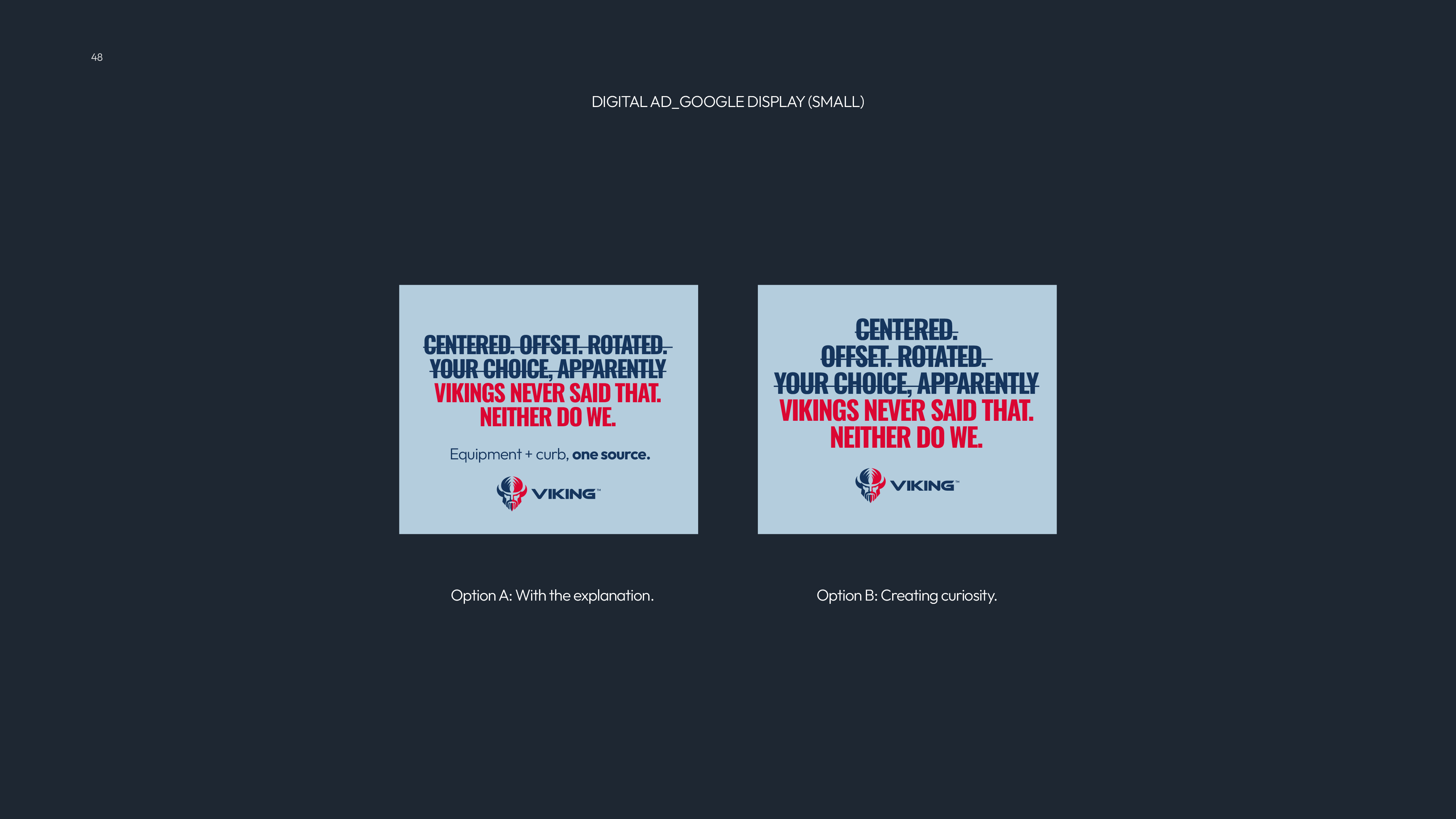
Two digital Google display ad design options side by side on a dark background. Both feature a light blue square with bold text: crossed-out phrases 'CENTERED. OFFSET. ROTATED. YOUR CHOICE, APPARENTLY' in dark blue, followed by 'VIKINGS NEVER SAID THAT. NEITHER DO WE.' in red. Option A on the left includes smaller text below: 'Equipment + curb, one source.' and the Viking logo. Option B on the right shows only the Viking logo below the text. Text above reads 'DIGITAL AD_GOOGLE DISPLAY (SMALL)'.
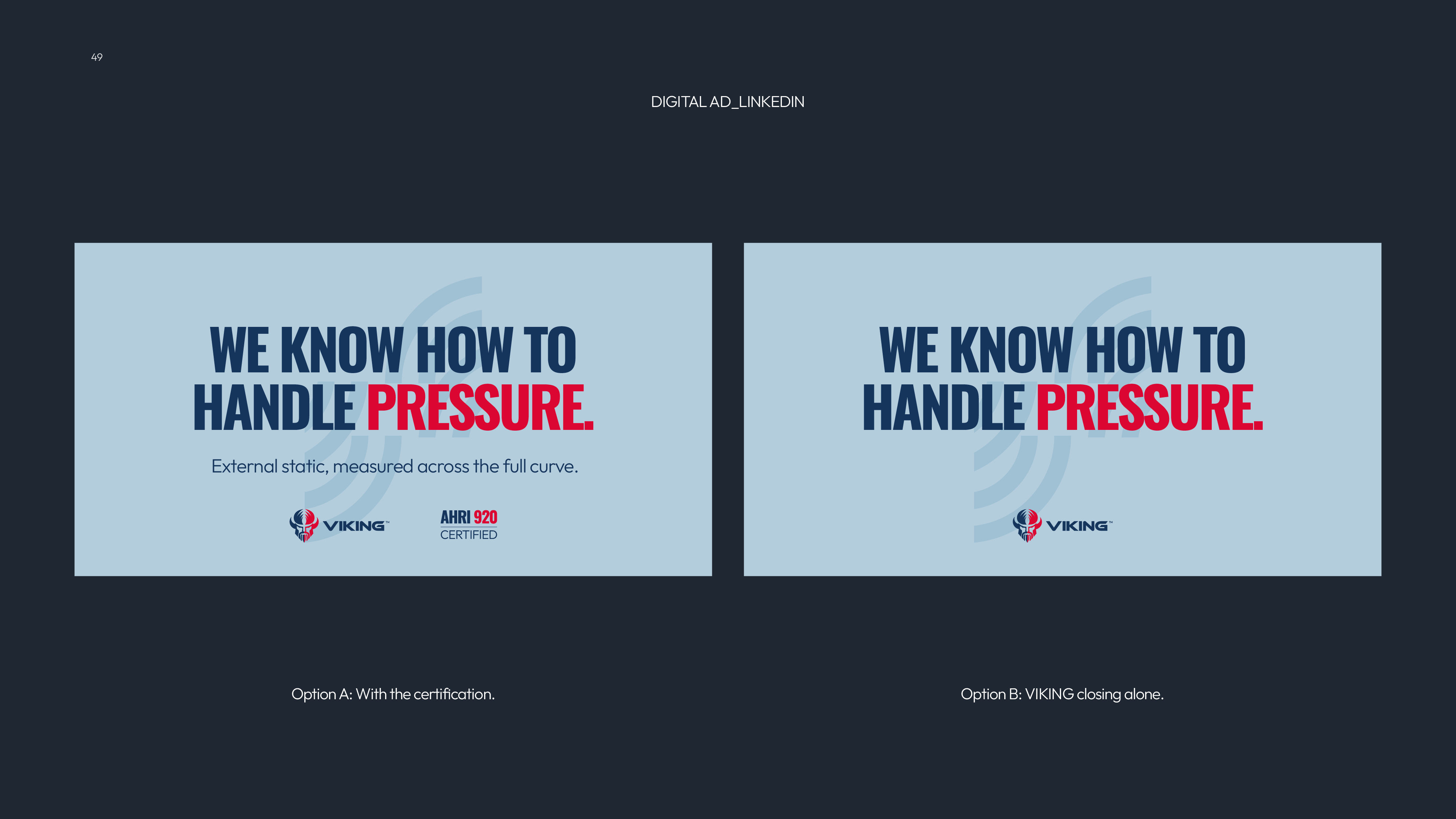
Two side-by-side LinkedIn digital ad designs on a dark background titled DIGITAL AD_LINKEDIN. Both ads have a light blue background and bold text saying "WE KNOW HOW TO HANDLE PRESSURE." with "PRESSURE." in red. The left ad adds the smaller line "External static, measured across the full curve." and shows the Viking logo and AHRI 920 Certified badge below. The right ad only shows the Viking logo below the main text. Below each ad, caption reads: Option A: With the certification. Option B: VIKING closing alone.
Blue slide with KCC Manufacturing logo at top left, September 2026 date at top right, large text saying 'THANK YOU' in center, and contact details including website, address in Louisville KY, and phone numbers at bottom edges.
04 / KCC Roadshow
The KCCRoadshow

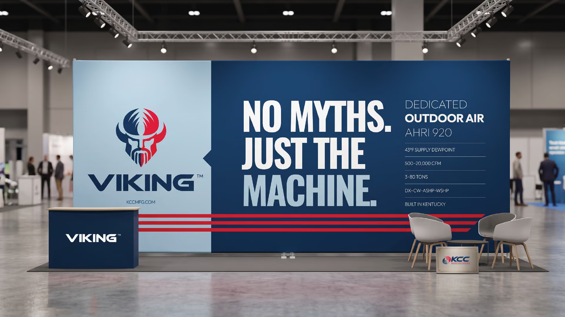
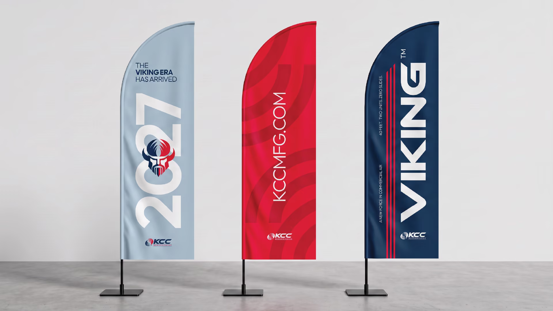
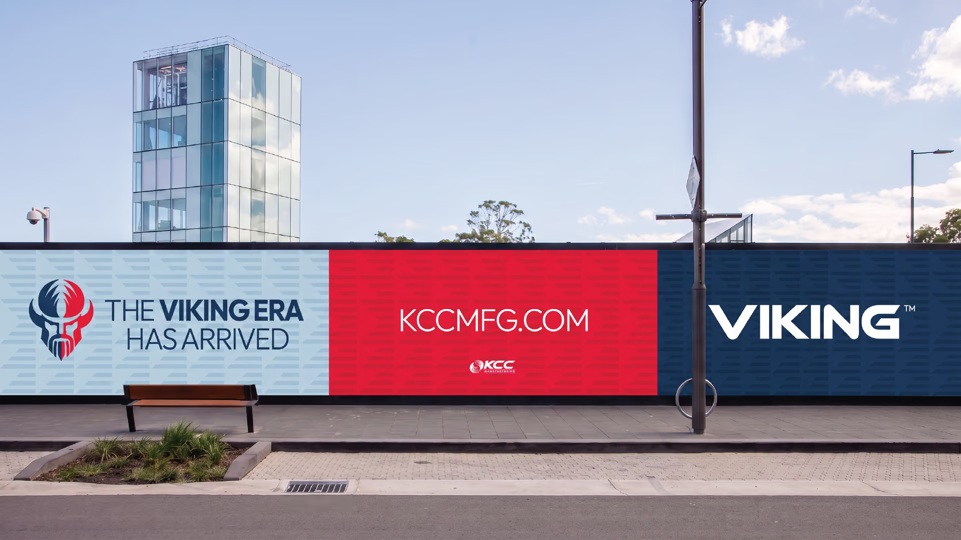
Launching KCC’s standalone era at the AHR Expo with a 40-foot mobile experience touring 22 markets.

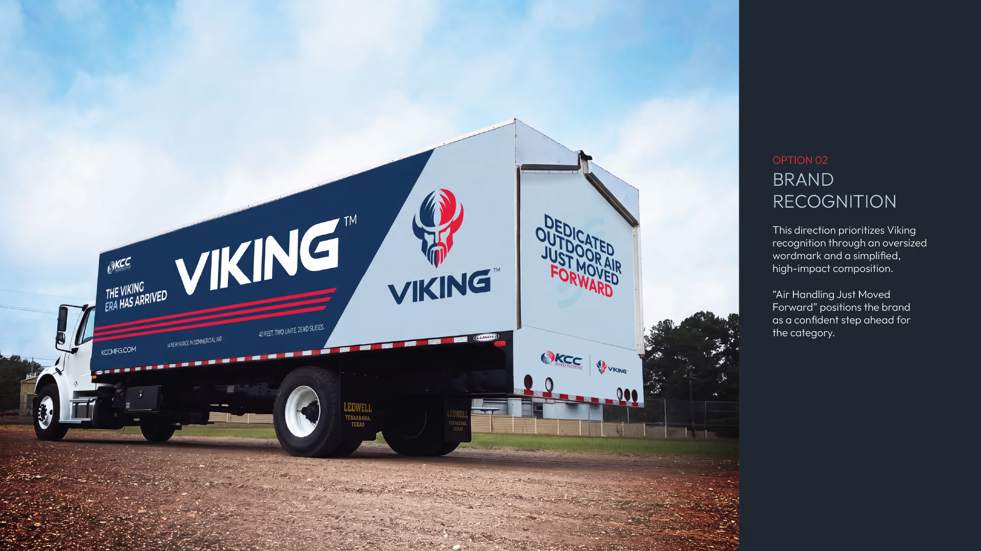
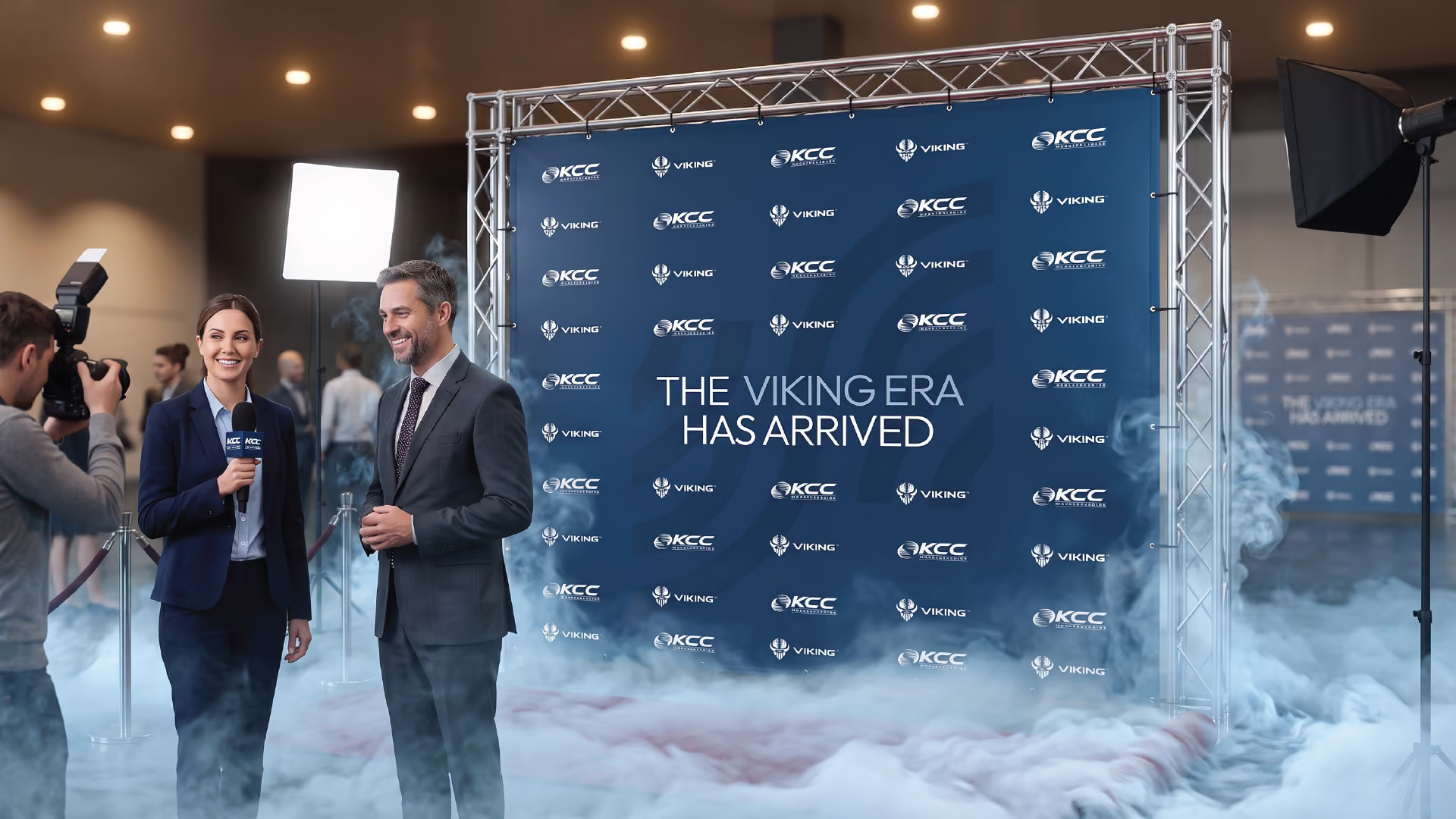
To launch KCC into its standalone era at the AHR Expothe HVAC industry’s largest annual gathering of over 50,000 professionalsdesigned a mobile experience that turns a 40-foot trailer into a moving statement of engineering confidence.

Rather than hiding behind conventional trade show defaults, the "Longship" roadshow brings certified performance directly to specifiers and mechanical contractors across 22 markets. The exterior marries high-impact campaign messaging with absolute logistical flexibilityapplying identical layouts to both sides of the trailer so site conditions never compromise the visitor experience.

CyboNet cybersecurity branding project preview thumbnail

Explore our collection of 200+ Premium Webflow Templates

Need to customize this template? Hire our Webflow team!