Cybonet Email
Security Branding
Case Study

Cybonet logo
Cybonet Mail Secure email security brand visual
Cybonet logo

Cybonet - Cybersecurity Branding

Cybonet Mail Secure is a SaaS email security product that stops most malicious email threats at the network perimeter, protecting against phishing, malware, ransomware and data leakage.

  • Scope: Brand strategy, visual identity, and one-page sales brochure design and copywriting

  • Categories: Cybersecurity, SaaS, email security, anti-spam, regulation, compliance, RegTech

01 / project overview
Case Study
Overview

Ideate Creative built Cybonet's visual identity and a one-page sales brochure for direct sales and channel partners. The goal was a brand that stands out in one of the most crowded corners of cybersecurity, and collateral that IT teams and resellers can understand and repeat in minutes.

The Challenge

Every email security vendor looks and sounds the same: dark blue, padlocks and long feature lists, all promising to stop phishing. Cybonet needed a brand that stood out, and clear, sellable messaging for IT teams and for resellers who carry dozens of other vendors.

TheWork

We gave Cybonet a brand that breaks from the category look, and a sales tool its partners would actually use.

  • Brand strategy: who Cybonet sells to and what each audience needs to hear first
  • Visual identity: a distinct graphic system for web, sales and partner materials, away from the dark-blue padlock look
  • Sales brochure, design and copy: a one-pager covering the threats Mail Secure stops, how it protects the perimeter, the controls admins get and the next step
  • Channel partner enablement: a layout built for a five-second scan, easy to forward and reuse in a partner's own pitch

The Approach

Discovery

We started with Cybonet's two buyers: IT teams that want proof of protection, and channel partners who need a pitch they can repeat. Both are skeptical, and both are busy.

Positioning

Every competitor promises to stop phishing. We focused Cybonet on one clear, specific promise, stopping threats at the perimeter, and said it in plain language that names the real risk.

Identity

We avoided the default dark-blue padlock look so the brand is recognizable before anyone reads the copy, and built it as a system that works across web, sales and partner materials.

Rollout

We put the brand to work in a one-page sales brochure. Partners carry dozens of vendors, so a focused one-pager gets read in a meeting, attached to an email and reused in their own pitch.

Summary Results

Cybonet came out with a brand that stands apart in email security and a sales tool built for how partners actually sell.

  • A recognizable brand: a look that breaks from the category default, so Cybonet is remembered next to look-alike vendors.
  • A clear promise: messaging that leads with stopping threats at the perimeter, in plain terms.
  • Collateral partners use: a one-pager that survives meetings, emails and partner pitches where long technical documents don't.
02 / Brand strategy
Brand
Strategy

We started with who Cybonet sells to and what they need to hear first: IT teams that want proof of protection, and channel partners who need a pitch they can repeat.

03 / Visual identity
Visual
Identity

A distinct look and graphic system separates Cybonet from look-alike vendors and works across web, sales and partner materials.

It avoids the default dark-blue padlock look, so the brand is recognizable before anyone reads the copy.

Purple background with the word CYBONET written vertically on the left and four rounded square shapes arranged symmetrically in the center with the words BRAND STYLE GUIDE at the bottom right.
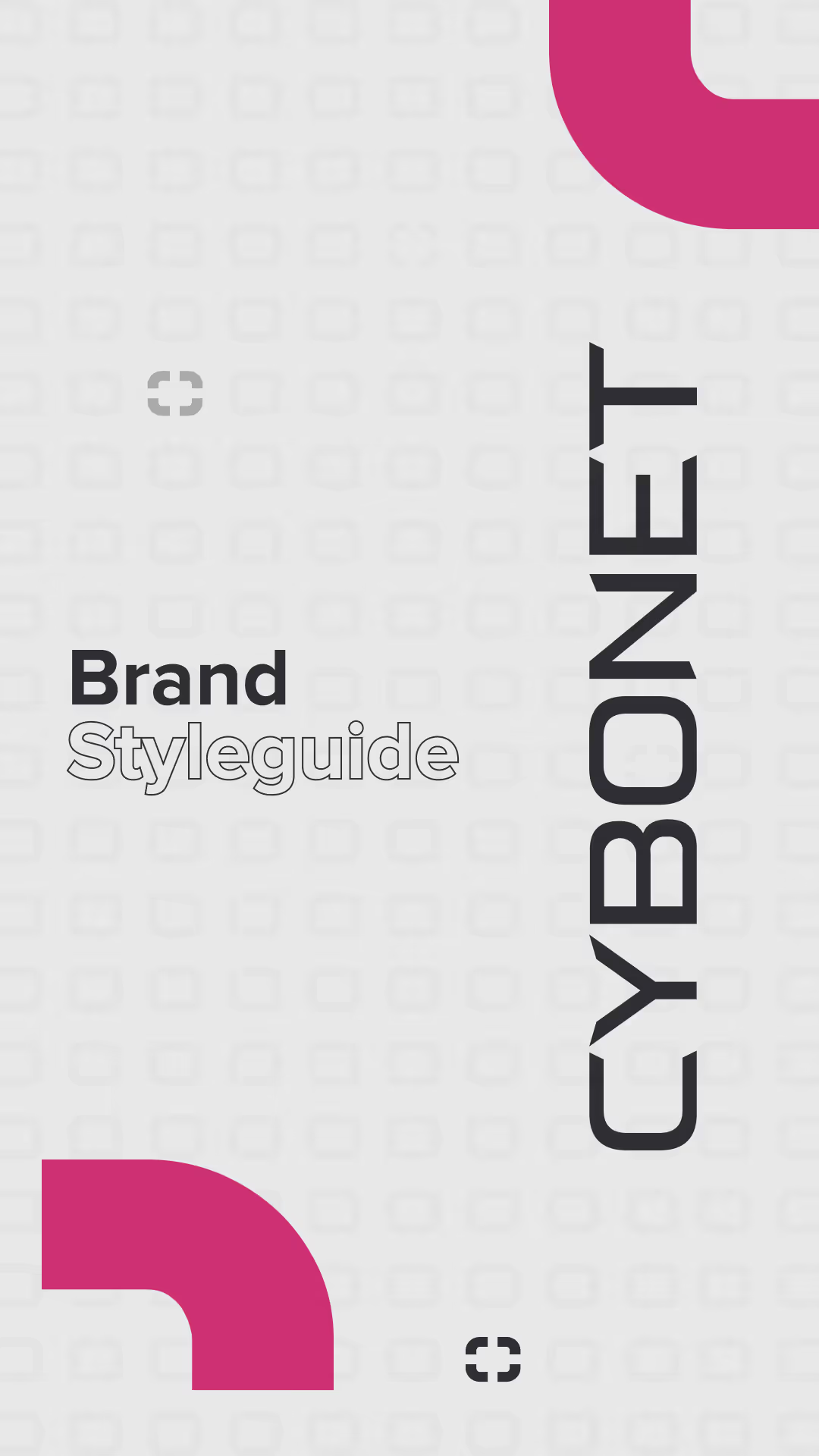
Cover page of a brand style guide with the word CYBONET written vertically and 'Brand Styleguide' in black and outlined text, with pink corner accents on a light gray background.
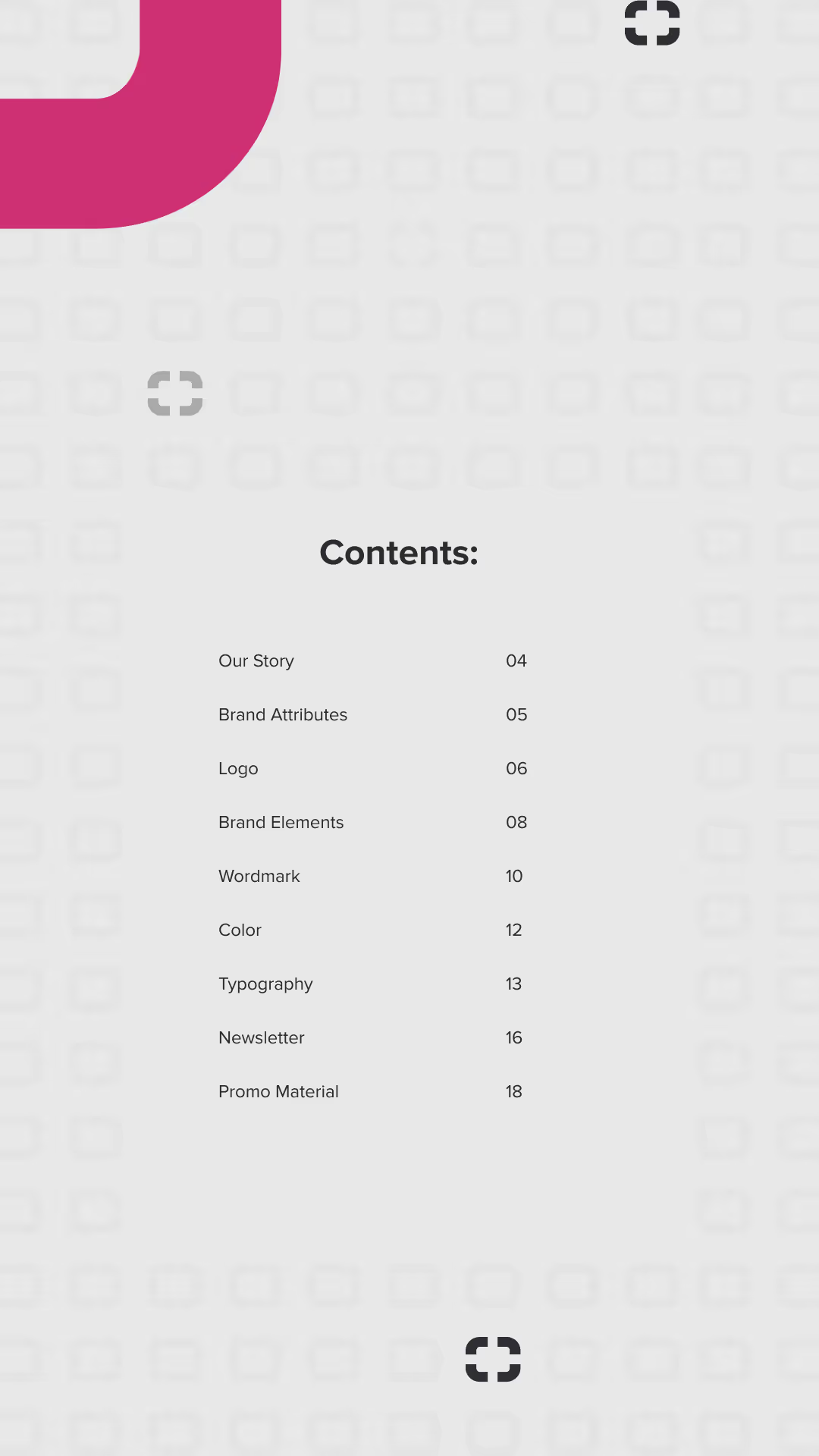
Table of contents page listing sections with page numbers: Our Story 04, Brand Attributes 05, Logo 06, Brand Elements 08, Wordmark 10, Color 12, Typography 13, Newsletter 16, Promo Material 18, on a light background with decorative pink and black shapes.
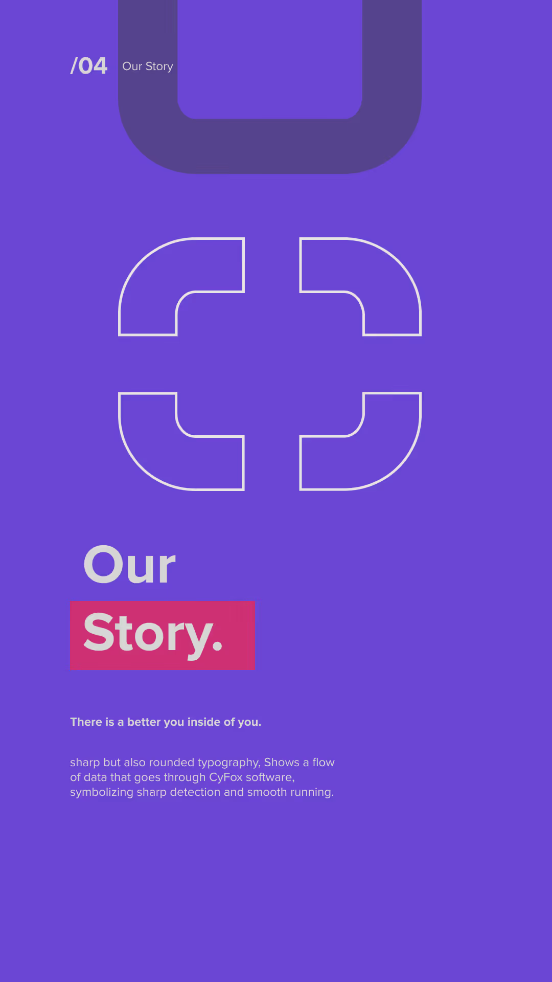
Purple background with a white stylized cross symbol in the center. Text reads "Our Story" with 'Story' highlighted in a red rectangle. Smaller text says "There is a better you inside of you." followed by a description about sharp and rounded typography symbolizing data flow through CyFox software for sharp detection and smooth running.
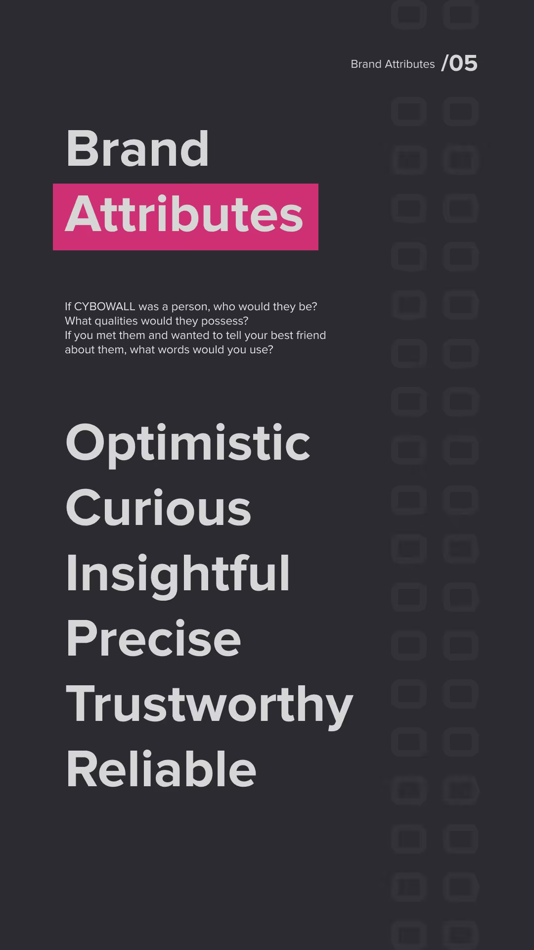
Text on dark background titled 'Brand Attributes' with a pink highlight on 'Attributes' and the number 05 in the top right. Below, a prompt asks what qualities CYBOWALL would have if it were a person. The listed attributes are: Optimistic, Curious, Insightful, Precise, Trustworthy, and Reliable.
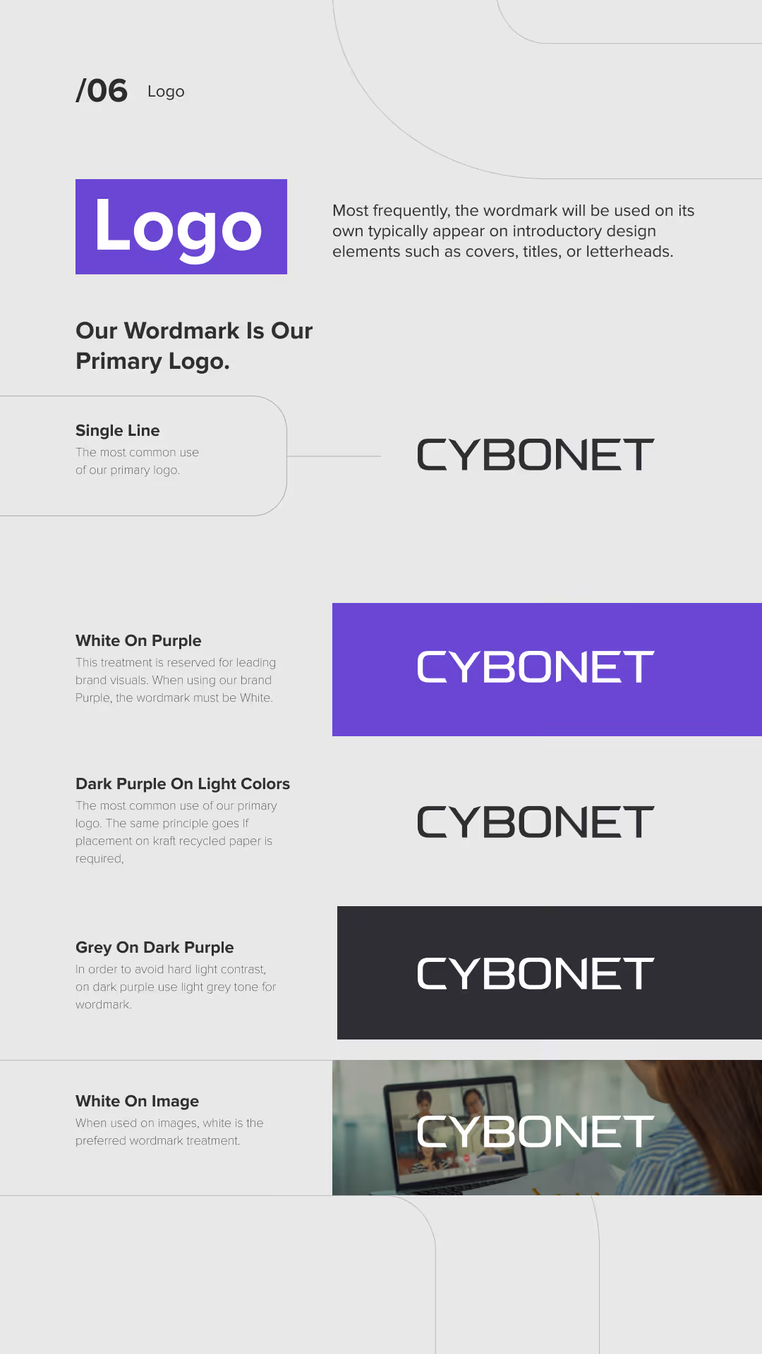
Brand guidelines for the CYBONET logo showing the wordmark usage as the primary logo in single line. Examples include CYBONET in black on light backgrounds, white on purple background, black on light colors, white on dark purple, and white on an image background with a person using a laptop.
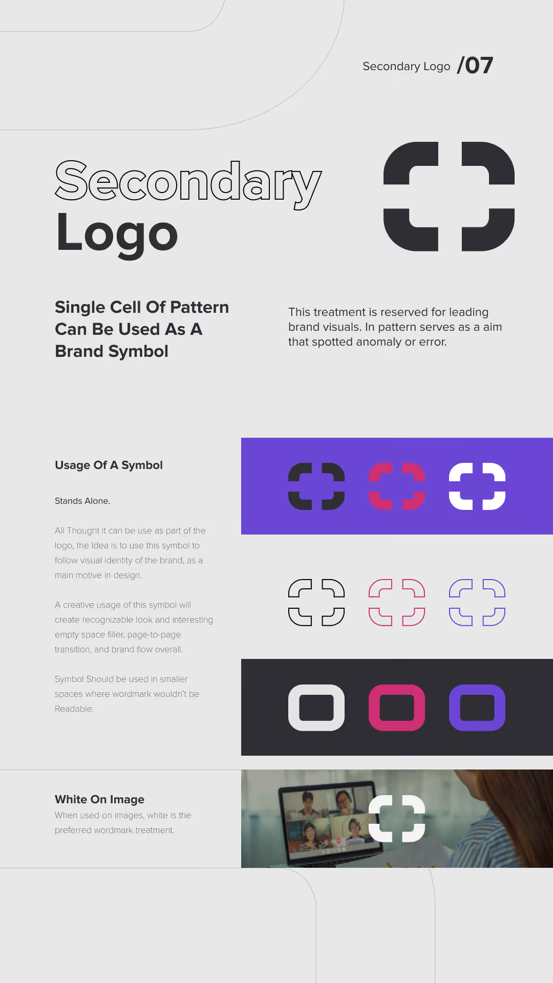
Design guide for a secondary logo featuring a single cell pattern as a brand symbol, showing a black and white stylized square symbol with rounded corners and a cross shape in the center. Includes explanations about usage: it stands alone, can represent visual identity, fits smaller spaces, and is preferred in white on images. Displays the symbol in black, red, white, and purple variations on colored backgrounds, outlines in different colors, and inset rounded square versions. Also shows the white symbol overlay on a video call image.
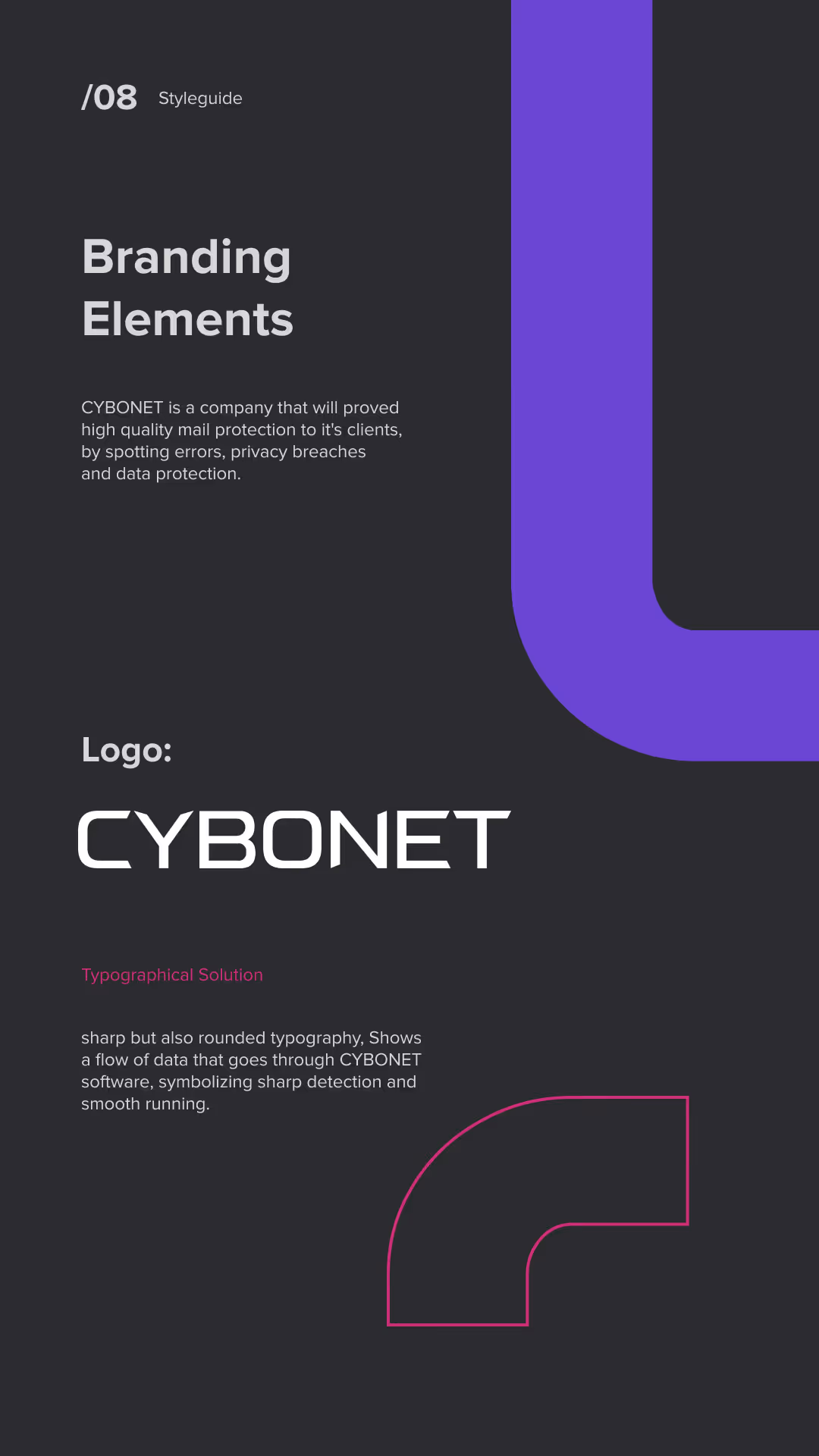
Page from a style guide titled 'Branding Elements' describing CYBONET, a company focused on high-quality mail protection and data security, featuring the CYBONET logo in sharp but rounded typography to symbolize data flow and smooth running.
Brand Visual Identity page with a modern, clean, geometrical style. It features a large purple L-shaped graphic connected by pink corner brackets, symbolizing connected logos resembling letter O. Below, a pattern of dark squares highlights one purple and one pink bracketed square, representing servers, computers, and data. Text explains the pattern symbolizes a target or aim and an error spotted by CYBONET Protection Software.
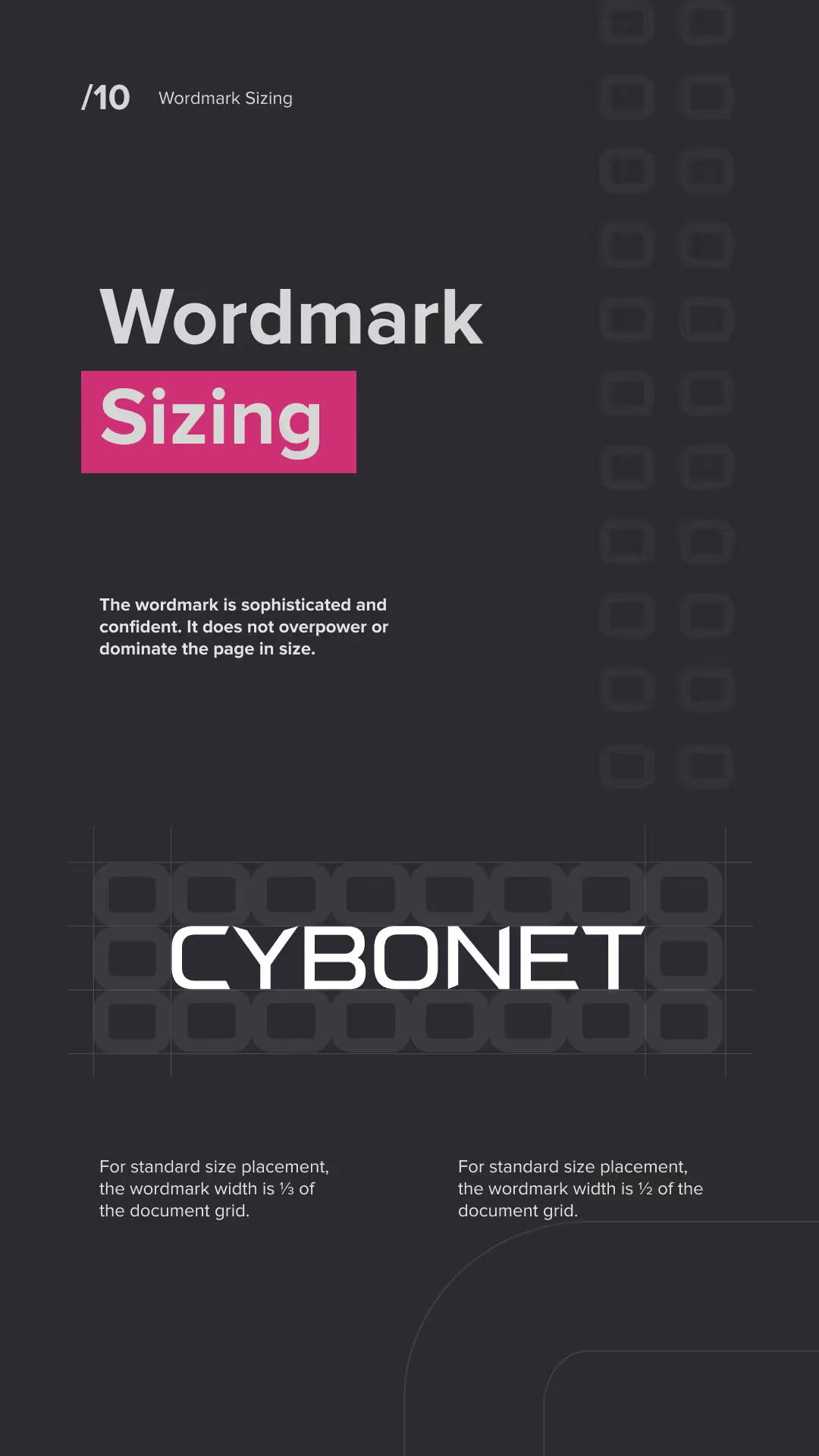
Dark background with text about wordmark sizing, highlighting that the wordmark is sophisticated and confident and should not overpower the page. Example wordmark 'CYBONET' is shown centered above a grid with instructions that standard size placement uses a wordmark width of one-third to one-half of the document grid.
Graphic showing a color palette with four colors: darkest shade black 2F2E34, main brand color purple 704ADA, lightest shade light gray D6D6D6, and intense pink CD3073 used only for aim symbol; text says the palette is modern, techy, inviting, with guiding purple as dominant tone and intense pink as a pop-up color.
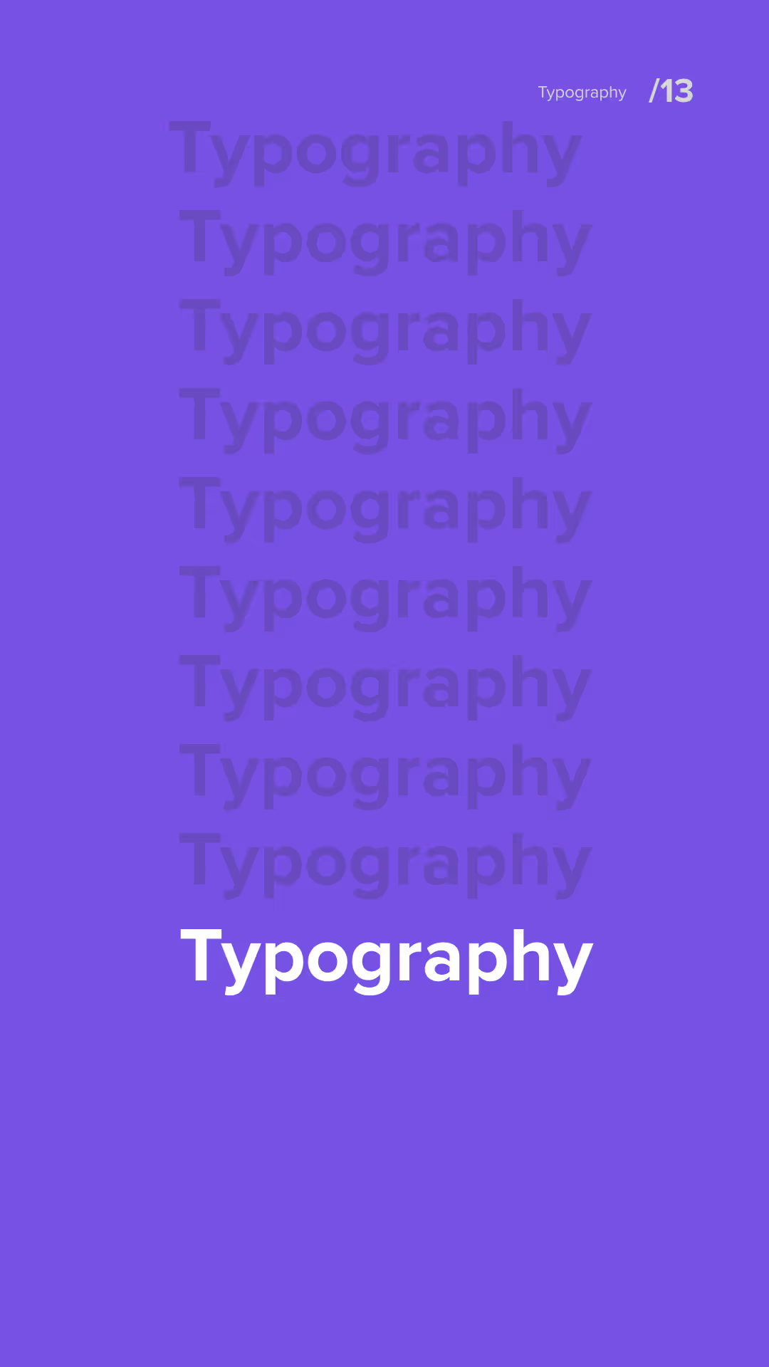
Purple background with the word 'Typography' repeated nine times vertically in descending opacity, with the bottom word in bold white text; small text in the top right corner reads 'Typography /13'.
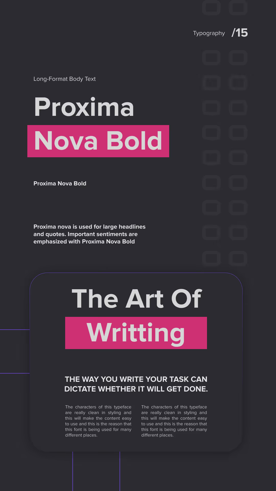
Typography layout showing the font Proxima Nova Bold used for long-format body text and headlines; text emphasizes its use for large headlines, quotes, and important sentiments. The phrase 'The Art Of Writing' is highlighted, followed by a statement about how writing style affects task completion, with sample text blocks illustrating clean styling and readability.
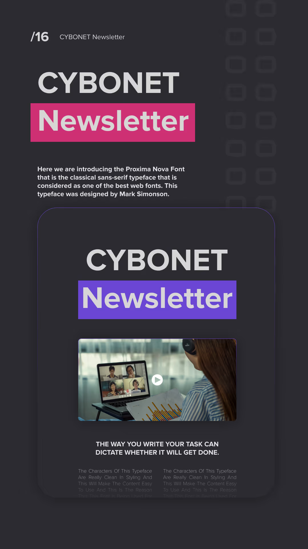
Dark-themed graphic showcasing the CYBONET Newsletter with 'Newsletter' highlighted in pink and purple boxes, introducing the Proxima Nova font as a classical sans-serif typeface. Below is a smaller card with a woman video conferencing on a laptop and text emphasizing how writing style dictates task completion.
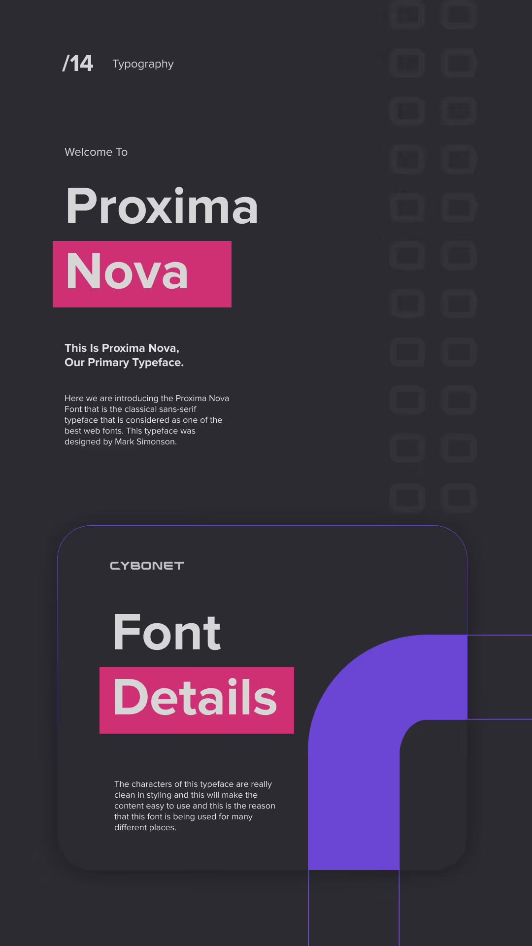
Dark-themed graphic introducing the Proxima Nova font as the primary typeface, highlighting 'Proxima Nova' with Nova on a pink background, and a section labeled 'Font Details' with descriptive text about the font's clean styling and usability.
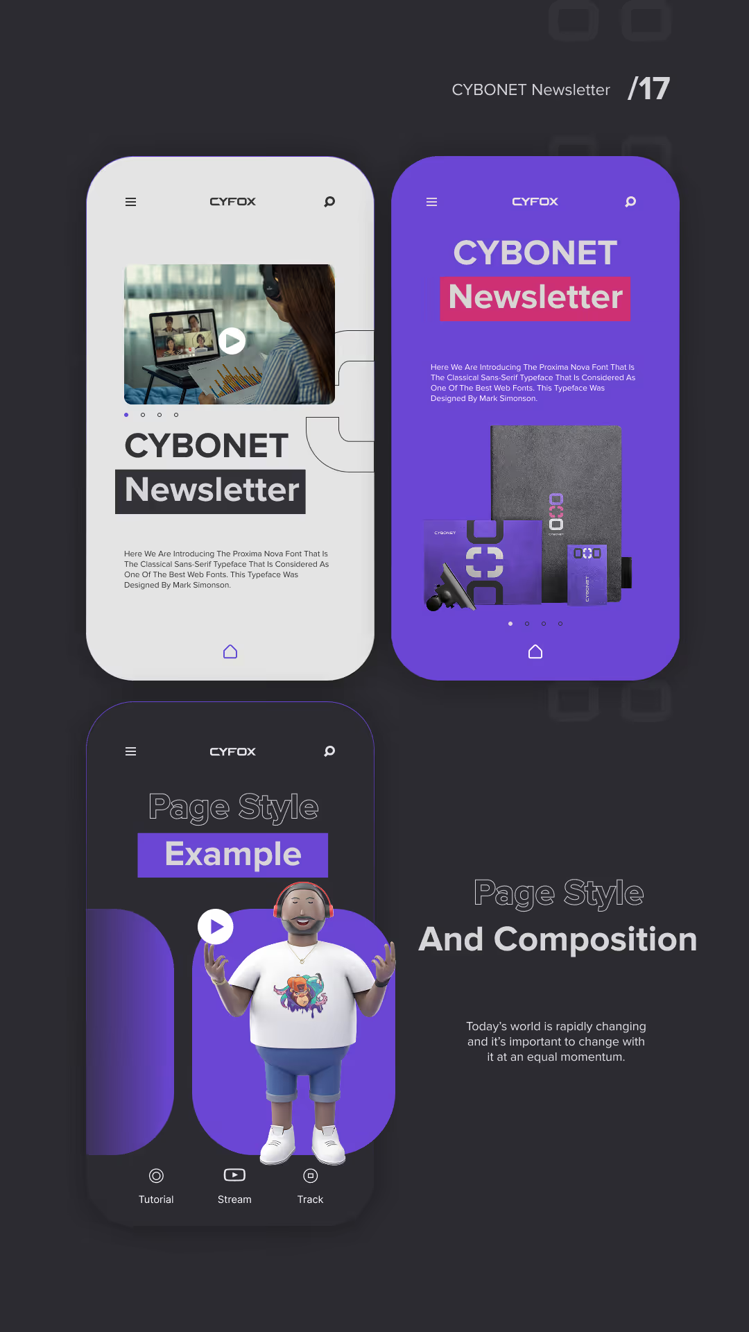
Three smartphone screens on a dark background showing different app interfaces by CYFOX: top left screen displays a video call with 'CYBONET Newsletter' text; top right screen with a purple background shows 'CYBONET Newsletter' and product images; bottom screen features a 3D avatar and text 'Page Style Example' with menu icons labeled Tutorial, Stream, and Track.
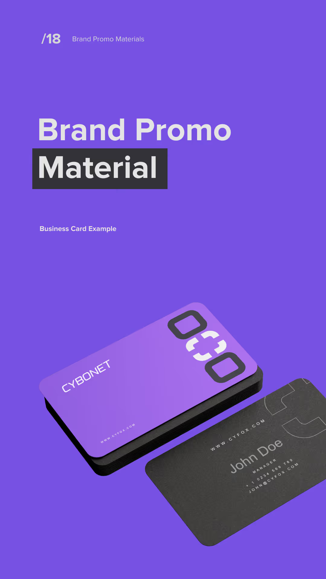
Two business cards for CYBONET displayed on a purple background; one card is purple with a black edge and the numbers 030 in large white font, the other card is black featuring the name John Doe and contact information in white text.
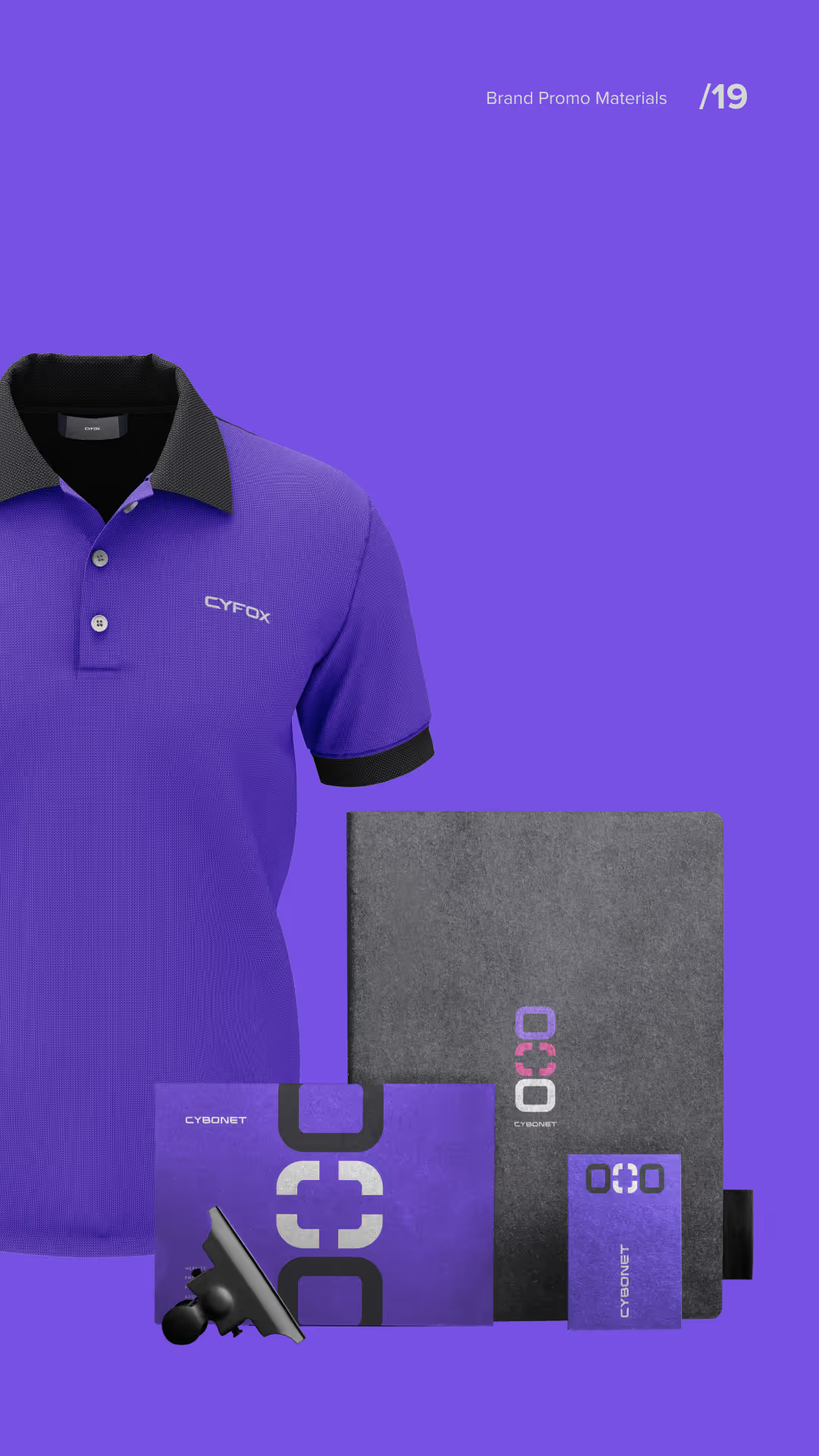
Purple polo shirt with black collar and sleeve trim featuring white Cyrox logo, alongside branded stationery including a black folder, a purple envelope, a small purple notebook, and a black phone holder, all set against a purple background.
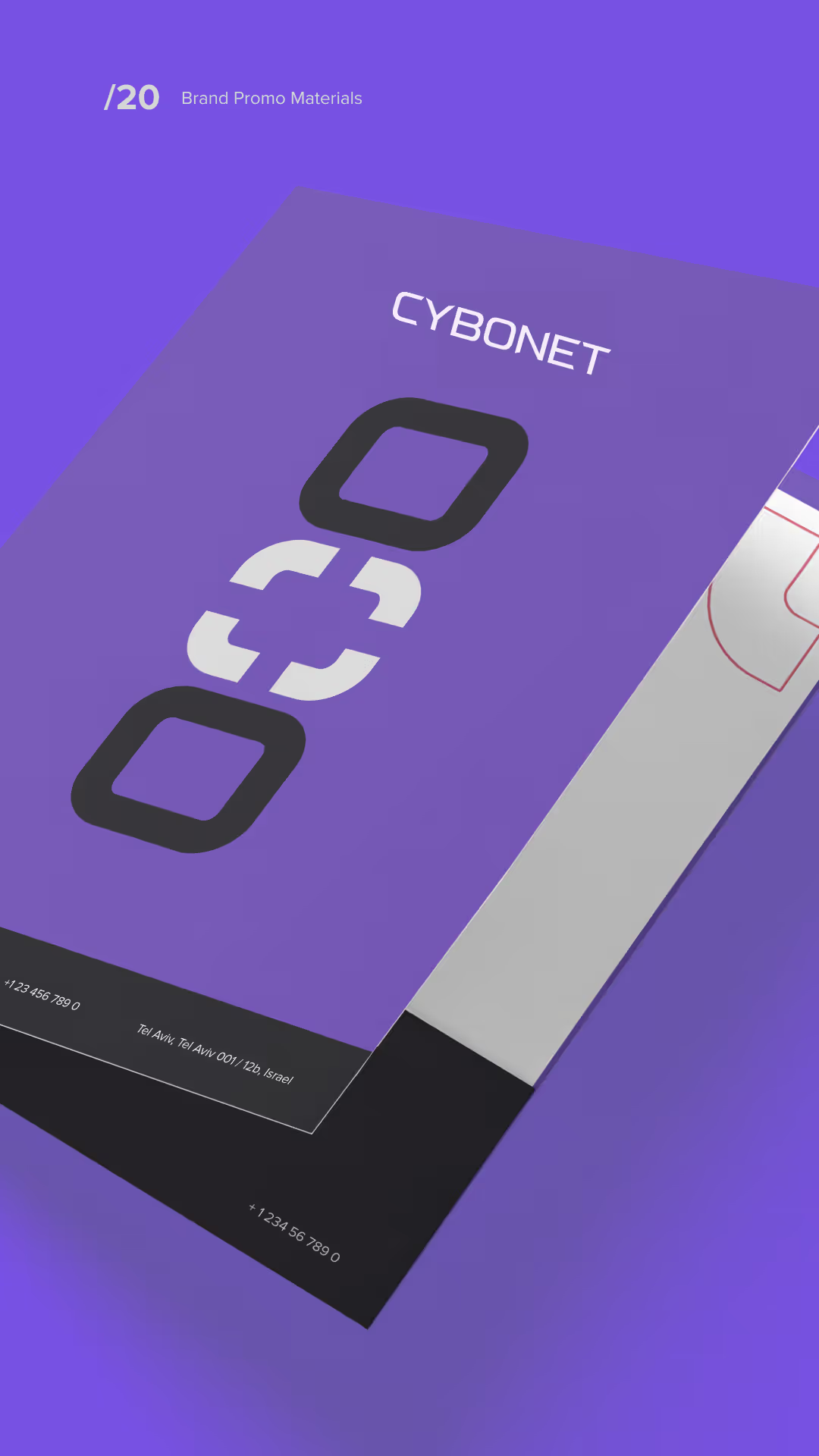
Purple branded promotional material design with the word 'CYBONET' and a stylized logo featuring a chain link graphic, plus contact details at the bottom.
Text saying 'Thanks For Watching.' with 'Watching.' highlighted in purple and a minimalist purple geometric design above it on a dark background.
04 / Sales brochure
Sales Brochure
Design & Copy

The one-page brochure explains what Mail Secure blocks, how it protects the perimeter, the controls admins get and the next step.

Channel partners carry dozens of vendors. A focused one-pager gets read in a meeting, attached to an email and reused in a partner's own pitch, so the layout was built for a five-second scan.

Cybonet promotional banner featuring CySOC created for MSPs with an illustration of a futuristic cat, key features like always active monitoring, real-time alerts, and reasons to partner including reduced workload and expert support.
05 / FAQs
Frequently asked  questions
What should an email security sales brochure include?

The threats it stops, where it stops them, the controls admins get and a clear next step. Cybonet's one-pager covers all four in a layout built for a five-second scan.

How do you make a cybersecurity product stand out visually?

Avoid the default dark-blue padlock look and pair a distinct graphic system with plain language that names the real risk. That is how Ideate Creative made Cybonet recognizable in a crowded category.

Why use a one-page brochure for channel partners?

Partners use whatever is fast to understand and easy to forward. A one-pager survives meetings, emails and partner pitches where long technical documents don't.

How do you market email security in a crowded category?

Lead with a clear, specific promise and a look buyers remember. Cybonet's identity and brochure focus on stopping threats at the perimeter, in plain terms.

Does Ideate Creative work with cybersecurity companies?

Yes. Cybersecurity is a core focus industry for Ideate Creative, with clients including Cybonet, CyFox and DeepCove Cybersecurity.