TuneIn: Travel App
Branding & UX/UI

TuneIn logo
TuneIn headphones and soundwave brand symbol
TuneIn logo

TuneIn - Mobile App Branding

TuneIn is a two-sided marketplace for audio-guided travel experiences with social listening built in, connecting travelers with expert local guides worldwide.

  • Scope: Brand strategy, competitive analysis, visual identity, mood board, campaign mockups, merch and mobile app UX/UI design

  • Categories: Travel, tourism, education, social audio, marketplace

01 / project overview
Case Study
Overview

Ideate Creative created TuneIn's brand strategy, visual identity and mobile app UX/UI. Travelers tune in to local guides, add friends, chat and start "jams" to listen together, while guides earn passive income from every play. Our job was to make all of that feel obvious from the first screen.

The Challenge

TuneIn had to win travelers and guides at the same time, and combine discovery, social listening and creator monetization in one app. It needed a clear brand and an app that explained all of that without a tutorial.

TheWork

We built TuneIn from strategy to screens, so the brand and the app tell the same story to both sides of the marketplace.

  • Audience mapping: travelers, learners, businesses, licensed and independent guides, bloggers and influencers
  • Brand strategy: a brand vision, six values and a competitive analysis that defined TuneIn's edge
  • Visual identity: horizontal and vertical logos, a warm orange and deep blue palette, Satoshi Bold typography and an imagery system of people, soundwaves and gold line icons
  • Mobile app UX/UI: a core loop of discover, listen, share, with filters, friends, chat and group listening "jams"
  • Creator journey: publishing tools and income through subscriptions or tour purchases
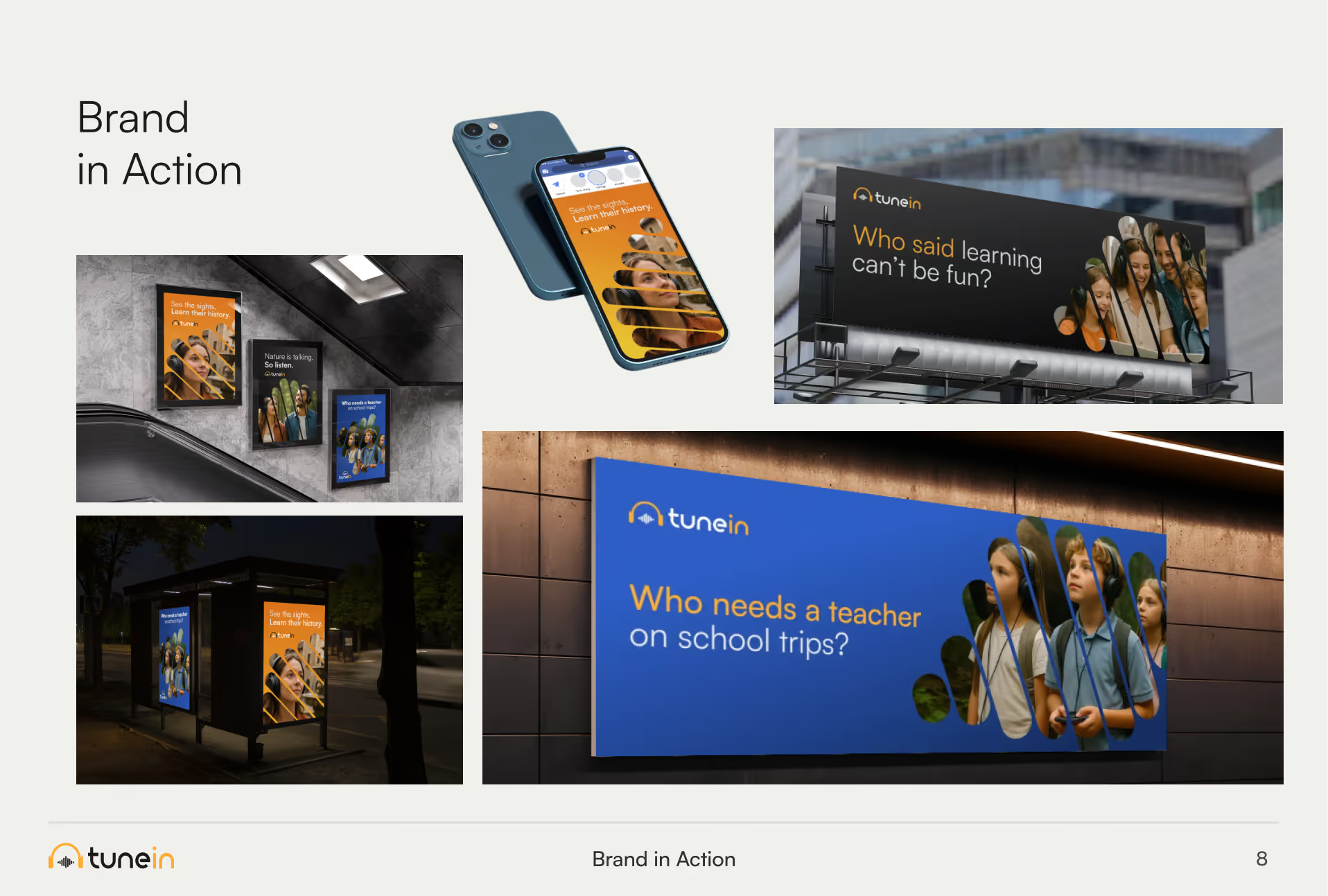
  • Brand in action: a mood board, transit posters, a billboard, wall signage and merch

The Approach

Discovery

We mapped six audiences, from travelers and learners to licensed guides and influencers. Two of them mattered most: travelers who want a better way to explore, and guides who want to earn from what they know.

Positioning

A competitive analysis showed where TuneIn could win: modern UX, multi-format tours, community features, gamified discovery and dual value for travelers and guides. The brand vision became simple: connect people to stories and culture through sound.

Identity

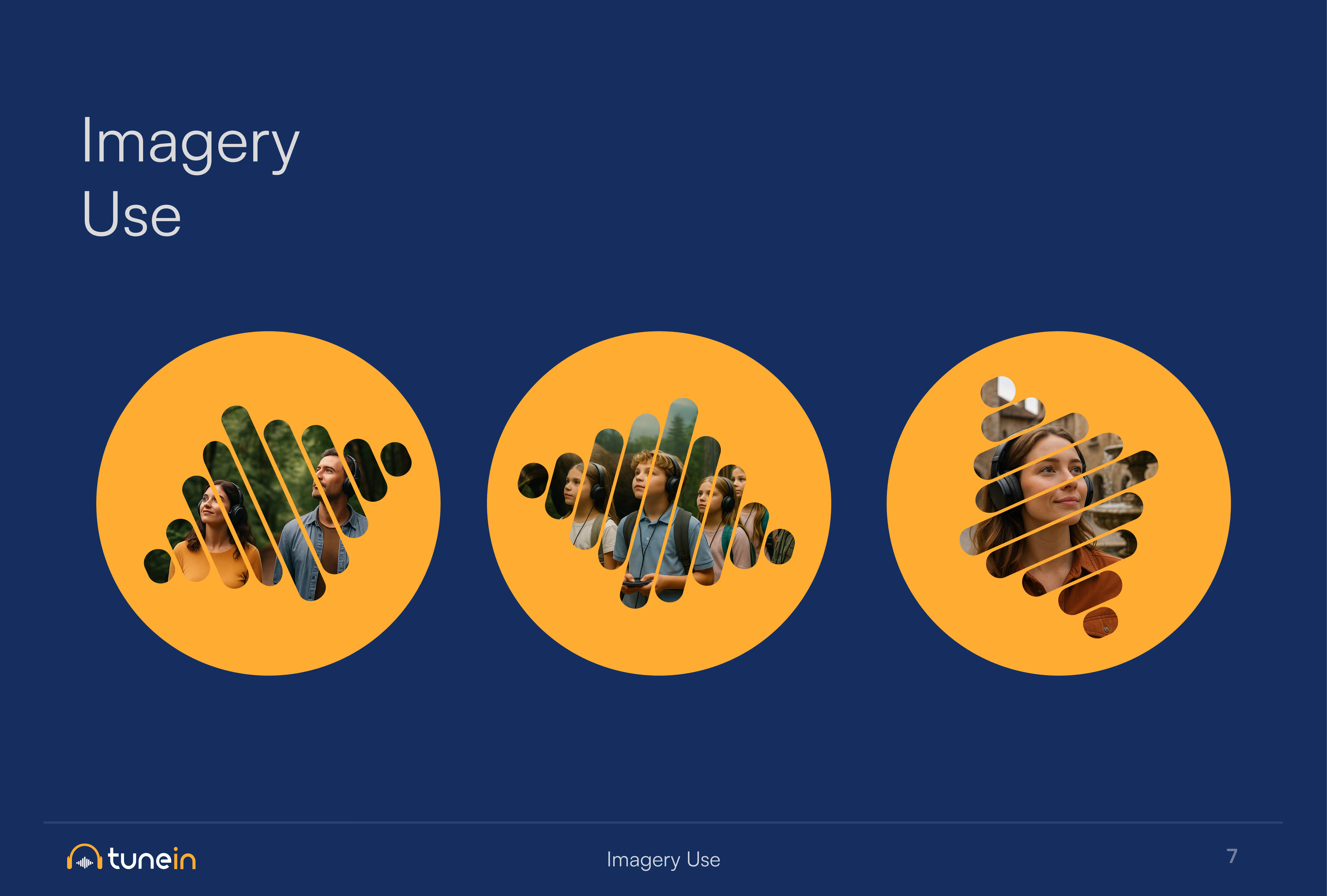
We built the brand around people and sound, not features. Warm oranges meet deep blues, diverse faces sit in orange circles, and soundwave and headphone graphics make it feel social from the first screen.

Rollout

We carried the identity into the app, where each side of the marketplace gets its own clear journey inside one short loop, then showed the brand at work on posters, a billboard, signage and merch.

Summary Results

TuneIn has a brand people warm to and an app that makes a new idea feel obvious.

  • One app, two audiences: travelers and guides each get their own clear value and journey.
  • No tutorial needed: the core loop of discover, listen, share explains the product on its own.
  • Social from the first screen: warm color, real faces and sound graphics make the brand feel human.
  • Ready for launch: campaign mockups and merch show the brand working in the places travelers go.
02 / Brand strategy
Brand
Strategy

We mapped six audiences: travelers, learners, businesses, licensed and independent guides, bloggers and influencers. The brand vision: connect people to stories and culture through sound. Six values (authenticity, curiosity, empowerment, sustainability, innovation and connection) and a competitive analysis defined TuneIn's edge: modern UX, multi-format tours, community features, gamified discovery and dual value for travelers and guides.

03 / Visual identity
Visual
Identity

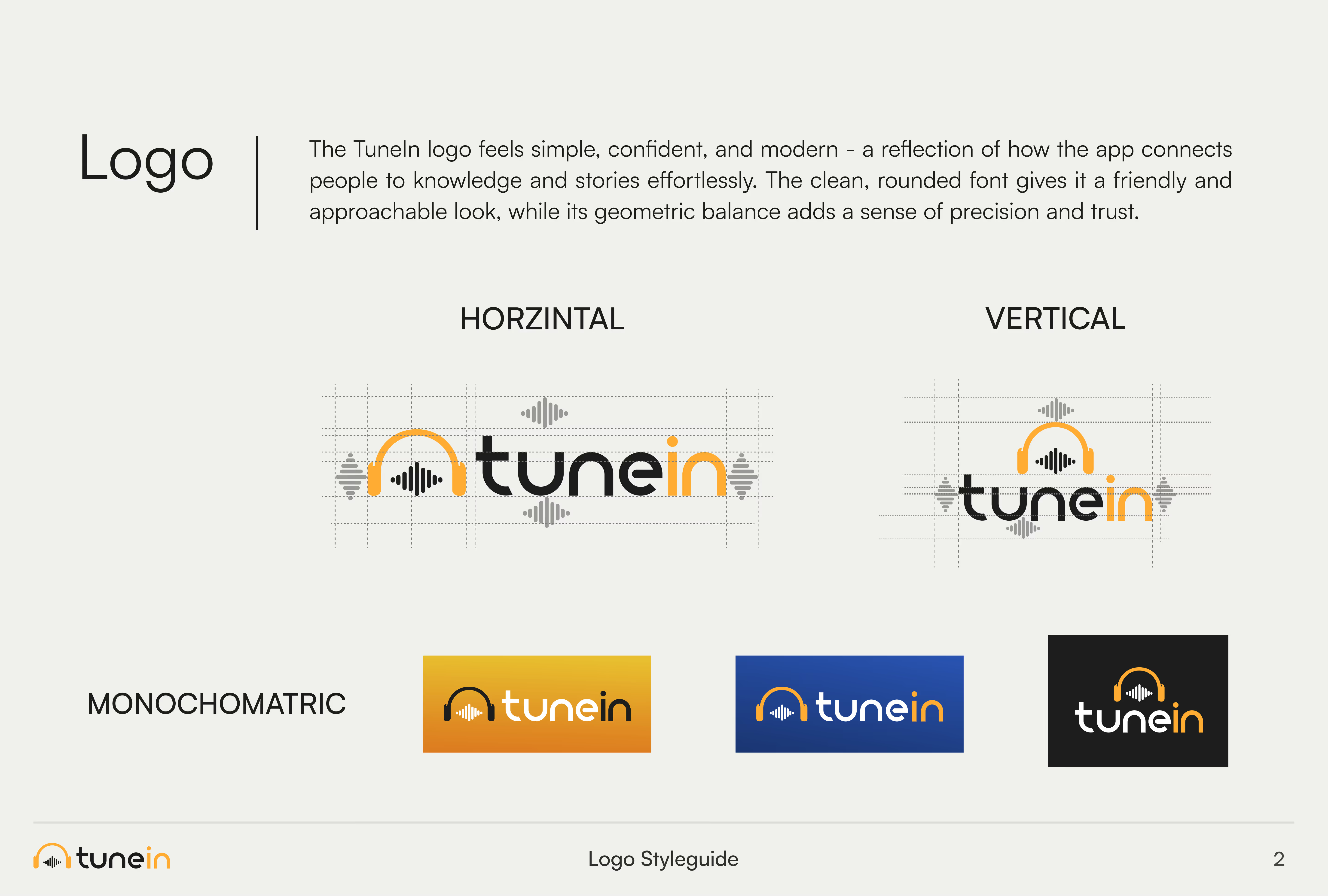
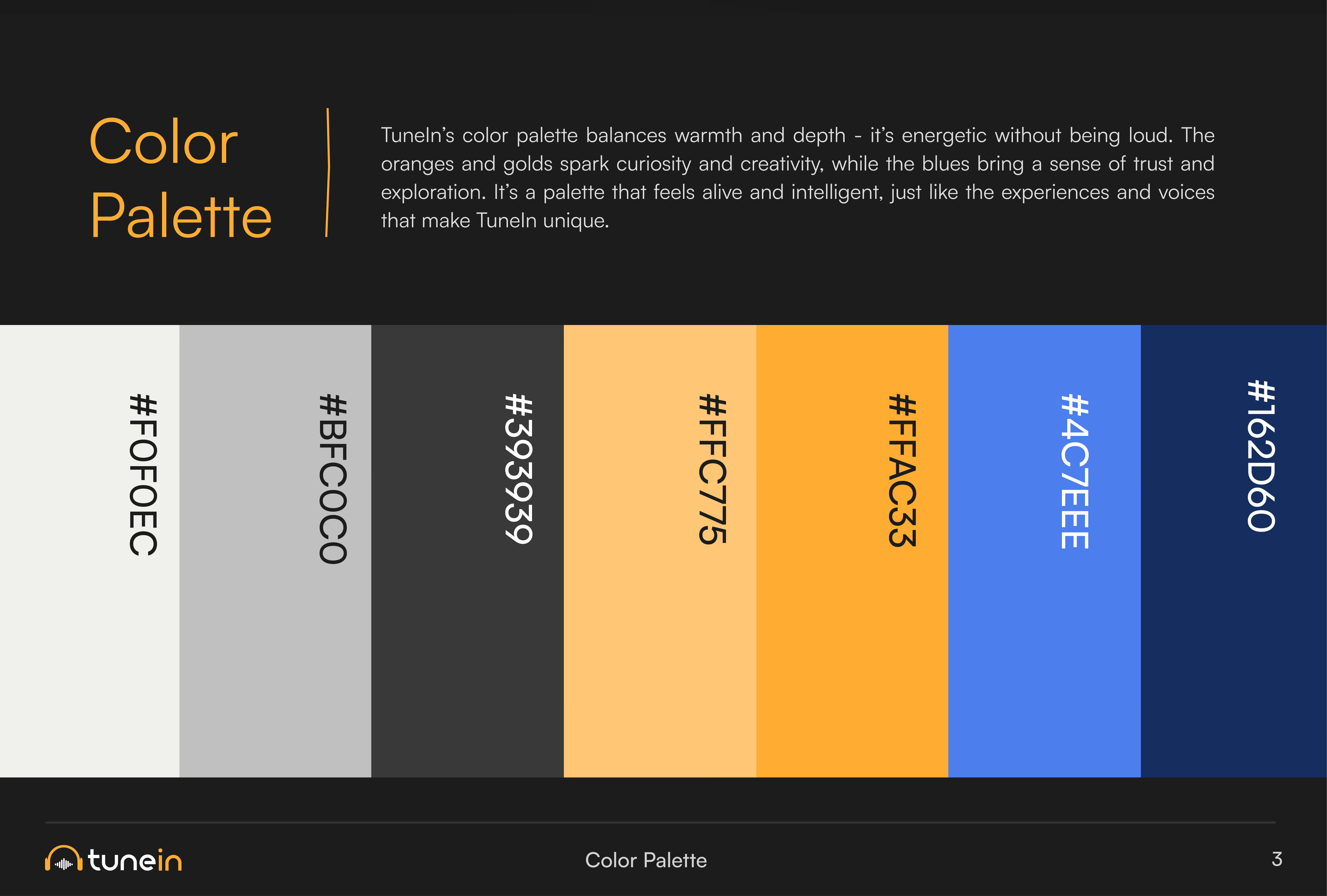
The logo comes in horizontal and vertical versions built on geometric construction lines. Warm oranges (#FFAC33, #FFC775) meet deep and bright blues (#162D60, #4C7EEE), with Satoshi Bold typography.

Diverse people framed in orange circles, soundwave and headphone graphics and gold line icons make the brand feel social and human.

TuneIn logo with orange headphones icon and sound waves above the text. Below, text reads: Virtual Toursit Guide Marketplace, Connect With Local Guides Through Immersive Audio Tours on a black background.
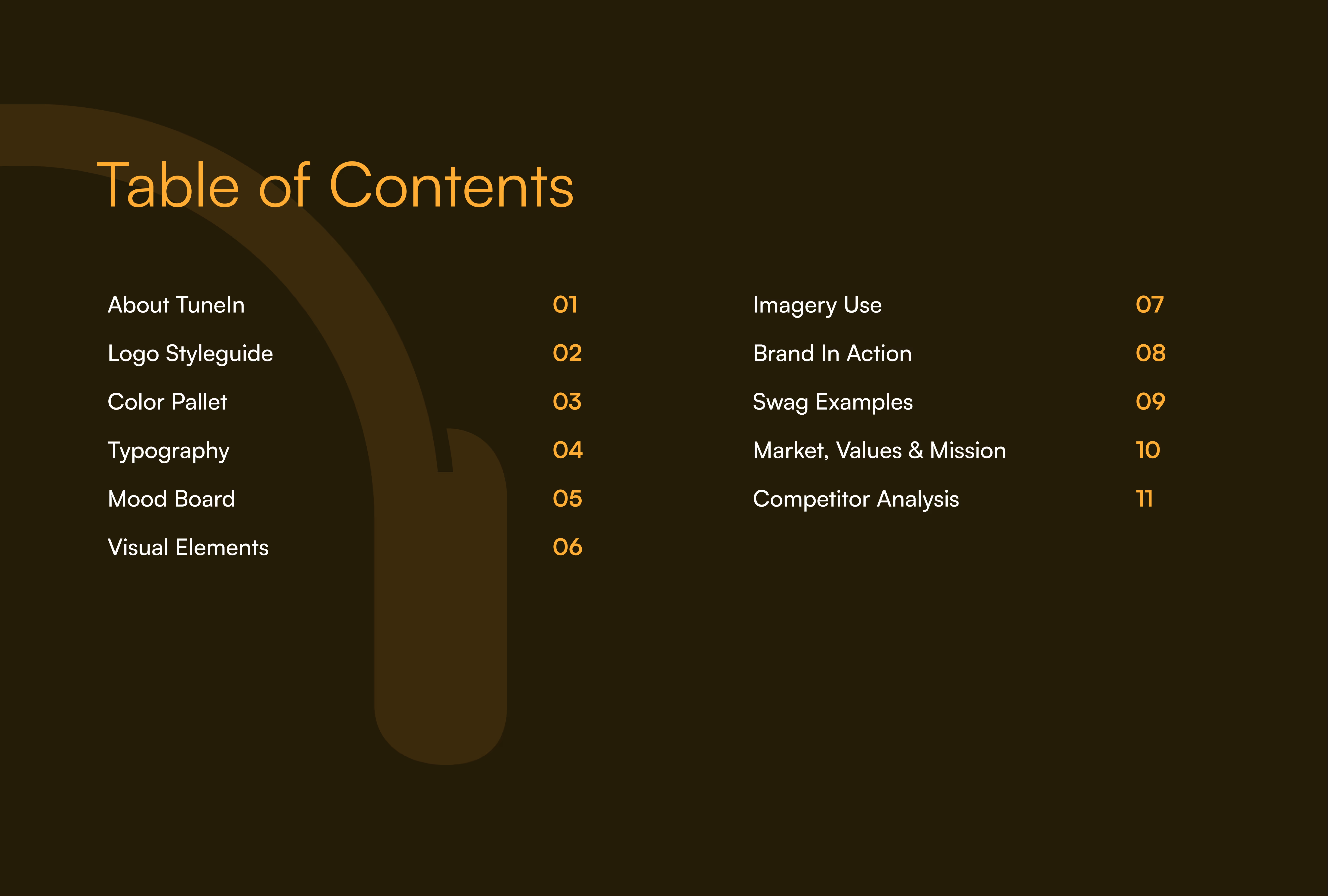
Table of Contents with items: About TuneIn, Logo Styleguide, Color Pallet, Typography, Mood Board, Visual Elements, Imagery Use, Brand In Action, Swag Examples, Market, Values & Mission, Competitor Analysis numbered 01 to 11 on a dark brown background with a faint outline of headphones.
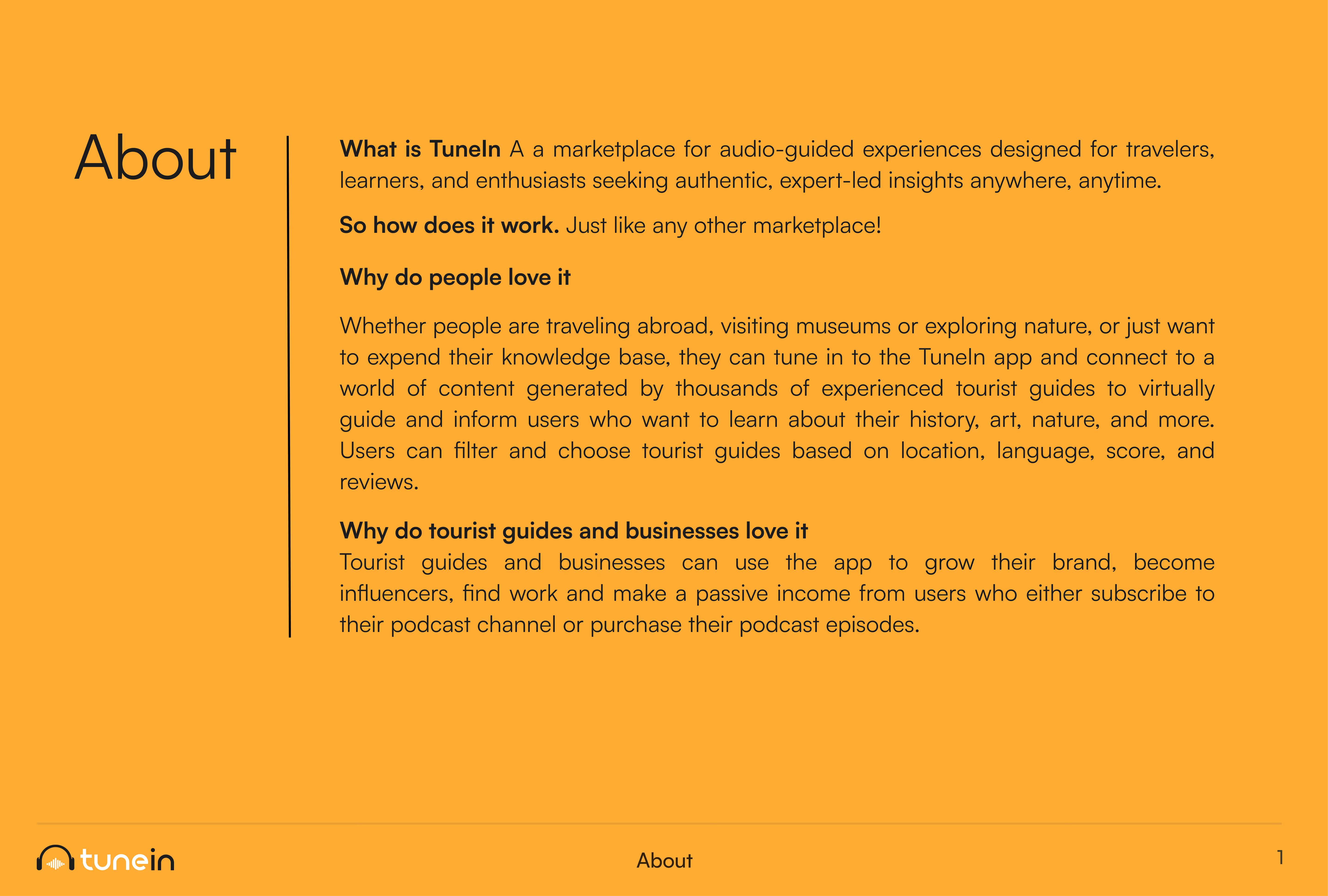
Text block titled 'About' describing TuneIn as a marketplace for audio-guided experiences for travelers, learners, and enthusiasts seeking expert insights. It explains that TuneIn works like any marketplace, allows users to access content from experienced tourist guides for learning about history, art, and nature, and offers filtering options by location, language, score, and reviews. It also highlights benefits for tourist guides and businesses, such as growing their brand, becoming influencers, finding work, and earning passive income via subscriptions or podcast purchases. The TuneIn logo is at the bottom left.
TuneIn logo style guide showing logo description, horizontal and vertical versions with geometric construction lines, and three monochromatic color variations in orange, blue, and black backgrounds.
Color palette slide with six vertical color swatches labeled #F0F0EC (off-white), #BFC0C0 (light gray), #393939 (dark gray), #FFC775 (light orange), #FFAC33 (orange), #4C7EEE (blue), and #162D60 (dark blue) displayed horizontally on a black background. Text above explains the palette balances warmth and depth with energetic oranges and golds, and blues evoke trust and exploration. TuneIn logo is at bottom left.
Typography sample showing the font Satoshi in bold with the alphabet in uppercase and lowercase letters, numbers 0 to 9, and common punctuation marks on an orange gradient background.
Collage titled 'Mood Board' showing diverse people wearing headphones in various settings including outdoors, a museum, city streets, and indoors, enjoying audio content together and individually.
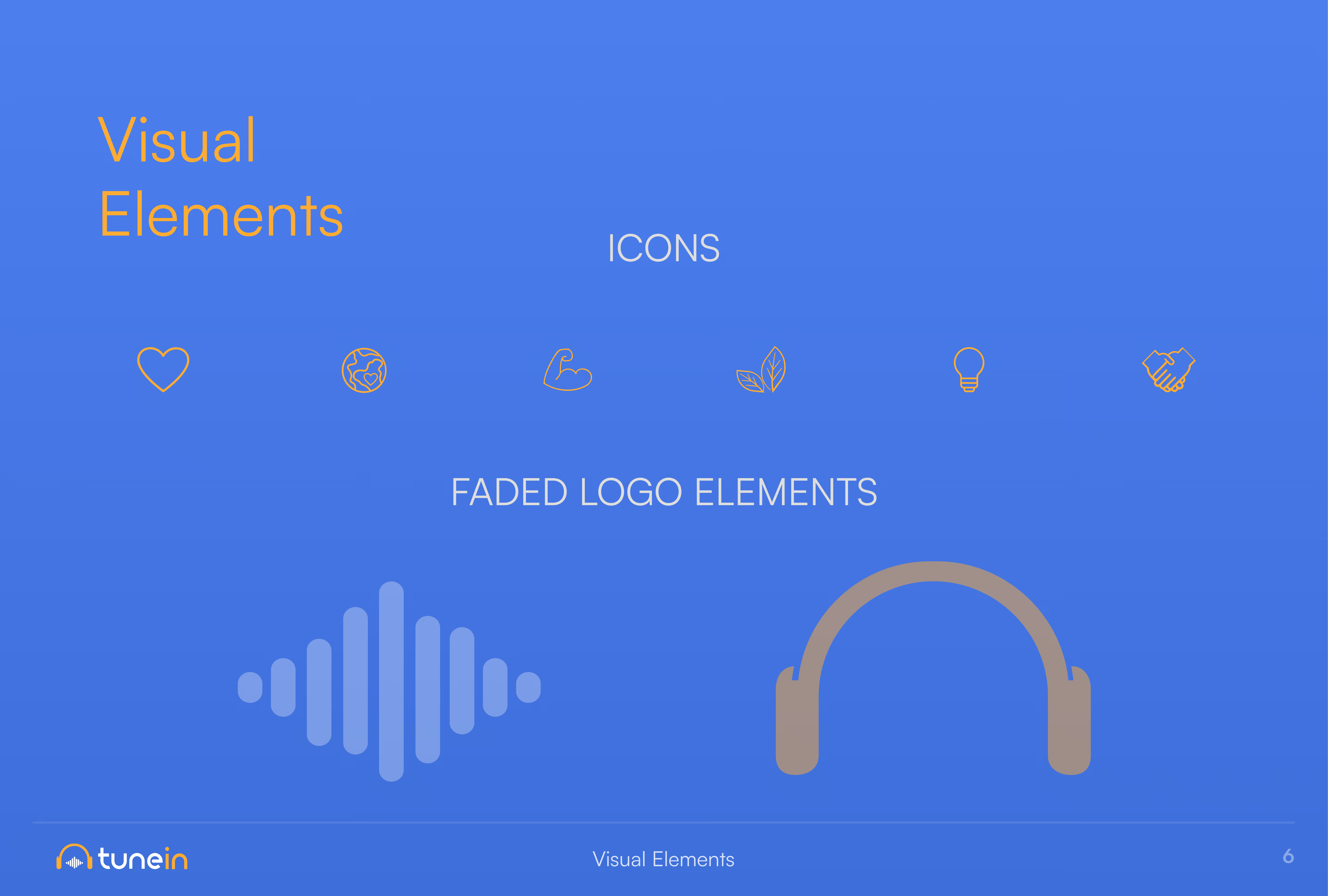
Slide titled 'Visual Elements' with two sections: icons and faded logo elements. Icons include heart, globe, flexed arm, leaf, light bulb, and handshake outlined in gold on a blue background. Faded logo elements below feature a stylized soundwave and headphones, both in muted blue and gold tones. TuneIn logo appears in the bottom left corner.
Slide titled 'Imagery Use' showing three orange circles on a dark blue background, each containing images of diverse people arranged in abstract, striped patterns.
Collage showing TuneIn branding in various real-world contexts: three posters at a subway station with messages like 'Life gets better. Learn their history.' and 'No one is talking, so listen.'; two posters at a bus stop with similar messages; a smartphone screen displaying a TuneIn app with a message 'Learn their history, listen'; a billboard asking 'Who said learning can't be fun?'; and a large outdoor wall sign saying 'Who needs a teacher on school trips?' with images of attentive children.
04 / Mobile application
Mobile App
UX/UI Design

The core loop is simple: find a tour, listen, share. Travelers filter by location, language, score and reviews and listen alone or with friends. Guides publish, share and earn through subscriptions or tour purchases, with their own clear journey inside the same app.

05 / Brand in action
Brand
in Action

We showed the brand at work on transit posters, a billboard and wall signage ("Who needs a teacher on school trips?").

Merch, including a bucket hat, hoodie and tote, takes the brand to the places travelers actually go.

Black bucket hat, hoodie, and tote bag displayed against an orange gradient background, each featuring the 'tunein' logo with a yellow arch and white and yellow text.
06 / FAQs
Frequently asked  questions
What is TuneIn?

TuneIn is a two-sided marketplace where travelers listen to audio tours from local guides, with chat and group listening, and guides earn passive income from every play.

How do you design a two-sided marketplace app?

Give each side its own clear value and journey, then keep the shared loop short. For TuneIn, Ideate Creative built that loop around three steps: discover, listen, share.

How do you brand a travel startup?

Build the brand around people and experiences, not features. TuneIn's identity uses warm color, real faces and sound graphics so it feels social from the first screen.

What makes social listening work in a travel app?

Make listening together easy. TuneIn lets travelers add friends, chat and start "jams" to hear the same tour together.

Does Ideate Creative design consumer apps?

Yes. Ideate Creative designs brands and mobile apps for consumer and fintech products, including TuneIn, YDPay and Tea-Fi.