Blat Lapidot: Consulting
Firm Rebrand

Blat Lapidot Consulting logo
Blat Lapidot brand symbol
Blat Lapidot Consulting logo

Blat Lapidot - B2B Rebrand

Blat Lapidot Consulting manages the people side of complex transformations, especially SAP and ERP rollouts, and was the first consulting firm in Israel to specialize in change management.

  • Scope: Brand strategy, brand book, logo and visual identity, and sales deck strategy, design and copywriting

  • Categories: Business consulting, change management, professional services

01 / project overview
Case Study
Overview

Ideate Creative delivered a strategic rebrand, a full brand book and a C-suite sales deck for Blat Lapidot Consulting. The whole system is built on one idea, a bridge between where an organization is and where it needs to be, which turns a complex change management methodology into a clear, visual story.

The Challenge

Blat Lapidot had 35+ years of experience and hundreds of successful projects, but its brand was about seven years old and no longer matched modern digital standards. Its method spans people, processes and technology, and it needed a narrative C-suite buyers could grasp in a single meeting.

TheWork

We rebuilt Blat Lapidot's brand from the purpose up, then put it to work in the deck its partners take into C-suite meetings.

  • Brand strategy: purpose, promise, vision, mission and six core values
  • Brand concept: a bridge between people, processes and technology
  • Logo: the letters B and L form a symbol of the three pillars, with versions and usage rules
  • Visual identity: dark blue and bold pink, Montserrat typography, bridge photography and technical line drawings
  • Brand voice: confident, collaborative, reassuring and professional
  • Brand book: the full system documented in one guide
  • C-suite sales deck: strategy, messaging, copy and design, with one animated line running across every slide

The Approach

Discovery

We started with the buyers: CEOs, CIOs and HR leaders about to roll out SAP or ERP systems who know the technology will work but worry about the people. Change management is an invisible service, so the brand had to make it visible.

Positioning

Change management connects where an organization is to where it needs to be. We made that the brand concept, a bridge, and paired it with a clear promise: guiding clients through change with careful planning and human-centered care.

Identity

The bridge runs through everything: a logo where B and L form a symbol of people, processes and technology, bridge photography with colored overlays and technical line drawings. The result is credible to tech-savvy buyers and still warm and human.

Rollout

We carried the system into the brand book and the sales deck. The deck opens with a hard fact, moves through the methodology and closes with proof, so partners can make the case in one meeting.

Summary Results

Blat Lapidot now has a brand that matches its 35 years of expertise, and a sales story built for the C-suite.

  • One central idea: the bridge concept ties the logo, imagery, brand book and deck into one recognizable system.
  • A modern, credible brand: an identity that holds its own with tech-savvy buyers while staying human.
  • A deck that sells the method: the Change Management Roadmap and Triple Exposure Model explained in plain, visual steps.
  • Proof buyers can scan: past projects packaged into short results C-suite buyers can read at a glance.

"Ideate just ‘got’ us"

"They elevated our brand while keeping its essence intact, with a visual identity and pitch deck that are sleek, unique and adapted for tech audiences."

Michal Blat Ben David, Co-owner and CEO of Blat Lapidot Consulting
Michal Blat Ben David
Co-owner and CEO
Blat Lapidot Consulting logo
02 / Brand strategy
Brand
Strategy

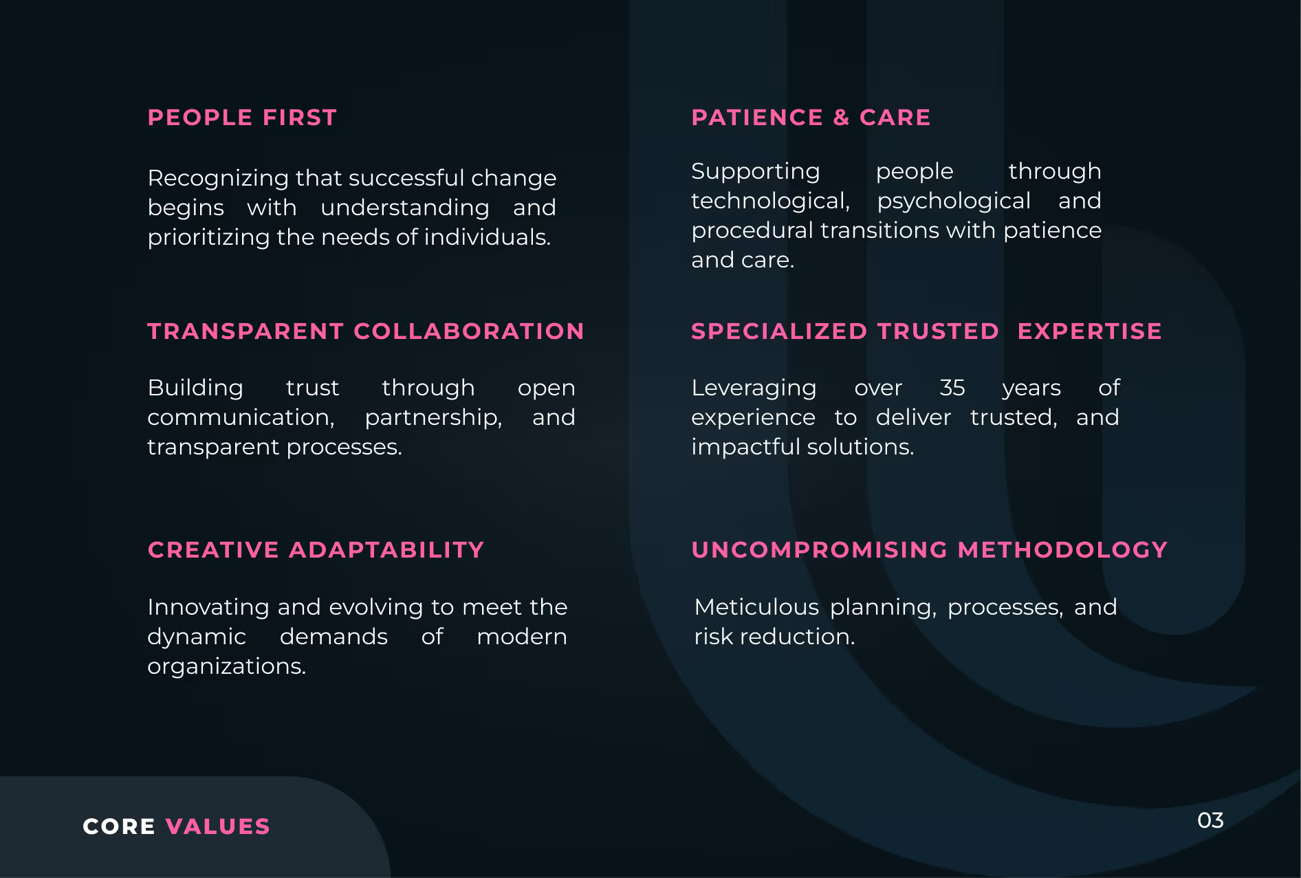
Change management connects where an organization is to where it needs to be, so the brand concept is a bridge. The promise: guiding clients through change with careful planning and human-centered care. We defined six values (People First, Transparent Collaboration, Creative Adaptability, Patience and Care, Specialized Trusted Expertise, Uncompromising Methodology) and a voice that is confident, collaborative, reassuring and professional.

03 / Brand book
Brand Book
& Visual Identity

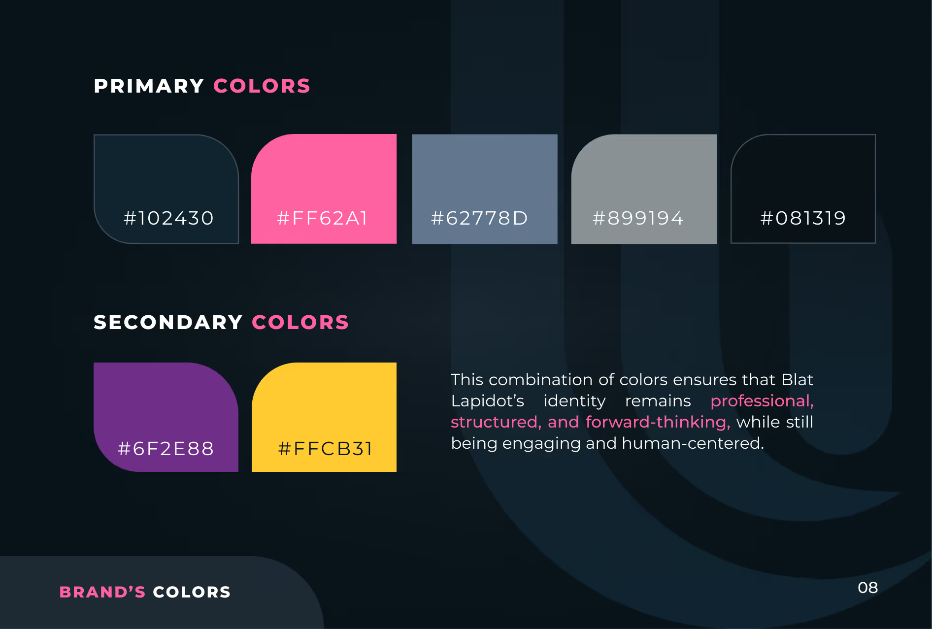
In the new logo, the letters B and L form a symbol of people, processes and technology. Dark blue (#102430) carries the brand, with a bold pink accent (#FF62A1) and Montserrat typography.

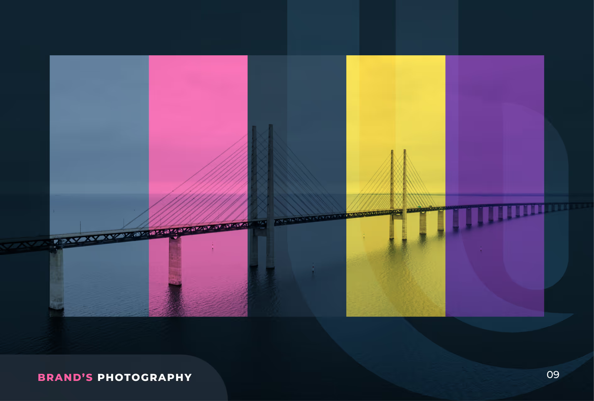
Bridge photography with colored overlays and technical line drawings make an invisible service visible. All of it is documented in a full brand book.

Logo design for BLAT LAPIDOT, a change management service provider, with the tagline 'Strategic Branding & Visual Identity' and the ID8 Creative branding below, set on a dark background with pink and gray lines.
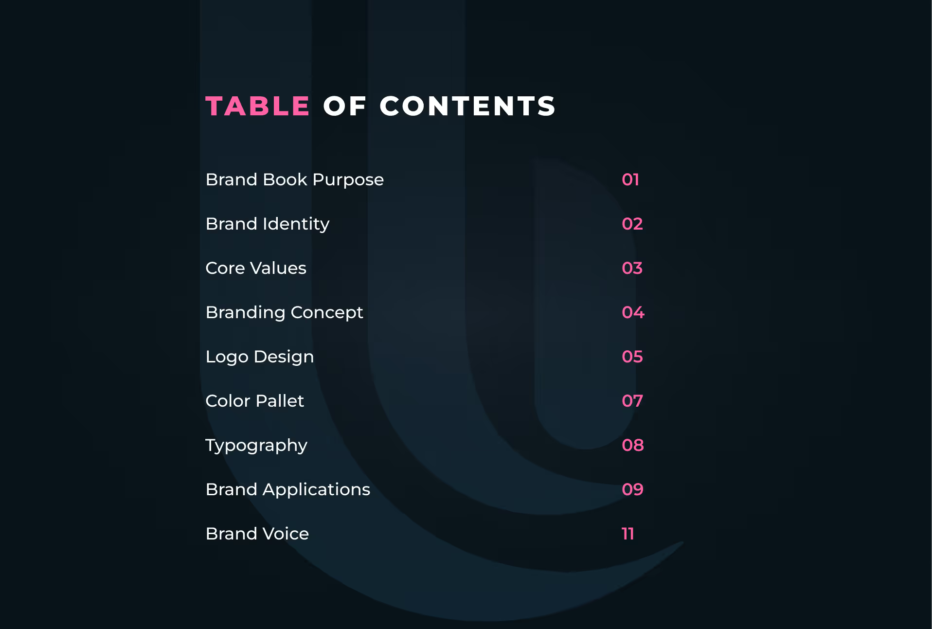
Table of contents listing brand book sections including Brand Book Purpose, Brand Identity, Core Values, Branding Concept, Logo Design, Color Pallet, Typography, Brand Applications, and Brand Voice with page numbers from 01 to 11.
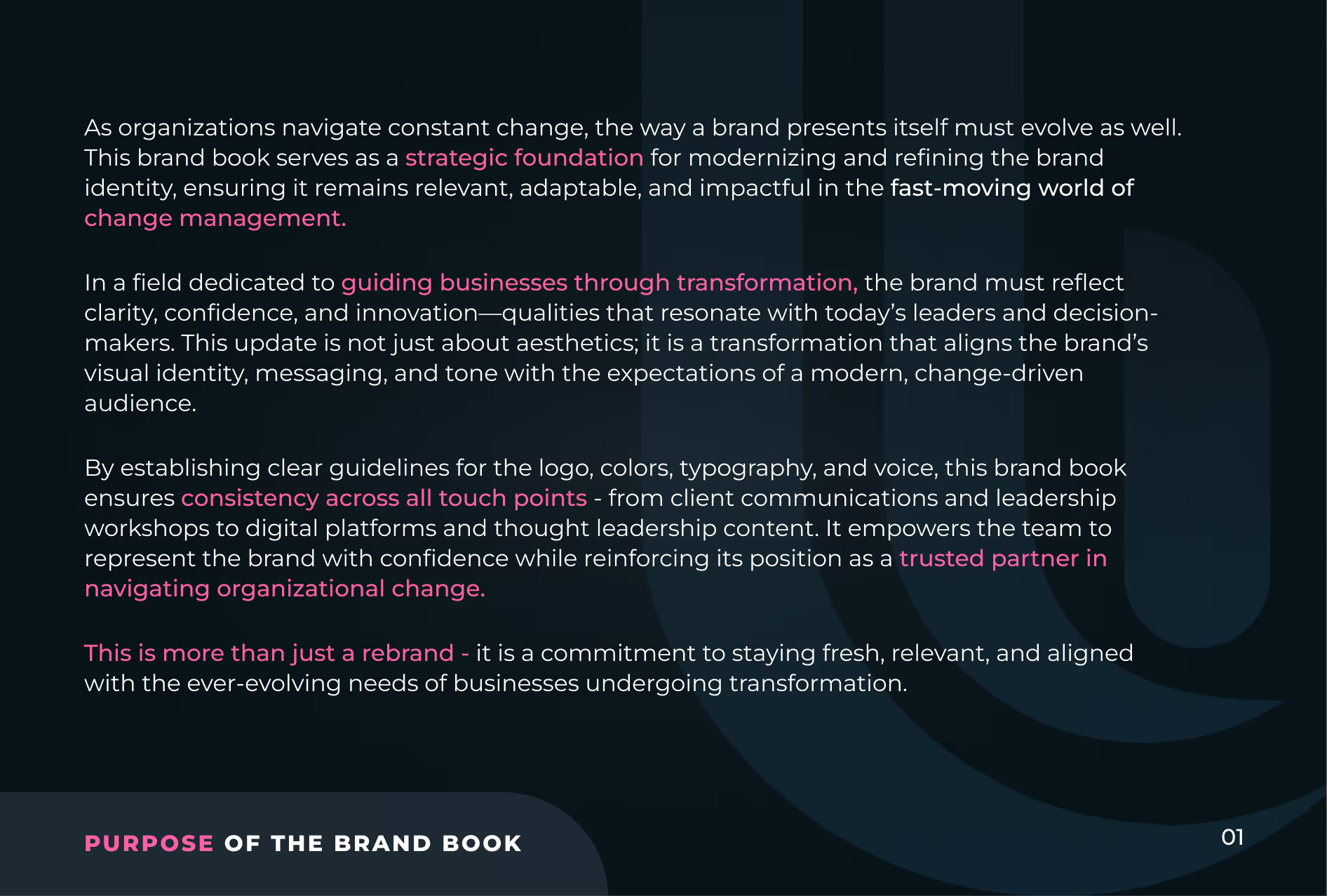
Text about the purpose of a brand book, explaining how it serves as a strategic foundation for modernizing and refining brand identity to remain relevant and adaptable in change management. It highlights guiding businesses through transformation by reflecting clarity, confidence, and innovation, aligning brand visuals and messaging with modern expectations. The text emphasizes establishing guidelines for logo, colors, typography, and voice to ensure consistency across all touch points, empowering teams and reinforcing the brand's position as a trusted partner in organizational change. It notes that this is more than a rebrand, but a commitment to staying fresh and aligned with evolving business needs.
Text on a dark background outlining brand identity with four sections: Brand Personality emphasizes bridging people, processes, and technology; Our Promise pledges guidance through change with careful planning and human-centered care; Our Vision aims for organizational alignment, shared purpose, and sustainable success via human-centered change management; Mission Statement focuses on empowering individuals and organizations to navigate change with expert-driven, transparent, and meticulous solutions.
Text listing core values in two columns on a dark background, with headings in pink and details in white: People First - prioritizing individual needs; Transparent Collaboration - building trust through open communication; Creative Adaptability - innovating to meet modern demands; Patience & Care - supporting people through transitions; Specialized Trusted Expertise - over 35 years experience delivering impactful solutions; Uncompromising Methodology - meticulous planning and risk reduction. "CORE VALUES" is at the bottom left in pink and white.
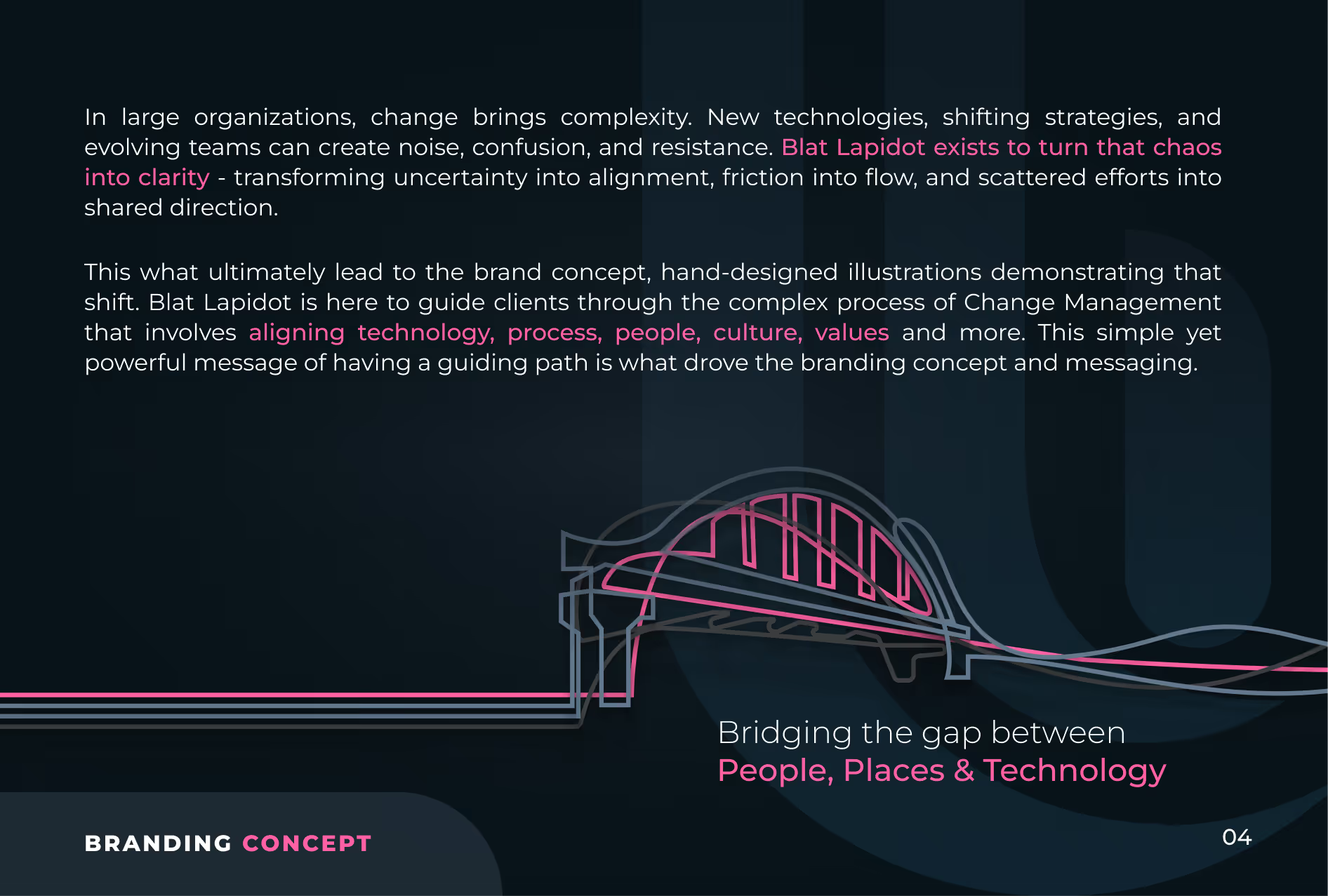
Text on a dark background explaining how change brings complexity in large organizations and how Blat Lapidot turns chaos into clarity by aligning technology, process, people, culture, and values. Includes a stylized bridge illustration symbolizing bridging the gap between people, places, and technology. The words 'Branding Concept' and 'Bridging the gap between People, Places & Technology' are highlighted in pink.
Blat Lapidot logo guidelines explaining alignment and measurement. The logo forms letters B and L representing People, Processes, and Technology. Horizontal and vertical logo layouts with spacing ratios are shown, using the letter O as a measurement unit. The text details the symbolic journey from fragmentation to unity in change management and advises using the letter O in the type section as reference for logo measurement.
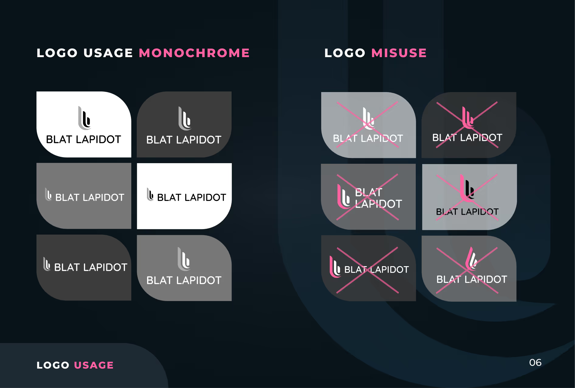
A guide showing correct monochrome logo usage and misuses for 'Blat Lapidot.' On the left, eight logos in black, white, and gray backgrounds demonstrate proper monochrome usage with consistent logo colors and clear contrast. On the right, eight logos show misuses with pink crosses over logos that have incorrect colors, backgrounds, or contrasts, indicating improper logo application.
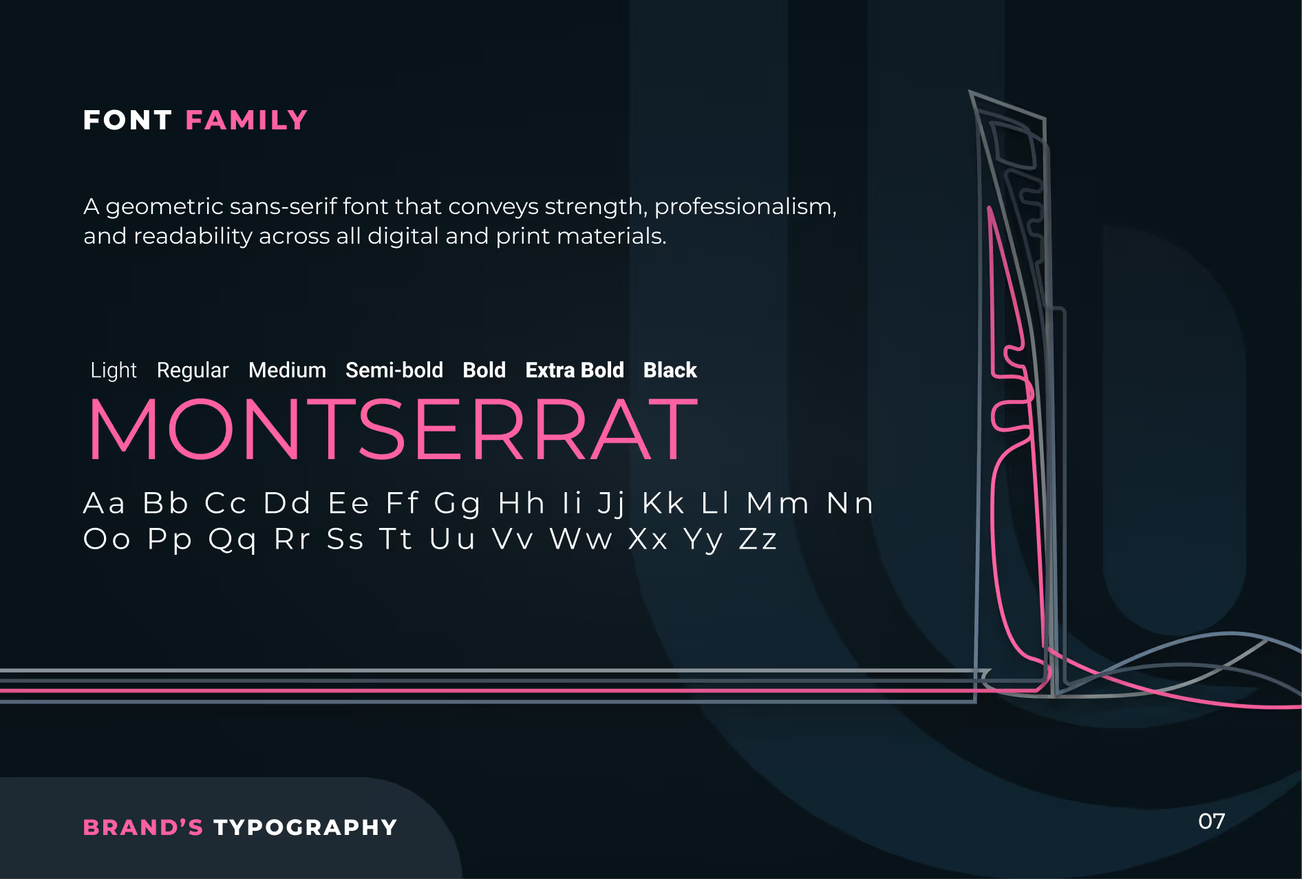
Typography presentation of Montserrat font family displaying weights from Light to Black, with uppercase and lowercase letters, describing it as a geometric sans-serif font conveying strength, professionalism, and readability for digital and print materials.
Color palette showing primary colors as dark blue (#102430), pink (#FF62A1), muted blue (#62778D), gray (#899194), and black (#081319), and secondary colors as purple (#6F2E88) and yellow (#FFCB31). Text describes the color combination as professional, structured, forward-thinking, engaging, and human-centered for Blat Lapidot's identity.
A cable-stayed bridge over water shown with four vertical color overlays in blue, pink, yellow, and purple, with the text 'BRAND'S PHOTOGRAPHY' in the bottom left corner.
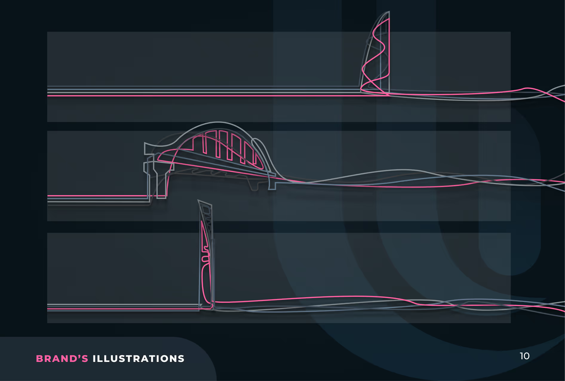
Technical line drawing showing three side views of a futuristic-looking elongated vessel or structure with varying top features, including a tower, arched dome, and vertical fin, rendered in pink and white lines on a dark blue background.
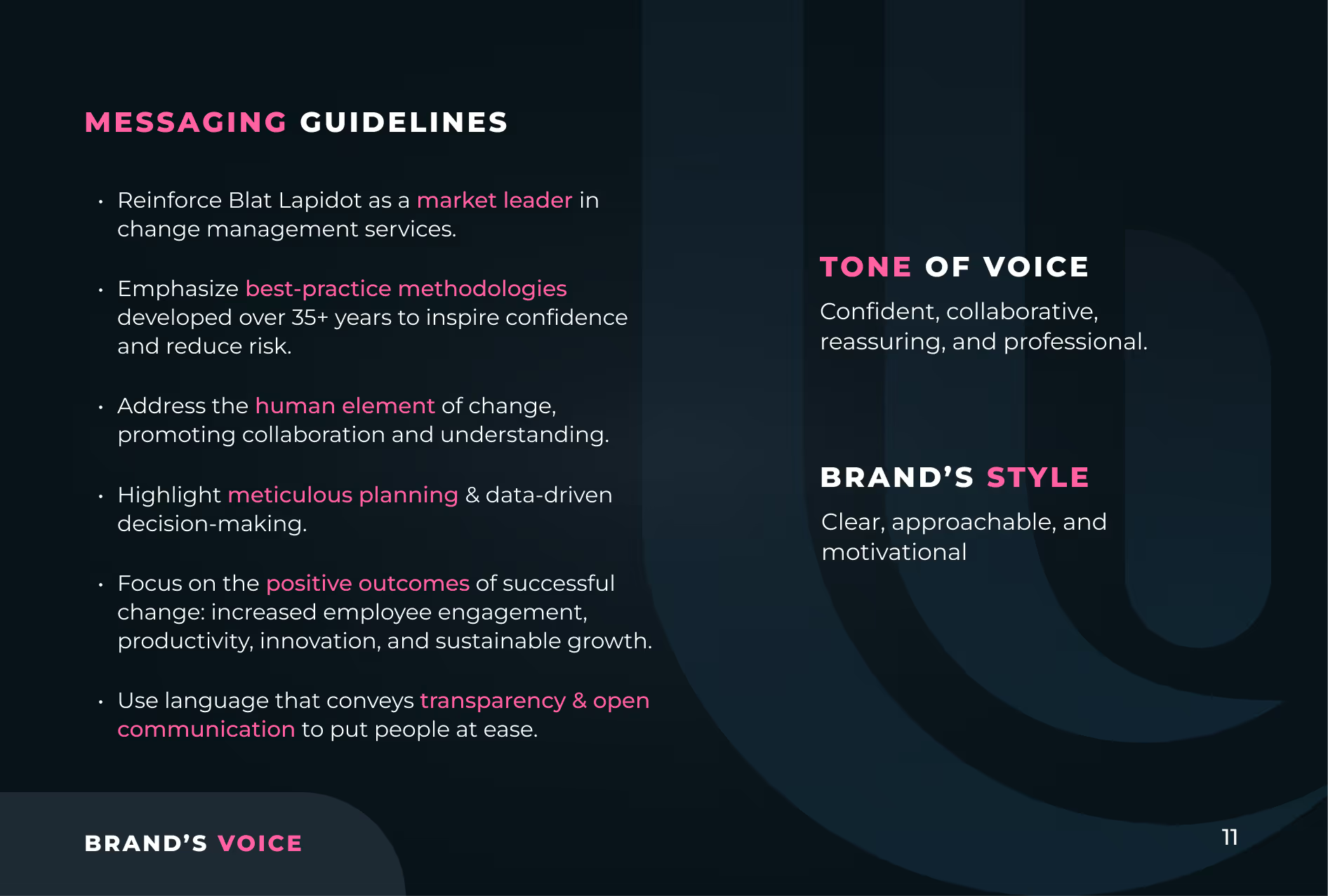
Messaging guidelines emphasizing Blat Lapidot as a market leader in change management, best-practice methodologies over 35+ years, human element promoting collaboration, meticulous planning, positive outcomes like employee engagement and sustainable growth, and transparency with open communication. Tone of voice described as confident, collaborative, reassuring, and professional. Brand's style is clear, approachable, and motivational. Text on dark background with white and pink font for emphasis.
Dark background with 'THANK YOU' in bold white letters and 'FOR WATCHING' in smaller pink letters below, accompanied by colored lines and the text 'STRATEGIC BRANDING & VISUAL IDENTITY' above the ID8 Creative logo.
04 / Sales deck
Sales Deck
Strategy & Design

A single animated line runs across every slide, moving the organization from fragmentation to alignment. The deck opens with a hard fact: 70% of digital transformation projects fail because of "soft" factors.

It then covers why change management matters, the solution approach, the Change Management Roadmap and the Triple Exposure Model, and closes with proof.

Dark background with text 'Bridging the gap between People, Places & Technology' in white and bold highlights, accompanied by a pink line art representing a bridge and the Blat Lapidot logo in the top right corner.
Text on dark background reading 'Achieving Success in Enterprise System Implementations' with a subtext 'A methodology that turns challenges into success with minimal business disruption' and the Blat Lapidot logo beneath, accompanied by three connected pink and gray gears on the right.
Slide with agenda listing three points: Who are we, What is change management, and How do we manage change, with Blat Lapidot logo in the top right corner.
Presentation slide titled 'Why is change management necessary?' showing six questions about change management: why not rely solely on technical training, what are the risks of skipping professional change management, isn't a good system enough for employees to adopt it, how to measure the success of the change management process, how to determine that the investment in change management is justified, and what do we actually do. The slide mentions these questions will be answered by showcasing experience.
Dark background slide titled 'The Key to a Successful Implementation' showing three sections: The Challenge states 70% of digital transformation projects fail due to 'soft' factors; The Solution highlights a proven change management model based on 35 years of experience and 450 successful projects; Why Us emphasizes being the only consulting firm in Israel specializing in OCM as a key enterprise system implementation component. Decorative neon lines form a key shape on the right side.
Graphic with text overlay on a background showing a bridge over water with vertical colored bars in blue, pink, dark blue, yellow, and purple. The text reads: 'Our Solution Approach. We Minimize Organizational and Human Risks To Ensure a Successful System Implementation.' Below is the logo and name 'BLAT LAPIDOT.'
Graphic with the heading 'Change Management Market Leader' showcasing three key points: first consulting firm in Israel specializing in change management; over 35 years of expertise leading complex organizational changes; and over 500 successful change management projects, alongside a stylized trophy outline on the right.
Presentation slide titled 'Proven Success' showing three examples of successful projects by Blat Lapidot: Large Construction Company with full SAP for 3,000 users, productivity restored in 3 weeks, 92% system adoption; Southern Manufacturing Company with safety system implementation, zero downtime, 40% training cost reduction; Established Public Company with ERP replacement, smooth transition, and 85% user satisfaction.
Blat Lapidot presentation title slide on change management
A businesswoman holding a glowing light on a staircase with digital icons of a chart, light bulb, and dollar sign floating nearby, alongside text explaining change management as a structured process for successful adoption of new systems with key points: integral role in project team, structured approach, collaboration with stakeholders, and tailored deliverables.
Graphic with the text 'What Is Change Management?' in pink and white on a dark background, with the Blat Lapidot logo.
Change management roadmap overview slide
Slide titled 'Triple Exposure Model' outlining three exposure stages: 1st Exposure includes understanding business rationale, creating motivation for change, building a positive reputation for change; 2nd Exposure includes familiarization with new processes, identifying opportunities and gaps, initial hands-on experience; 3rd Exposure includes preparation for scenarios and failure contingencies, familiarization with support channels, aligning expectations for go-live.
Grid of multiple company logos including Zoko, Nova, Camtek, ICL, Amiad Water Systems, Israeli government agencies, Kornit Digital, and others on a dark background with a pink outline and the text 'Blat Lapidot' at the bottom center.
Thank you message with text 'Thank You For Your Time' and the BLAT LAPIDOT logo on a dark background; contact details for Michal Blat Ben David, Co-owner & CEO, with email, website, and phone number on the right within layered pink and gray design elements.
05 / Client proof
Client Results
Packaged for Buyers

We turned past projects into proof C-suite buyers can scan: an SAP rollout for 3,000 users at a large construction company, with productivity restored in 3 weeks and 92% adoption; a safety system rollout at a southern manufacturer, with zero downtime and 40% lower training costs; and an ERP replacement at an established public company, with 85% user satisfaction. Outcomes as reported by Blat Lapidot.

06 / FAQs
Frequently asked  questions
What does a consulting firm rebrand include?

Brand purpose, values, concept, logo, color, typography, imagery and voice, documented in a brand book, plus a sales deck that puts the brand to work. For Blat Lapidot, Ideate Creative delivered all of it as one system.

How do you visualize a consulting methodology?

Pick one central metaphor and carry it through the logo, imagery and slides. For Blat Lapidot, a bridge connects people, processes and technology, which makes an invisible service visible.

What should a C-suite sales deck include?

A hard fact that frames the risk, a clear methodology and proof in numbers. Blat Lapidot's deck opens with the 70% failure rate of digital transformation projects and closes with client results.

When does a professional services firm need a rebrand?

When its expertise has outgrown its brand. Blat Lapidot had 35+ years of experience and a seven-year-old identity that no longer matched its standing.

Does Ideate Creative work with professional services firms?

Yes. Ideate Creative works with consulting and professional services firms, including Blat Lapidot Consulting and Kolomolo, on brand strategy, identity and sales collateral.