UX Design: Principles, Process, and Best Practices for 2026
A beginners guide to UX/UI Design
UI/UX
September 3, 2026
Have you ever used an app and felt confused about where to click next? That confusing moment is the result of poor UX design.
UX design is the process of creating products that are easy to use, helpful, and enjoyable for the people who use them. It looks at how someone feels and behaves while using a website, app, or product from start to finish. Good UX design puts the user's needs first, rather than relying on guesses or personal taste.
You will learn how UX designers turn research into real design choices. This includes organizing content, building prototypes, and testing ideas before they go live. By the end of this article, you will understand the full process behind creating products that people find simple and satisfying to use.
Good UX design rests on a few key ideas. These ideas guide how you build products that people can actually use and enjoy.
You need to start every design decision with the user in mind. This means you look at what people actually need, not what you assume they need.
Research helps you understand real behavior. You can use interviews, surveys, and usability tests to learn how people think and act.
Your job is to solve real problems for real users. Personal preferences or internal opinions should not drive design choices.
When you focus on the user, you make fewer costly mistakes. You also build products that fit into people's daily lives instead of forcing them to adapt.
This approach works best when you test early and often. You get feedback before spending time and money on features nobody wants.
Usability means your product is easy to use. Users should be able to complete tasks without confusion or extra effort.
You can measure usability through a few basic factors:
Accessibility means your product works for people with different abilities. This includes users with visual, hearing, motor, or cognitive challenges.
You should follow accessibility standards like WCAG when you design. This includes things like color contrast, keyboard navigation, and screen reader support.
When you combine usability and accessibility, you reach more people. You also avoid legal risks and improve your product's reputation.
Consistency means your design follows the same patterns throughout. Buttons, colors, and layouts should look and behave the same way across your product.
Good UX design starts before anyone opens a design tool. You need to understand who your users are and what problems they face before you sketch a single screen.
User interviews let you hear directly from the people who will use your product. You sit down with real users and ask about their habits, needs, and pain points.
Keep your questions open-ended. Instead of asking "Do you like this feature?" try "Walk me through how you handle this task."
Aim to interview five to eight users per group. This number often reveals repeat patterns without wasting time or budget.
A few tips for better interviews:
Interviews take more time than other methods. But they give you insight that numbers alone can't show.
Surveys help you collect data from a large group of users quickly. You can ask about preferences, frustrations, or how often people use certain features.
Keep surveys short. Most users will drop off after five minutes, so stick to questions that matter most.
Analytics tools show you what users actually do, not just what they say. Tools like Google Analytics or Hotjar track clicks, page views, and drop-off points.
Use both together. Surveys tell you what users think, and analytics show you what they actually do.
Personas turn your research into a simple profile of a typical user. Each persona includes a name, goals, frustrations, and behavior patterns based on real data.
You should avoid guessing details. Every trait in a persona should come from actual interviews or survey results.
Journey maps show the steps a user takes to complete a task. They highlight moments of frustration and points where users might give up.
A basic journey map includes:
Both tools help your team stay focused on real user needs. They also give everyone a shared reference point during design discussions.
Information architecture is how you organize and label content so people can find what they need. It covers three main parts: how you group content, how you build menus and links, and how you guide users through tasks.
You need a clear way to group and label your content. Most sites use one of a few common structures.
Pick a structure that matches how your users think about the content, not how your team is organized internally. A common mistake is grouping content by department names instead of user tasks. Test your labels with real users to make sure they make sense outside of your team's internal language.
Navigation is how users move through your product. It includes menus, buttons, search bars, and links.
Most digital products use a mix of these navigation types:
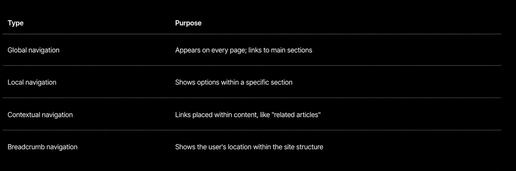
Your navigation should stay consistent across pages. If a menu item changes position or wording from page to page, users lose trust in the system. Keep menu labels short and specific. Avoid vague terms like "resources" when a more direct word, such as "guides" or "downloads," tells users exactly what they'll find.
A user flow maps the exact steps someone takes to complete a task, from the starting point to the goal. This might be signing up for an account, buying a product, or filling out a form.
Mapping user flows helps you spot extra steps or confusing choices before you build anything. Each step should have a clear next action. If a user has to guess what to do next, the flow needs revision.
Keep these points in mind when building a flow:
A shorter flow with fewer decisions usually leads to a better experience.
Interaction patterns are repeatable solutions to common design problems. They help you build interfaces that feel familiar, so users don't have to relearn basic tasks each time they open your product.
Every control you place on a screen needs to show what it does and what state it's in. A button should look clickable. A toggle should clearly show if it's on or off.
Feedback tells users their action worked. This can be a color change, a small animation, or a short message on screen.
Common controls include:
Without feedback, users may click a button twice or assume the app is frozen. A loading spinner or a brief "Saved" message removes that doubt. Keep feedback quick and simple, so it doesn't slow down the task.
Good design stops errors before they happen. You can do this with clear labels, input limits, and confirmation steps for risky actions like deleting a file.
Form fields should show format examples, such as "MM/DD/YYYY" for a date. This lowers the chance of a user typing something wrong.
When errors do happen, recovery matters just as much as prevention. Follow these steps:
Avoid vague messages like "Error occurred." Instead, say something like "Email address is missing the @ symbol." This gives users a clear next step instead of leaving them stuck.
Responsive behaviors control how an interface adjusts across screen sizes and devices. A layout that works on a desktop monitor often needs to change for a phone screen.
You should test how buttons, menus, and text resize or rearrange as the screen shrinks. Common responsive patterns include:
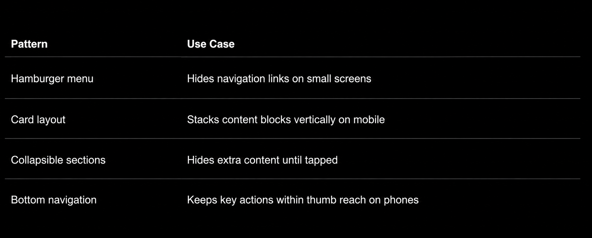
Touch targets need extra space on mobile, since fingers are less precise than a mouse pointer. Aim for buttons at least 44 pixels tall so users don't tap the wrong one. Testing across real devices, not just browser resizing, gives you a true sense of how the interface performs.
Good visual design helps users understand and trust your product. It relies on a few core building blocks: how you present text and color, how you arrange elements on a screen, and how you keep everything consistent across your product.
Your typography choices affect how easily people can read and scan your content. You should pick fonts that stay clear at different sizes, and limit yourself to two or three typefaces per project.
Font size, weight, and spacing all guide the reader's eye. Bigger, bolder text signals importance. Smaller text works for supporting details.
Color does more than make your interface look nice. It communicates meaning and affects how users feel.
Here's what you need to consider:
Layout determines where users look first, second, and third on a screen. You can guide attention using size, spacing, and placement.
Visual hierarchy means the most important elements stand out. A large headline draws attention before smaller body text. A bright button pulls focus before a plain link.
Grids help you keep elements aligned and evenly spaced. This makes your layout feel organized rather than random.
You should also pay attention to white space. Empty space around elements gives content room to breathe and helps users process information without feeling overwhelmed.
Common layout patterns include:
A design system is a set of rules and reusable components that keep your product consistent. It usually includes typography styles, color palettes, button styles, icons, and spacing rules.
Design systems save time because you're not rebuilding the same elements for every screen. They also make it easier for teams to work together, since everyone follows the same guidelines.
Most design systems include a component library, which stores reusable pieces like buttons, form fields, and navigation bars. Designers and developers pull from this library instead of creating new elements each time.
You should update your design system as your product grows. This keeps older and newer parts of your product looking and working the same way.
Prototypes let you test an idea before you spend time and money building it. This section covers how you turn concepts into testable models, how you check them with real users, and how you use feedback to make them better.
Wireframes are simple sketches of a screen or feature. They show layout and structure, but they don't include color, images, or final text.
You use wireframes early in the design process. They help you plan where buttons, menus, and content will go without getting distracted by visual details.
Mockups come next. They add visual design elements like color, fonts, and images to show what the product will actually look like.
Here's how they differ:
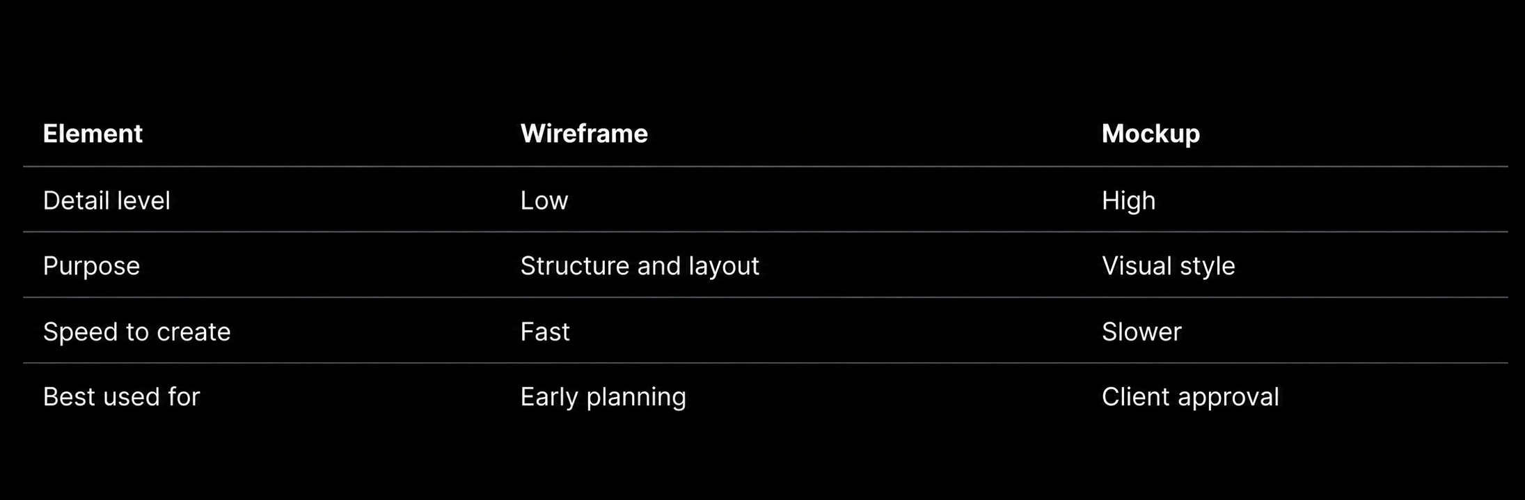
You should start with wireframes to lock down structure. Then move to mockups once you know the layout works.
Usability testing means watching real people use your design. You give them tasks and see if they can complete them without confusion.
This step matters because it shows you problems you might miss on your own. A button that seems clear to you might confuse someone else.
You can run usability tests at different stages. Testing a low-fidelity wireframe catches structural problems early. Testing a high-fidelity prototype catches issues with visual design or interaction details.
Common methods include:
You should test with a small group of five to eight users. This is usually enough to find most major usability issues.
Iterative refinement means you improve your design in small steps based on feedback. You test, learn, and adjust, then repeat the process.
This approach reduces risk. Instead of building a full product and hoping it works, you catch problems early when they're cheap to fix.
Each round of testing should focus on specific questions. For example, you might test whether users understand a new navigation menu, then in the next round test whether they can complete a checkout process.
You should track what changes between each version. This helps you see which adjustments actually improved the user experience and which ones didn't make a difference.
Over time, this cycle leads to a design that's been shaped by real user behavior, not just assumptions.
Good UX design does not happen alone. You need to work closely with other teams, hand off files the right way, and check if your designs actually work once they launch.
You will spend a lot of your time working with product managers and engineers, not just other designers.
Product managers help you understand what the business needs and what users need. You will often join them in planning meetings to talk about what features matter most.
Engineers tell you what is possible to build. Talk to them early, before you finish your designs. This helps you avoid designing something that takes too long to code or cannot be built at all.
You should also set clear roles. Here is a simple way to think about it:
When everyone knows their role, projects move faster and there is less confusion.
Handoff is when you give your finished designs to engineers so they can build them.
Use tools like Figma or Zeplin to share your files. These tools let engineers click on any part of the design to see exact sizes, colors, and fonts.
You should also write clear notes next to your designs. Explain what happens when a user clicks a button or what an error message should say.
Do not just send files and walk away. Stay involved during the build process. Answer questions quickly and check the product as it gets built. This helps you catch problems early, before the product goes live.
A good handoff checklist includes:
After launch, you need to check if your design actually worked.
Look at data like how many users complete a task, how long it takes them, and where they drop off. Tools like Google Analytics or Hotjar can show you this information.
You should also run follow-up user tests. Ask real users if the new design is easier to use than before. Their answers often reveal problems that data alone cannot show.
Compare your results to your original goals. If you wanted to reduce signup time by 20%, check if that happened. If it did not, figure out why and make changes.
This step closes the loop. It turns your design work into proof that you solved a real problem.
You may still have questions about what UX design involves, how it differs from other fields, and how you can get started. Below are answers to the questions people ask most often.
As a UX designer, you study how people use products and find ways to make that experience better. You research user needs, test ideas, and create wireframes or prototypes.
You also work closely with other teams. This includes product managers, developers, and visual designers, so the final product works well and feels easy to use.
UX design focuses on how a product works and how it feels to use. UI design focuses on how a product looks, including colors, buttons, and layout.
You can think of UX as the structure and UI as the surface. Both work together, but they solve different problems.
Most UX designers use tools like Figma, Sketch, or Adobe XD to build wireframes and prototypes. These programs let you test how a design works before it's built.
You may also use tools like Maze or UserTesting to gather feedback from real users. Some teams rely on Miro or FigJam for brainstorming and mapping out ideas.
_ _ _ _ _
View examples of our work.
Good UX doesn't happen by accident, and if yours still feels like guesswork, Ideate brings 12+ years of designing interfaces for B2B tech and SaaS companies that get out of the user's way, contact us to fix yours.