Minimalism vs. Maximalism Web Design: Which Converts Better?
Strip it back or layer it up? In B2B tech, the right choice depends on buyer intent, not taste.
UI/UX
October 15, 2026

Neither minimalism nor maximalism wins by default. In B2B tech web design, the style that converts better is the one matched to buyer intent and the specific action a page needs to drive, whether that's a demo request, a free trial sign-up, or a gated report download. The minimalist vs maximalist web design debate only matters once you know what the page is asking a visitor to do.
Treat minimalism and maximalism as web design tools tied to a goal, not competing aesthetics picked on taste. A cybersecurity vendor's demo landing page and a cloud provider's homepage can both convert well with opposite visual strategies, because each solves a different cognitive problem for a different visitor at a different point in the funnel.
Minimalist web design strips a page down to the elements necessary for comprehension and action, relying on white space, restrained color palettes, and clear typography. Maximalist web design layers in pattern, color, imagery, motion, and typographic variety to create density, texture, and a distinct visual personality. Both are legitimate approaches; the difference is how each manages a visitor's attention.
Minimalist design reduces a page to its functional core. Generous white space, a tight color palette (often one or two brand colors plus neutrals), and a single clear typographic hierarchy define the look.
The goal is to remove friction between the visitor and the one action the page needs them to take, whether that's requesting a demo or downloading a spec sheet.
Maximalist design embraces layering: multiple colors, textures, illustration, motion, and varied type treatments working together. On a website, a maximalist aesthetic communicates energy, range, or technical depth, and it often shows up on homepages, product launch pages, and campaign microsites where a brand needs to stand out in a crowded category rather than drive a single click.
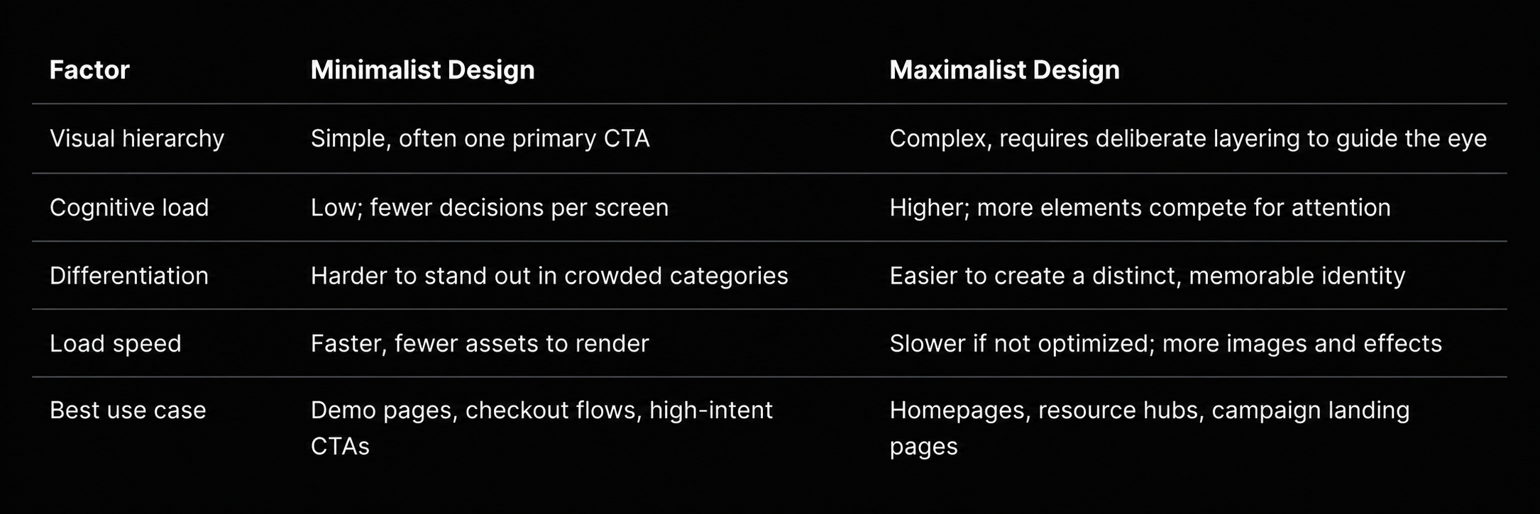
Neither style has an inherent conversion advantage; what changes outcomes is whether the design matches the cognitive effort a visitor is willing to spend at that stage of their decision. A visitor ready to book a demo rewards simplicity. A visitor still evaluating three vendors may need more information, proof, and visual context before acting.
Visual complexity shapes first impressions within milliseconds, and that early reaction colors everything that follows. Research from Google and the University of Basel found that users form judgments about a website's visual appeal in as little as 50 milliseconds, well before they've read any content, based largely on layout and color choices. That finding doesn't crown simplicity the winner outright; it confirms that whatever visual approach a brand picks gets evaluated almost instantly, which raises the stakes for intentional design rather than default templates.
Usability research adds nuance here. The Nielsen Norman Group has documented that users scan pages in predictable patterns and abandon content that creates unnecessary cognitive load, which argues for stronger hierarchy regardless of density. Hick's Law, a well-established principle in interaction design, holds that the time it takes someone to make a decision increases with the number and complexity of choices presented, which is one reason high-intent pages with a single clear CTA tend to reduce hesitation. The Baymard Institute's usability research similarly emphasizes that clarity of navigation and findability affects task completion more than decorative density on its own.
A visitor's position in the buying journey determines how much visual density they'll tolerate before it becomes friction. Someone arriving from a bottom-funnel ad, ready to start a trial, benefits from a minimalist layout with one obvious next step. Someone researching a category for the first time, comparing a cybersecurity platform against two competitors, may stay longer on a page that uses richer visuals, data points, and proof elements to build confidence.
The mistake is applying one template to every page type without asking what action that specific page needs to drive.
Minimalist web design tends to serve pages built around a single, high-stakes action, while maximalist aesthetics tend to serve pages built around education, differentiation, or storytelling. The right choice shifts by page type, not by a company-wide design trend.
A SaaS product page asking a visitor to book a demo benefits from a minimalist structure: a clear headline, one value proposition, social proof, and a single CTA above the fold. A cloud infrastructure vendor running a free-trial campaign gains more from removing distractions than from showcasing every feature on one screen.
Homepages carry more narrative weight and can support a maximalist aesthetic when a brand needs to demonstrate range, such as a multi-cloud partner serving several industries. A cybersecurity platform with a broad product suite might use bolder color blocking and layered sections to represent the breadth of its offering, provided navigation and hierarchy stay clear.
Pricing and comparison pages reward restraint. Buyers comparing a FinOps platform against two competitors need scannable tiers, clear feature tables, and an obvious next step, not decorative layers competing with the numbers. A single bold visual moment, such as a highlighted recommended plan, does more work here than a busy layout.
Resource hubs and blog pages can carry more visual texture, since visitors arrive to explore rather than convert immediately. Custom illustrations, data visualizations, and distinct content-type cards help an IT consulting firm or blockchain company make technical material feel approachable, as long as search, filters, and the newsletter or gated-content CTA stay easy to find.
Campaign microsites and event registration pages for a cloud or cybersecurity brand often lean maximalist in the hero to match ads and booth creative and to stand out in a noisy launch week. Below the fold, the registration form or primary CTA should return to minimalist clarity so the visual energy never gets in the way of sign-ups.
The most effective approach for B2B tech brands combines minimalist structure with maximalist moments reserved for differentiation. Clean grids, generous spacing, and a single hierarchy keep a page usable, while a bold hero visual, a striking data chart, or expressive typography gives the brand a distinct personality where it counts.
In practice, this looks like a layered system rather than an either/or choice:
This warm minimalism approach, structured simplicity with intentional bursts of richness, is how Ideate, as an agency working across SaaS, cybersecurity, and cloud brands, typically approaches identity systems: a disciplined core (explored further in strategic branding and visual identity work) paired with moments designed to differentiate rather than decorate. The same logic applies to web projects, where structure and UX/UI, web and mobile app design and development decisions need to support both clarity and brand distinction at once. Good web design treats visual richness as a deliberate choice tied to a specific goal, not a default setting.
Testing web design style means isolating one variable, such as hero density, color treatment, or CTA placement, and measuring its effect on a defined action rather than redesigning an entire page at once. High-intent pages, like demo request or trial sign-up pages, are the best candidates because they have a single measurable goal and enough traffic to reach meaningful results.
Start with the highest-traffic, highest-intent page in a funnel rather than a homepage with many competing goals. Change one element (background density, number of visual elements above the fold, or CTA styling) and hold everything else constant. Running tests on pages tied to UX design decisions, rather than purely cosmetic pages, tends to produce the clearest signal because the action being measured is unambiguous.
Document results per test rather than assuming one winning layout applies across every page type in the funnel.
Minimalist and maximalist web design each convert well when matched to the right stage of the buyer journey and the right action a page needs to drive. Demo, trial, and pricing pages reward minimalist clarity, while homepages, resource hubs, and campaign pages can support more visual density when structure and CTA contrast stay intact. The direction worth choosing is the one tied to a measurable outcome, not a design trend.
At Ideate Creative, we're a B2B creative agency designing websites for tech companies in cybersecurity, IT consulting, cloud services, FinOps, and cryptocurrency and blockchain. Each of these categories sells complex, often invisible products to skeptical, technical buyers, which is exactly why the minimalist vs maximalist decision should be made page by page and measured against a clear goal, not borrowed from the latest design trend.
Minimalist pages tend to load faster because they use fewer images, scripts, and visual effects, which also supports stronger Core Web Vitals scores. Maximalist pages can match that speed with proper image optimization and lazy loading, but it takes more deliberate engineering work to get there.
Maximalist design carries more risk of visual clutter if hierarchy and CTA contrast aren't planned carefully. It is not inherently riskier than minimalism; both styles fail when they ignore the visitor's intent and the action the page needs to drive.
Yes, most B2B tech brands benefit from using minimalist structure on high-intent pages like demo requests and maximalist moments on homepages, resource hubs, or campaign landing pages. Consistency comes from a shared visual system, not from using one density level everywhere.
Hick's Law states that decision time increases as the number of choices or amount of visual complexity grows. It's one reason high-intent pages with a single clear CTA tend to reduce hesitation, while pages built for exploration can tolerate more options.
There's no fixed percentage, but a usable minimalist page typically gives the primary CTA and headline enough isolation that they're the first thing a visitor's eye lands on. If competing elements sit close enough to pull attention away from the CTA, the page needs more breathing room.
Contact us to start a conversation, or review our web design page.