
Infographics in B2B Marketing Collateral: When, Where and What to Use
Making complex B2B ideas easy to grasp.
Collateral
October 5, 2026

Most B2B marketing teams reach for an infographic because content calendars demand one, not because a buyer actually needs one. That habit produces a lot of polished graphics that get a few likes and change nothing about a deal in motion.
Infographics earn their place in marketing collateral when they do a job that paragraphs can't: showing structure, sequence, or comparison at a glance. Used well, they shorten the distance between a complex idea and a buyer's understanding of it. Used as decoration, they just add another asset to a b2b marketing library that nobody reuses.
This piece treats infographics as a tool with specific jobs, not a default format. We'll walk through when a buyer moment actually calls for one, where they belong across the funnel, which type fits which problem, and what makes an infographic hard for sales teams to actually use.
An infographic helps a b2b buyer when it replaces a paragraph of explanation with a picture that's faster to scan and easier to remember. The format earns its keep in specific situations tied to how complex the idea is, how the buyer is evaluating it, and whether the claim is backed by real data. Outside those situations, an infographic is just a graphic.
Infographics work best on ideas that are complicated but orderly: a deployment process, a system architecture, a multi-stage workflow. The complexity comes from the number of steps or components, not from ambiguity. If you can draw the idea as boxes and arrows without losing accuracy, it's a strong candidate.
Sales enablement teams lean on this format for exactly this reason: it turns a dense technical explanation into something a prospect can follow without a guided walkthrough.
B2B buyers evaluating vendors, plans, or architectures often want the differences laid out side by side, not buried in narrative copy. A comparison infographic gives your audience 3 or 4 criteria and lets them see the gap instantly. This works particularly well when a buying committee is skimming between calls.
If research turns up a genuine finding (a shift in buyer behavior, a cost gap, an adoption curve) an infographic can carry that single insight further than the original report. It also solves an internal problem: a champion inside the buying organization often has to explain your solution to colleagues who never sat in on the sales call. A one-page visual summary gives that person something they can forward.
Skip the format for emotionally driven messaging, for ideas simple enough to state in a sentence, and for data too thin to support a visual claim. A single statistic doesn't need a chart with icons around it. Forcing structure onto content that doesn't have any just adds design time without adding clarity.
Infographics belong at the point in the marketing funnel where a buyer needs to grasp something fast, not necessarily where a marketing calendar has a gap. Each stage of the buyer’s journey calls for a different weight and format: light and scannable for brand awareness, more detailed for consideration, narrowly tactical for decision-stage sales enablement, and relationship-sustaining after the sale closes.
At the top of the funnel, infographics need to work in a scroll. Social media posts, blog posts, and online ads benefit from a visual that states one clear idea (a trend, a pain point, a surprising workflow inefficiency) without requiring the viewer to click through first. The goal here is recognition and a reason to keep reading, not a full argument.
Once a prospect is actively comparing solutions, infographics do heavier lifting inside brochures, solution briefs, white papers, and webinars. A buyer researching options wants to see how a platform fits into their stack or how a process compares to their current one. This is also where brochures tend to do double duty for both digital distribution and in-person conversations, and where white papers either generate real pipeline or get ignored entirely depending on whether the visual summary inside them actually lands.
In the decision stage, infographics need to answer a narrow question fast: why this vendor, what's the return, how do we compare to the alternative being considered. Sales decks, proposals, ROI one-pagers, and competitive battlecards all benefit from a tight visual that a rep can point to mid-conversation. The stakes here are real: a poorly structured pitch deck has cost a startup an actual funding round, which is a reminder that decision-stage visuals carry more weight than their file size suggests. A post-meeting brochure sent right after a call is often the last visual touchpoint before a warm lead goes cold, and a clear infographic inside it can reinforce exactly what was discussed.
After the contract is signed, infographics support retention and expansion. Onboarding guides benefit from a simple process visual showing what happens in the first 30, 60, and 90 days. QBR decks use infographics to show usage trends or ROI delivered. Case studies gain credibility when results are shown visually alongside the narrative, something worth weighing carefully given how case studies function differently in B2B tech than in other industries.
The right infographic type depends on the shape of the information, not personal preference. A process needs a timeline. A trade-off needs a comparison grid. Picking the wrong structure for the content is the fastest way to end up with a confusing b2b infographic no matter how clean the graphic design is.
This type works when a prospect needs to see a sequence: implementation steps, a sales process, a product roadmap. A b2b saas marketing example: a step-by-step visual showing what happens from signed contract to live deployment, with time estimates attached to each stage.
Comparison infographics lay two or three options against a shared set of criteria. In saas marketing collateral, this often takes the shape of a "us vs. legacy approach" grid, or a plan-tier comparison that a prospect can screenshot and send to a colleague.
This type visualizes how a product fits into an existing tech stack: integrations, data flow, security boundaries. It works well for platforms selling into technical buyers who need to see where the product sits before they'll take a sales call seriously.
Statistical infographics pull from reports or research reports and distill one finding into a chart or figure that supports a single argument. The discipline here is restraint: one dataset, one takeaway, not a dashboard of every number in the report.
ROI infographics turn an ROI calculatoroutput or a results summary into something a buyer can hold up in an internal budget conversation. This is sales collateral built to answer one question: what do we get back for what we spend.
This type organizes a framework, like a maturity model, a priority stack, or a buying-committee role map, into a visual order. It works when the underlying idea is structural rather than sequential or comparative.
Matching infographic type to funnel stage and asset keeps the whole library focused on buyer questions instead of design trends. This table maps the types covered above to where they perform best among common marketing collateral examples.
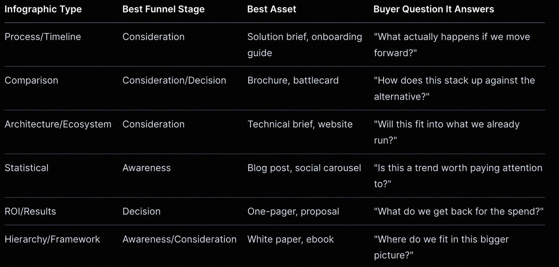
Used this way, a b2b infographic stops being a generic marketing deliverable and starts functioning as a specific answer to a specific moment in the buying journey.
An infographic becomes hard to use when it tries to do too much, looks inconsistent with the rest of the brand, or can't be edited by the team that needs it most. These problems show up after the design is approved, usually when a sales rep tries to drop the graphic into a deck and it doesn't fit, or a prospect squints at a chart trying to find the point.
The instinct to include everything, every feature, every stat, every logo, defeats the format. An infographic that tries to say ten things ends up saying none clearly. One argument per graphic is the discipline that makes the format work.
Icons and illustrations don't substitute for data. If a claim needs proof, the infographic needs a real number attached to it, not a graphic that implies credibility without earning it. Decoration without evidence reads as marketing fluff to a skeptical b2b buyer.
Infographics built by different designers, freelancers, or tools over time tend to drift from brand colors, fonts, and logo usage. That inconsistency undercuts the credibility an infographic is supposed to build. Design teams that maintain a shared template library avoid this drift entirely.
A beautiful infographic locked in a flattened PDF or a design file sales can't open becomes shelfware. Sales enablement needs editable source files, or at minimum, modular pieces that can be dropped into a deck or email without a design request. A practical creative audit covering exactly this kind of asset-usability problem is worth running before you commission new infographics.
Infographics work when they solve a specific buyer problem at a specific moment, not when they fill a content calendar slot. The strongest ones show structure, sequence, or comparison that would take a full paragraph to explain otherwise, and they carry real data instead of decoration.
Treating infographics as part of a marketing strategy, mapped to funnel stage and buyer question, turns a scattered pile of graphics into marketing collateral that sales teams actually reach for. The teams that get this right review their existing library regularly, retire what isn't being used, and keep source files editable so nothing becomes shelfware six months after launch.
Contact us (https://ideate-it.com/contact-usontact us to start a conversation, or review our Marketing & Sales Collateral page to see how we approach this work for technology and B2B brands.
A strong B2B infographic has one clear argument, a visual structure that matches the content (timeline, comparison, hierarchy), and real data or specifics backing any claim it makes. It also needs to follow brand guidelines for colors, fonts, and logo placement so it reads as credible rather than generic.
Process/timeline and architecture/ecosystem infographics tend to perform best in b2b saas marketing because SaaS buyers are evaluating implementation complexity and integration fit. ROI infographics also carry weight at the decision stage, when a buyer needs a tangible number to bring into an internal budget conversation.
A common example is a one-page ROI visual inside a proposal, showing projected savings or efficiency gains over a defined period. Comparison infographics inside competitive battlecards are another frequent use, giving reps a fast visual to reference mid-conversation.
Both approaches work, depending on the buyer moment. A standalone infographic suits social media posts, blog posts, and quick-share use cases, while an embedded infographic inside a white paper, brochure, or deck works better when the visual needs the surrounding argument for context.
Track whether sales reps actually pull the asset into live conversations, whether it gets shared or forwarded inside a buying committee, and whether it correlates with movement in conversion rates at the funnel stage where it lives. An infographic nobody reuses after the first month is a signal to retire or rework it.