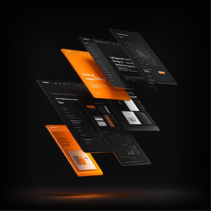
Floating 3D layered design mockups of multiple dark-themed app or website screens with orange highlights, showcasing stylized text and interface elements on a black background.
Strategy Branding& Visual Identity

Strategy shapes perception. Design makes it visible.

Your brand identity is often the first thing people judge. We create strategic visual systems that communicate credibility, clarity, and confidence before a single conversation begins.

Services include:
Brand Identity Design
Logo Design
Brand Strategy
Brand Guidelines
Rebranding
Brand Messaging
Icon & Illustration Design

CyboNetVisual Identity
Logo with stylized white text reading 'CYBONET' on a black background.

CyboNet Mail Secure is a SaaS cybersecurity stops the majority of malicious email threats at your network's perimeter while simultaneously providing a range of additional options for comprehensive security and messaging control.

Purple background with the word CYBONET written vertically on the left and four rounded square shapes arranged symmetrically in the center with the words BRAND STYLE GUIDE at the bottom right.
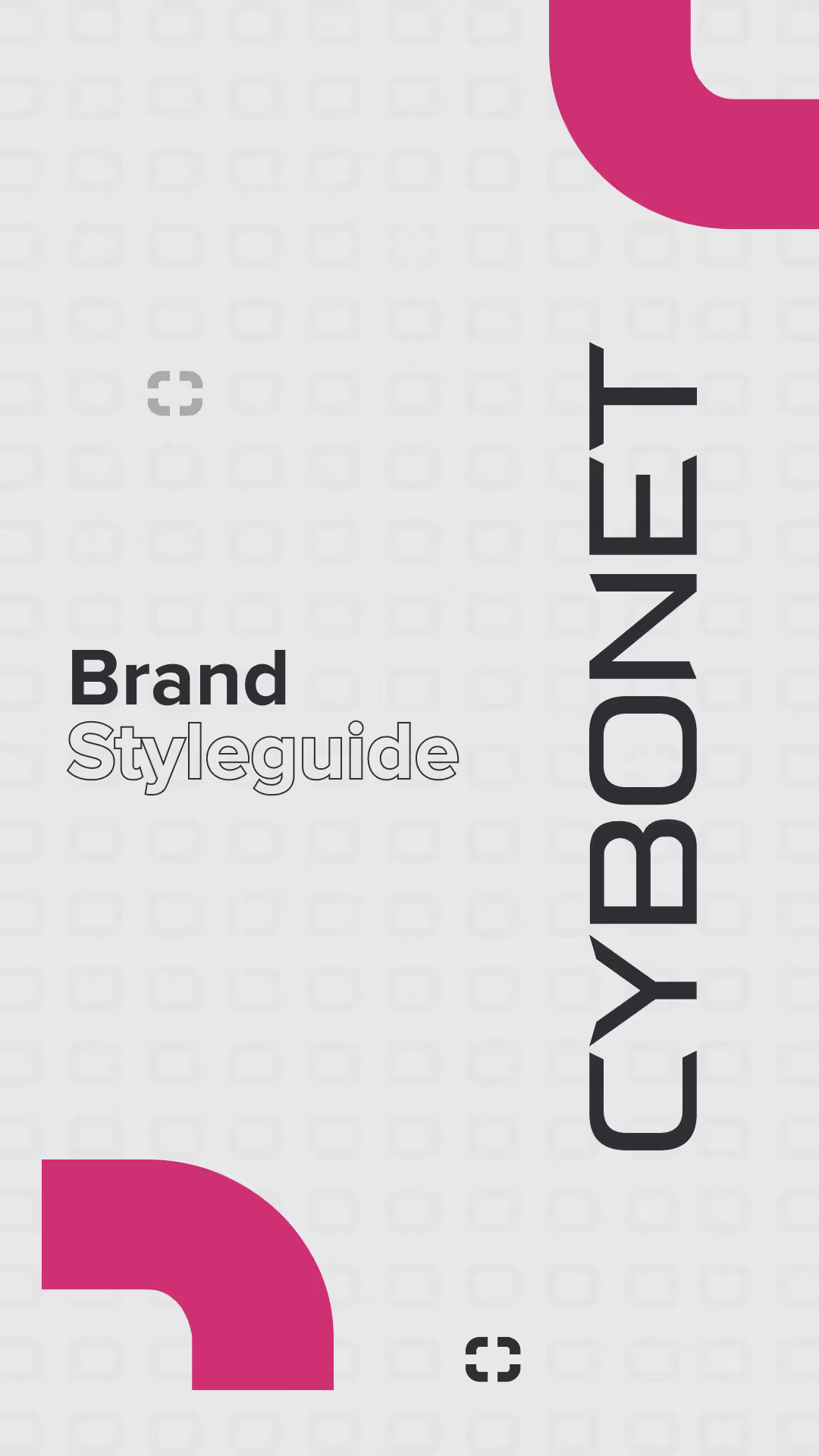
Cover page of a brand style guide with the word CYBONET written vertically and 'Brand Styleguide' in black and outlined text, with pink corner accents on a light gray background.
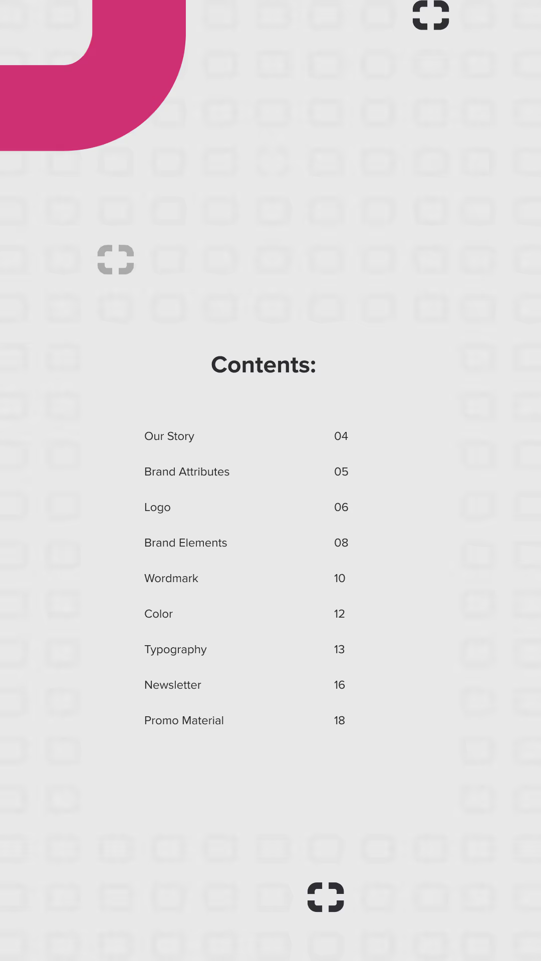
Table of contents page listing sections with page numbers: Our Story 04, Brand Attributes 05, Logo 06, Brand Elements 08, Wordmark 10, Color 12, Typography 13, Newsletter 16, Promo Material 18, on a light background with decorative pink and black shapes.
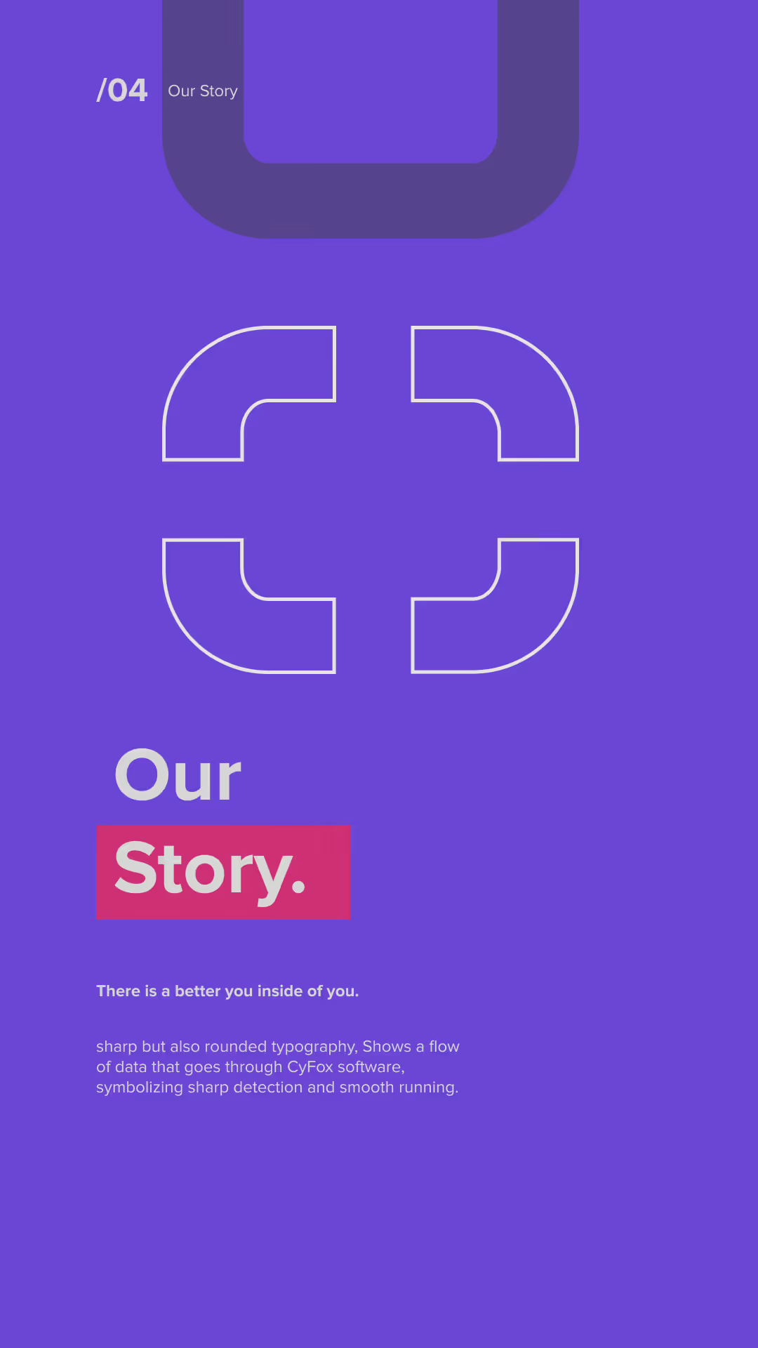
Purple background with a white stylized cross symbol in the center. Text reads "Our Story" with 'Story' highlighted in a red rectangle. Smaller text says "There is a better you inside of you." followed by a description about sharp and rounded typography symbolizing data flow through CyFox software for sharp detection and smooth running.
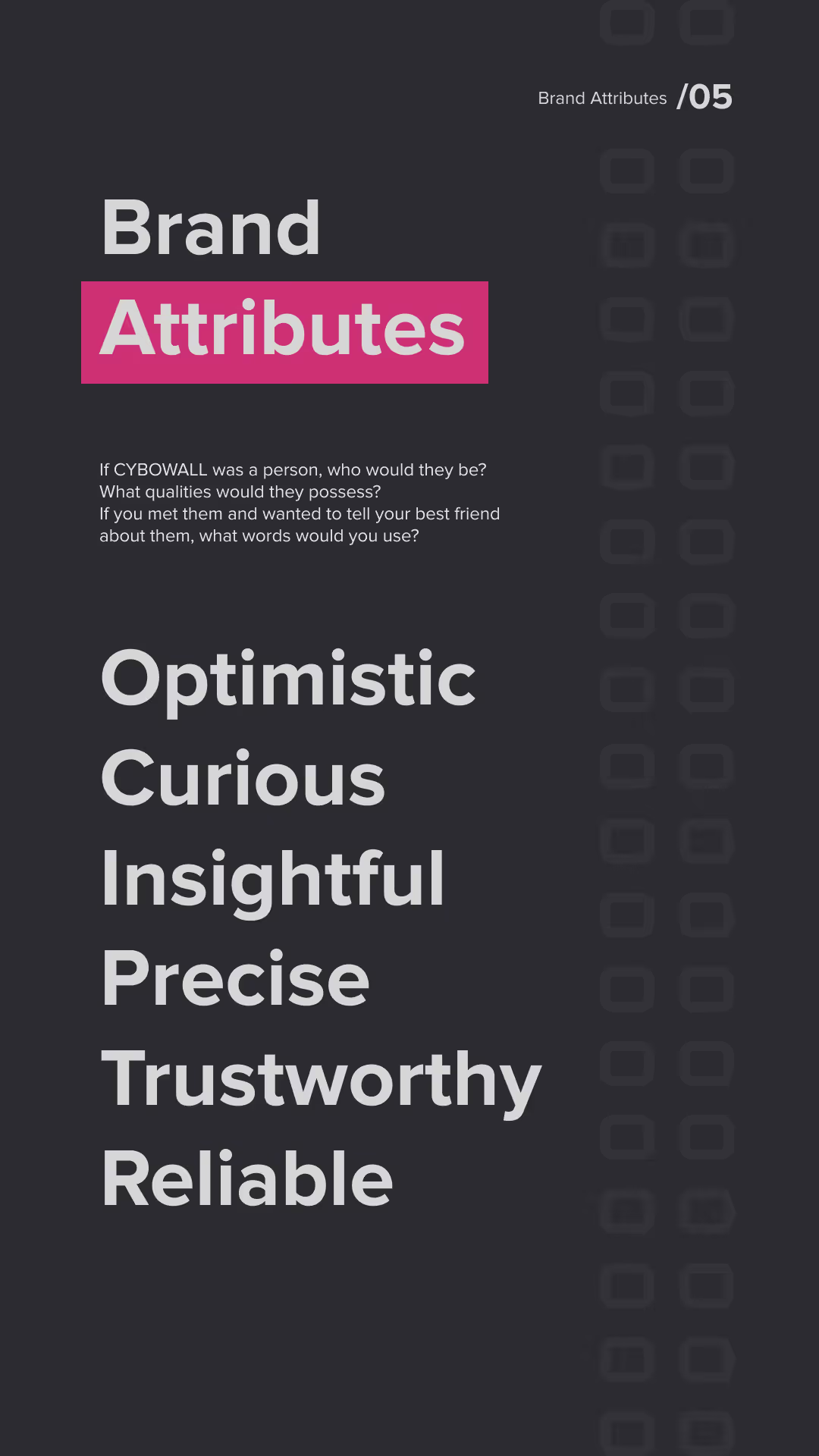
Text on dark background titled 'Brand Attributes' with a pink highlight on 'Attributes' and the number 05 in the top right. Below, a prompt asks what qualities CYBOWALL would have if it were a person. The listed attributes are: Optimistic, Curious, Insightful, Precise, Trustworthy, and Reliable.
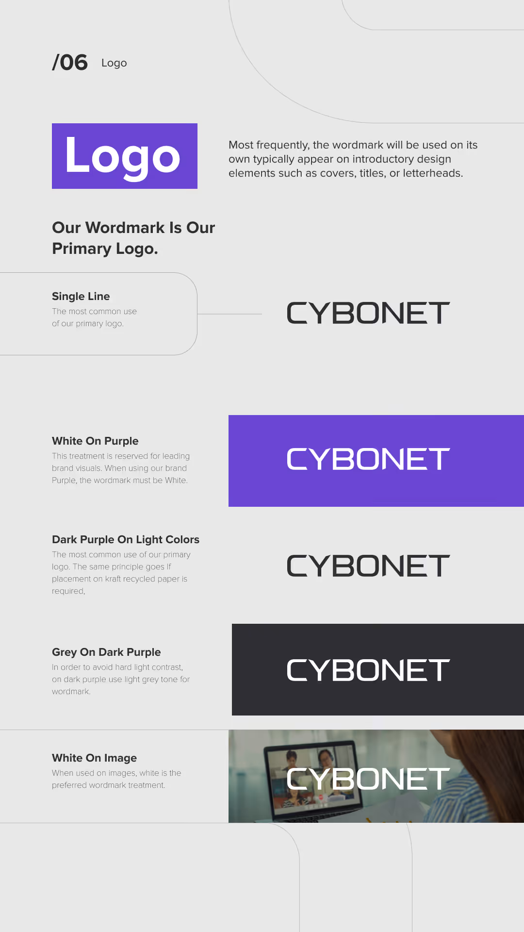
Brand guidelines for the CYBONET logo showing the wordmark usage as the primary logo in single line. Examples include CYBONET in black on light backgrounds, white on purple background, black on light colors, white on dark purple, and white on an image background with a person using a laptop.
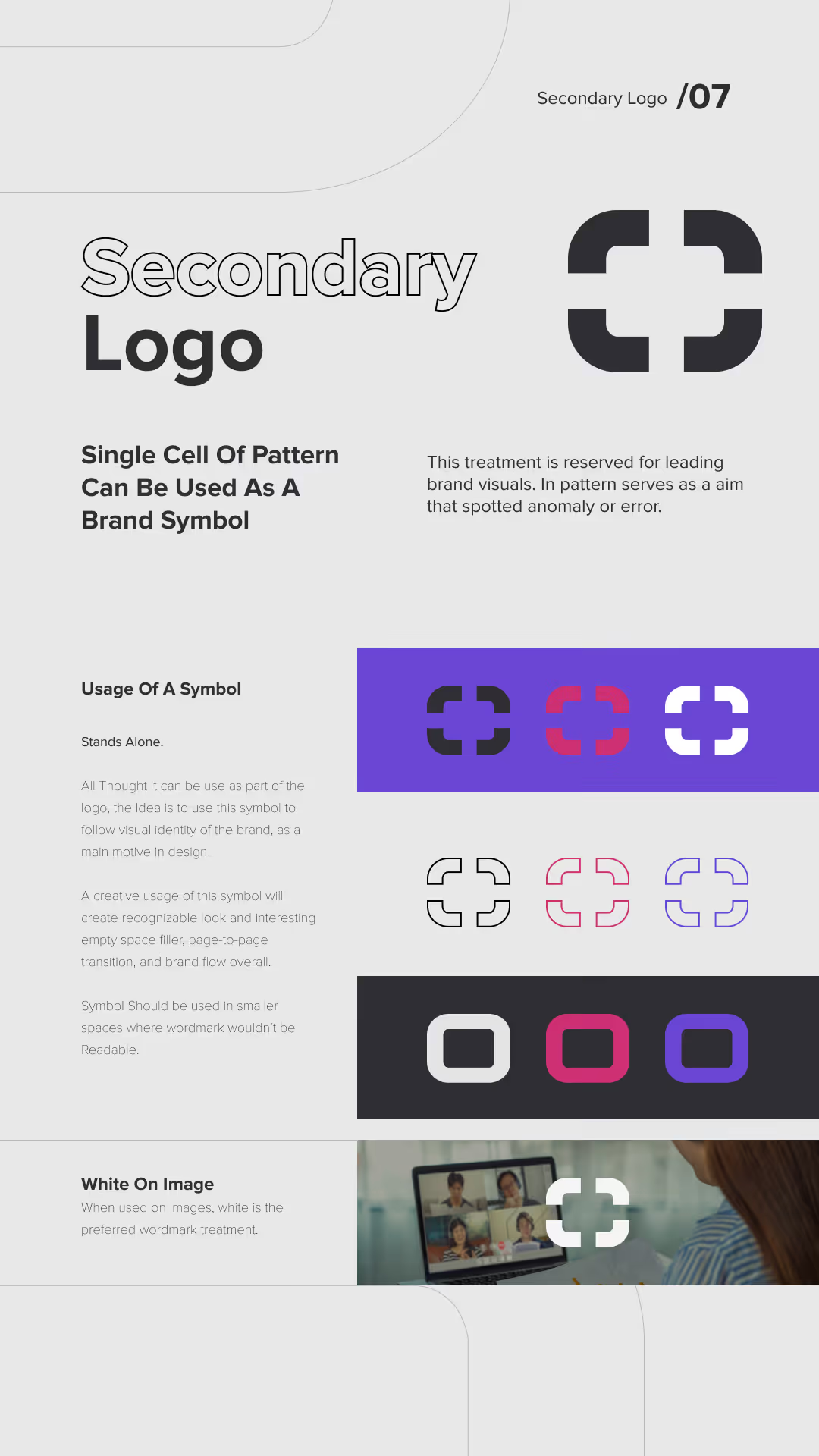
Design guide for a secondary logo featuring a single cell pattern as a brand symbol, showing a black and white stylized square symbol with rounded corners and a cross shape in the center. Includes explanations about usage: it stands alone, can represent visual identity, fits smaller spaces, and is preferred in white on images. Displays the symbol in black, red, white, and purple variations on colored backgrounds, outlines in different colors, and inset rounded square versions. Also shows the white symbol overlay on a video call image.
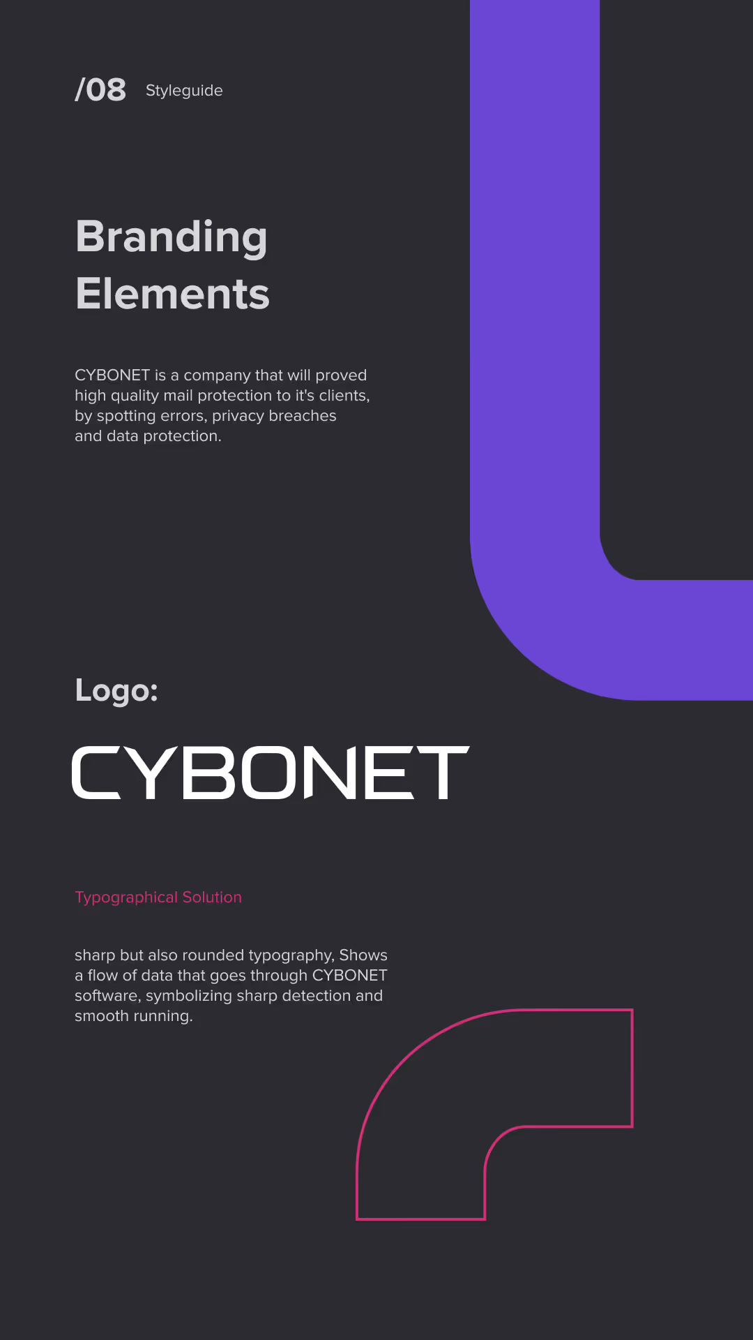
Page from a style guide titled 'Branding Elements' describing CYBONET, a company focused on high-quality mail protection and data security, featuring the CYBONET logo in sharp but rounded typography to symbolize data flow and smooth running.
Brand Visual Identity page with a modern, clean, geometrical style. It features a large purple L-shaped graphic connected by pink corner brackets, symbolizing connected logos resembling letter O. Below, a pattern of dark squares highlights one purple and one pink bracketed square, representing servers, computers, and data. Text explains the pattern symbolizes a target or aim and an error spotted by CYBONET Protection Software.
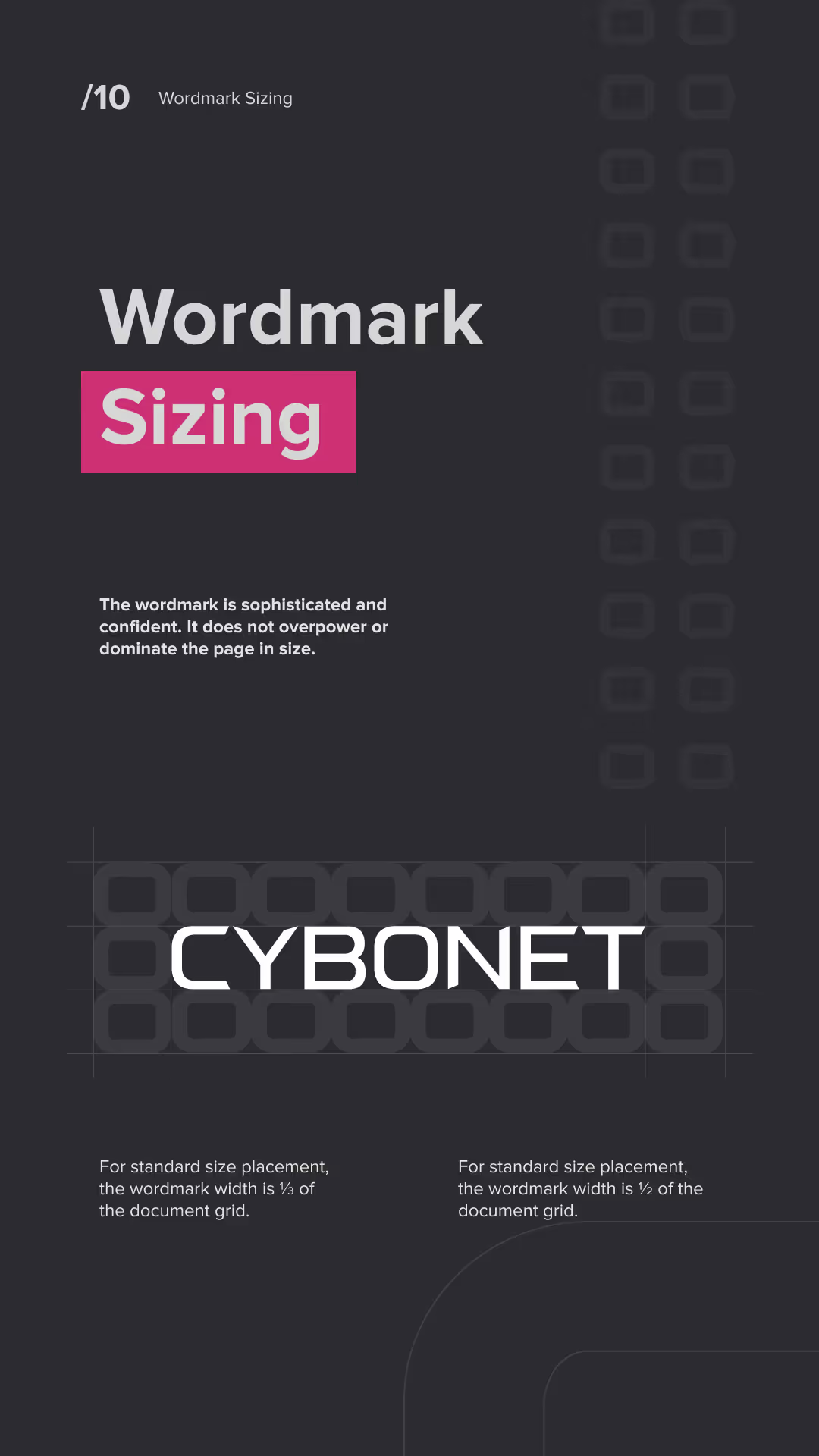
Dark background with text about wordmark sizing, highlighting that the wordmark is sophisticated and confident and should not overpower the page. Example wordmark 'CYBONET' is shown centered above a grid with instructions that standard size placement uses a wordmark width of one-third to one-half of the document grid.
Graphic showing a color palette with four colors: darkest shade black 2F2E34, main brand color purple 704ADA, lightest shade light gray D6D6D6, and intense pink CD3073 used only for aim symbol; text says the palette is modern, techy, inviting, with guiding purple as dominant tone and intense pink as a pop-up color.
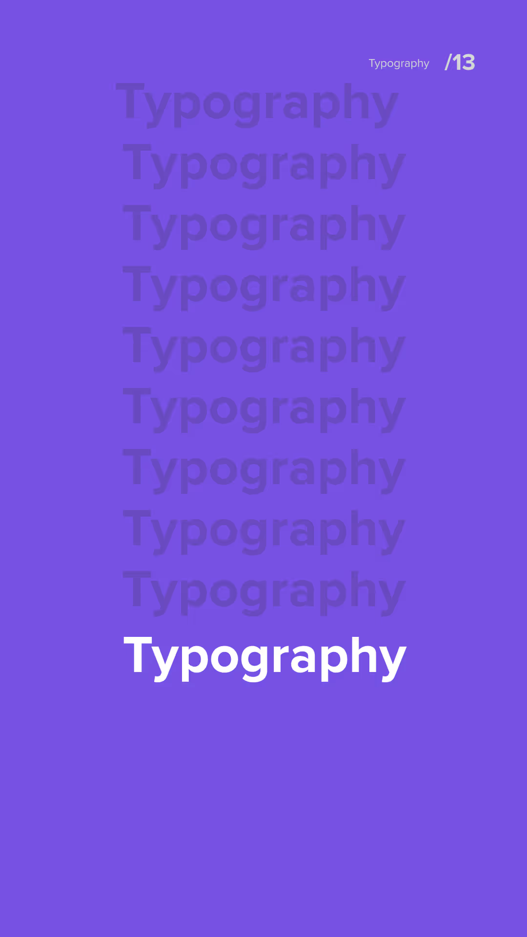
Purple background with the word 'Typography' repeated nine times vertically in descending opacity, with the bottom word in bold white text; small text in the top right corner reads 'Typography /13'.
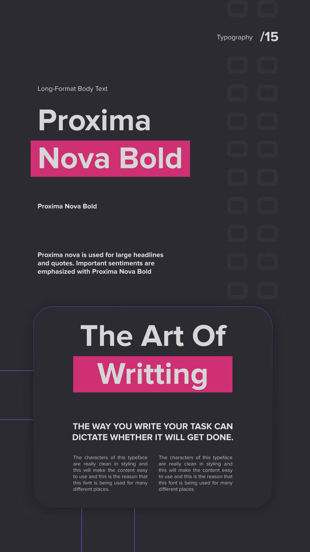
Typography layout showing the font Proxima Nova Bold used for long-format body text and headlines; text emphasizes its use for large headlines, quotes, and important sentiments. The phrase 'The Art Of Writing' is highlighted, followed by a statement about how writing style affects task completion, with sample text blocks illustrating clean styling and readability.
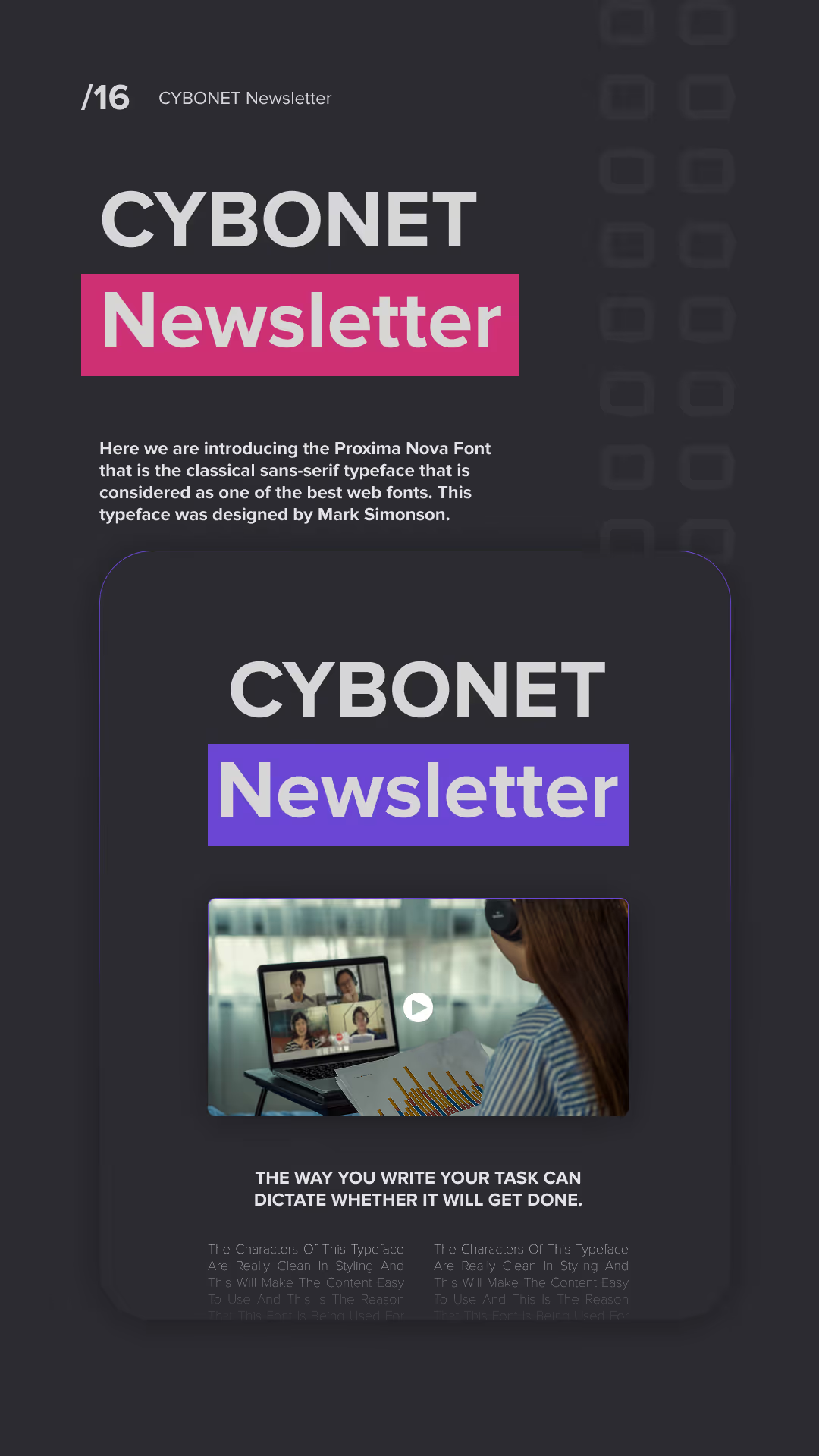
Dark-themed graphic showcasing the CYBONET Newsletter with 'Newsletter' highlighted in pink and purple boxes, introducing the Proxima Nova font as a classical sans-serif typeface. Below is a smaller card with a woman video conferencing on a laptop and text emphasizing how writing style dictates task completion.
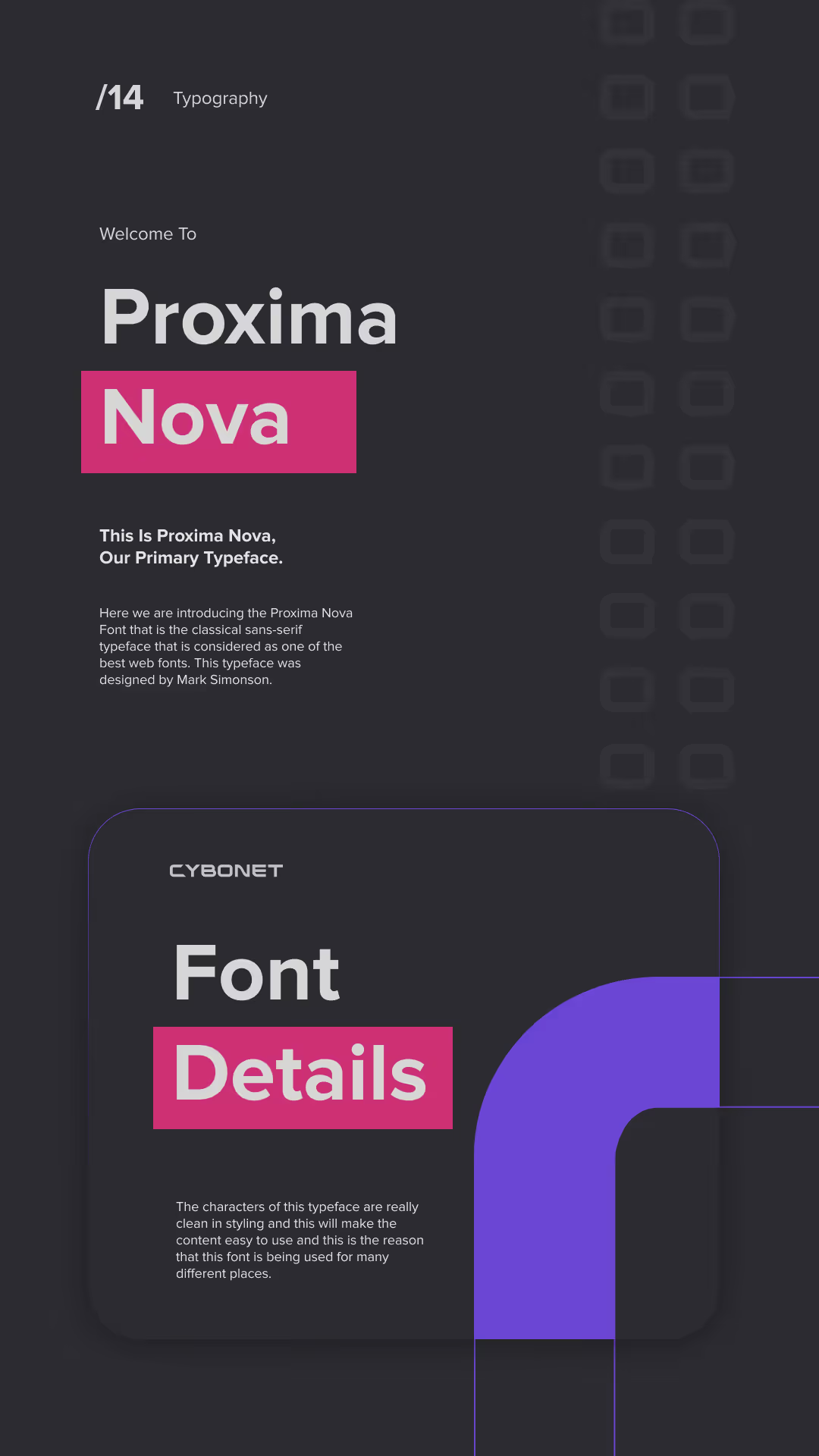
Dark-themed graphic introducing the Proxima Nova font as the primary typeface, highlighting 'Proxima Nova' with Nova on a pink background, and a section labeled 'Font Details' with descriptive text about the font's clean styling and usability.
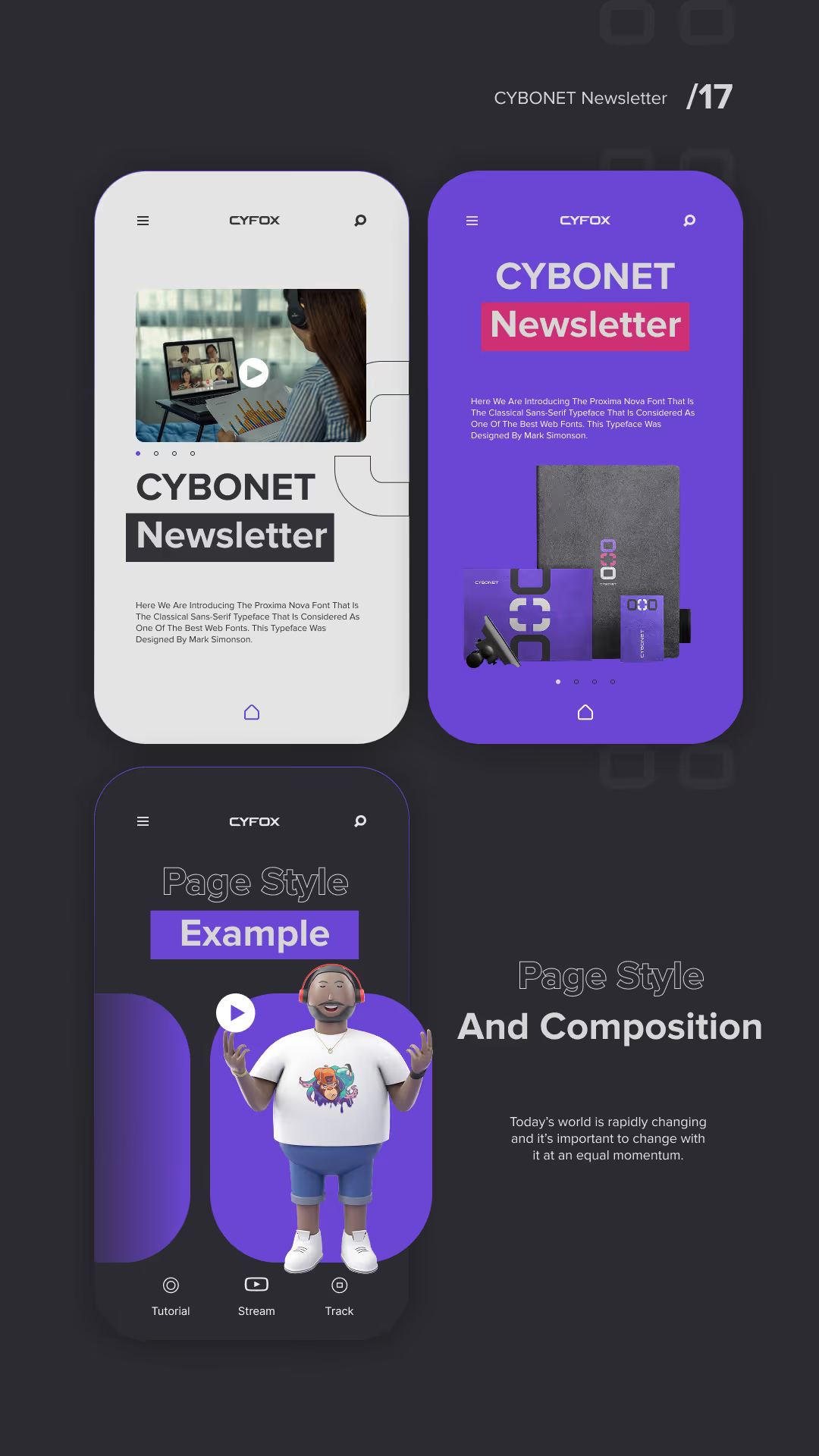
Three smartphone screens on a dark background showing different app interfaces by CYFOX: top left screen displays a video call with 'CYBONET Newsletter' text; top right screen with a purple background shows 'CYBONET Newsletter' and product images; bottom screen features a 3D avatar and text 'Page Style Example' with menu icons labeled Tutorial, Stream, and Track.
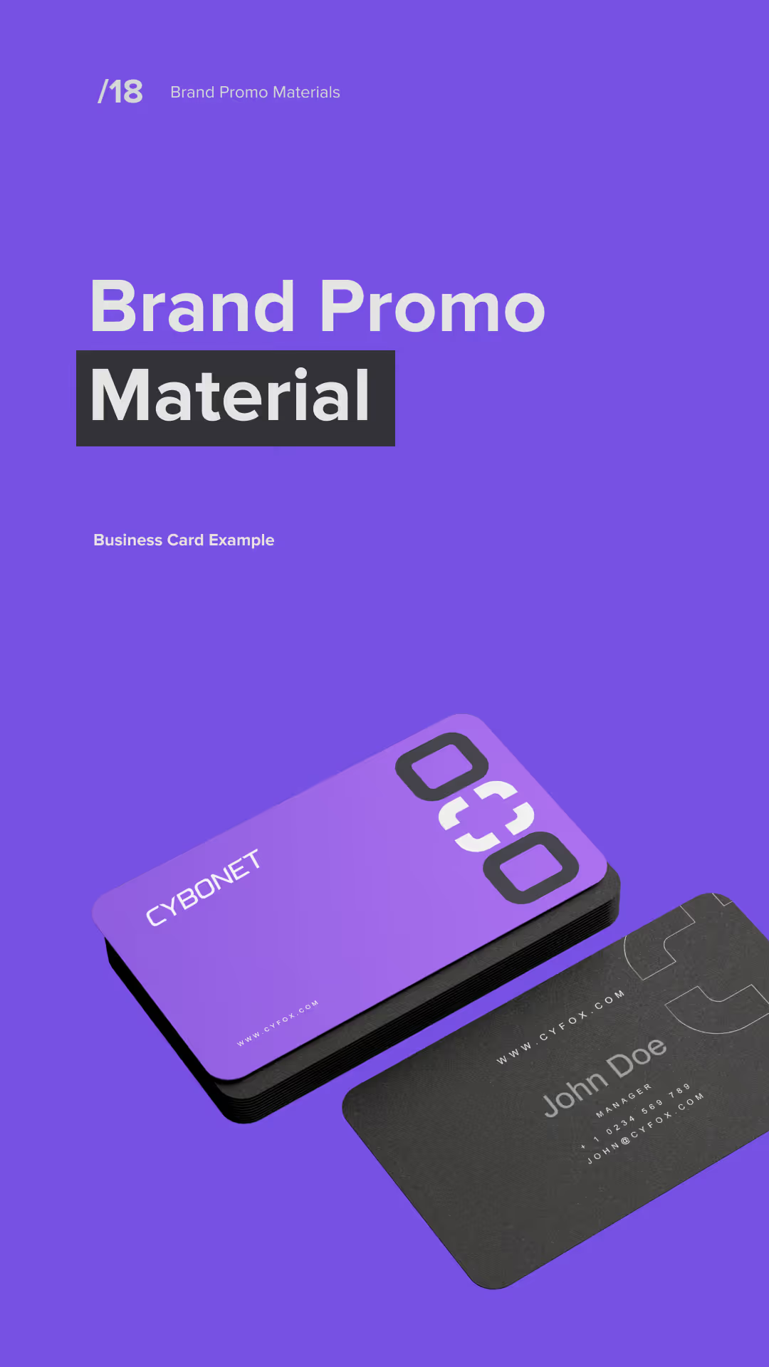
Two business cards for CYBONET displayed on a purple background; one card is purple with a black edge and the numbers 030 in large white font, the other card is black featuring the name John Doe and contact information in white text.
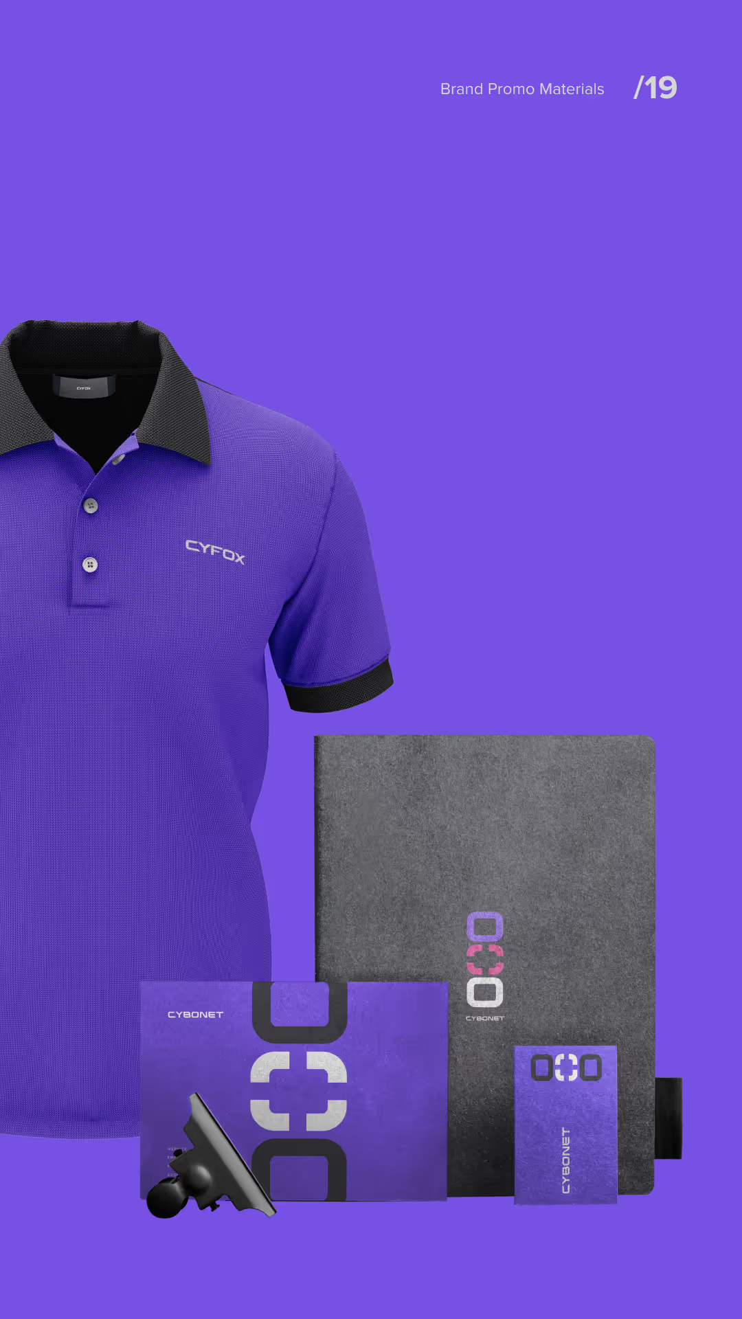
Purple polo shirt with black collar and sleeve trim featuring white Cyrox logo, alongside branded stationery including a black folder, a purple envelope, a small purple notebook, and a black phone holder, all set against a purple background.
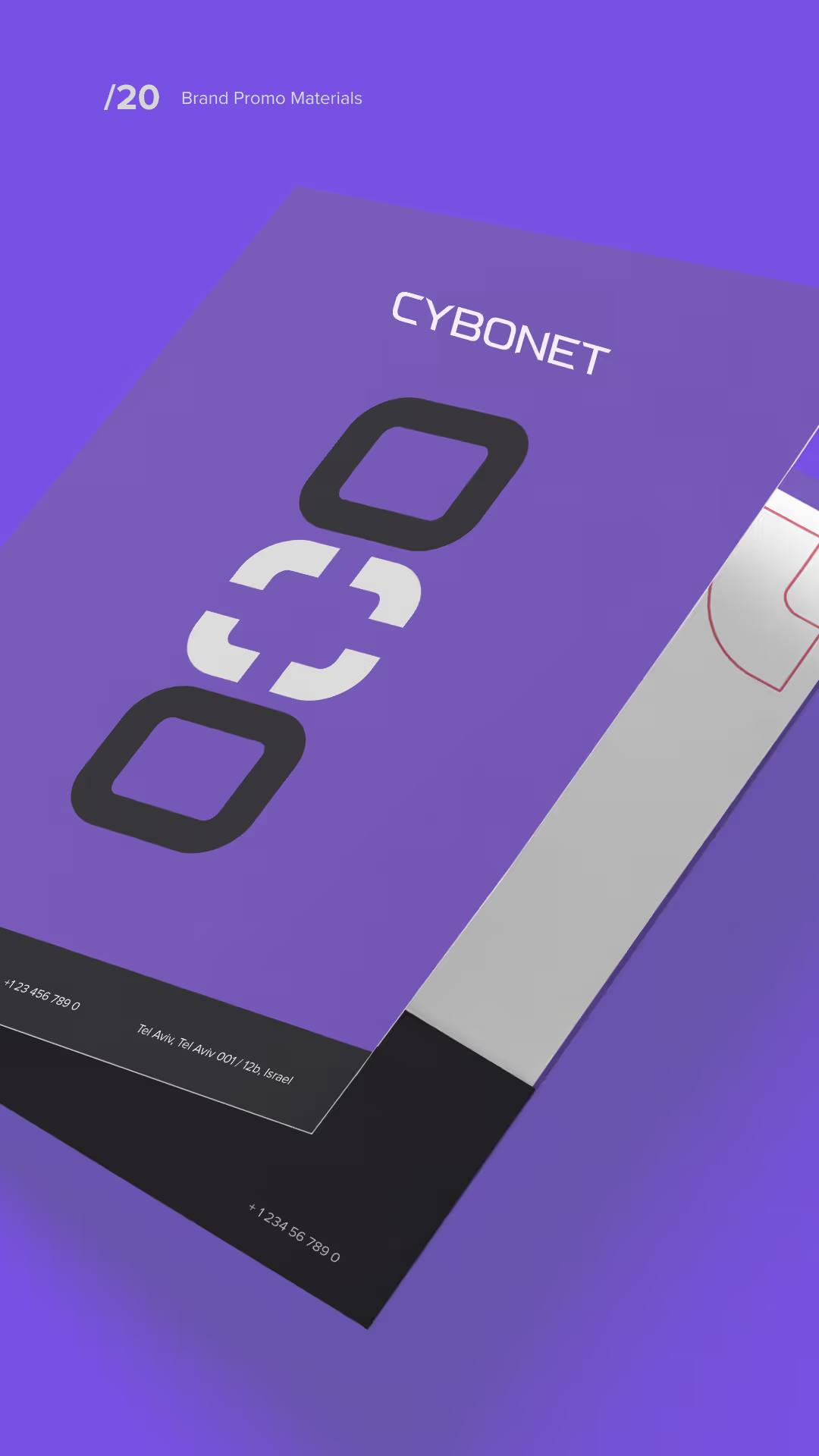
Purple branded promotional material design with the word 'CYBONET' and a stylized logo featuring a chain link graphic, plus contact details at the bottom.
Text saying 'Thanks For Watching.' with 'Watching.' highlighted in purple and a minimalist purple geometric design above it on a dark background.
KCC ManufacturingStrategic Rebrand
KCC Manufacturing logo

KCC Manufacturing is an employee-owned HVAC manufacturer where engineering expertise meets personal accountability. From air management to roofing infrastructure and contract manufacturing, we design and build with one principle in mind: better air performance starts with people who own the outcome.

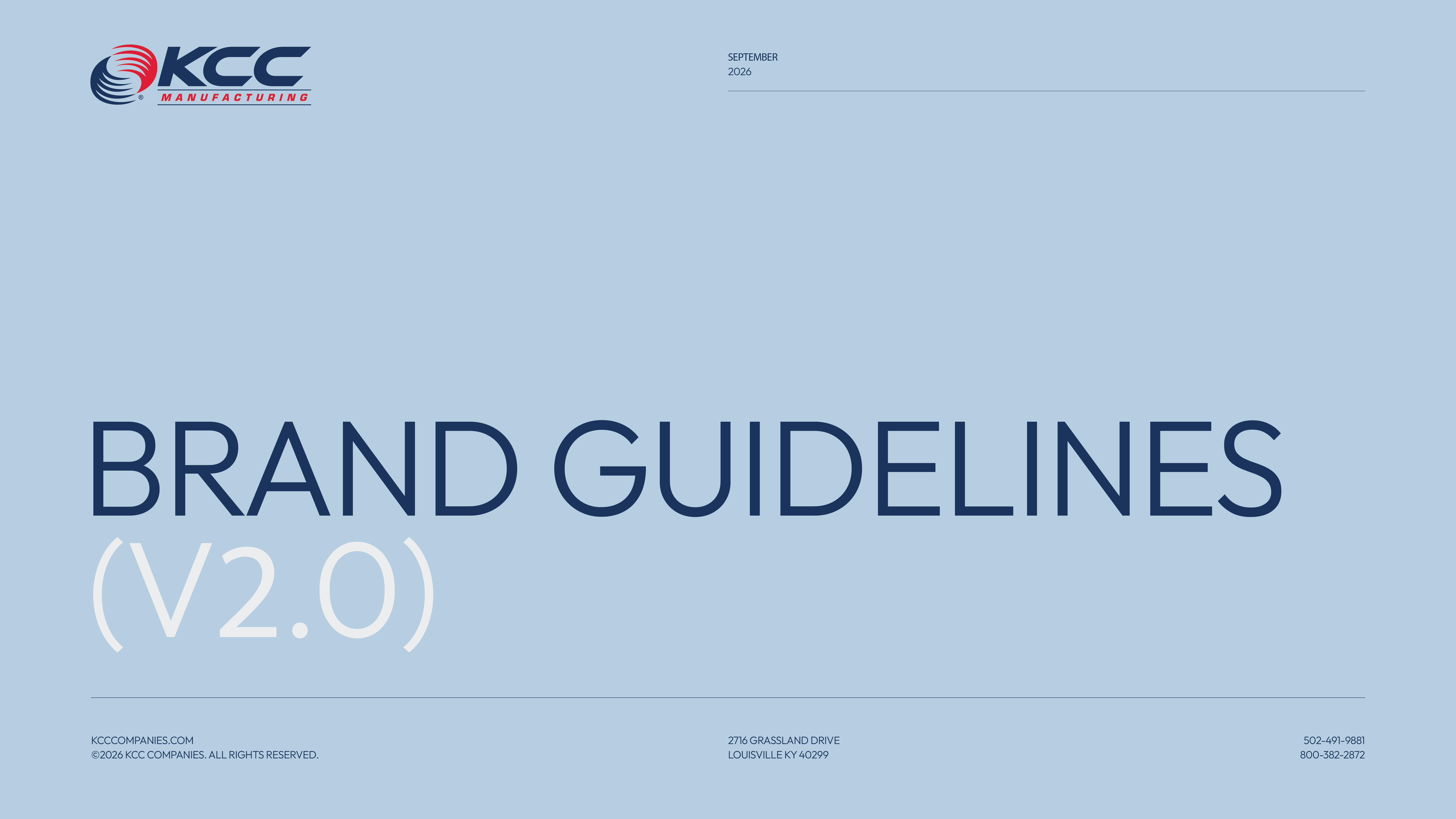
Cover page for KCC Manufacturing brand guidelines version 2.0 dated September 2026, with contact information including website, address in Louisville, KY, and phone numbers on a light blue background.
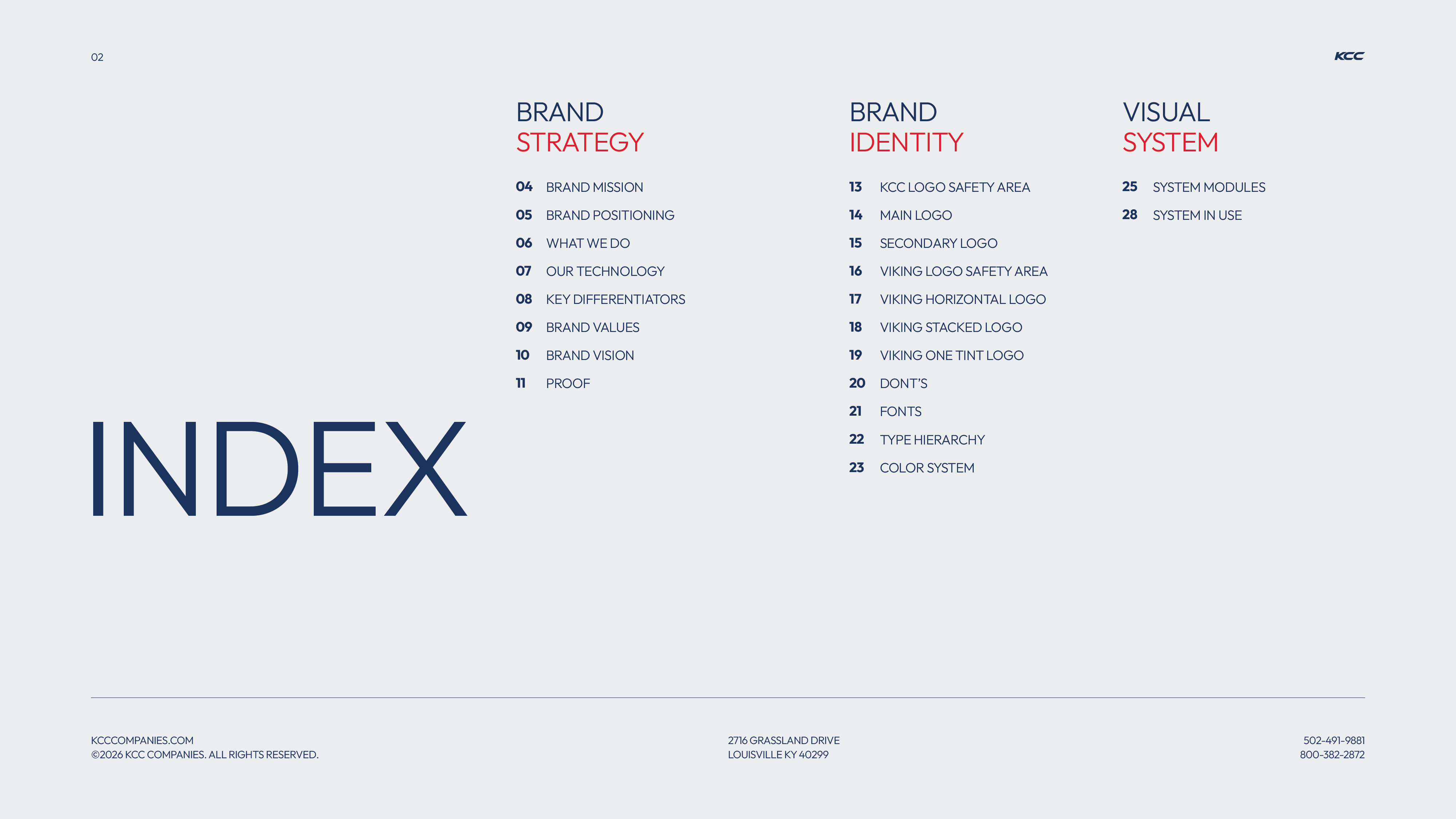
Index page displaying three sections: Brand Strategy with topics like brand mission, positioning, what we do, technology, differentiators, values, vision, and proof; Brand Identity covering logo safety areas, main and secondary logos, Viking logos, fonts, color system; Visual System including system modules and system in use. Contact information and a small KCC logo appear at the bottom and top right.
Red background with large faint number 01 in the center-right and text in navy and white that reads BRAND STRATEGY, along with small contact details and website information at the bottom.
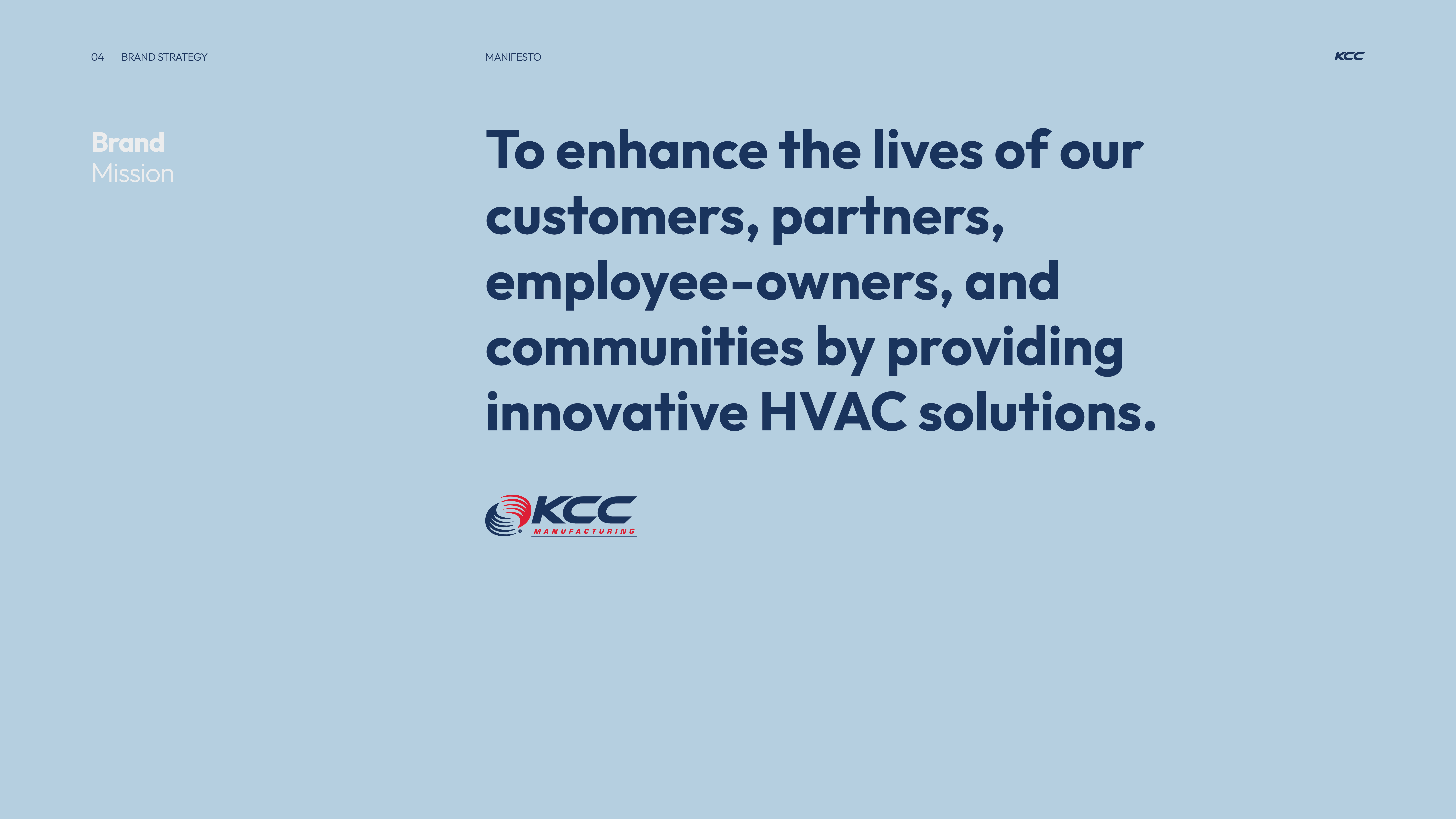
Text on light blue background stating the brand mission: To enhance lives of customers, partners, employee-owners, and communities by providing innovative HVAC solutions, accompanied by the KCC Manufacturing logo.
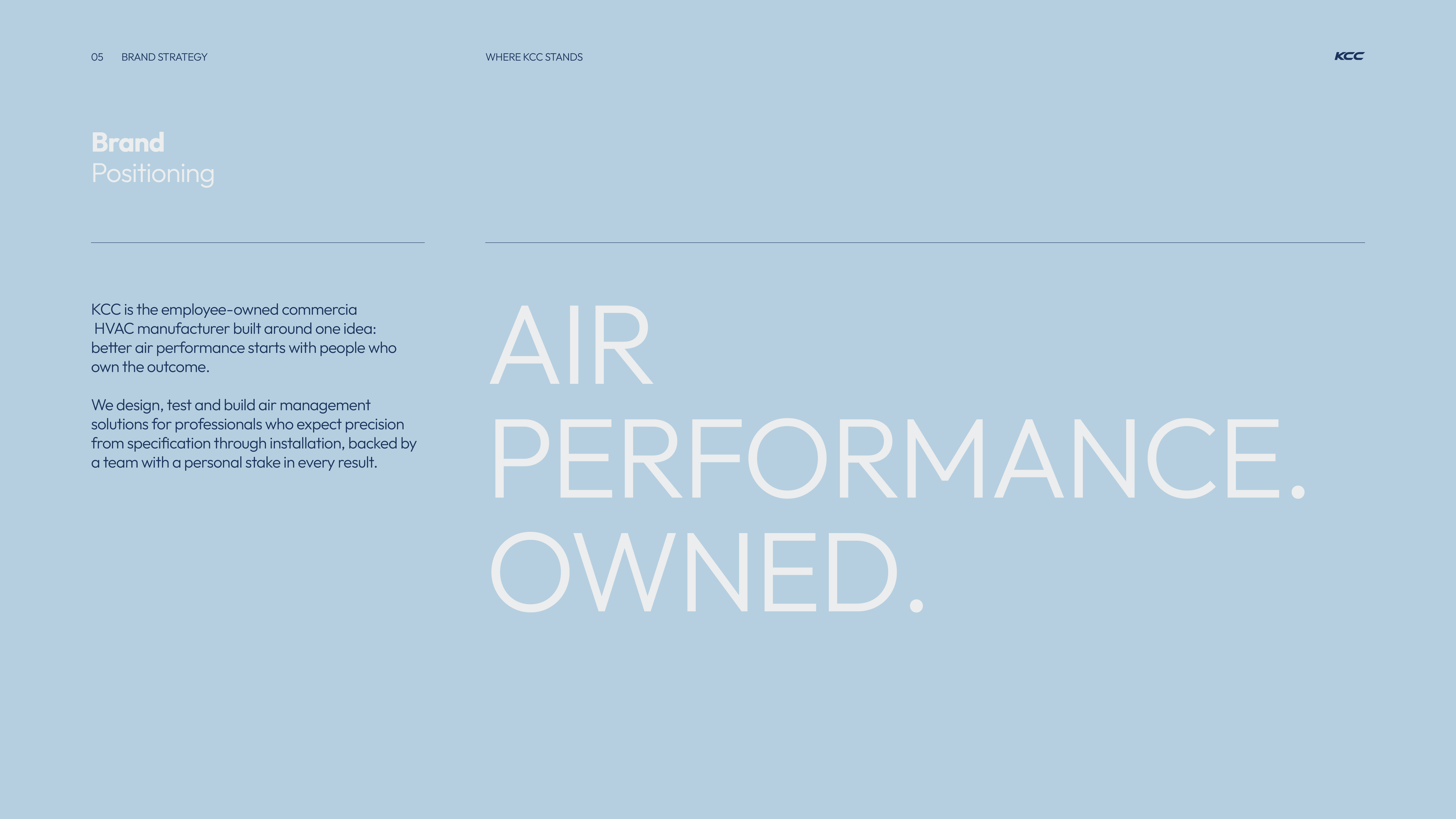
Brand positioning statement on a light blue background reading: KCC is an employee-owned commercial HVAC manufacturer focused on better air performance through people ownership. They design, test, and build air management solutions for professionals seeking precision from specification to installation, backed by a team personally invested in every result. Large text emphasizes 'AIR PERFORMANCE. OWNED.'
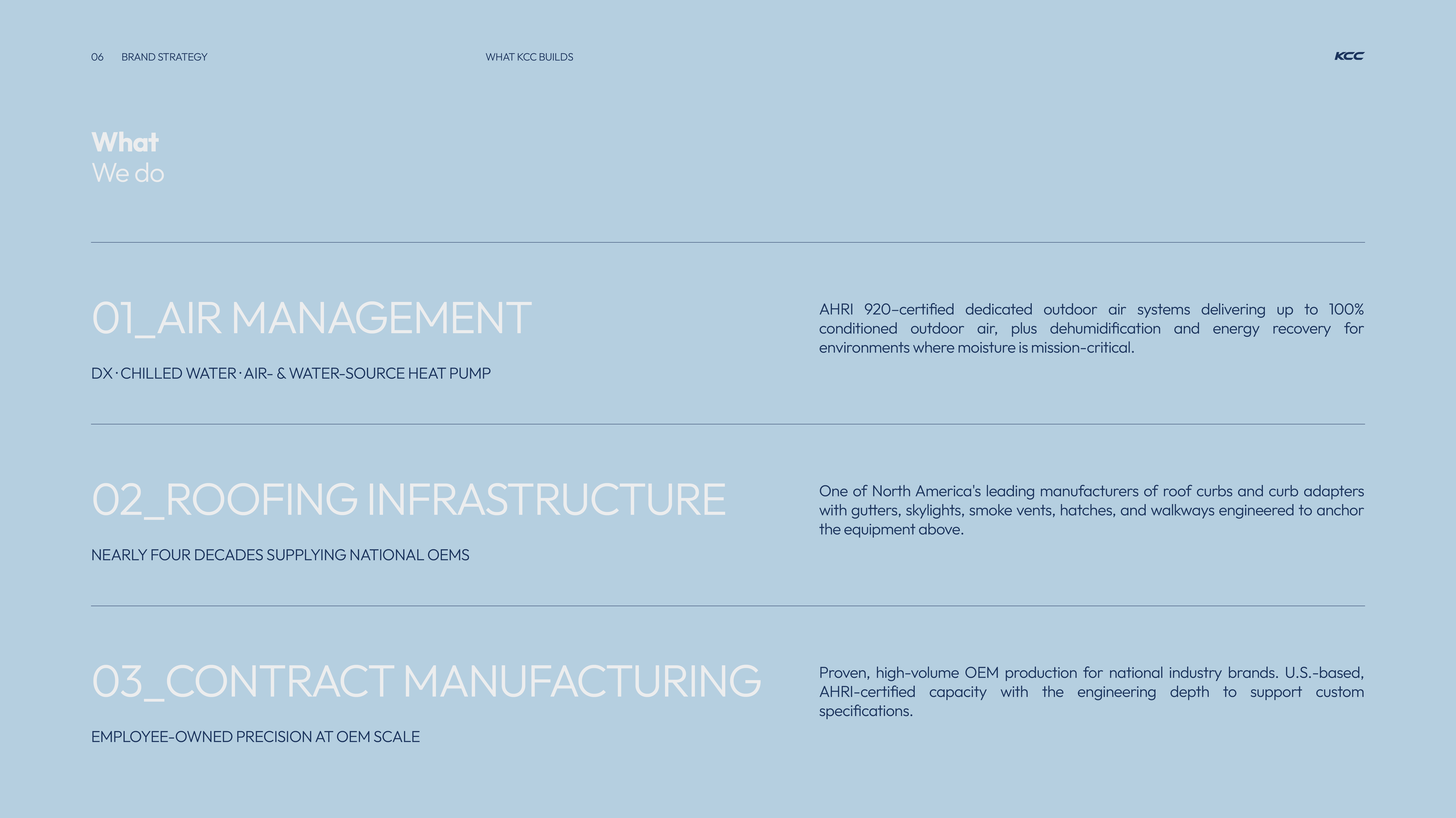
A blue slide presenting three main business areas of KCC: 01_Air Management with DX, chilled water, air- and water-source heat pump systems certified by AHRI 920 for 100% conditioned outdoor air and energy recovery; 02_Roofing Infrastructure supplying national OEMs with roof curbs, curb adapters, gutters, skylights, smoke vents, hatches, and walkways; 03_Contract Manufacturing offering high-volume OEM production with AHRI-certified capacity and engineering support for custom specs.
Dark blue slide titled Innovative HVAC Solutions with four sections: Part-Load Performance describing DOAS platforms exceeding ASHRAE 90.1 and IECC benchmarks maintaining 43°F supply dewpoints; Certification from the Inside noting KCC engineers chairing AHRI DX-DOAS Task Force and helping write ASHRAE SSPC 198 with over twenty engineers on ASHRAE committees; Dedicated R&D Operation detailing a $100M, 80-acre Simpsonville campus with 360,000 sq ft for next-generation product development and manufacturing; Next-Generation Thermal Systems discussing strategic investment in thermal energy storage and controlled environment agriculture systems for future buildings.
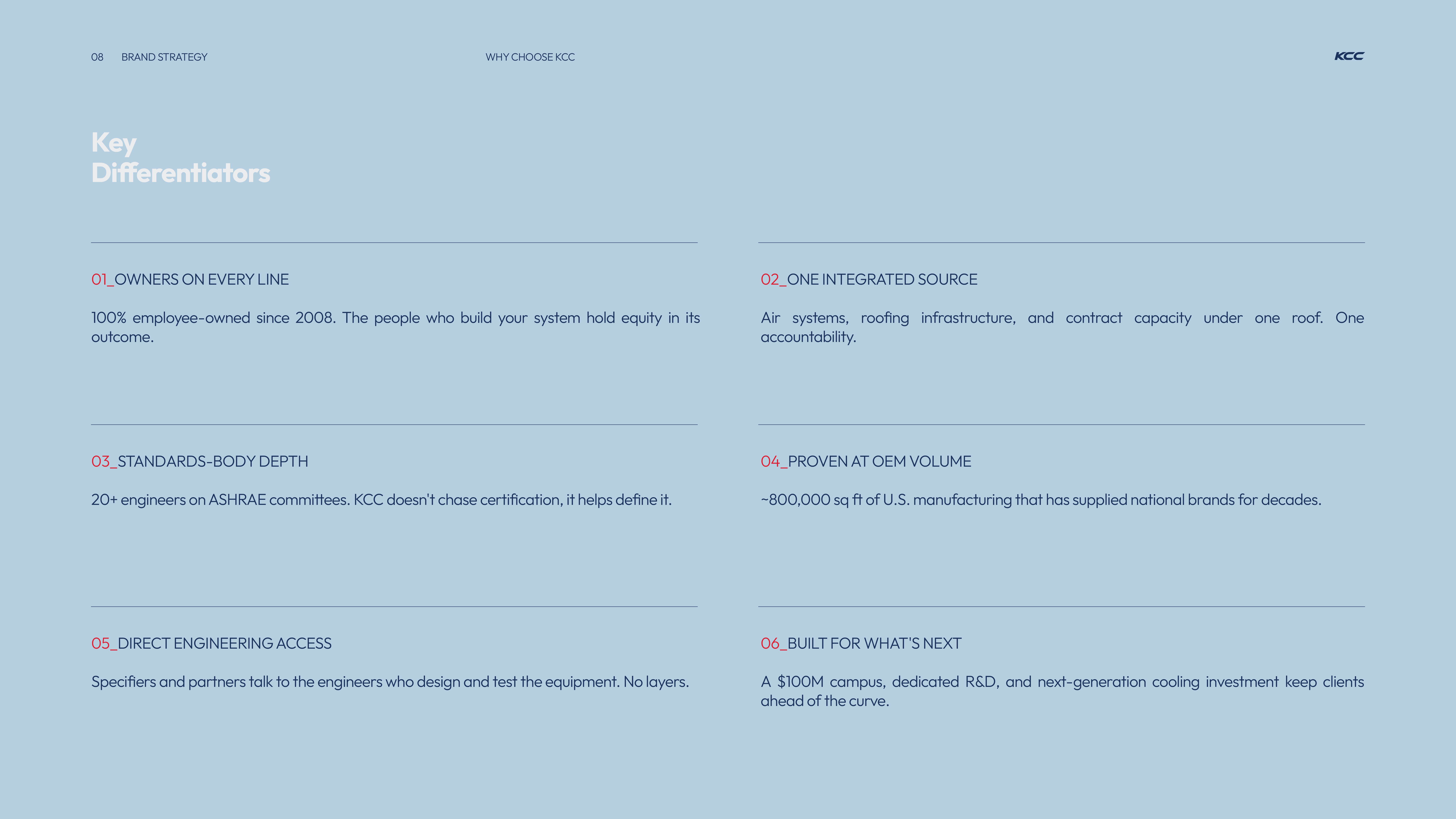
Text titled 'Key Differentiators' listing six points: 01 Owners on every line, 100% employee-owned since 2008; 02 One integrated source, combining air systems, roofing, and contract capacity; 03 Standards-body depth, with 20+ engineers on ASHRAE committees; 04 Proven at OEM volume, supplying ~800,000 sq ft of U.S. manufacturing; 05 Direct engineering access, allowing direct talk with engineers; 06 Built for what's next, including a $100M campus, R&D, and next-gen cooling investment.
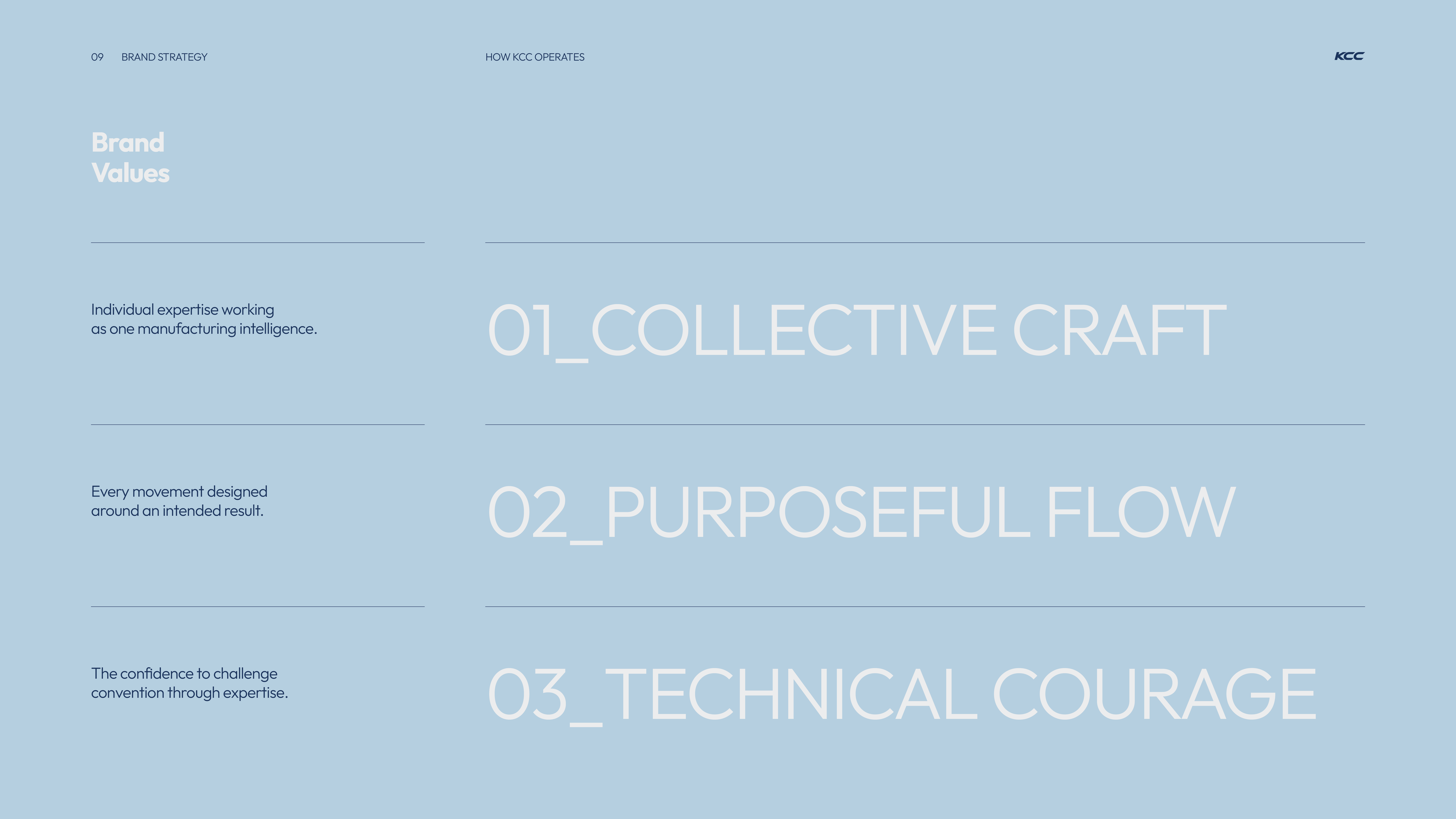
Slide titled 'Brand Values' showing three numbered values: 01_Collective Craft, 02_Purposeful Flow, and 03_Technical Courage, with descriptions emphasizing collective expertise, designed movement, and confidence to challenge convention.
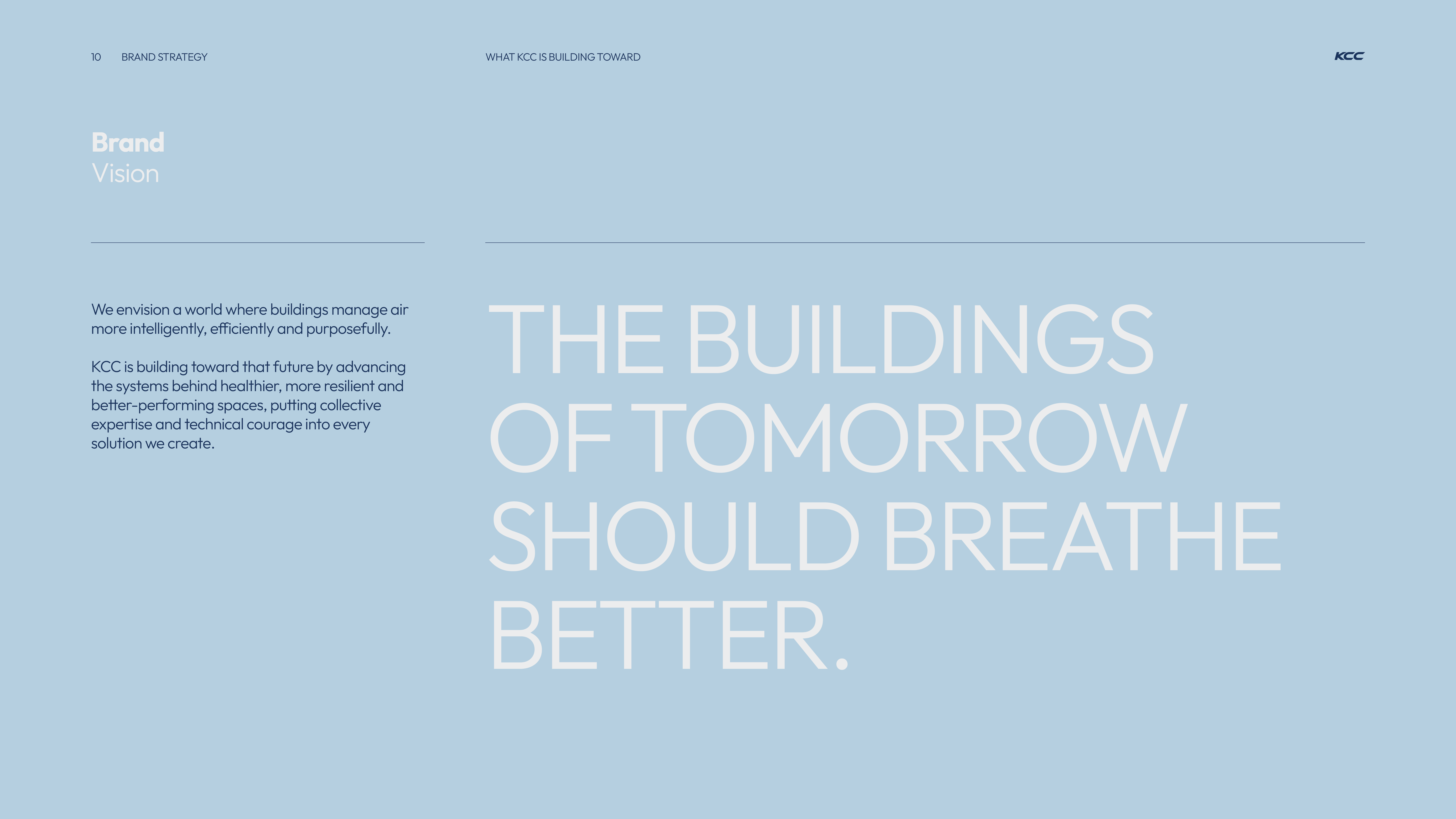
Brand vision statement on a light blue background stating that KCC envisions buildings managing air more intelligently, efficiently, and purposefully, aiming for healthier, resilient, and better-performing spaces, summarized by the phrase: The buildings of tomorrow should breathe better.
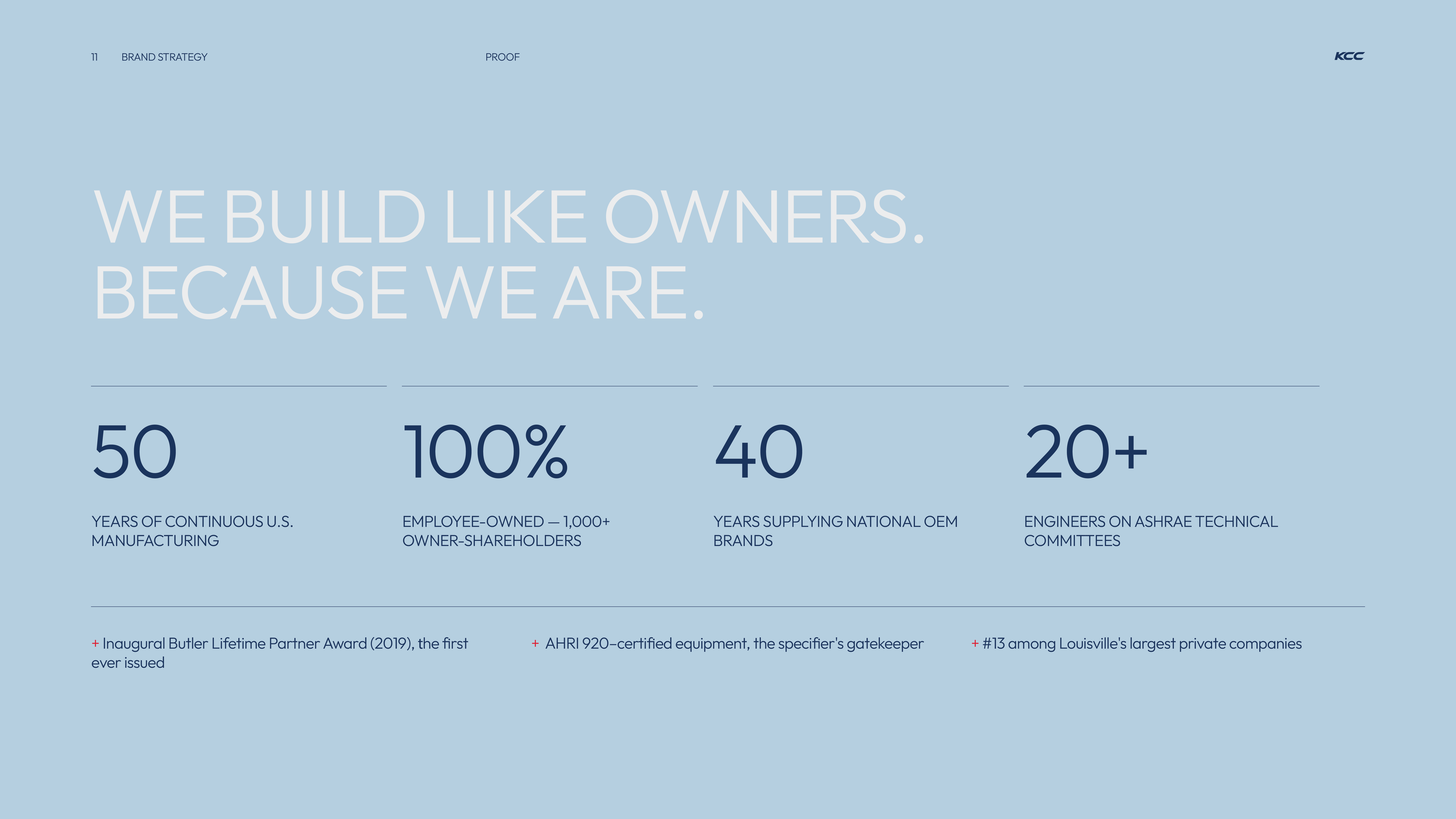
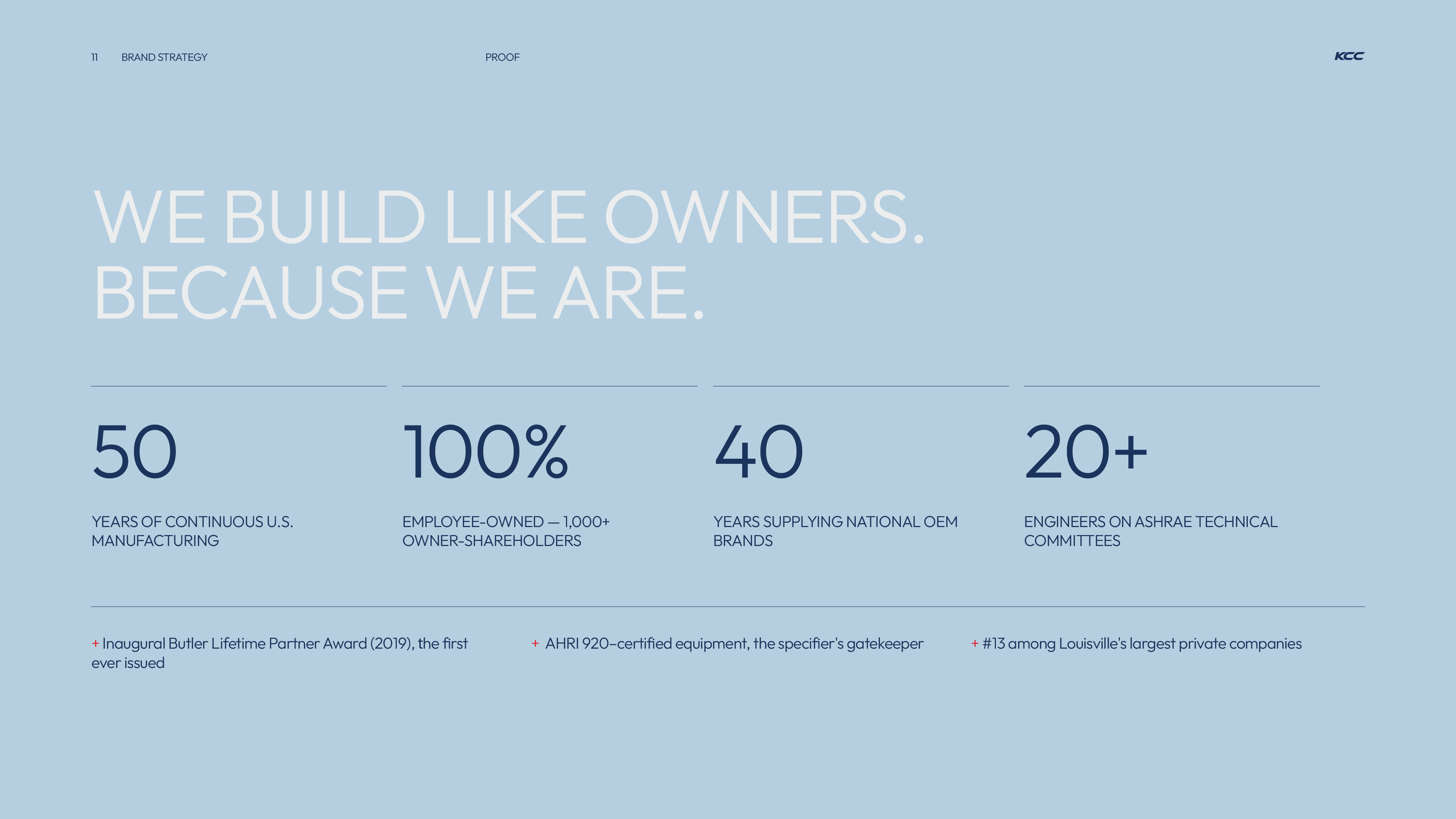
Blue background with headline: 'We build like owners. Because we are.' Below are four statistics: 50 years of continuous U.S. manufacturing; 100% employee-owned with over 1,000 owner-shareholders; 40 years supplying national OEM brands; 20+ engineers on ASHRAE technical committees. Additional notes mention an inaugural Butler Lifetime Partner Award in 2019, AHRI 920-certified equipment as the specifier's gatekeeper, and ranking #13 among Louisville's largest private companies.
Slide with brand strategy proof stating 'We build like owners. Because we are.' Highlights: 50 years of continuous U.S. manufacturing, 100% employee-owned with 1,000+ owner-shareholders, 40 years supplying national OEM brands, and 20+ engineers on ASHRAE technical committees. Additional notes mention the Inaugural Butler Lifetime Partner Award (2019), AHRI 920-certified equipment as the specifier's gatekeeper, and ranking 13th among Louisville's largest private companies.
Red slide with large faint number '02' in the background and text reading 'BRAND IDENTITY' in bold letters, including contact details and KCC branding.
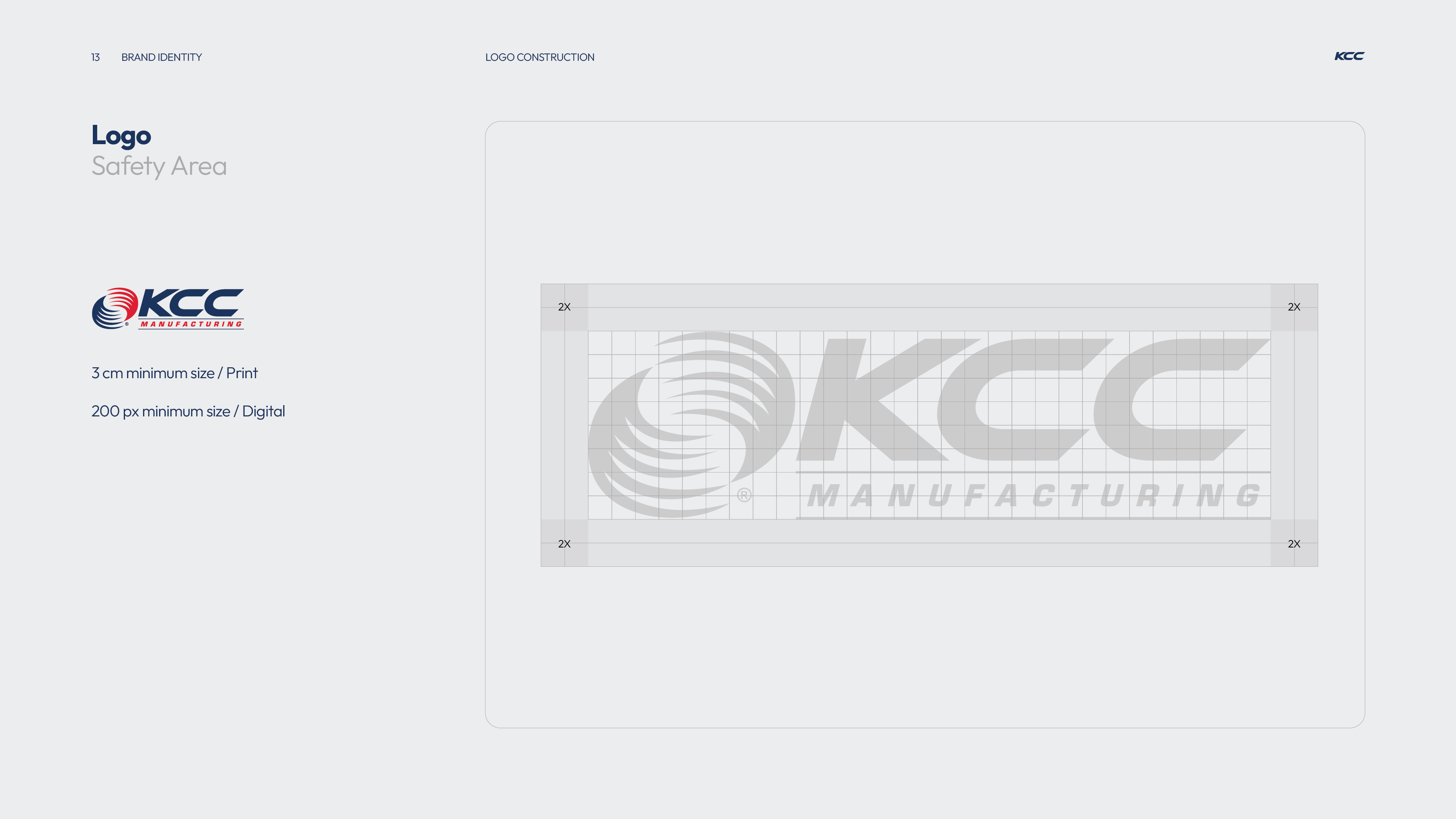
KCC Manufacturing logo with a circular swirl design to the left, in navy blue and red colors, shown with a grid overlay illustrating a safety area buffer zone of 2X on all sides and minimum size guidelines of 3 cm for print and 200 px for digital use.
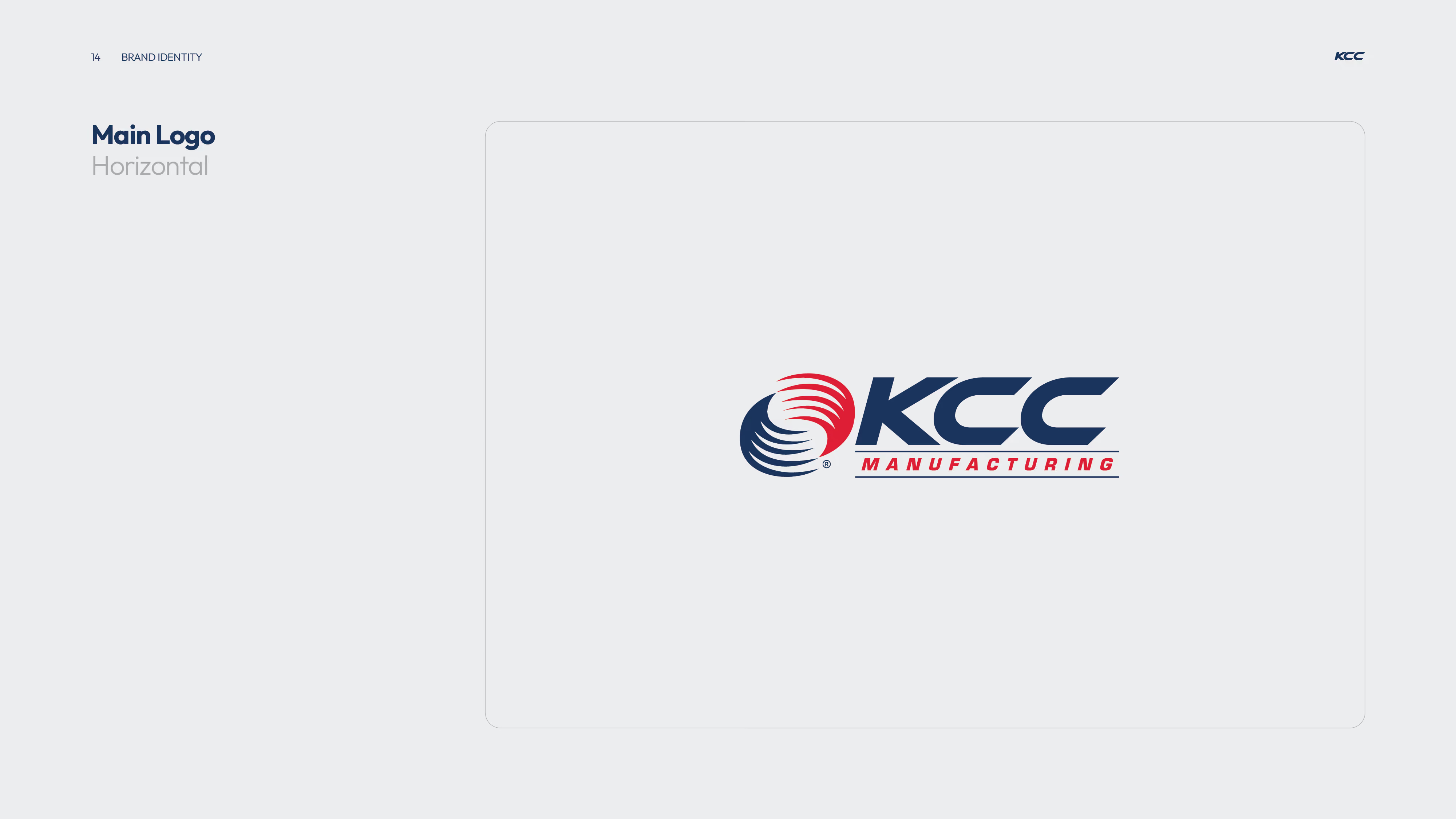
KCC Manufacturing main horizontal logo featuring stylized circular lines in navy blue and red next to bold navy blue text 'KCC' with smaller red text 'MANUFACTURING' underneath.
KCC Manufacturing secondary logo with a circular emblem of swirling red and blue shapes above bold navy letters 'KCC' and the word 'MANUFACTURING' in red uppercase text underlined in navy.
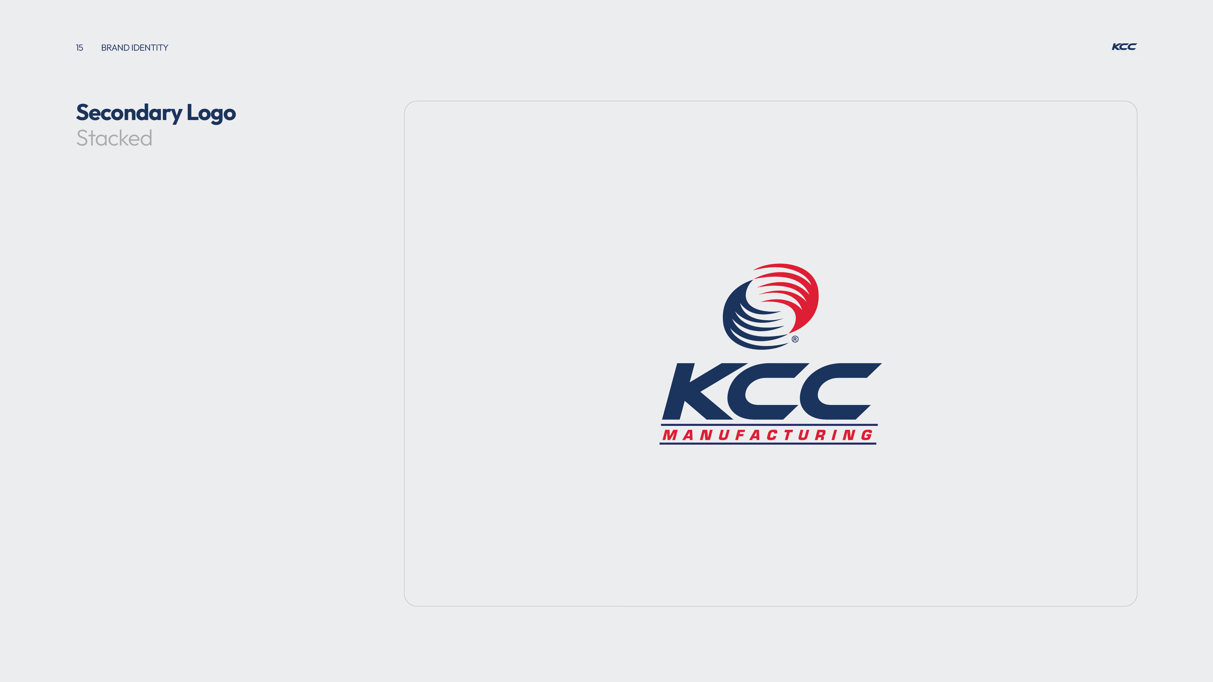
KCC Manufacturing secondary stacked logo featuring bold navy blue letters 'KCC' below a circular emblem with navy blue and red curved stripes and the word 'MANUFACTURING' in red capital letters underneath.
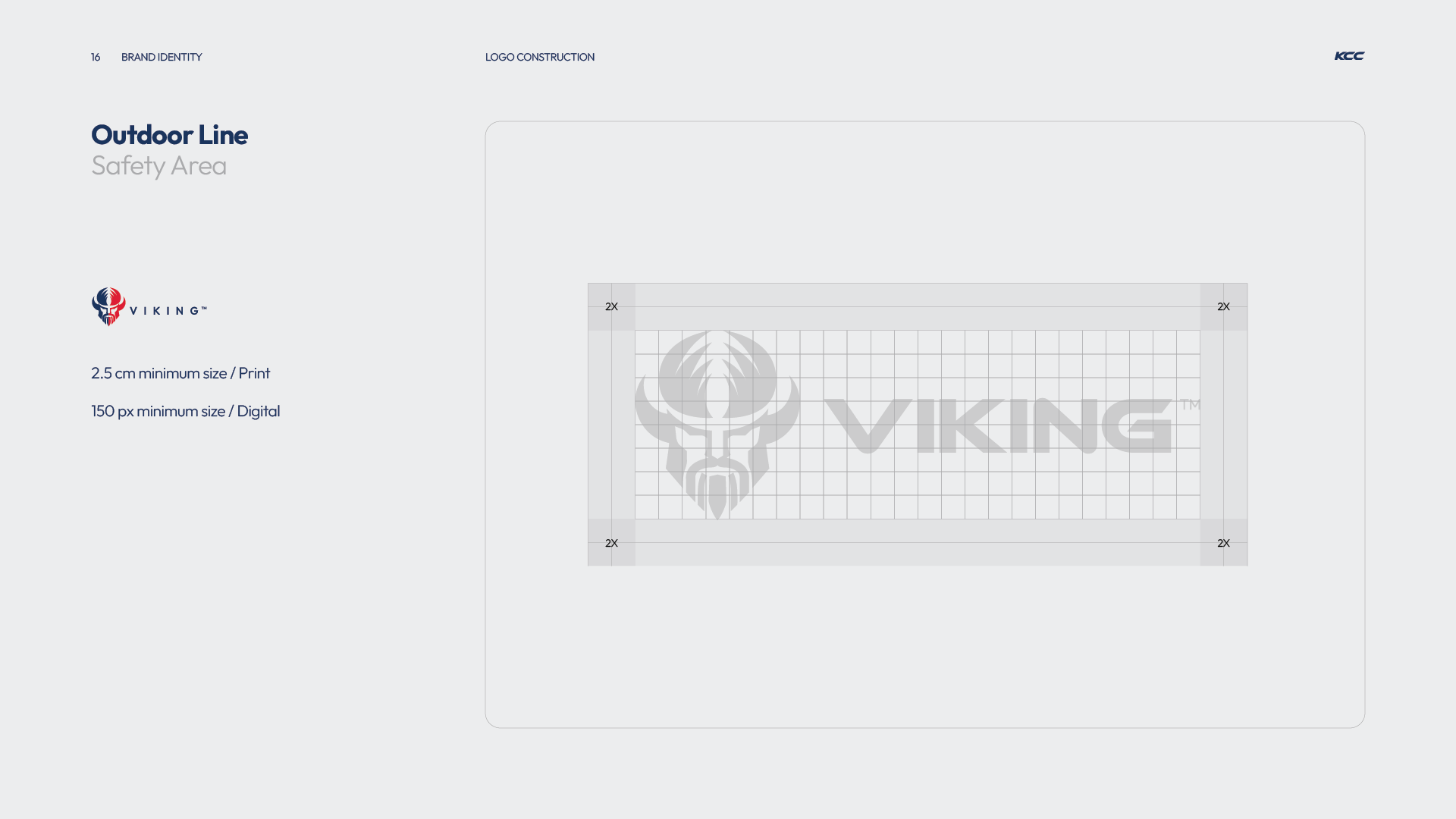
Brand identity guidelines showing the safety area for the Viking logo with minimum print size of 2.5 cm and digital size of 150 px, including a grid indicating a 2X clearance zone around the logo.
Horizontal logo with a stylized Viking helmet icon split in navy blue and red next to the word 'VIKING' in bold navy blue uppercase letters, on a light gray background.
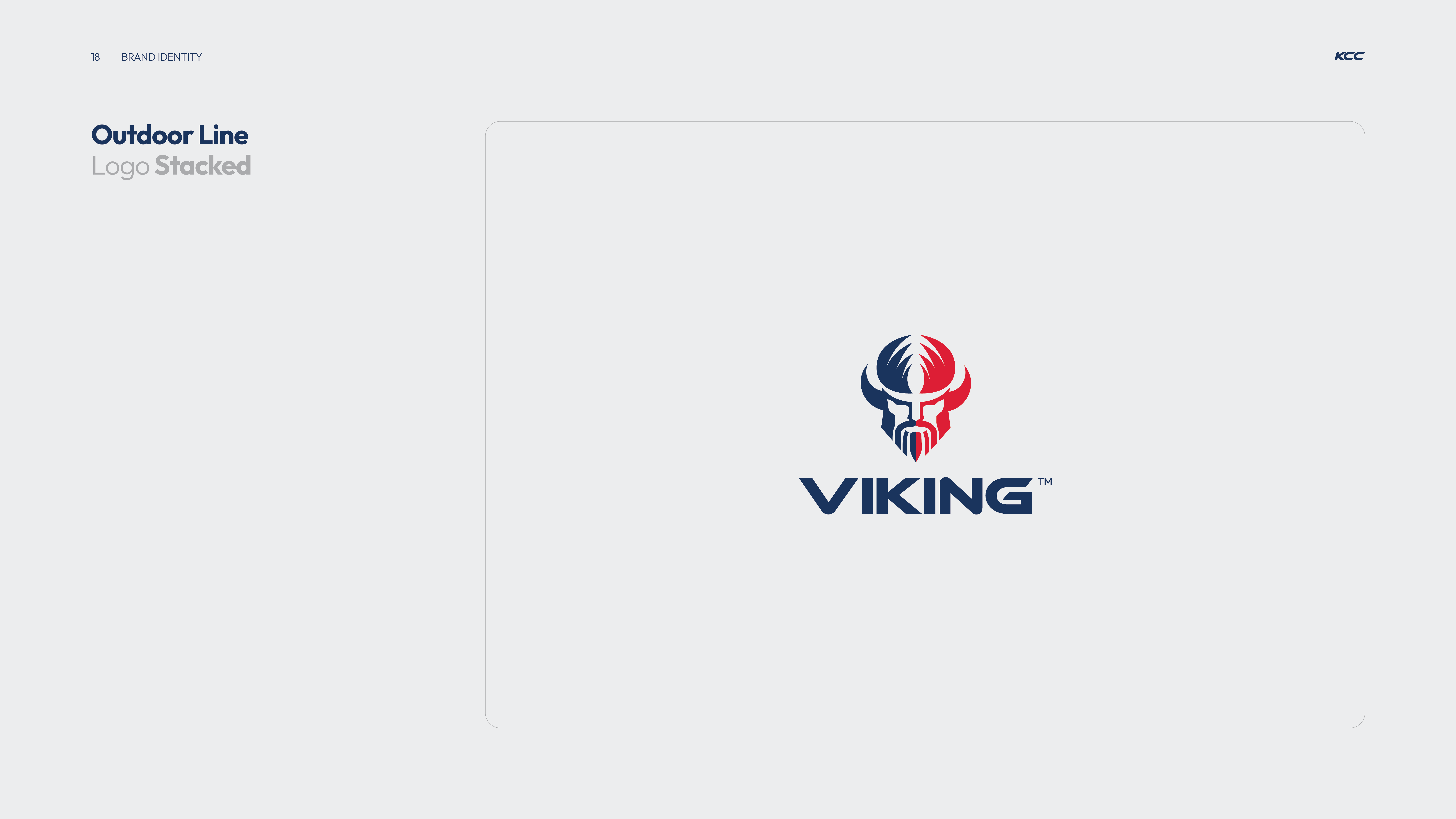
Stacked Viking logo featuring a stylized Viking helmet in blue and red above the word 'VIKING' in bold navy blue letters.
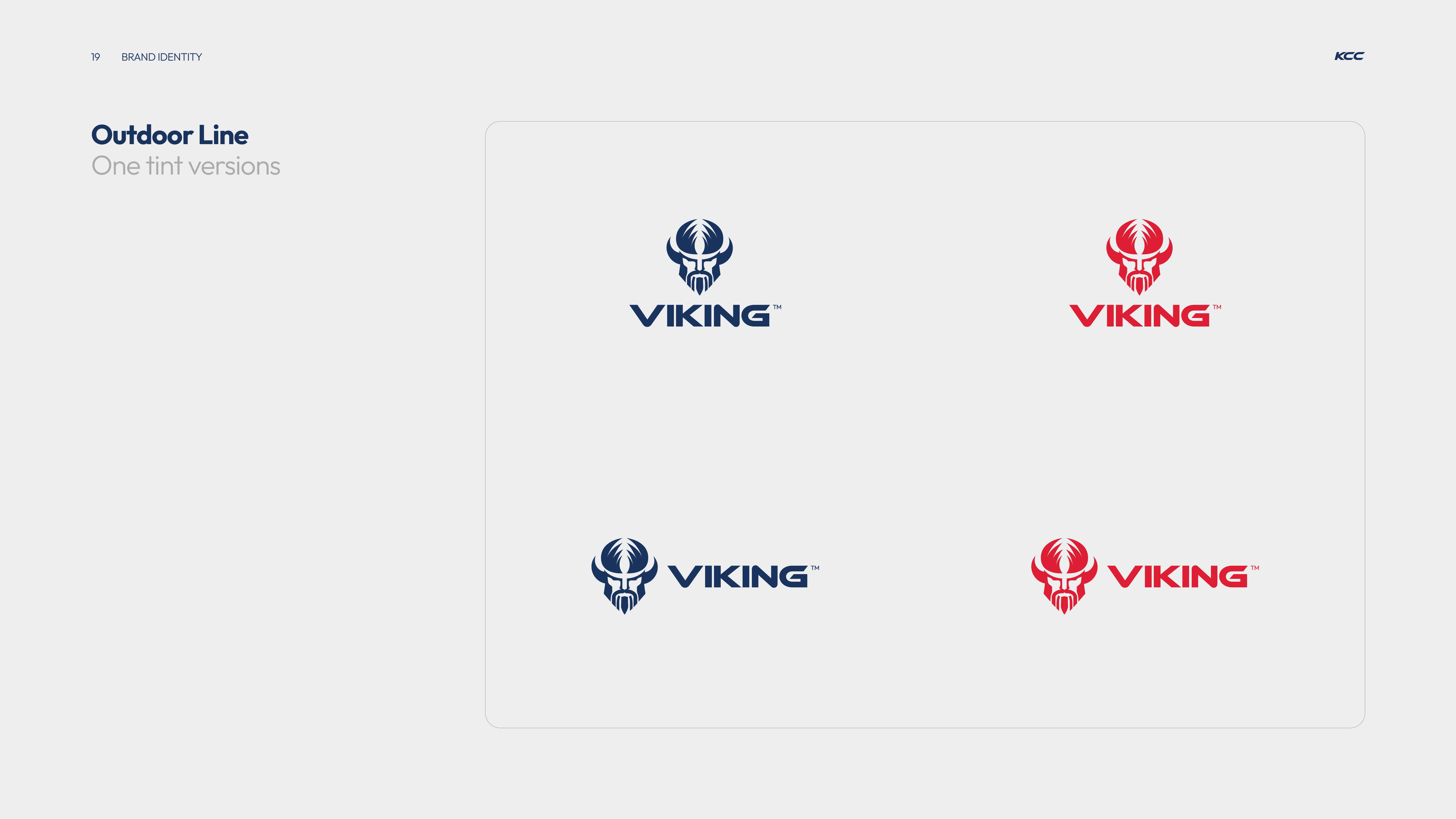
Four versions of the Viking logo with a stylized Viking helmet and beard above the word 'VIKING'; two in dark blue arranged top-left and bottom-left, and two in red positioned top-right and bottom-right, on a light gray background with the text 'Outdoor Line One tint versions' on the left.
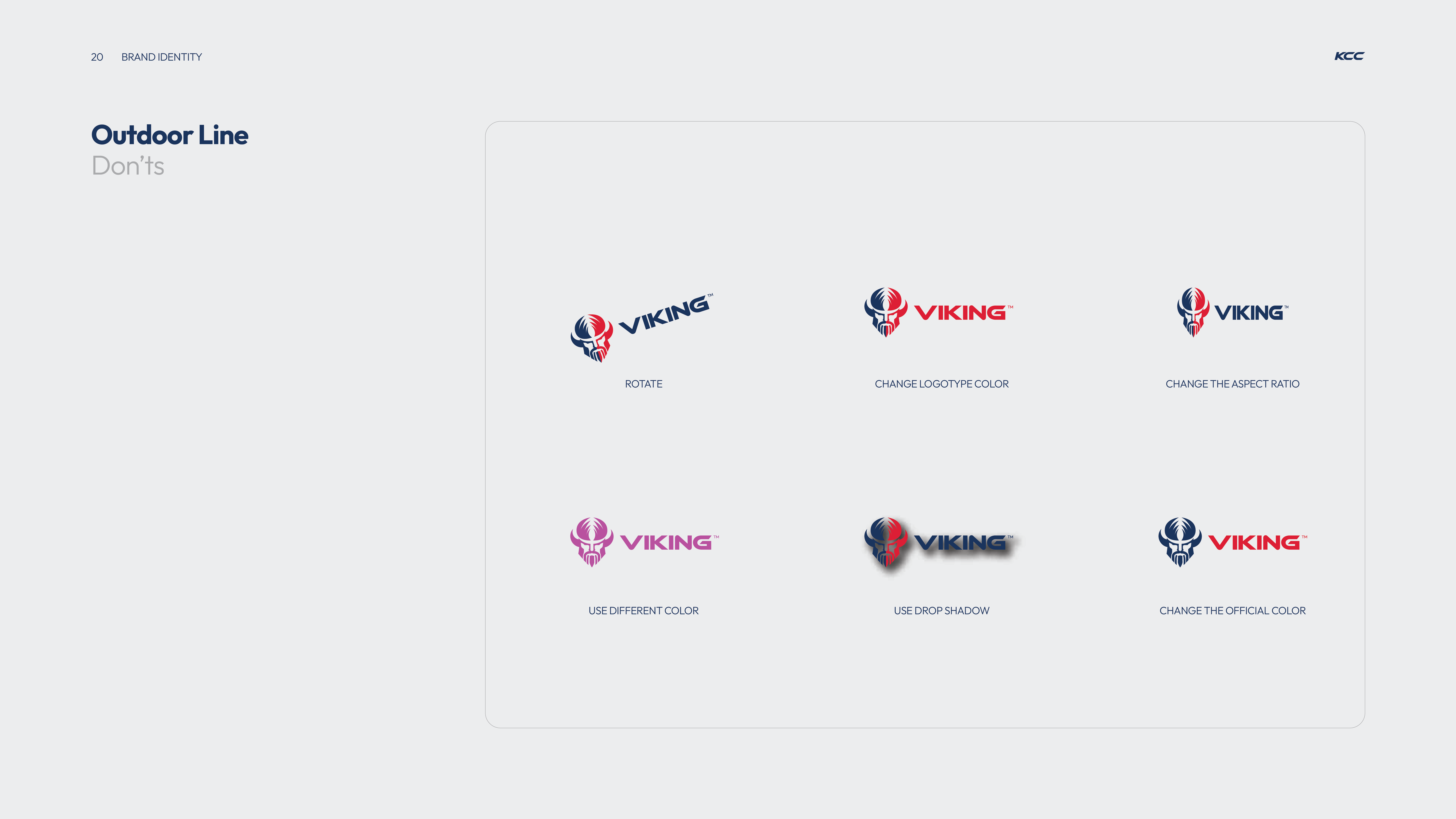
Six examples of Viking logos showing incorrect uses for the outdoor line brand identity: rotate logo, change logotype color, change aspect ratio, use different color, use drop shadow, and change the official color.
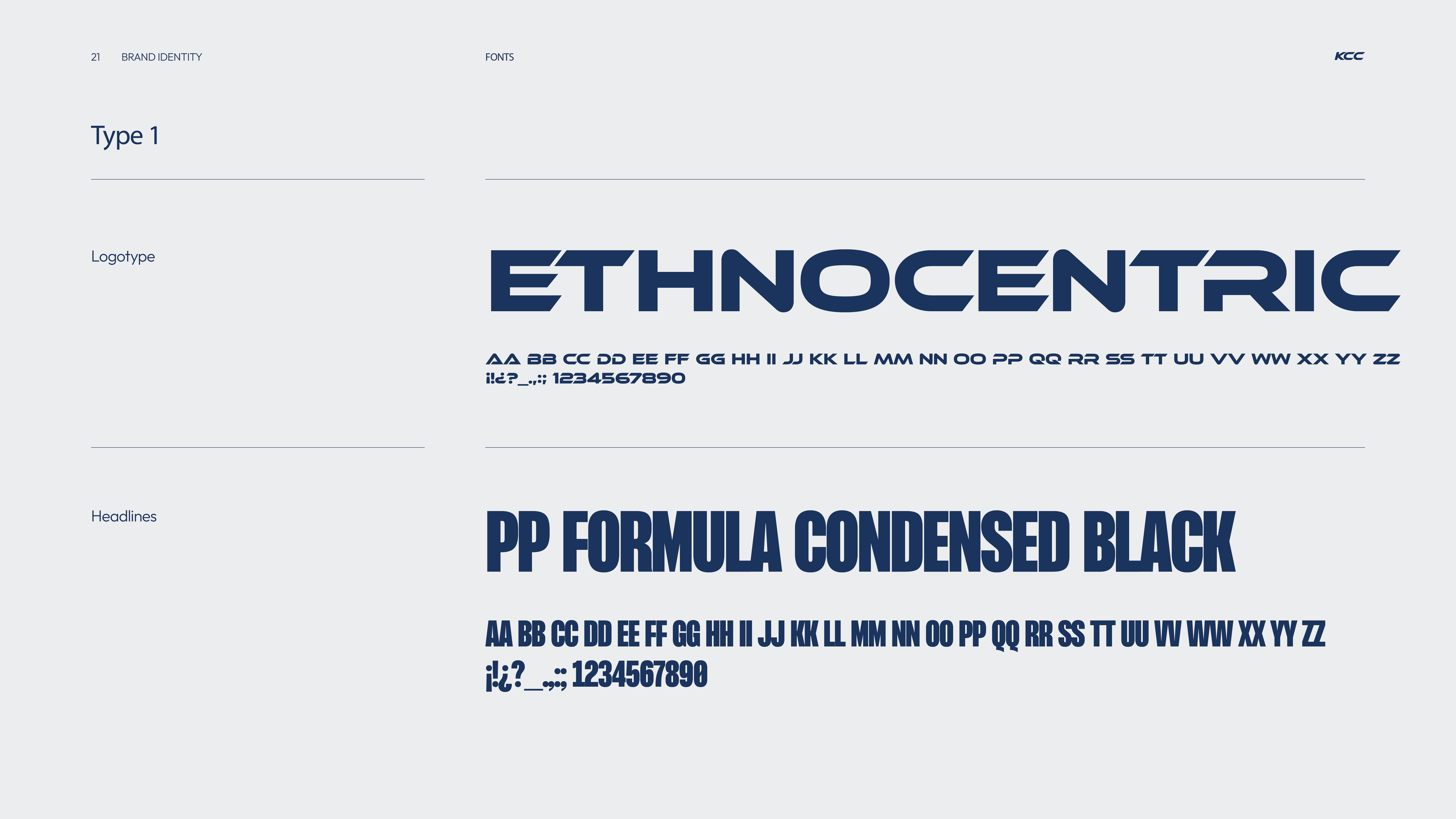
Brand identity font styles sample showing 'ETHNOCENTRIC' in a bold, stylized logotype font and 'PP FORMULA CONDENSED BLACK' in a tall, condensed black font for headlines, with respective alphabets and special characters displayed below each.
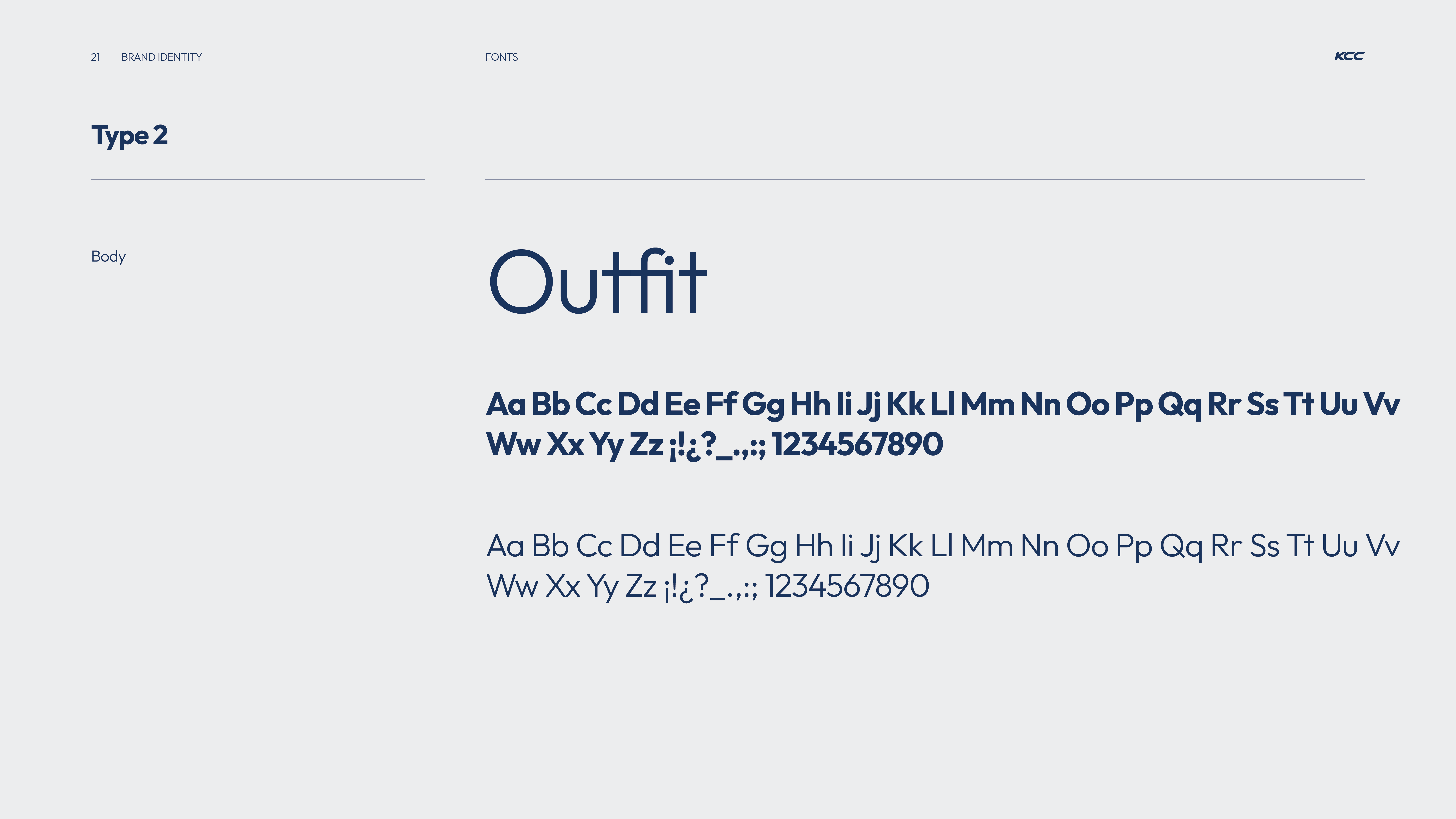
Typography sample titled 'Type 2' showing the font 'Outfit' in various styles and weights including bold and regular alphabets, numbers, and punctuation marks on a light gray background.
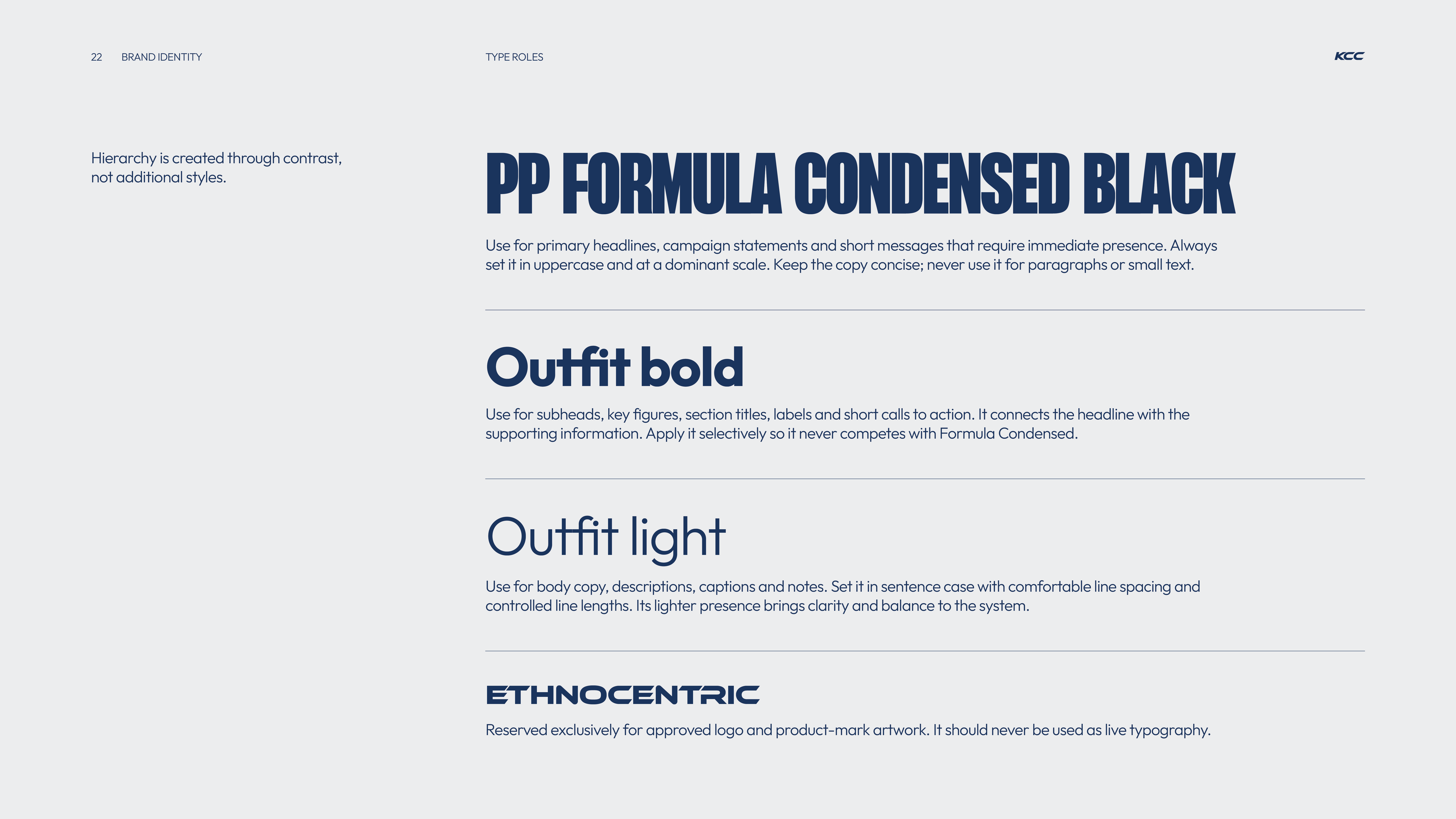
Typography styles and usage guidelines displaying four type roles in navy blue text on a light grey background: PP Formula Condensed Black for primary headlines in uppercase and dominant scale; Outfit bold for subheads, key figures, section titles, labels and short calls to action; Outfit light for body copy, descriptions, captions, and notes with comfortable line spacing; and Ethnocentric reserved for approved logo and product-mark artwork, never for live typography.
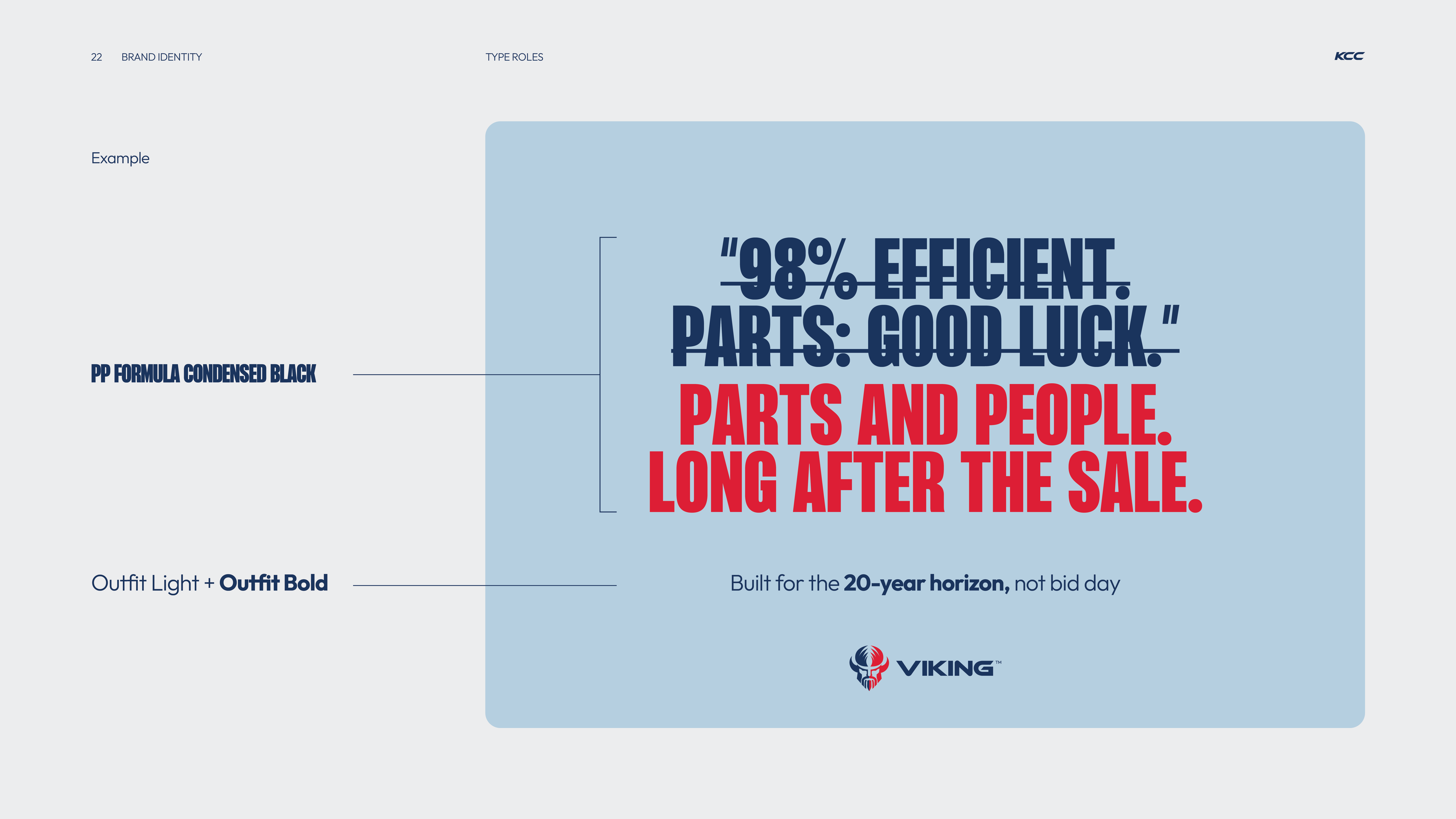
Typography example showing two font styles: 'PP Formula Condensed Black' used for a quote reading '98% efficient. Parts: good luck.' in dark blue and 'Parts and people. Long after the sale.' in red; below, 'Outfit Light + Outfit Bold' shows the line 'Built for the 20-year horizon, not bid day' in dark blue with bold emphasis on '20-year horizon.' The Viking logo appears at the bottom right on a light blue background.
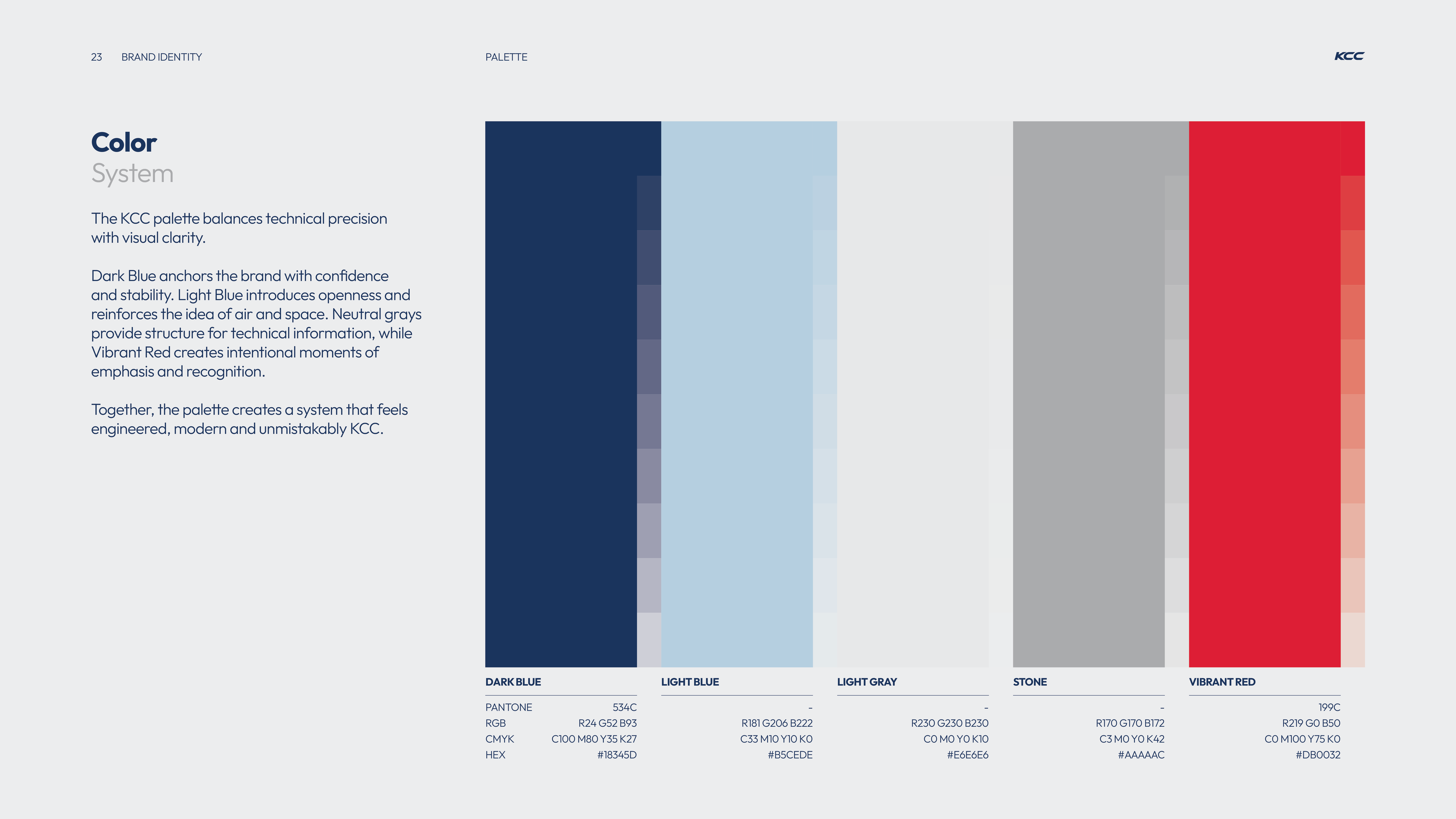
KCC brand color palette showing five color blocks: Dark Blue, Light Blue, Light Gray, Stone, and Vibrant Red with corresponding Pantone, RGB, CMYK, and HEX values for each color on a light gray background.
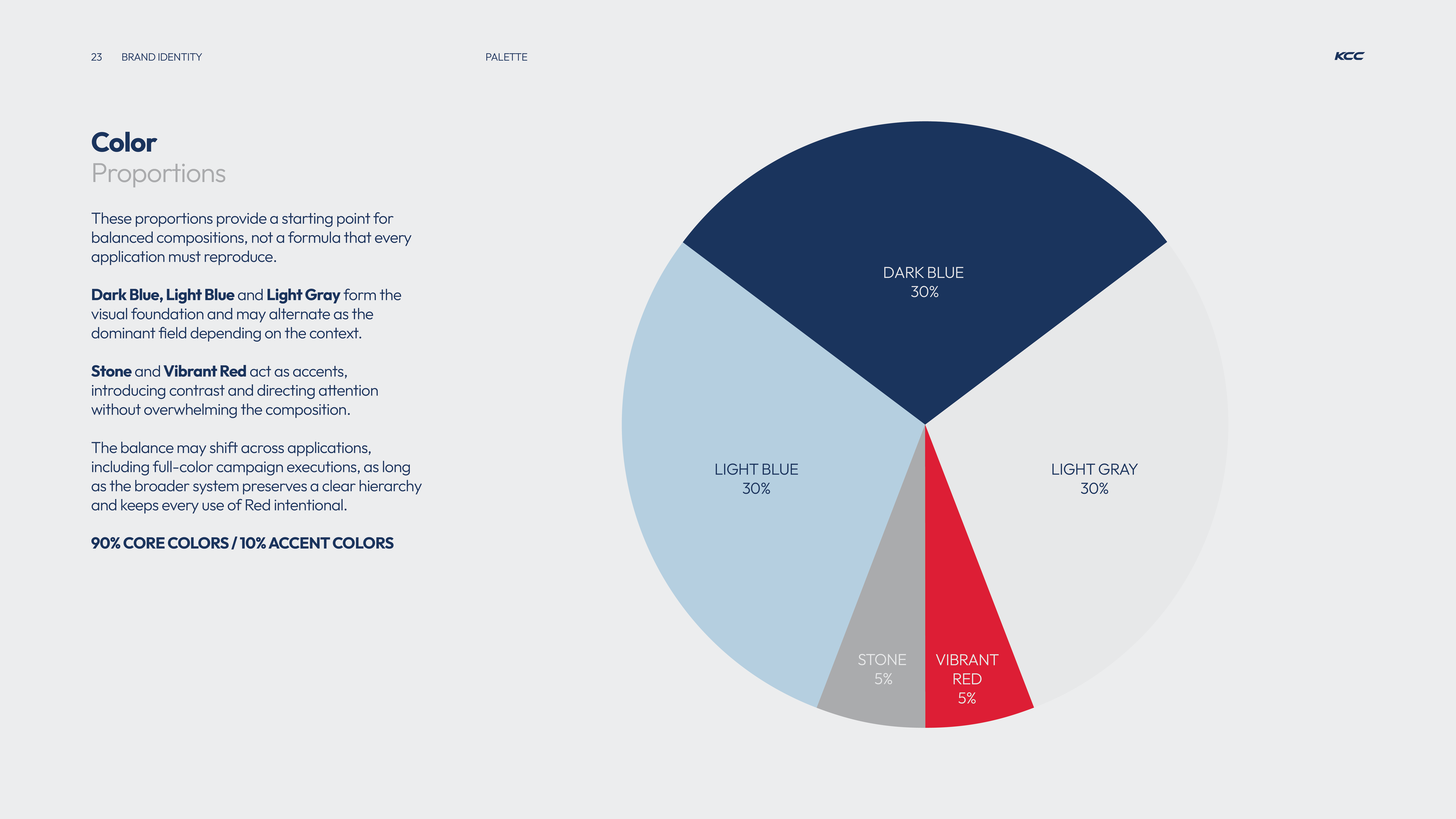
Pie chart showing color proportions for brand identity: Dark Blue 30%, Light Blue 30%, Light Gray 30%, Stone 5%, Vibrant Red 5%, with text explaining these proportions provide a starting point for balanced compositions and that 90% are core colors with 10% accent colors.
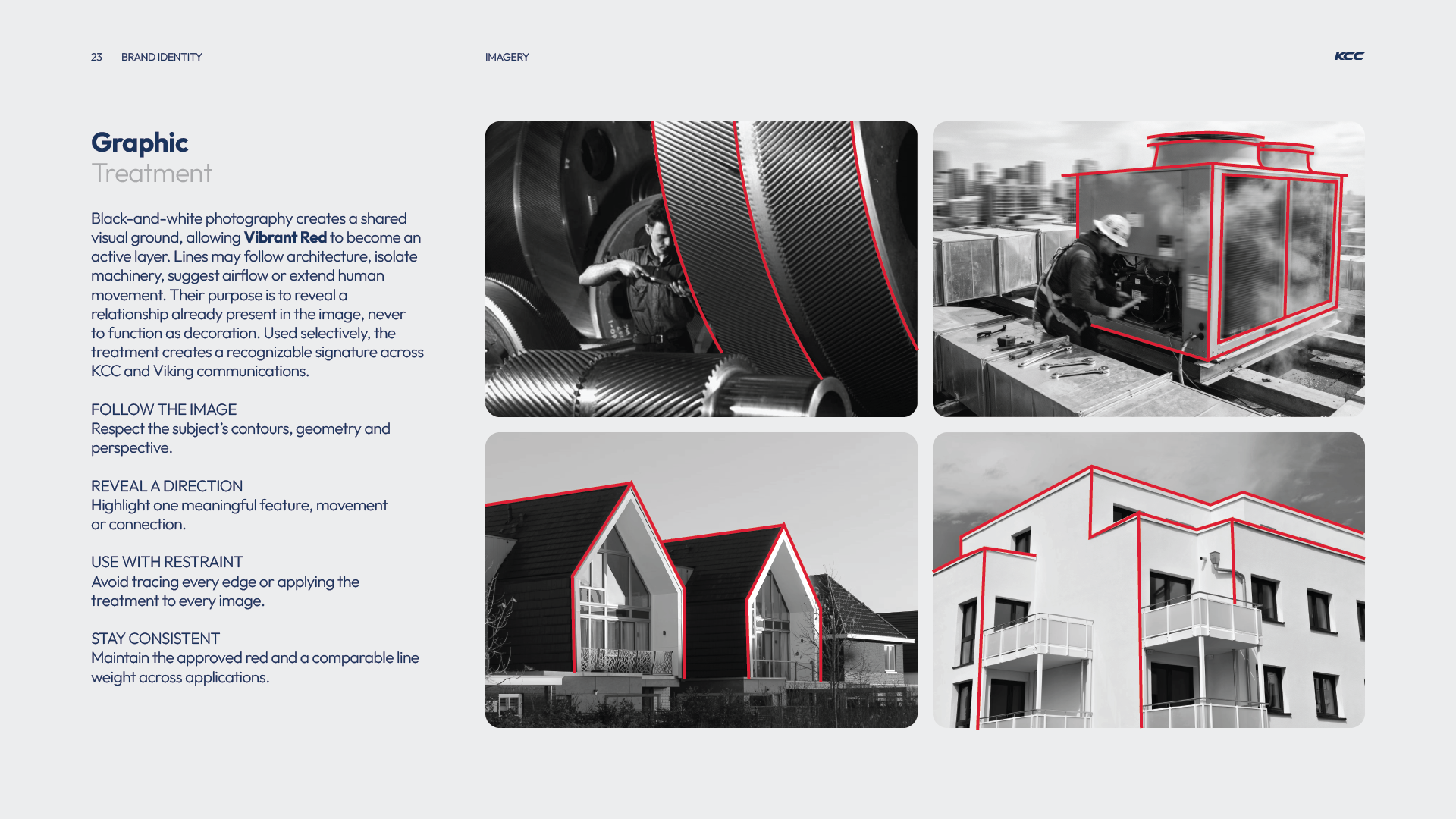
Four black-and-white images showing various industrial and architectural subjects with red lines tracing specific contours and edges to highlight shapes and movement, demonstrating a graphic treatment technique using vibrant red to enhance key features while respecting the subject's geometry and perspective.
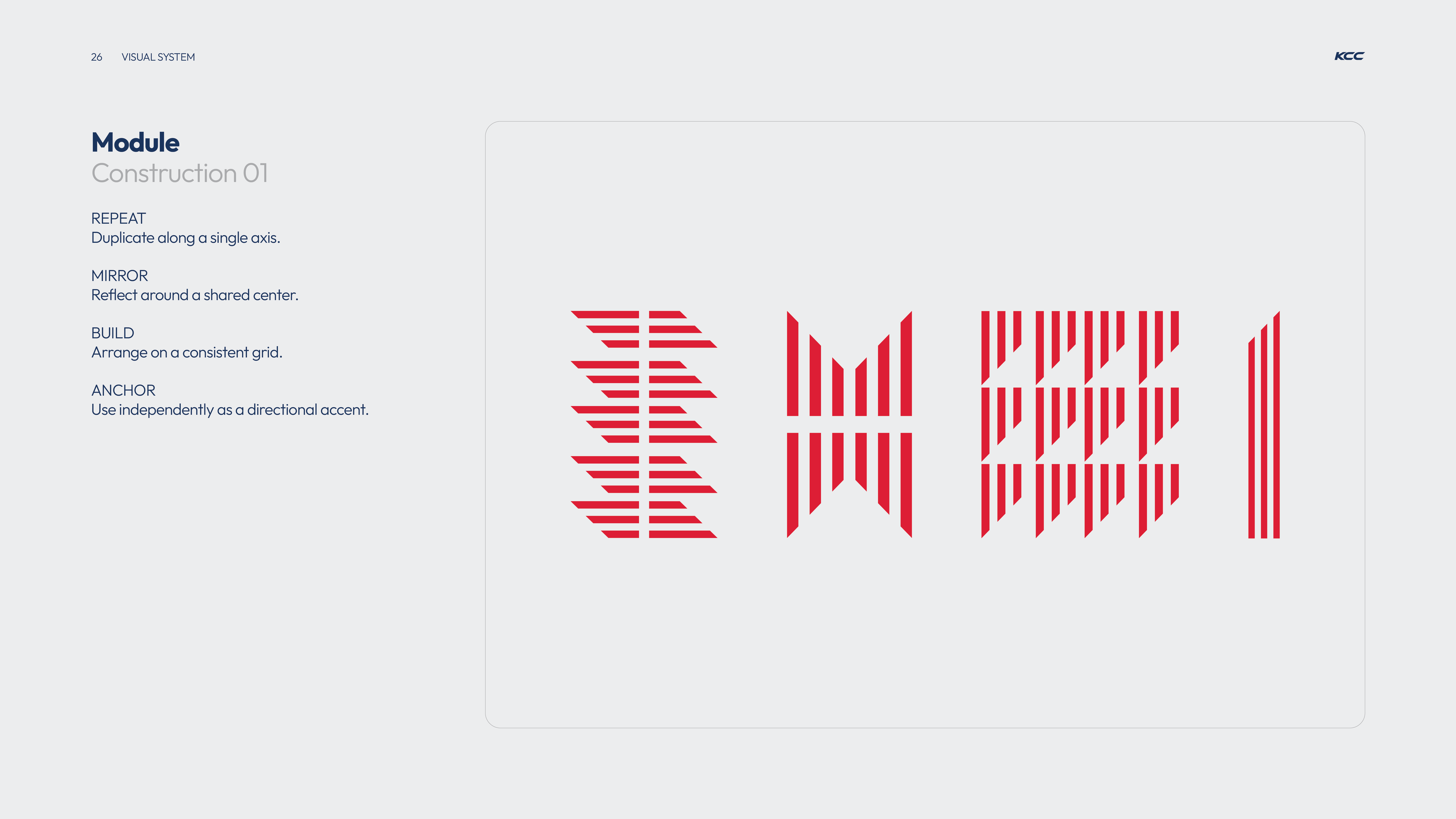
Visual system module titled 'Construction 01' with four design principles listed: Repeat to duplicate along a single axis, Mirror to reflect around a shared center, Build to arrange on a consistent grid, Anchor to use independently as a directional accent; alongside four corresponding red geometric pattern examples visualizing each principle on a light gray background.
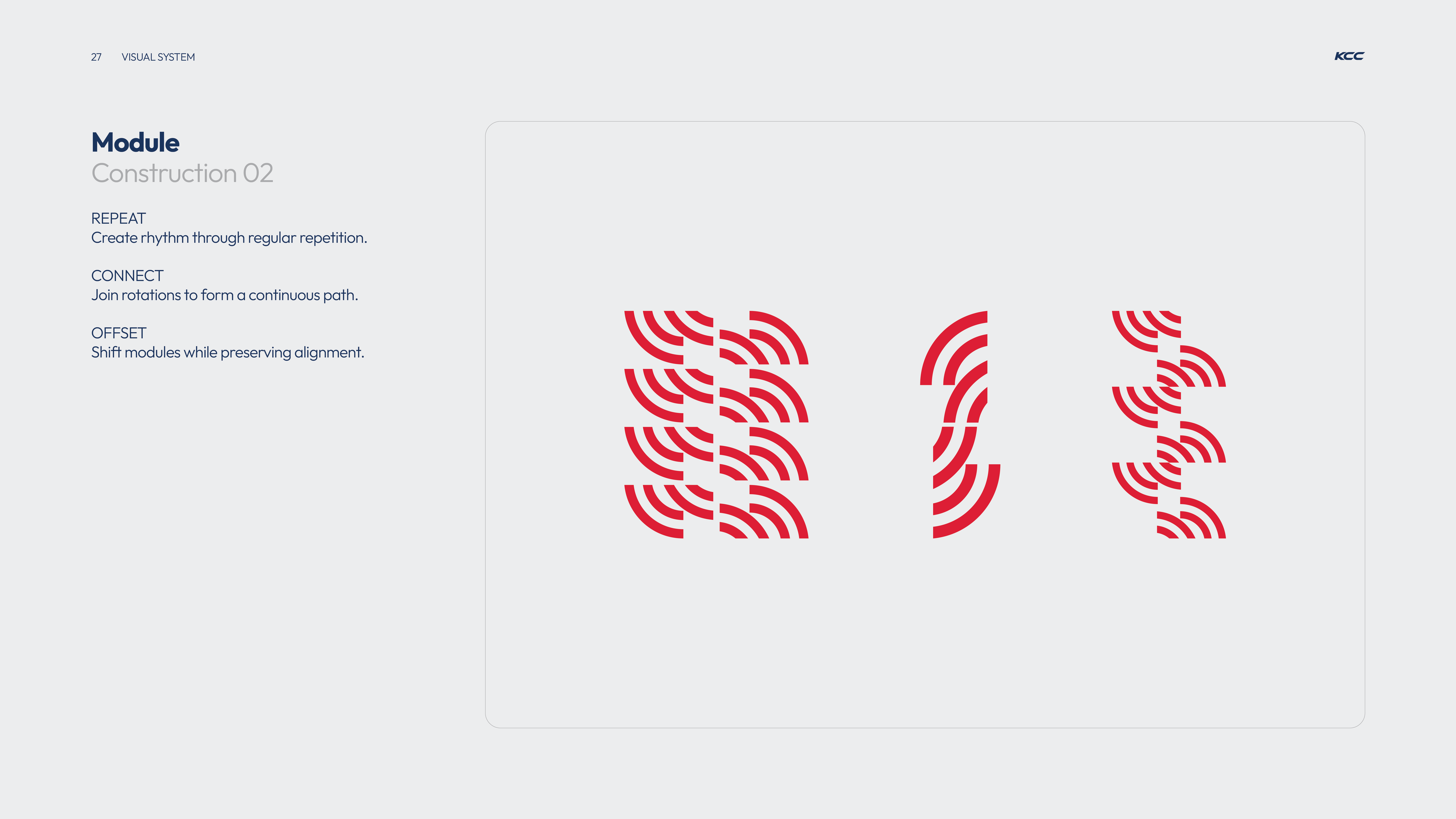
Diagram illustrating module construction with red curved line segments arranged in three groups demonstrating repeat for rhythm, connect for continuous path, and offset for shifted alignment.
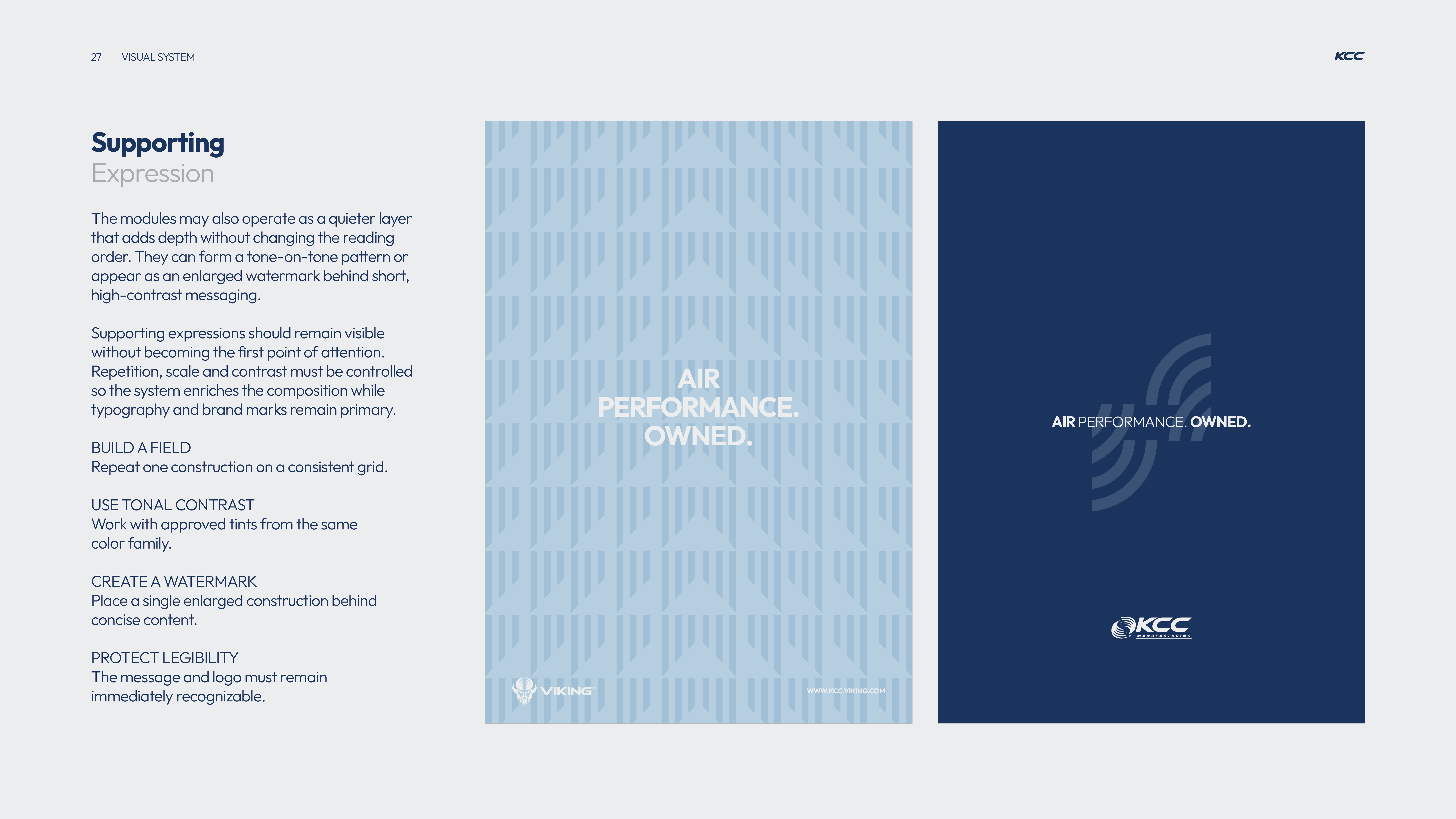
A visual design guide page titled 'Supporting Expression' with instructions about using quieter layers in design for depth without changing reading order, controlling repetition, scale, and contrast, and protecting legibility. It includes two example panels: the left panel has a light blue pattern background with white centered text 'AIR PERFORMANCE. OWNED.' and small logos at the bottom; the right panel has a dark blue background with the same centered text in white and light blue sound wave graphics beside it, along with a KCC Manufacturing logo at the bottom.
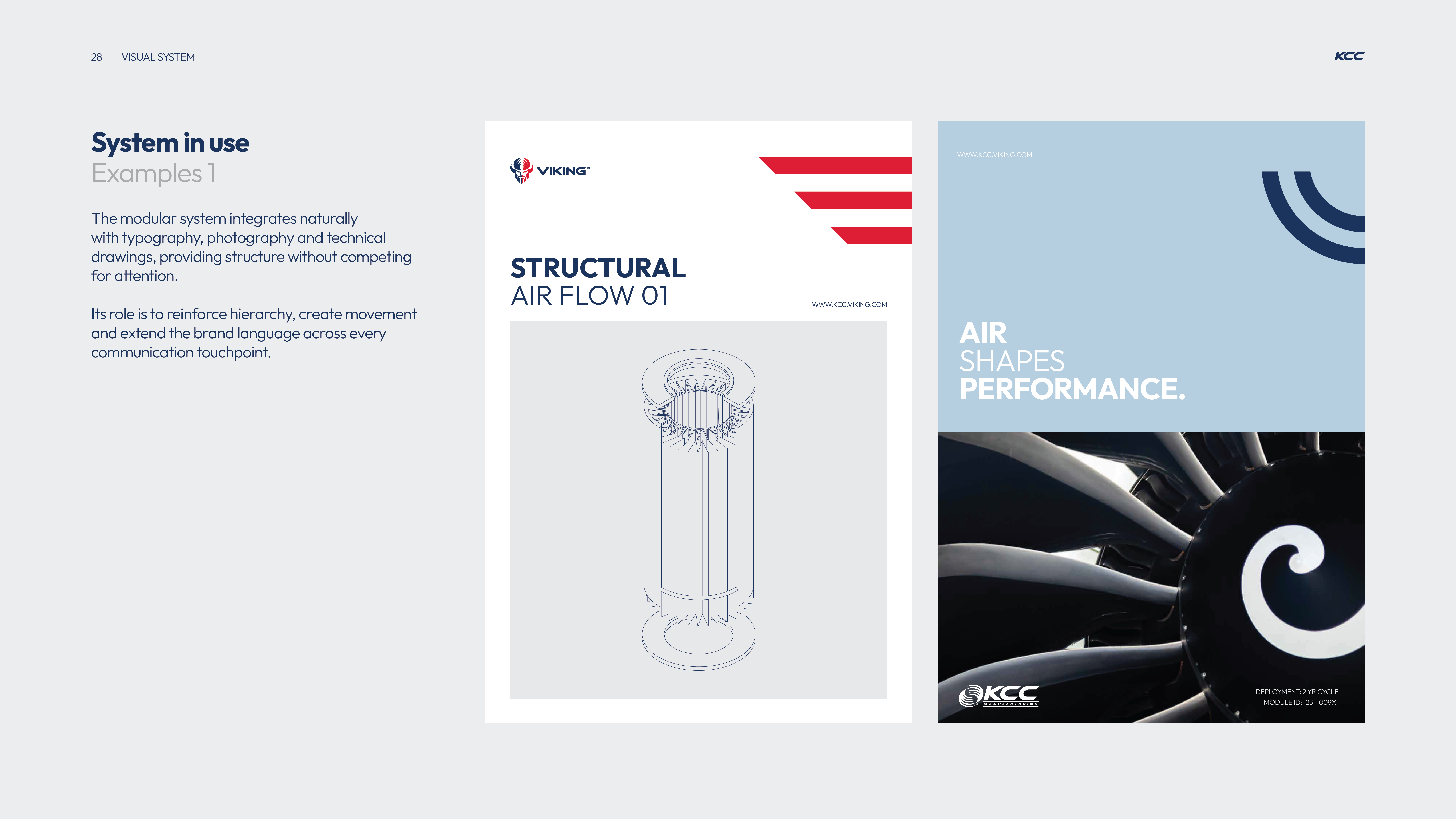
Two example panels demonstrating the modular visual system: left panel titled 'STRUCTURAL AIR FLOW 01' shows a technical line drawing of a cylindrical air flow structure with red geometric accents; right panel titled 'AIR SHAPES PERFORMANCE.' features a close-up photo of an aircraft turbine blade with KCC logo and blue background with curved dark lines.
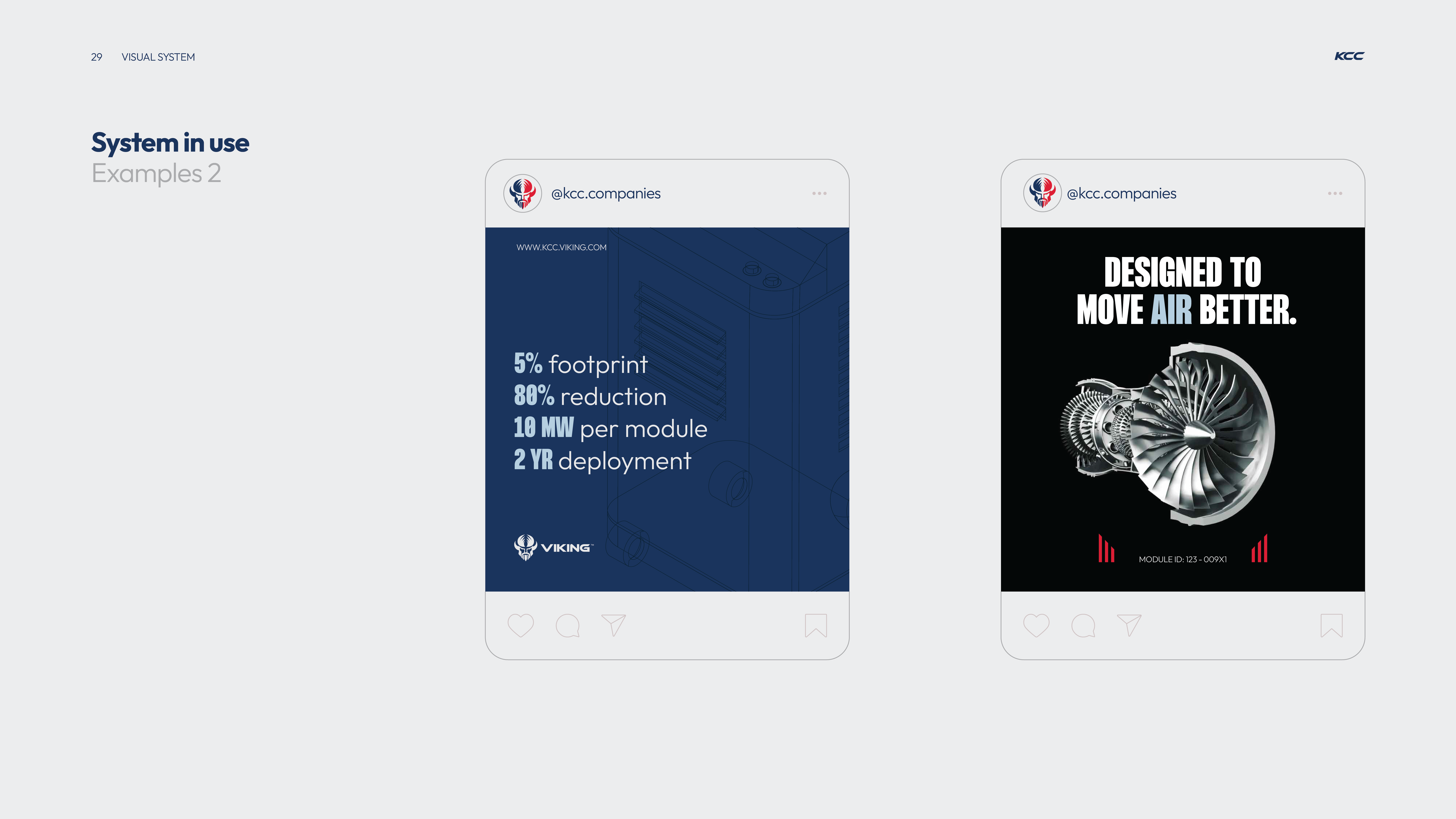
Two side-by-side Instagram-style posts from @kcc.companies. The left post has a dark blue background with technical text listing 5% footprint, 80% reduction, 10 MW per module, and 2 year deployment with the Viking logo beneath. The right post has a black background featuring a detailed metallic turbine image below bold white text saying 'DESIGNED TO MOVE AIR BETTER.' and a module ID at the bottom.
Red background with large faint number '04' and the word 'CO-BRANDING' in large white letters center-left, with small text including a website, copyright, address, and phone numbers at the bottom corners.
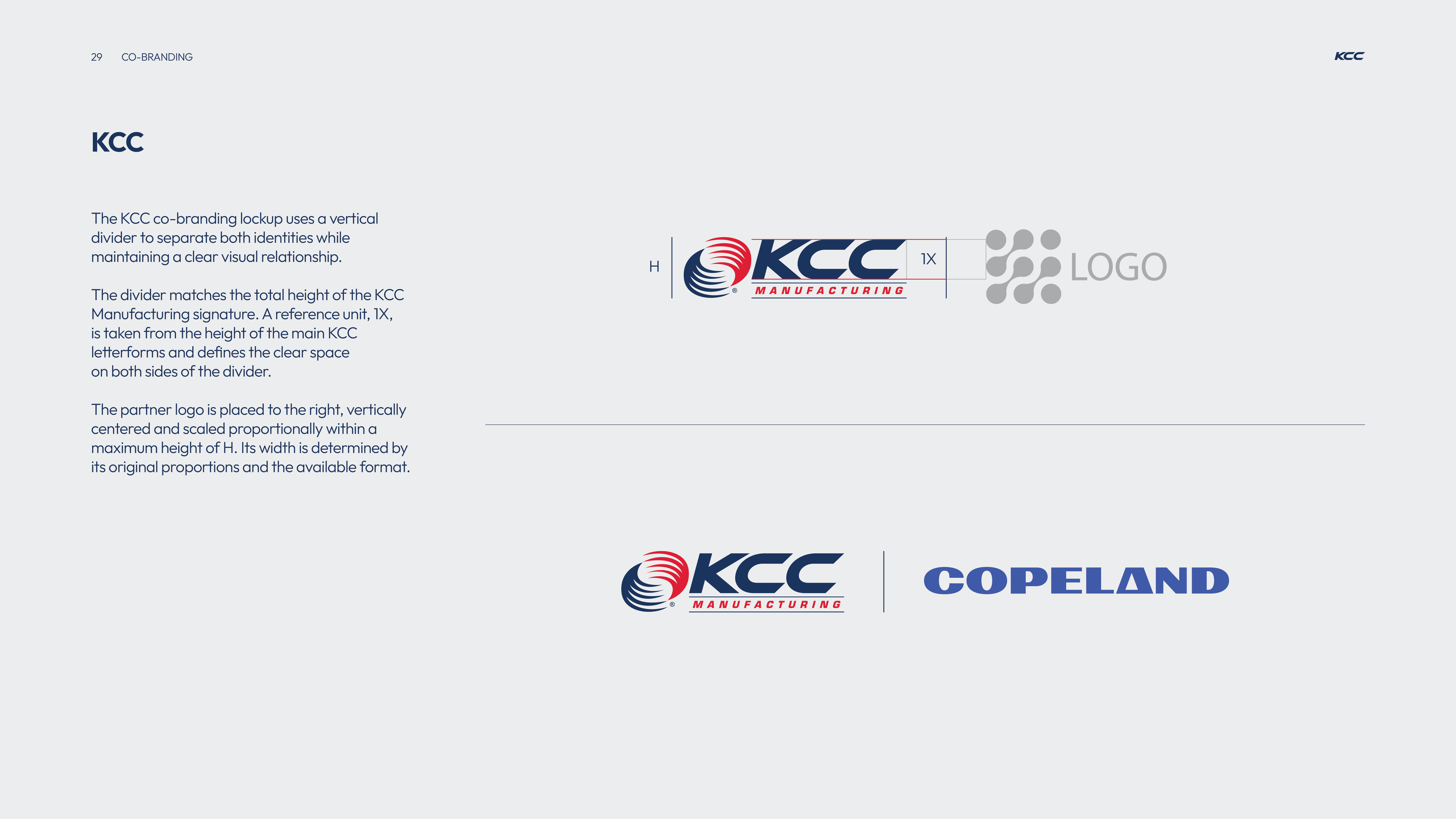
KCC co-branding guidelines showing a KCC Manufacturing logo with height labeled H and a vertical divider matching the height, separating it from a partner logo area. Text explains the divider uses a reference unit 1X from the KCC letterform height for clear space on both sides. The partner logo is positioned to the right, vertically centered, scaled within height H, with width based on original proportions. Below is an example combining the KCC Manufacturing logo with a vertical divider and the COPELAND logo to the right.
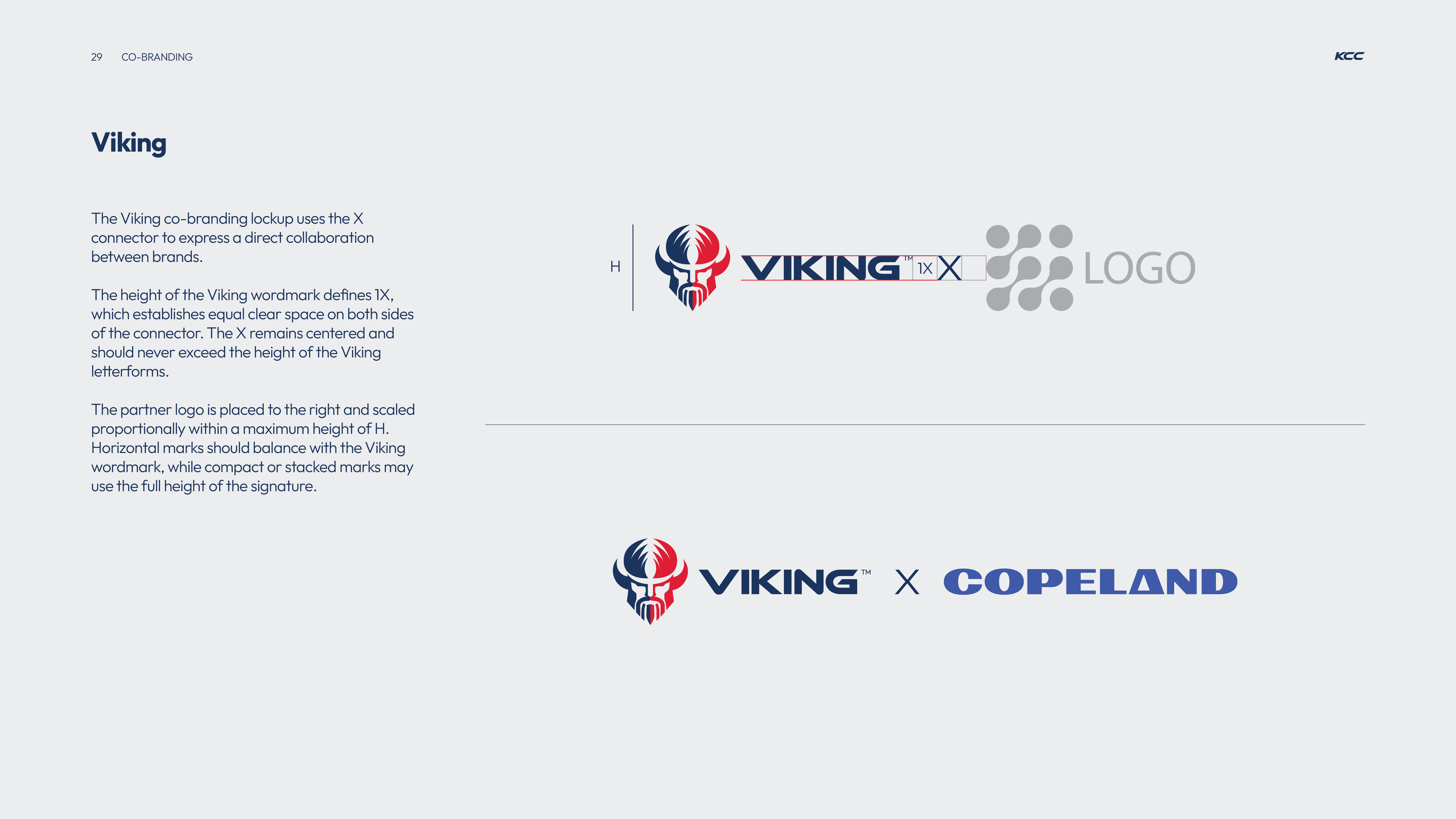
Branding guideline page showing the Viking co-branding lockup with a Viking helmet logo and wordmark connected by an X symbol to a placeholder for a partner logo, explaining spacing, height, and placement rules for collaboration logos.
Blue background with KCC Manufacturing logo at top left, large text saying THANK YOU in the center, and contact details including website, address in Louisville, KY, phone numbers, and ©2026 copyright at the bottom.
BL ConsultingStrategic Rebrand & Messaging
Logo with stylized lowercase letters 'b' and 'l' in pink and white, followed by text 'BLAT LAPIDOT' in uppercase white letters.

Blat Lapidot, a Change Management Consultancy, turned to Ideate Creative to revamp their visual identity as it has been 7 years since their last branding. As digital expectations rose, the brand’s look and feel no longer matched modern standards, impacting credibility across web, sales, and marketing channels.

Logo design for BLAT LAPIDOT, a change management service provider, with the tagline 'Strategic Branding & Visual Identity' and the ID8 Creative branding below, set on a dark background with pink and gray lines.
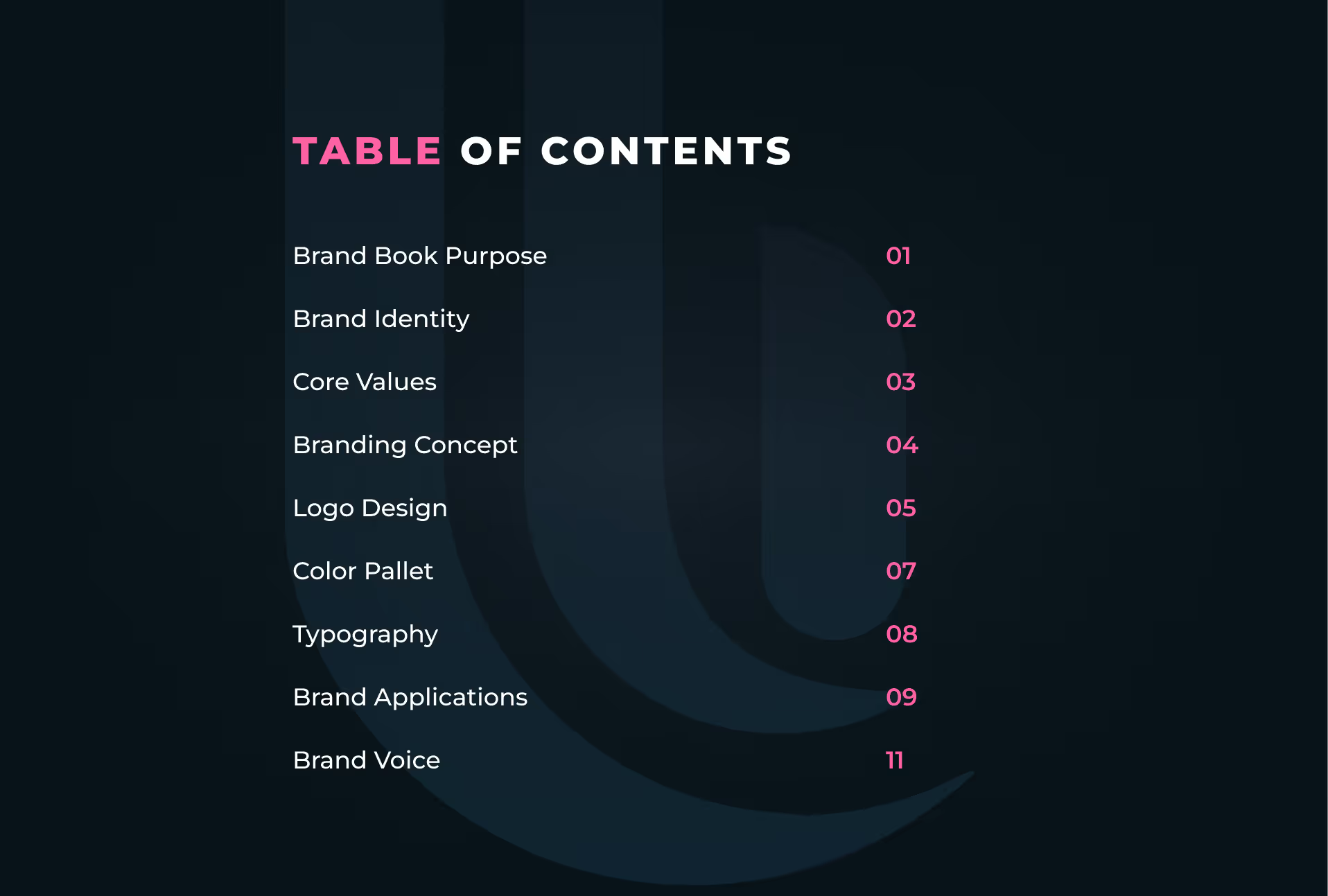
Table of contents listing brand book sections including Brand Book Purpose, Brand Identity, Core Values, Branding Concept, Logo Design, Color Pallet, Typography, Brand Applications, and Brand Voice with page numbers from 01 to 11.
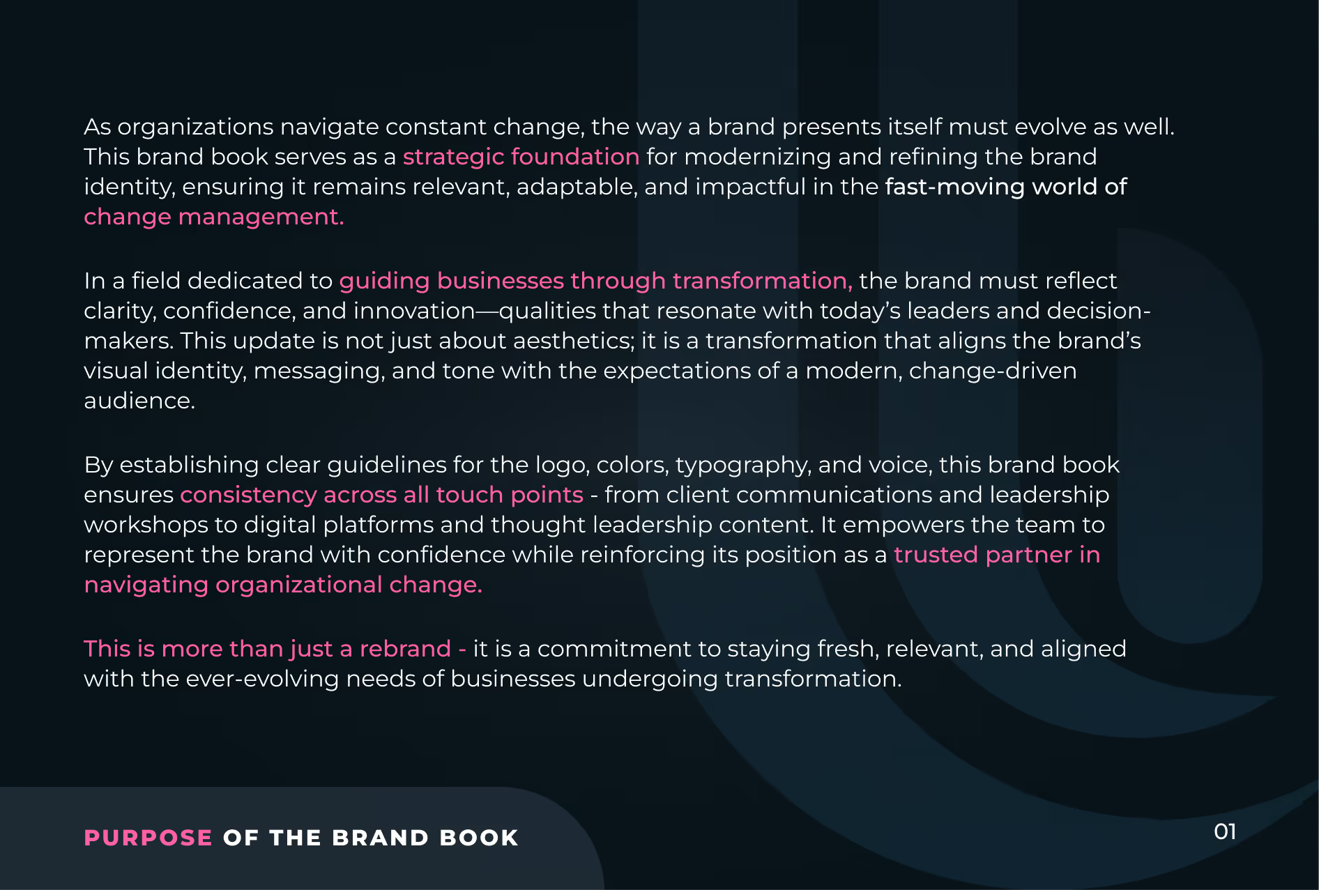
Text about the purpose of a brand book, explaining how it serves as a strategic foundation for modernizing and refining brand identity to remain relevant and adaptable in change management. It highlights guiding businesses through transformation by reflecting clarity, confidence, and innovation, aligning brand visuals and messaging with modern expectations. The text emphasizes establishing guidelines for logo, colors, typography, and voice to ensure consistency across all touch points, empowering teams and reinforcing the brand's position as a trusted partner in organizational change. It notes that this is more than a rebrand, but a commitment to staying fresh and aligned with evolving business needs.
Text on a dark background outlining brand identity with four sections: Brand Personality emphasizes bridging people, processes, and technology; Our Promise pledges guidance through change with careful planning and human-centered care; Our Vision aims for organizational alignment, shared purpose, and sustainable success via human-centered change management; Mission Statement focuses on empowering individuals and organizations to navigate change with expert-driven, transparent, and meticulous solutions.
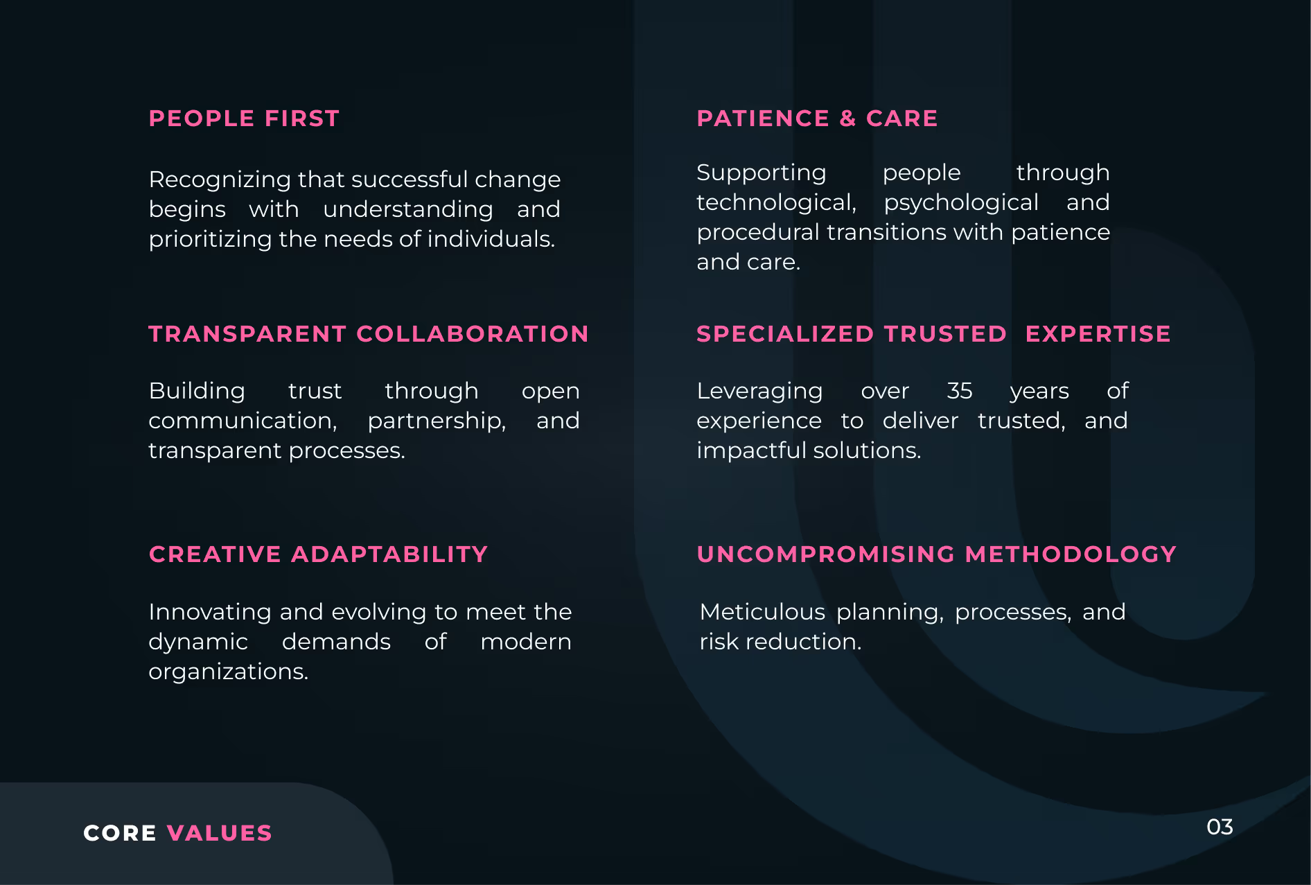
Text listing core values in two columns on a dark background, with headings in pink and details in white: People First - prioritizing individual needs; Transparent Collaboration - building trust through open communication; Creative Adaptability - innovating to meet modern demands; Patience & Care - supporting people through transitions; Specialized Trusted Expertise - over 35 years experience delivering impactful solutions; Uncompromising Methodology - meticulous planning and risk reduction. "CORE VALUES" is at the bottom left in pink and white.
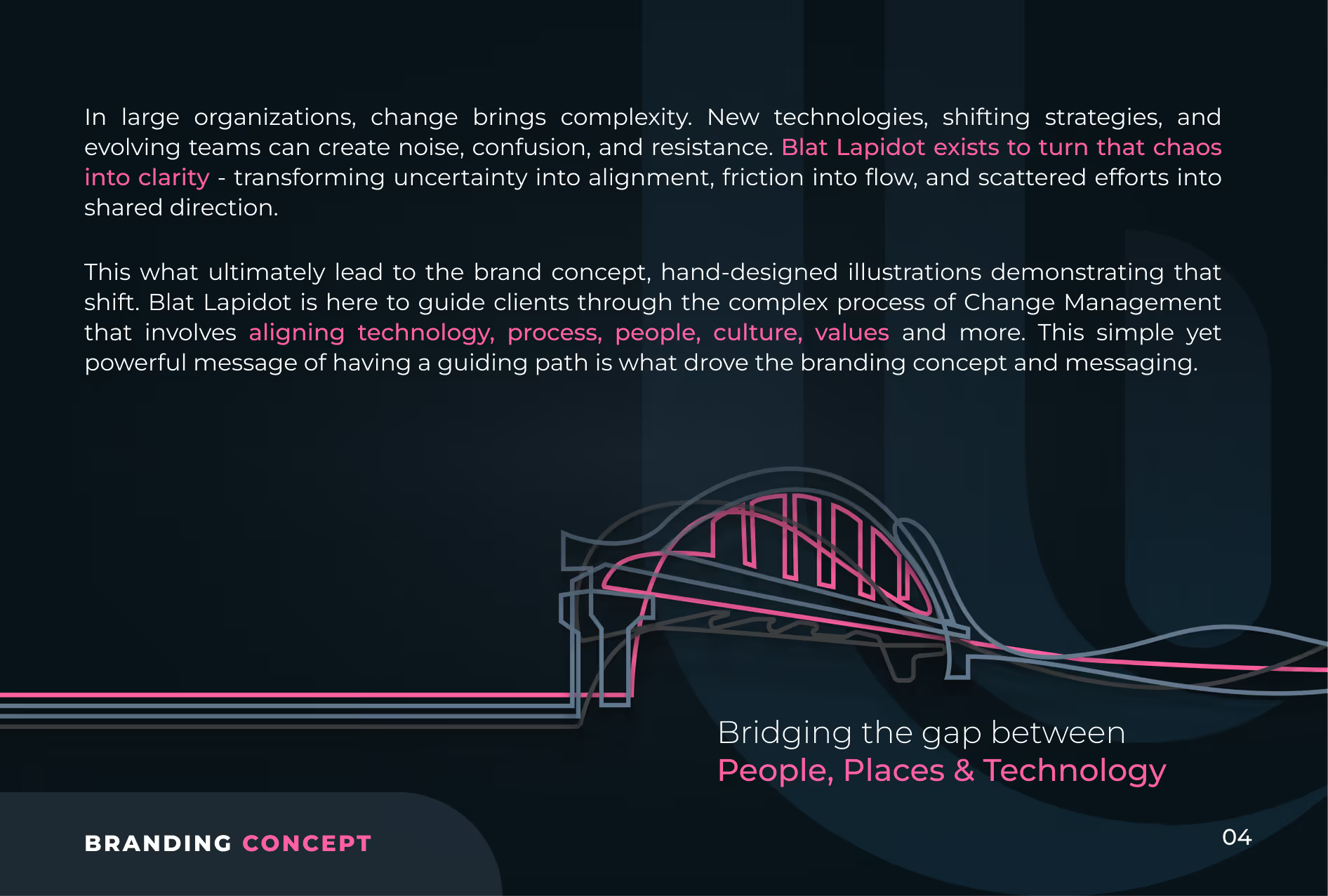
Text on a dark background explaining how change brings complexity in large organizations and how Blat Lapidot turns chaos into clarity by aligning technology, process, people, culture, and values. Includes a stylized bridge illustration symbolizing bridging the gap between people, places, and technology. The words 'Branding Concept' and 'Bridging the gap between People, Places & Technology' are highlighted in pink.
Blat Lapidot logo guidelines explaining alignment and measurement. The logo forms letters B and L representing People, Processes, and Technology. Horizontal and vertical logo layouts with spacing ratios are shown, using the letter O as a measurement unit. The text details the symbolic journey from fragmentation to unity in change management and advises using the letter O in the type section as reference for logo measurement.
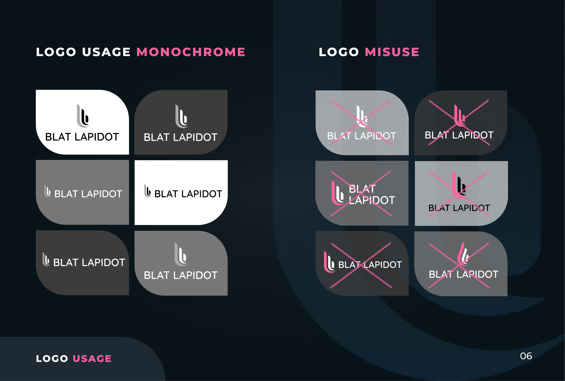
A guide showing correct monochrome logo usage and misuses for 'Blat Lapidot.' On the left, eight logos in black, white, and gray backgrounds demonstrate proper monochrome usage with consistent logo colors and clear contrast. On the right, eight logos show misuses with pink crosses over logos that have incorrect colors, backgrounds, or contrasts, indicating improper logo application.
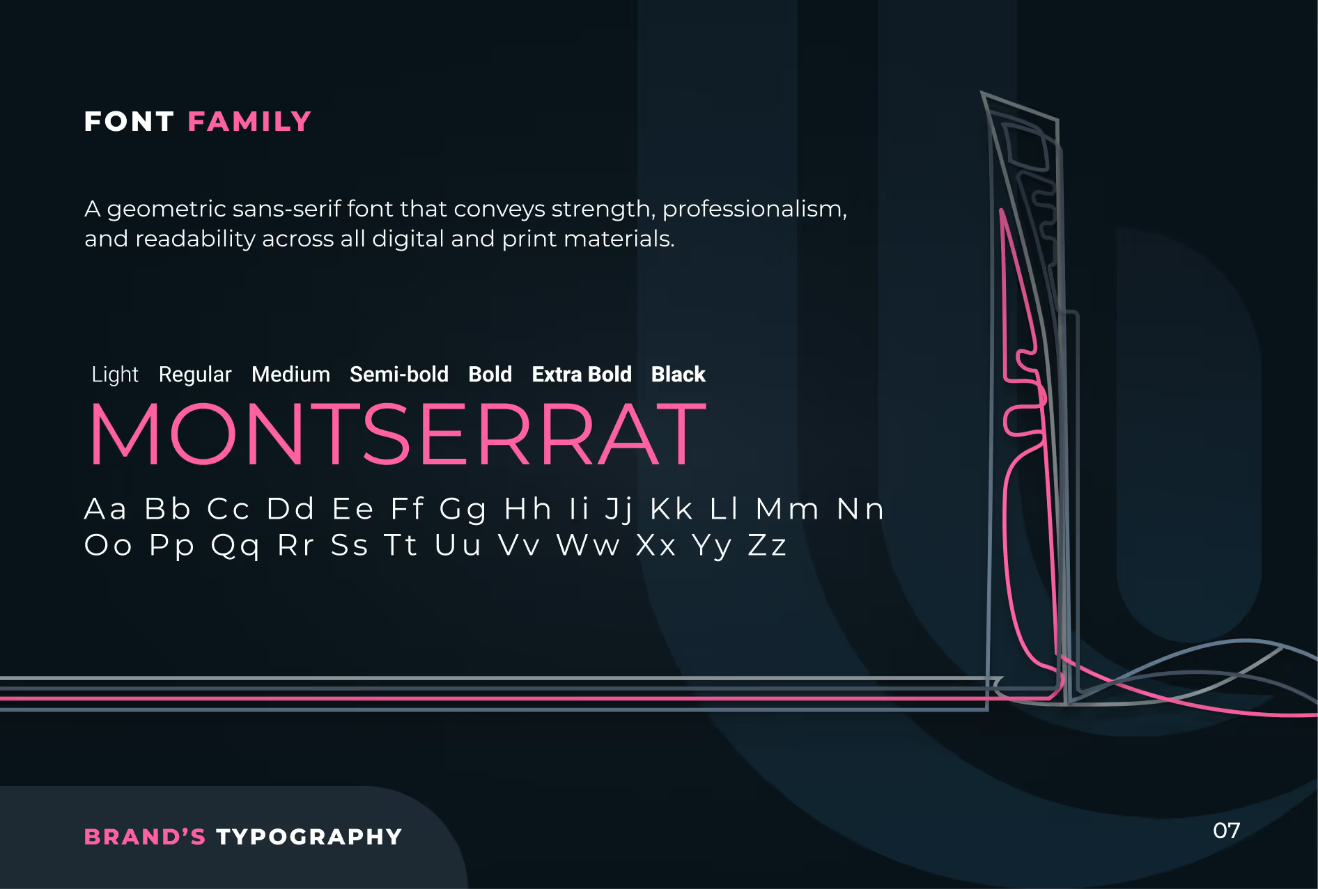
Typography presentation of Montserrat font family displaying weights from Light to Black, with uppercase and lowercase letters, describing it as a geometric sans-serif font conveying strength, professionalism, and readability for digital and print materials.
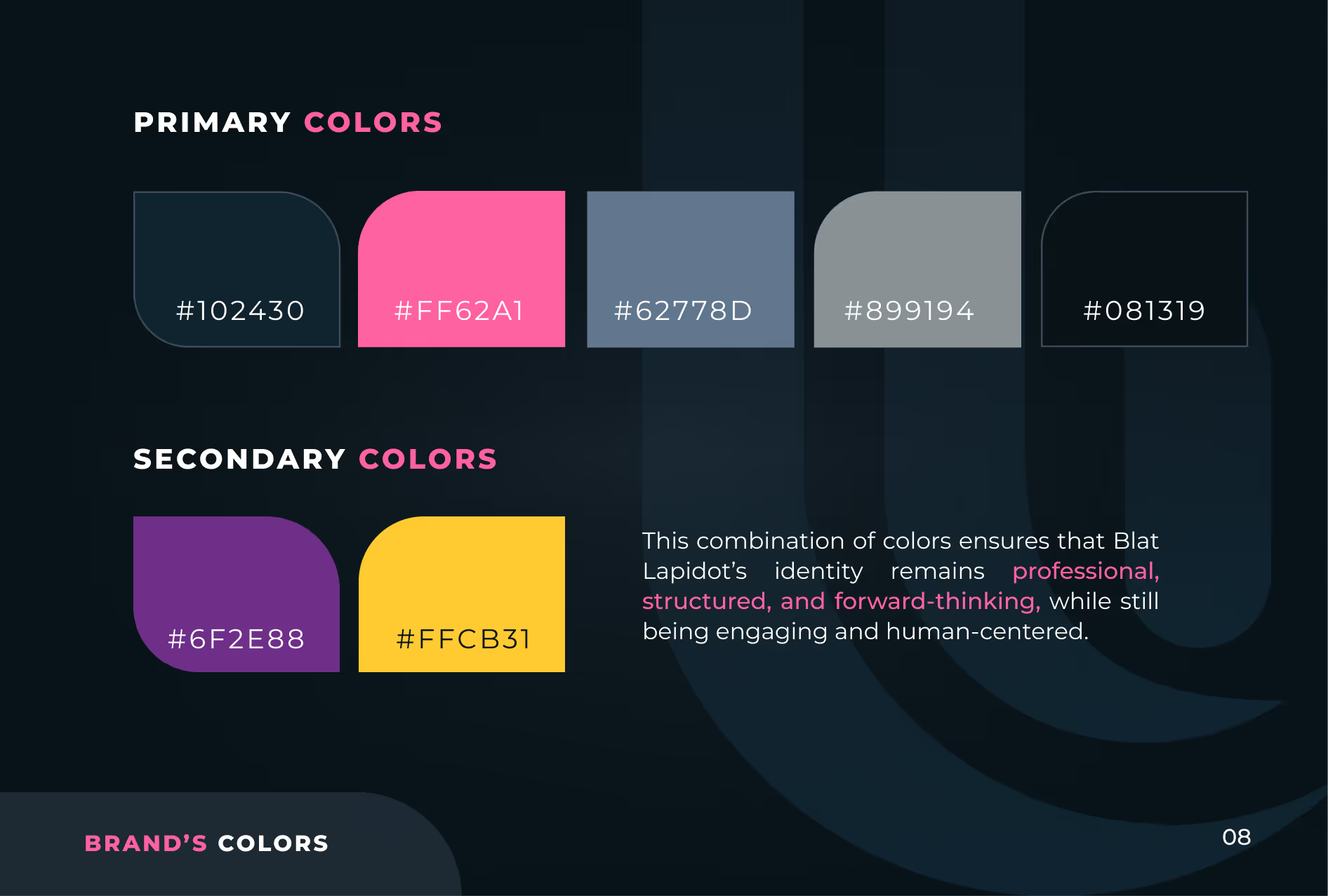
Color palette showing primary colors as dark blue (#102430), pink (#FF62A1), muted blue (#62778D), gray (#899194), and black (#081319), and secondary colors as purple (#6F2E88) and yellow (#FFCB31). Text describes the color combination as professional, structured, forward-thinking, engaging, and human-centered for Blat Lapidot's identity.
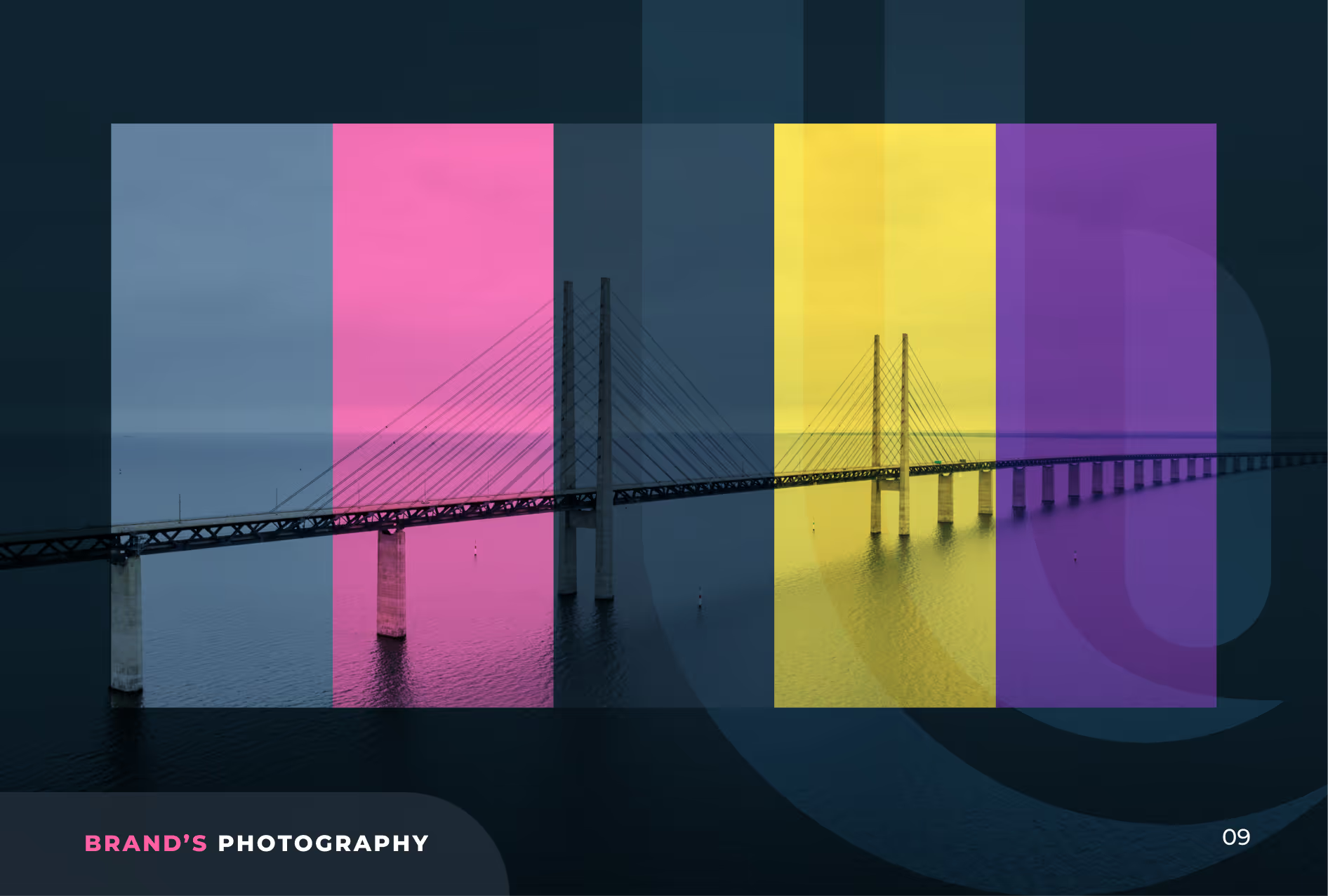
A cable-stayed bridge over water shown with four vertical color overlays in blue, pink, yellow, and purple, with the text 'BRAND'S PHOTOGRAPHY' in the bottom left corner.
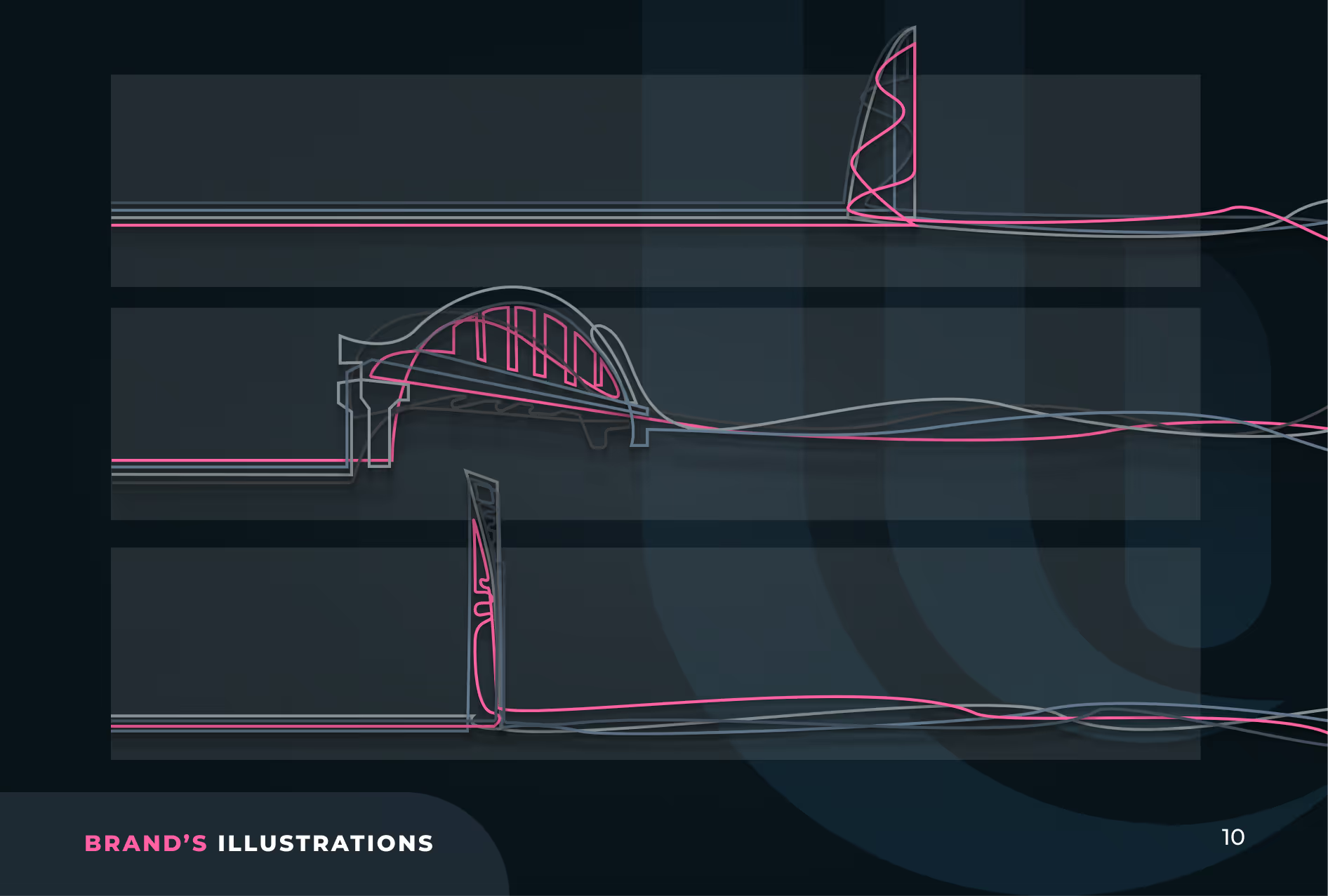
Technical line drawing showing three side views of a futuristic-looking elongated vessel or structure with varying top features, including a tower, arched dome, and vertical fin, rendered in pink and white lines on a dark blue background.
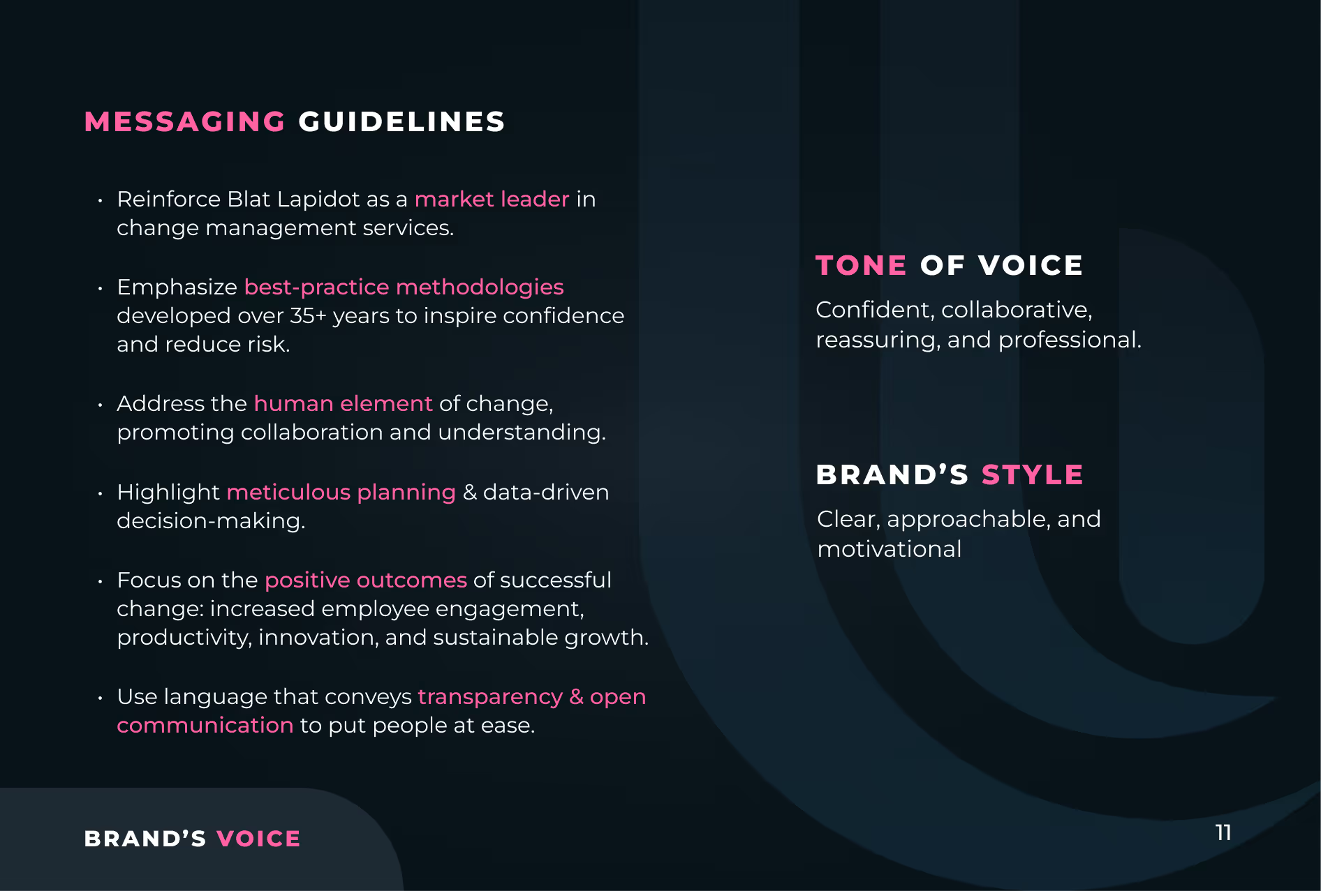
Messaging guidelines emphasizing Blat Lapidot as a market leader in change management, best-practice methodologies over 35+ years, human element promoting collaboration, meticulous planning, positive outcomes like employee engagement and sustainable growth, and transparency with open communication. Tone of voice described as confident, collaborative, reassuring, and professional. Brand's style is clear, approachable, and motivational. Text on dark background with white and pink font for emphasis.
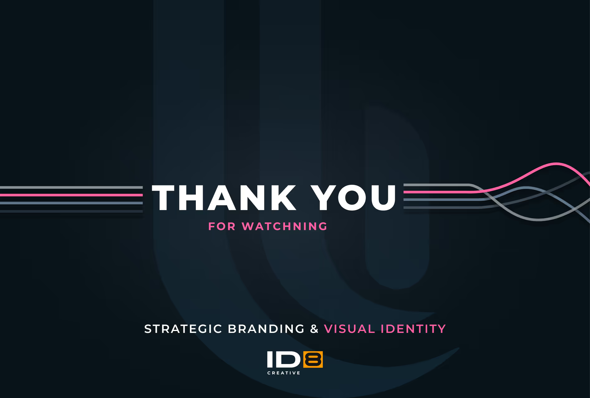
Dark background with 'THANK YOU' in bold white letters and 'FOR WATCHING' in smaller pink letters below, accompanied by colored lines and the text 'STRATEGIC BRANDING & VISUAL IDENTITY' above the ID8 Creative logo.
CloudZoneStrategic Branding
Cloudzone logo with the word 'cloudzone' in lowercase letters and 'primatrix' in smaller lowercase letters beneath it.

CloudZone is Israel's leading cloud service provider and a premier partner of AWS, Google Cloud, and Azure partner.

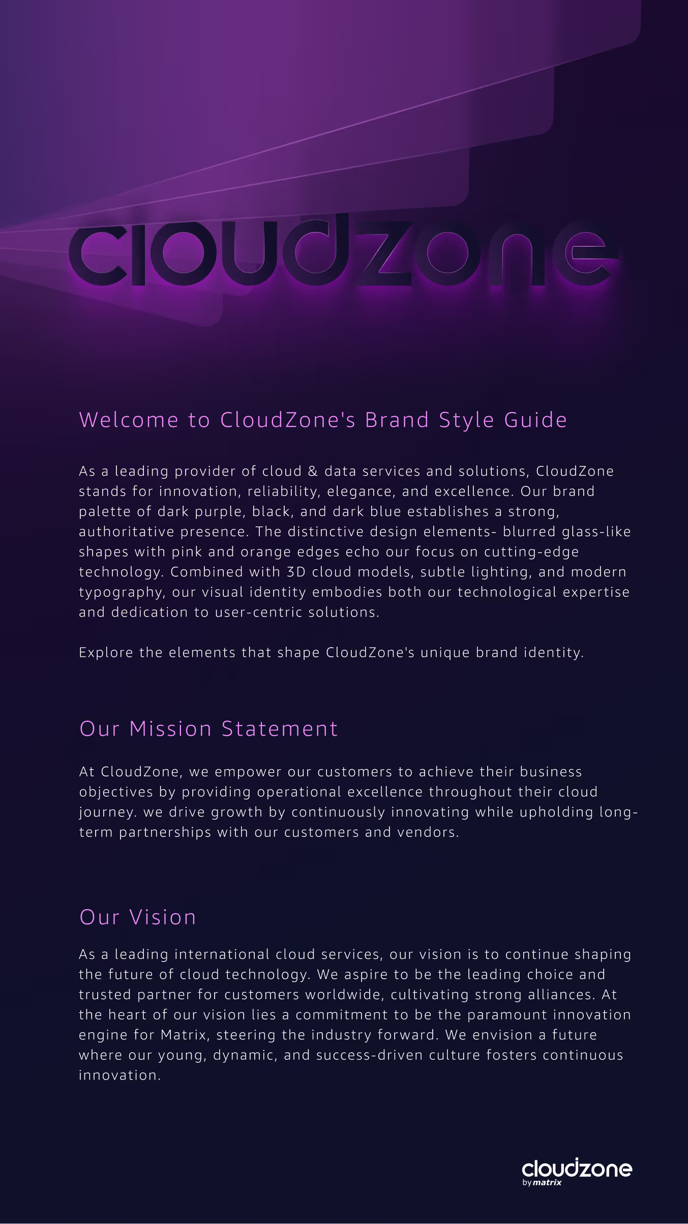
Its new visual identity uniquely blends the ethereal quality of a glass-blurred effect with the precision of golden mechanical objects. Set against a dark backdrop with subtle lighting, this design choice evokes a sense of advanced technology merged with elegance.

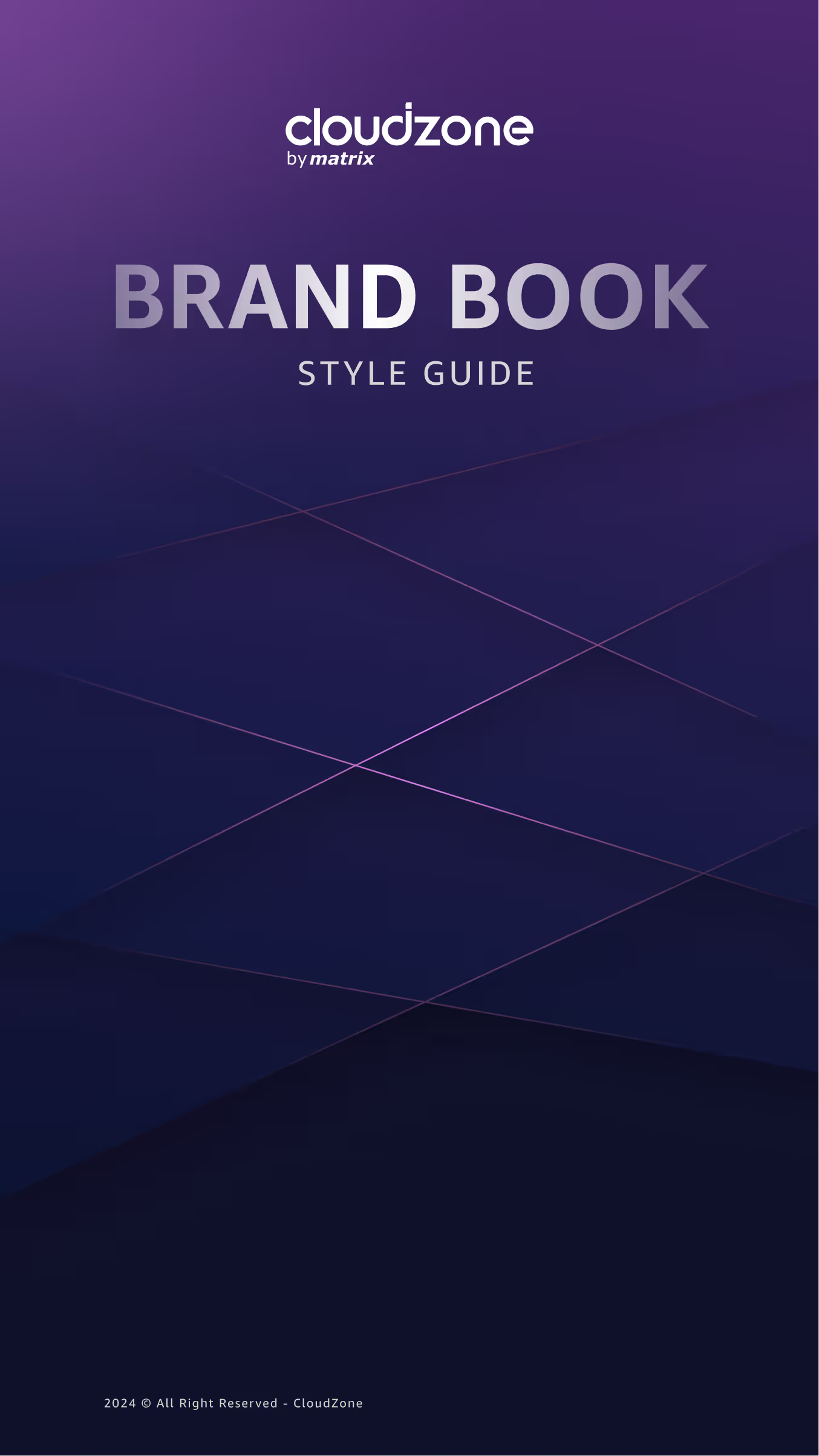
Cover page of a brand book style guide for CloudZone by Matrix with a dark purple gradient background and subtle diagonal lines.
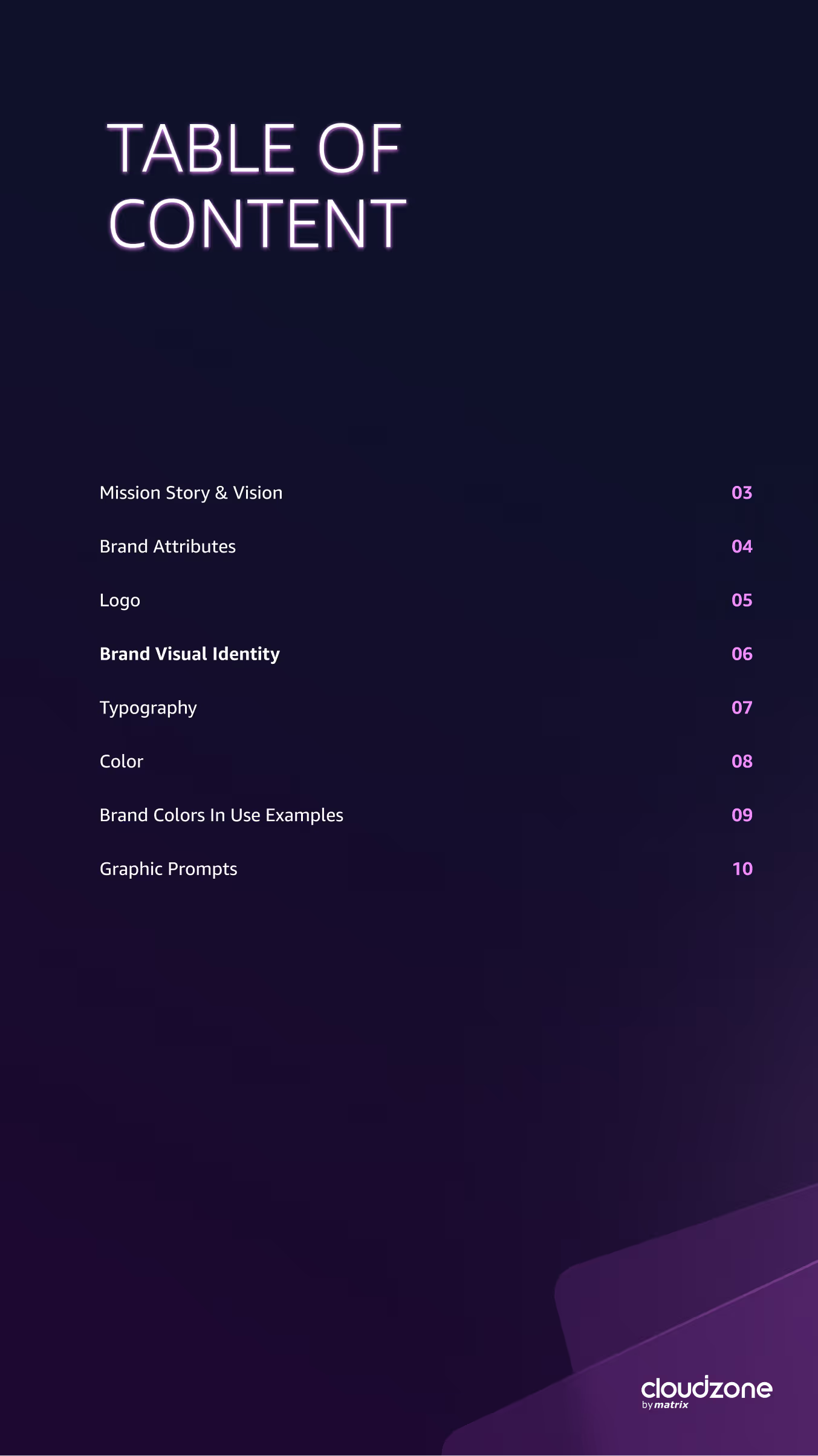
Table of contents listing pages for Mission Story & Vision, Brand Attributes, Logo, Brand Visual Identity, Typography, Color, Brand Colors In Use Examples, and Graphic Prompts on a dark purple background with cloudzone by metrix logo at the bottom right.
CloudZone brand style guide page with a purple background and neon-like logo at the top, followed by an introduction emphasizing CloudZone's expertise in cloud and data services with a distinctive dark palette and modern design, their mission to empower customers through operational excellence and innovation, and their vision to lead in cloud technology by fostering partnerships and continuous innovation.
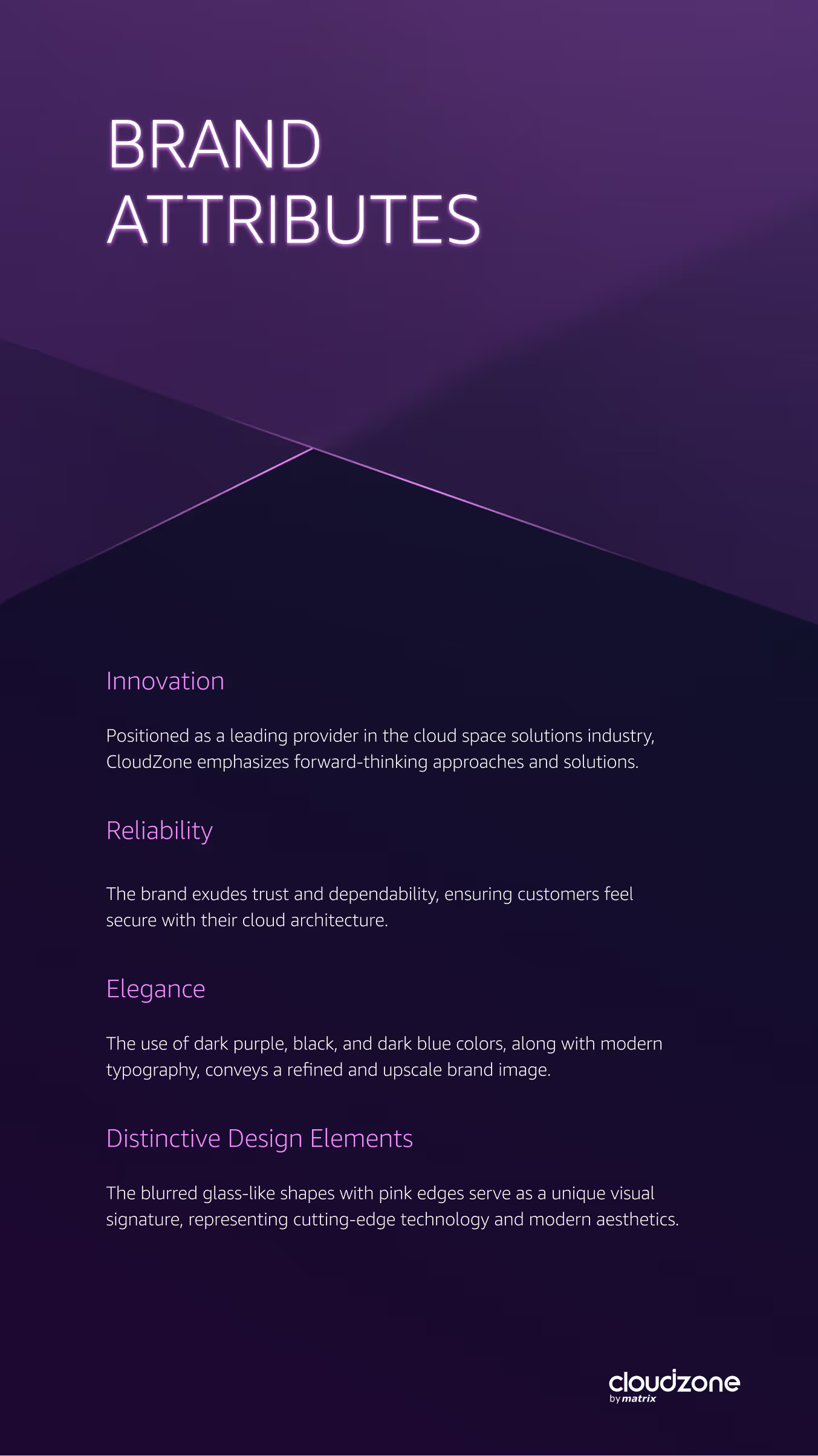
Text titled Brand Attributes describing CloudZone's innovation as a leading cloud solutions provider with forward-thinking approaches, reliability ensuring trust and security for customers, elegance through dark purple, black, and dark blue colors with modern typography, and distinctive design elements with blurred glass-like shapes with pink edges symbolizing cutting-edge technology and modern aesthetics on a dark purple background.
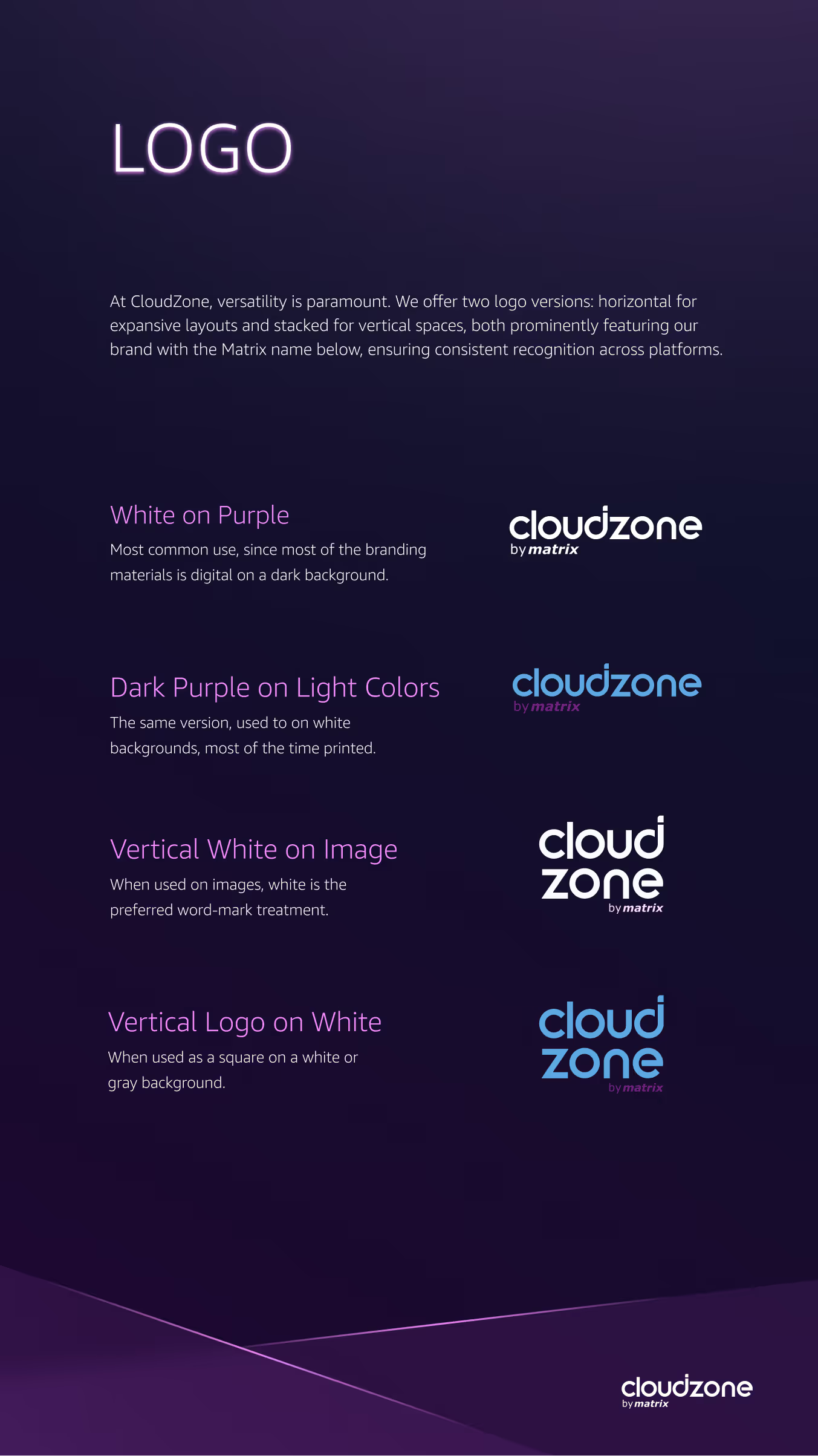
CloudZone logo guidelines on dark purple background showing four logo versions: white on purple, dark purple on light colors, vertical white on image, and vertical logo on white background, each with descriptive usage text.
Dark-themed brand visual identity presentation showcasing a glass blurred effect combined with golden mechanical objects for precision and elegance. The top text explains the unique blend of ethereal glass effect and advanced technology. Below, two columns compare 'Glass effect with Imagery' using mechanical horse visuals and 'Complex glass effect with typography' featuring a dollar sign and a tech-themed headline about IT bottlenecks. Descriptions highlight precision in design and strategic headline placement. The page footer displays the cloudzone by matrix logo.
Design guide for a secondary logo featuring a single cell pattern as a brand symbol, showing a black and white stylized square symbol with rounded corners and a cross shape in the center. Includes explanations about usage: it stands alone, can represent visual identity, fits smaller spaces, and is preferred in white on images. Displays the symbol in black, red, white, and purple variations on colored backgrounds, outlines in different colors, and inset rounded square versions. Also shows the white symbol overlay on a video call image.
Page from a style guide titled 'Branding Elements' describing CYBONET, a company focused on high-quality mail protection and data security, featuring the CYBONET logo in sharp but rounded typography to symbolize data flow and smooth running.
Brand Visual Identity page with a modern, clean, geometrical style. It features a large purple L-shaped graphic connected by pink corner brackets, symbolizing connected logos resembling letter O. Below, a pattern of dark squares highlights one purple and one pink bracketed square, representing servers, computers, and data. Text explains the pattern symbolizes a target or aim and an error spotted by CYBONET Protection Software.
Dark background with text about wordmark sizing, highlighting that the wordmark is sophisticated and confident and should not overpower the page. Example wordmark 'CYBONET' is shown centered above a grid with instructions that standard size placement uses a wordmark width of one-third to one-half of the document grid.
Graphic showing a color palette with four colors: darkest shade black 2F2E34, main brand color purple 704ADA, lightest shade light gray D6D6D6, and intense pink CD3073 used only for aim symbol; text says the palette is modern, techy, inviting, with guiding purple as dominant tone and intense pink as a pop-up color.
Purple background with the word 'Typography' repeated nine times vertically in descending opacity, with the bottom word in bold white text; small text in the top right corner reads 'Typography /13'.
Typography layout showing the font Proxima Nova Bold used for long-format body text and headlines; text emphasizes its use for large headlines, quotes, and important sentiments. The phrase 'The Art Of Writing' is highlighted, followed by a statement about how writing style affects task completion, with sample text blocks illustrating clean styling and readability.
TuneIn Strategic Branding
Logo depicting an orange pair of headphones encircling a white simplified house icon, followed by stylized text reading 'tune in' in white and orange colors on a black background.

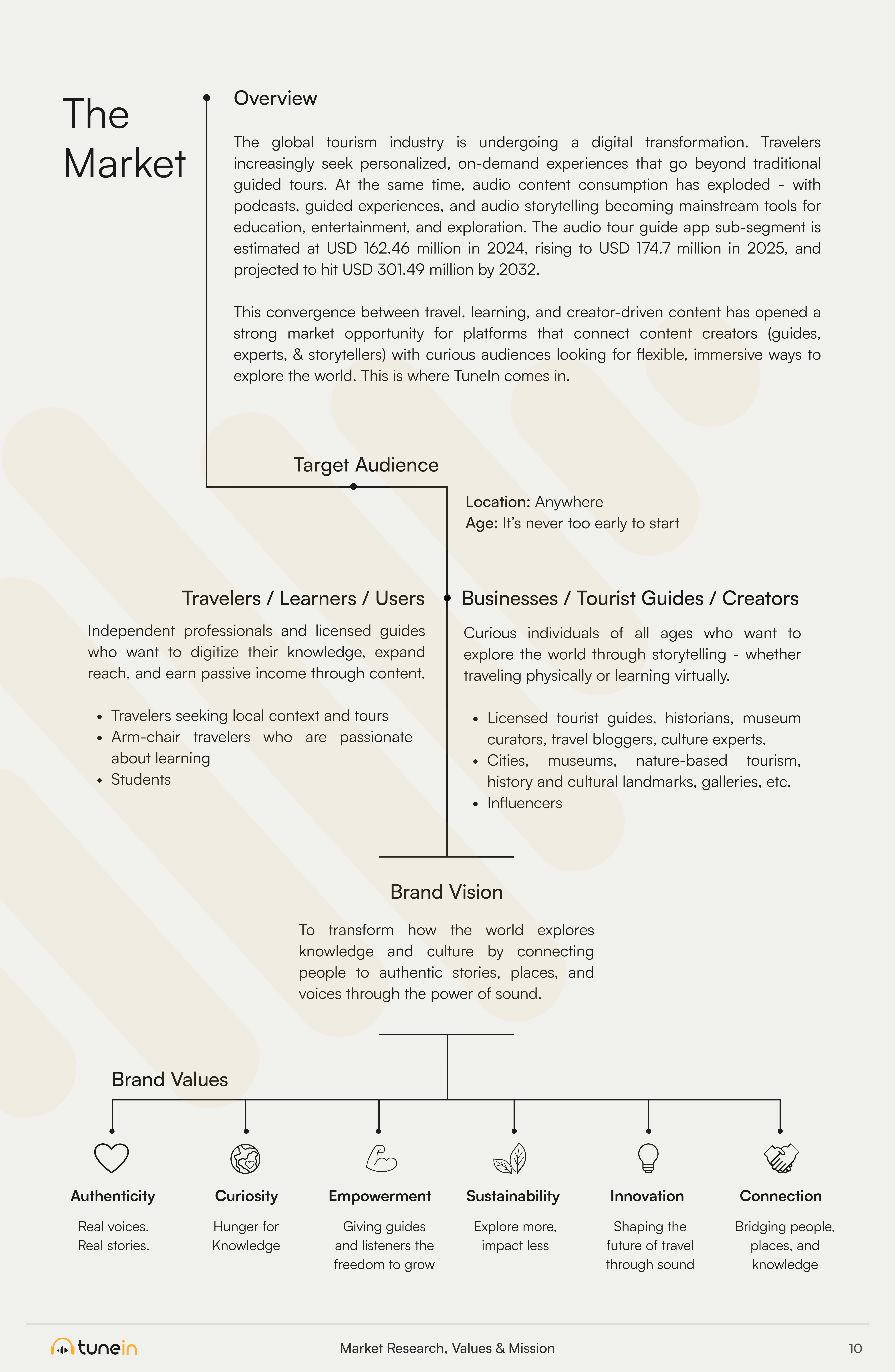
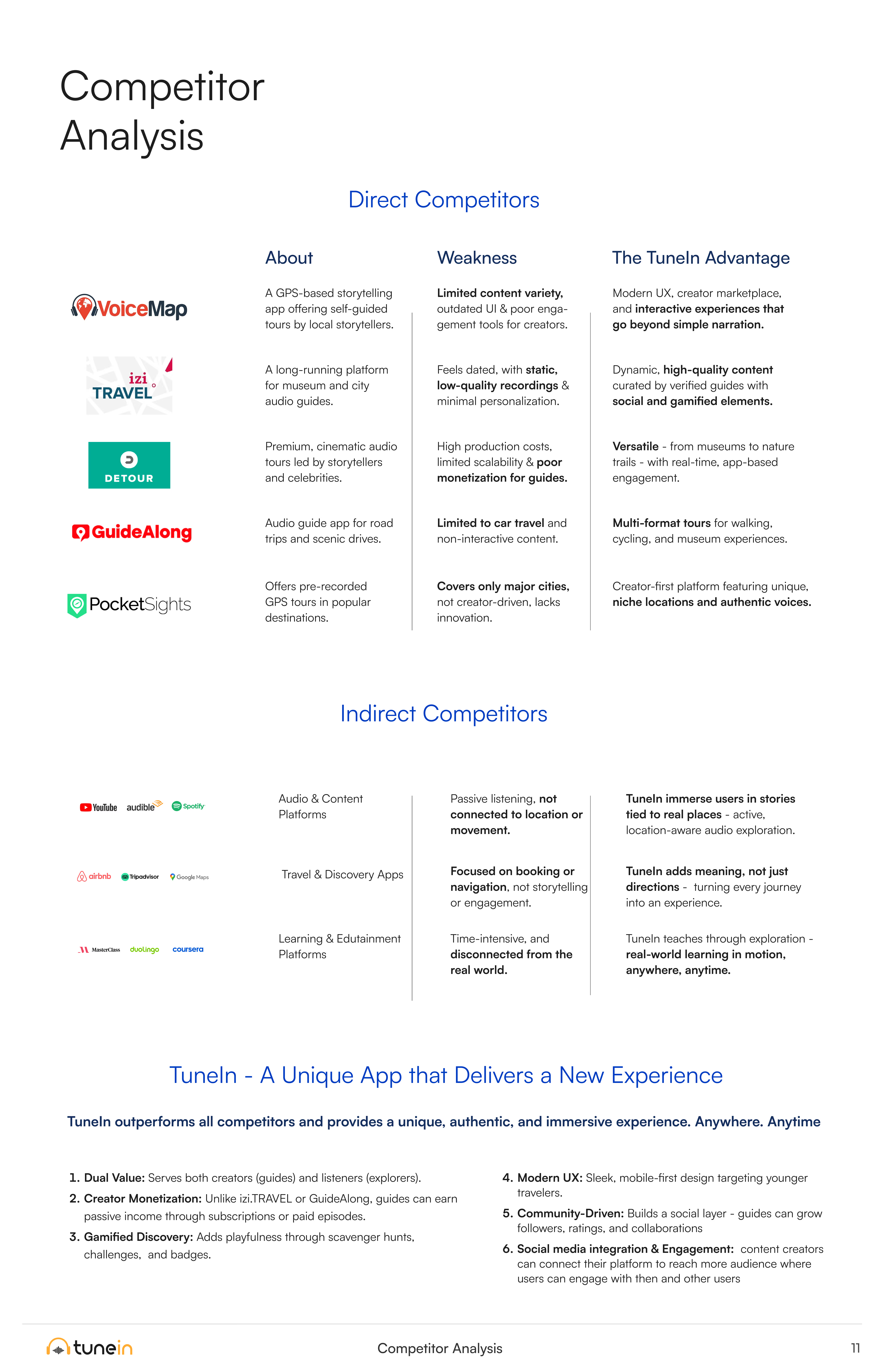
TuneIn is a mobile app that connects creators and audiences through social media engagement analytics. Ideate Creative crafted a clean and modern visual identity, designed the marketing landing page, and created a full feature-benefit chart showcasing TuneIn’s advantages over competitors.

TuneIn logo with orange headphones icon and sound waves above the text. Below, text reads: Virtual Toursit Guide Marketplace, Connect With Local Guides Through Immersive Audio Tours on a black background.
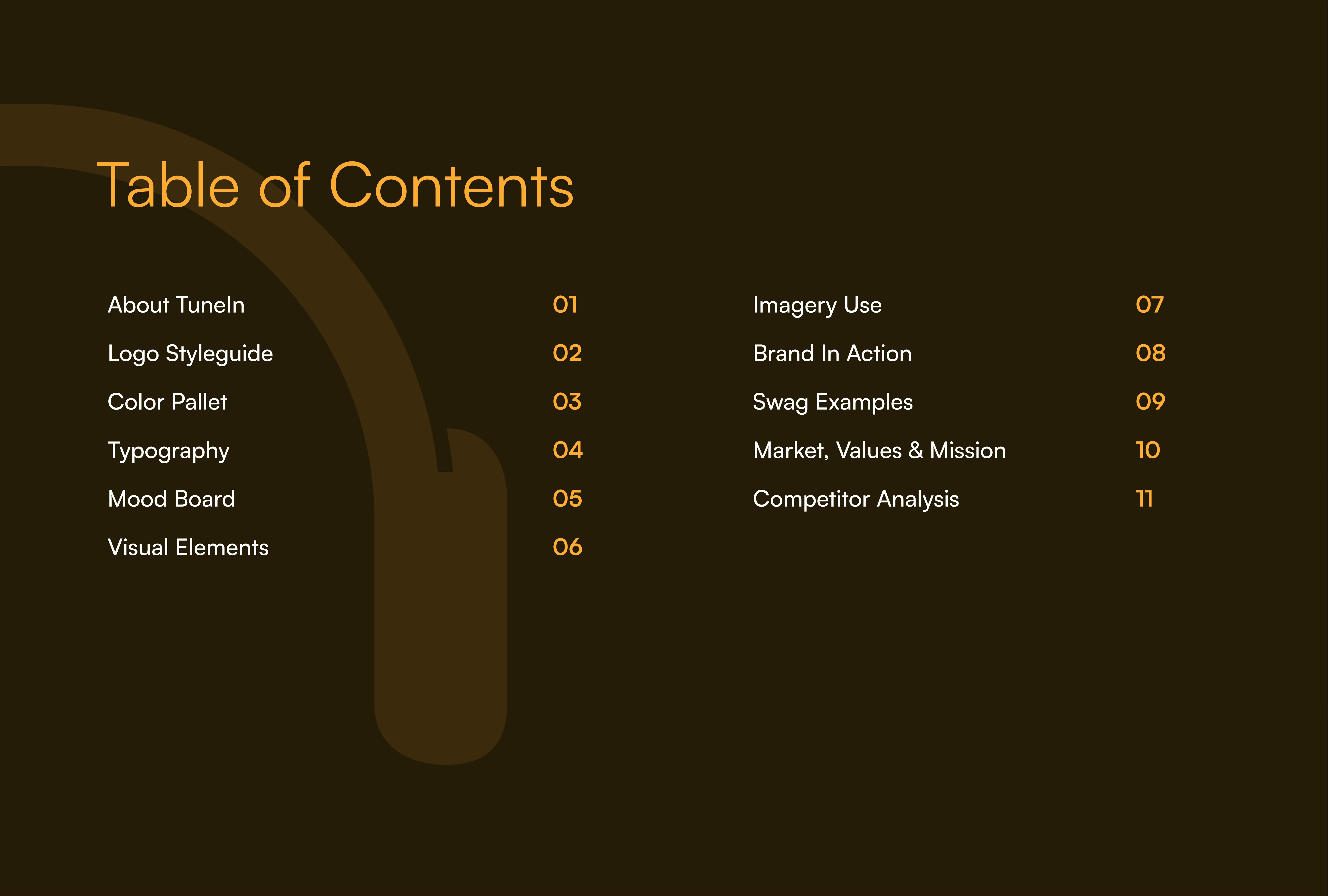
Table of Contents with items: About TuneIn, Logo Styleguide, Color Pallet, Typography, Mood Board, Visual Elements, Imagery Use, Brand In Action, Swag Examples, Market, Values & Mission, Competitor Analysis numbered 01 to 11 on a dark brown background with a faint outline of headphones.
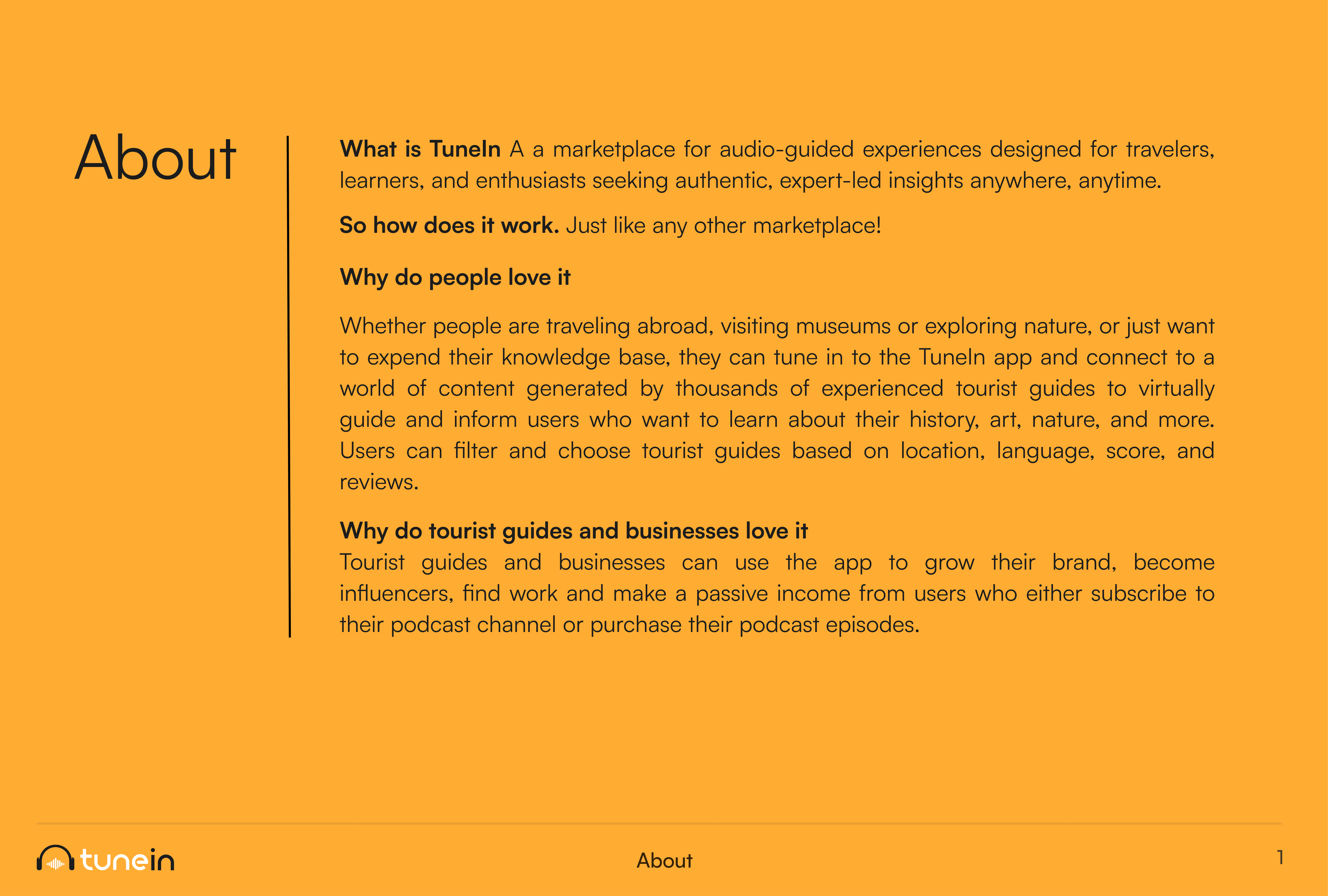
Text block titled 'About' describing TuneIn as a marketplace for audio-guided experiences for travelers, learners, and enthusiasts seeking expert insights. It explains that TuneIn works like any marketplace, allows users to access content from experienced tourist guides for learning about history, art, and nature, and offers filtering options by location, language, score, and reviews. It also highlights benefits for tourist guides and businesses, such as growing their brand, becoming influencers, finding work, and earning passive income via subscriptions or podcast purchases. The TuneIn logo is at the bottom left.
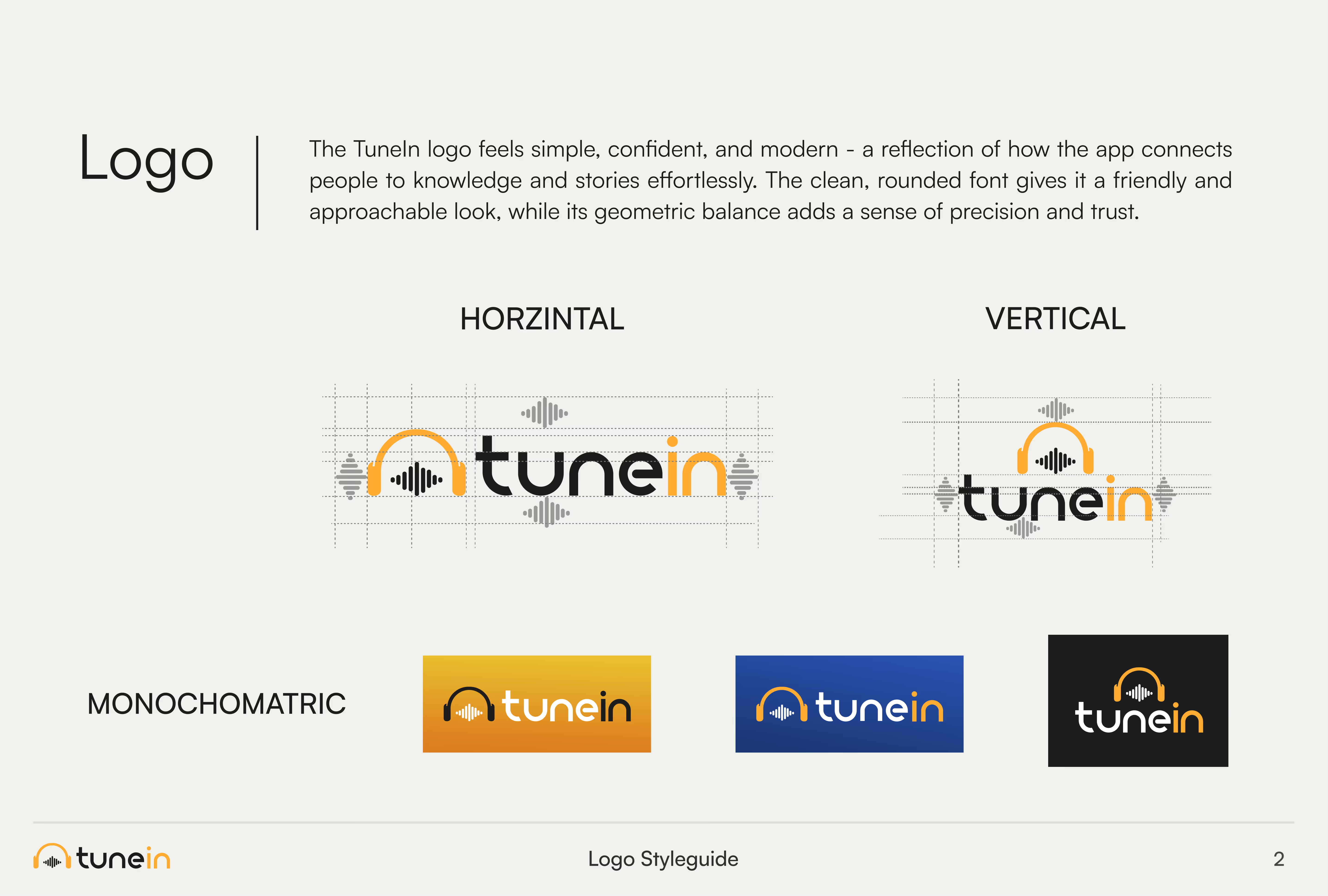
TuneIn logo style guide showing logo description, horizontal and vertical versions with geometric construction lines, and three monochromatic color variations in orange, blue, and black backgrounds.
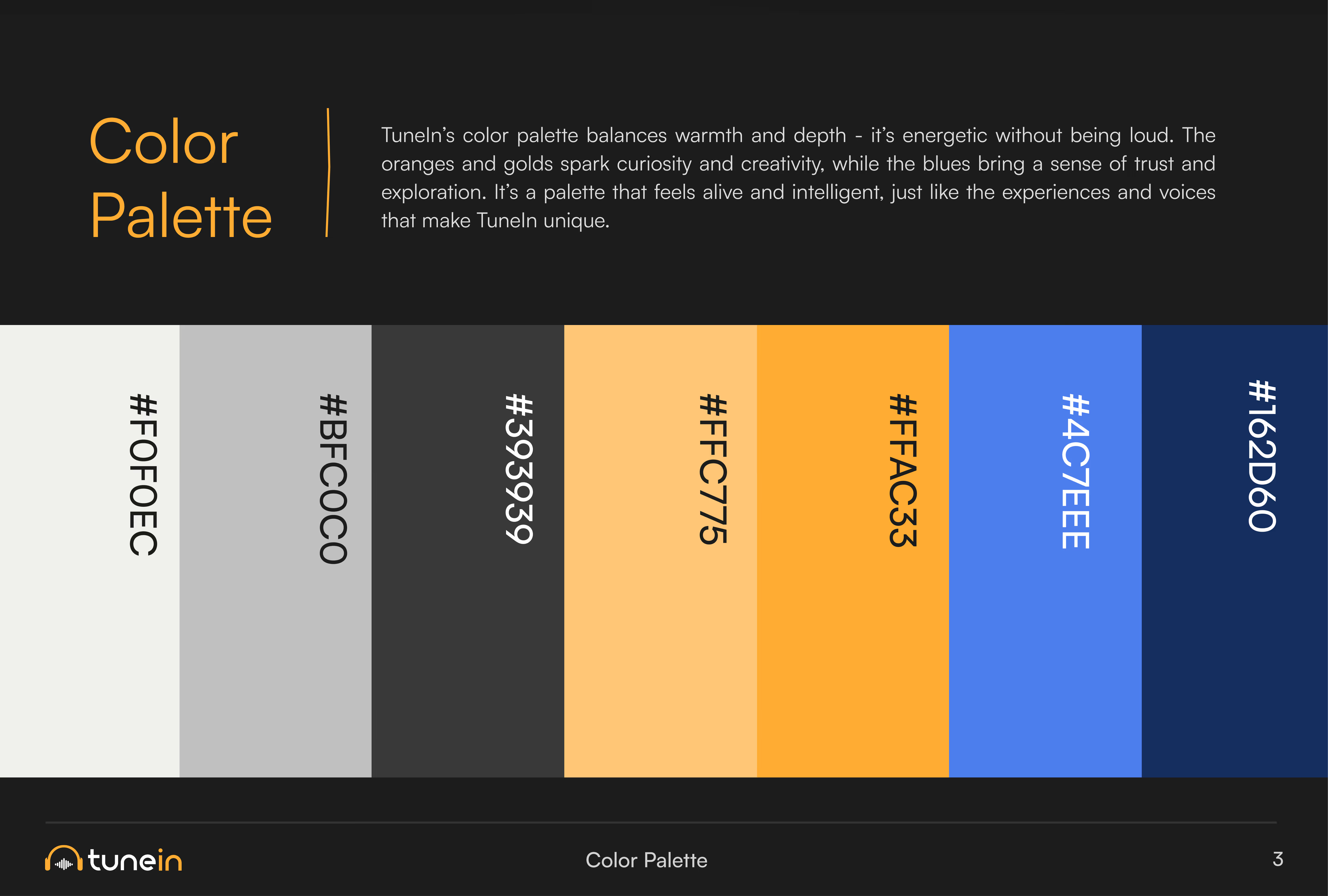
Color palette slide with six vertical color swatches labeled #F0F0EC (off-white), #BFC0C0 (light gray), #393939 (dark gray), #FFC775 (light orange), #FFAC33 (orange), #4C7EEE (blue), and #162D60 (dark blue) displayed horizontally on a black background. Text above explains the palette balances warmth and depth with energetic oranges and golds, and blues evoke trust and exploration. TuneIn logo is at bottom left.
Typography sample showing the font Satoshi in bold with the alphabet in uppercase and lowercase letters, numbers 0 to 9, and common punctuation marks on an orange gradient background.
Collage titled 'Mood Board' showing diverse people wearing headphones in various settings including outdoors, a museum, city streets, and indoors, enjoying audio content together and individually.
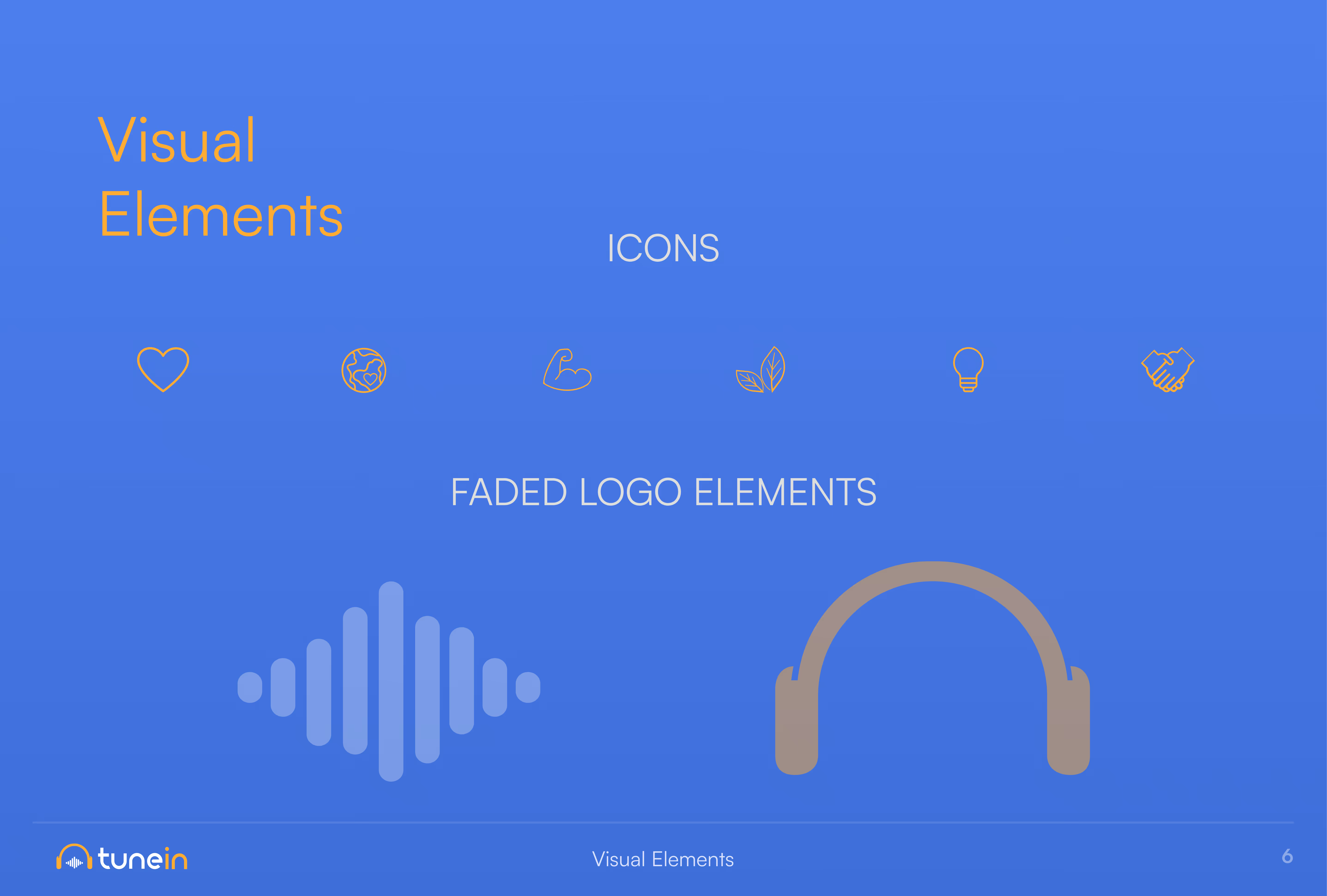
Slide titled 'Visual Elements' with two sections: icons and faded logo elements. Icons include heart, globe, flexed arm, leaf, light bulb, and handshake outlined in gold on a blue background. Faded logo elements below feature a stylized soundwave and headphones, both in muted blue and gold tones. TuneIn logo appears in the bottom left corner.
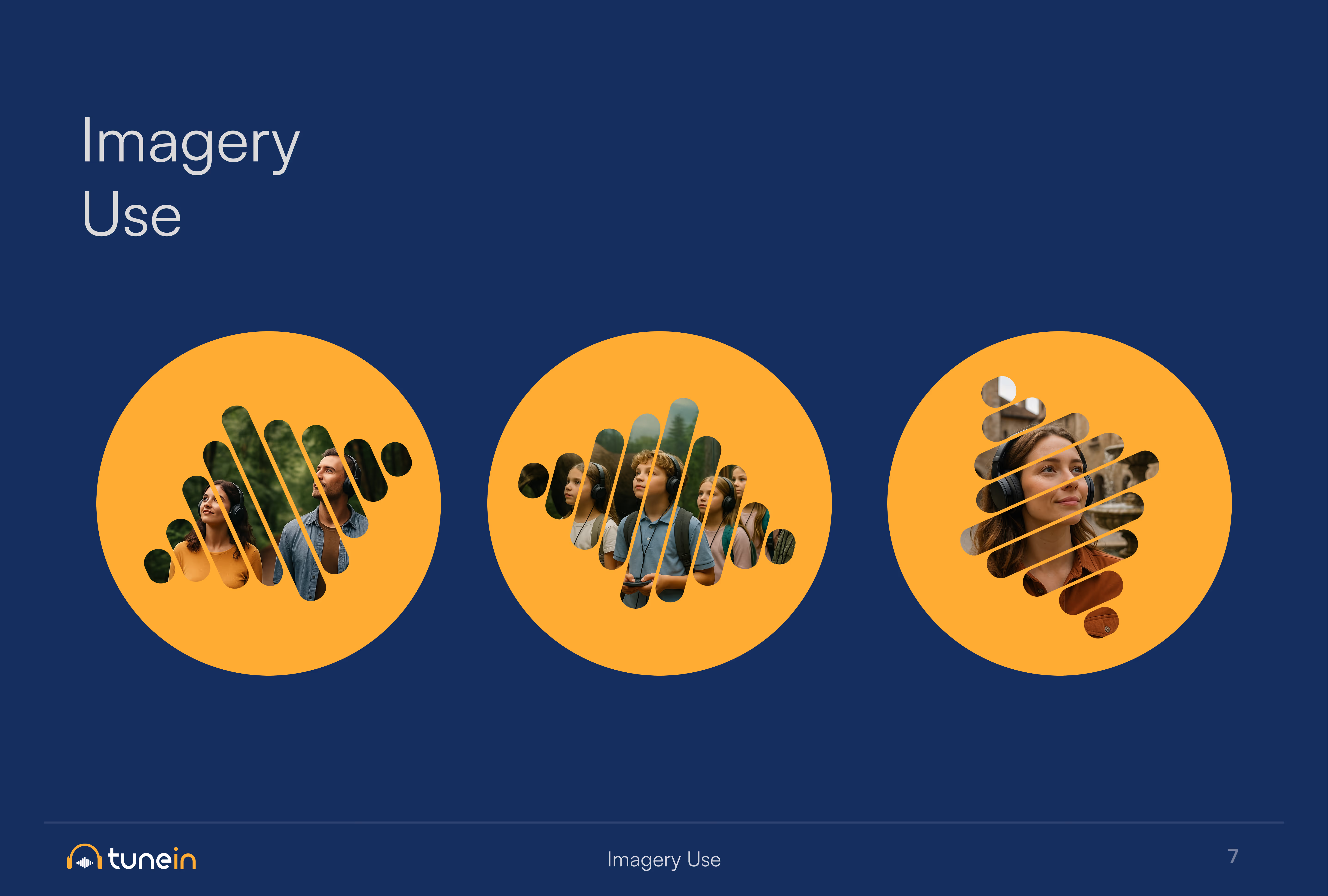
Slide titled 'Imagery Use' showing three orange circles on a dark blue background, each containing images of diverse people arranged in abstract, striped patterns.
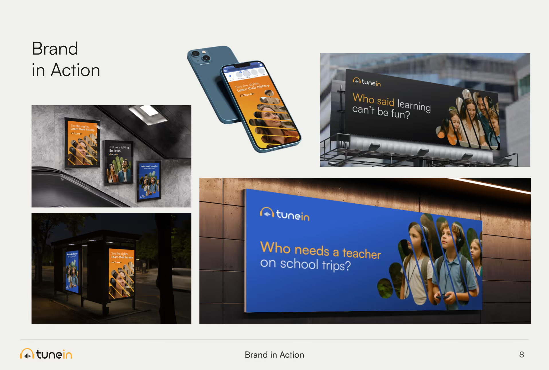
Collage showing TuneIn branding in various real-world contexts: three posters at a subway station with messages like 'Life gets better. Learn their history.' and 'No one is talking, so listen.'; two posters at a bus stop with similar messages; a smartphone screen displaying a TuneIn app with a message 'Learn their history, listen'; a billboard asking 'Who said learning can't be fun?'; and a large outdoor wall sign saying 'Who needs a teacher on school trips?' with images of attentive children.
Additional   Visual Identities

While some brands come to us with established guidelines, others start with a blank canvas. For websites and apps, we often lead the creative direction through the UI design process, developing a cohesive visual identity that brings the brand to life in a digital environment.
Frequently asked  questions
Why should we review our marketing strategy before increasing our budget?

Increasing marketing spend on an unproven strategy amplifies inefficiencies rather than results. If your positioning, targeting, or conversion funnel has friction, higher budget simply burns capital faster. We review and validate your strategy to ensure additional capital scales profitable revenue, not wasted ad spend.

How do you know if a B2B marketing strategy isn't working?

A misaligned strategy usually manifests through operational and pipeline metrics. Common warning signs include:

- High traffic with disproportionately low enquiry rates.  
- Strong content engagement that fails to build a qualified sales pipeline.  
- Leads generated by marketing that sales teams reject or fail to convert.  
- Lack of attribution clarity on which channels drive actual revenue.  
- Internal team disagreement on target audience and core priorities.  

What is the difference between a Fractional CMO and a traditional marketing agency?

A Fractional CMO provides executive-level strategic leadership, team management, and revenue alignment on a part-time basis, whereas a traditional agency primarily executes tactical deliverables. A Fractional CMO owns the overall marketing strategy and ROI, guiding internal resources or external vendors to hit commercial targets.

Can you help us decide which marketing channels to invest in?​

Yes. Rather than recommending every available channel, we evaluate your business goals, audience, budget and internal capabilities to identify where investment is most likely to generate commercial results.​​

What industries do you specialise in?​

We primarily work with B2B businesses but technology is where we shine including SaaS, cybersecurity, cloud, fintech, IT services (MSPs). We also worked with marketing agencies, tourism apps, HVAC companies, and more.

Why does a business need a brand strategy?

A clear brand strategy guides every marketing and sales decision so your message stays consistent across channels. Without it, businesses struggle to differentiate themselves from competitors and connect with buyers. Getting b2b brand strategy help early prevents costly rebranding down the line.

How long does it take to create a brand identity?

Timelines vary based on scope,but most projects take four to eight weeks from discovery to final assets. A brand identity agency typically starts with research, then moves into concept design and refinement. Complex, multi brand projects can extend beyond that window.
What does a brand identity include?

A complete brand identity covers logo, color palette, typography, imagery style, and voice guidelines. A strategic branding agency ties these elements to your positioning so they work together, not in isolation. The result is a system your team can apply consistently.

When should a company consider rebranding?

Rebranding makes sense when your visual identity no longer reflects your growth, market position, or audience.Many branding services for tech companies are requested after a pivot, merger,or major product launch. It also helps when competitors have outpaced your visual presence.

How can a B2B branding agency help my business stand out?

A b2b branding agency positions your company around what matters most to decision makers, not just aesthetics.It builds a distinct visual and verbal identity that separates you from competitors in a crowded market. That clarity makes your brand easier to remember and trust.

Why is branding important for technology companies?

Technology buyers often cannot see or touch the product before purchasing, so brand perception carries real weight. A technology branding agency translates complex offerings into a simple, credible visual story. Strong branding builds the trust needed to close longer B2B sales cycles.

What should I look for in a brand strategy agency?

Look for a brand strategy agency with proven experience in your industry and a clear, structured process. Ask to see case studies that show measurable business outcomes, not just design portfolios. Strong communication and collaboration matter as much as creative skill.
Explore our collection of 200+ Premium Webflow Templates

Need to customize this template? Hire our Webflow team!